My latest portfolio project Level Artist
polycounter lvl 7
Hi, i've been working on a scene for about 3 weeks now and here is my final shot, so take a look at it and feel free to criticise to help me improve mu skills.
[ame="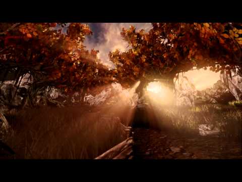 https://www.youtube.com/watch?v=L8nSZ9k9HdU"]UDK - Larsic Village - YouTube[/ame]
[ame="
https://www.youtube.com/watch?v=L8nSZ9k9HdU"]UDK - Larsic Village - YouTube[/ame]
Replies
Larger post coming, that just needs to be said.
Here we go!
- Everything is a little bit too fenced in, sure they want to have their properties but at least it should look a little bit more natural within the space. Ie there should be enough space to drag carts around the village.
- The roads look really narrow with all the fences being like that. Generally you have a couple of main-roads and then paths from the main road leading to interesting places/buildings and those two should be visually different if you can. I really like that you're not making everything flat though! The roads have a little bit of a bowl-effect going which is nice but be sure not to make it too much because it's easy to cross over to "too cartoony".
- The grass is a bit tall to be inside the village, you'd think the villagers would've taken care of tall grass to some extent or at least trampled most of it wondering around inside the village.
- A good rule of thumb to make prop compositions more interesting is to always have 1-2 big props, 2-4 medium props and a couple of small props.
An example would be the composition at 2:20 -> The platform and stuff = big props , barrels are medium props (would also be other equipment) and small props like tools lying about in places that make sense.
- The houses visually look the same right now, it would be good to introduce some more color into the scene. Medieval villages or towns usually have markets and squares where the town people gather for trading etc.
- Colorchoice: You need some more contrasting colors I'd say in general, I know you're going for the fall.
You got a really nice spectrum of colors to choose from to make it a little bit more interesting. The colors will help lead the eye when walking around the village as well, so that when you squint, the scene doesn't turn into just a big blur of 1 color.
- A slight blue fog will help you blend the background with the sky color, HOWEVER, the sun is low which indicates either early morning or it's going into evening. The gradient color of the sky dome should reflect this as well.
- Using the same tree with the same height all over the place is a little bit too much, but I bet you already know this. If you have time try to see if you can either scale the different trees a little bit without making em looking too awkward or actually create some of your own.
- I'm not seeing a lot of shadows OR a lot of areas in this environement inside of shadow giving it a flat look which you need to maybe compensate with fill lights and cool lightsources within the village. Are the lightmaps baked correctly for the buildings and props as well?
---
There we go, that's all I can think of right now in the morning xD
I hope I've helped a little bit, you're doing really well it's looking good
This is a pretty great level overall. I like the overall palette, feel, setting and soundtrack.
The video itself:
All of the best shots in this video don't have god-rays and are focusing on a visual point of the area. All of the god-rays shots are horrible as they blow out everything, and we artists are wise to the fact that that is default settings in UDK scenes. Let them enhance your art, not be the focal point. I do agree however with the choice of the big god-ray shot at the end. Only use it here because it's used so much before, it being the end is devalued.
It runs long in the village with a lot of the same shots. In fact, I was surprised over halfway through, the camera explored more areas. This even went to a whole destroyed castle that we only get one shot. Most employers won't make it through this. While I like the option of a longer video, try cutting down to 90 seconds hitting major scenes and focal points. This is a big level and not just a scene. Conveying all the content quickly is important.
the art:
Again I like the general feel. Lanterns are lite, windmill is going (pretty fast for a place with no wind effecting the trees), thus the town must be alive and active. So why is there so much chest high grass? Grass scale is ridiculous for the in-town scenes.
Are those trees modified UDK foliage scene trees to have autumn leaves? Even if not, I'd replace them for two reasons. First, they look exactly like those UDK trees, and secondly, they're expressing tropic elements within a very non-tropical location.
The lantern glow material. This is way too dark. It appears to be a constant plugged into the emissive set at a much to low number. Also it appears to be higher saturation than anything else in the scene. Should you choose to keep it simple, jack that constant number up into the two, maybe even, three digit numbers until it gives on a nice, accurate to lighting, glow. However, I suggest making it more like a dirty glass with a flame inside like a real lantern.
The windows appear to be a solid reflective material without and dirt or grounding. This works in the higher, out of view, circular windows because it has frames, but the ground level, most seen, windows don't have a frame. At the least, this is three primitive boxes. No excuses there.
Textures don't appear to be leveled or within the same style. The lantern has already been mentioned, in scene of realistic textures it's just a glowing, over-saturated thing. The next striking example is the dark shadows in the corner column stone of the houses. At 0:44 its seen on the right. The shadows are solid black with brighter highlights than the plastered brick and wood next to it.
Like the stacked stone, some of the rocks have too dark of lines for up-close shots. They do work in the distance shots.
Also in that 44 second pause on the left UV stretching on the roof. It appears other buildings have a piece of wood covering that. Would be a quick fix. Additionally, the roof texture appear to be leveled brighter than most other texture maps.
At 0:57, lamp post knocked over, lamp position and illumination not effected. This would be a perfect opportunity to break it open and have a fire started like in the castle scene.
Barrels and fence stuff looks nice.
Grass seems to get too dark at the base. I think it's due to a combination of the diffuse, transparency and scale. It might get too dark in the diffuse, allowing it to fade into the ground with transparency sometimes helps, and again, they are so big that they are overpowering themselves and the scene.
That's one of the default UDK sky's right? And by that I mean, the one that when starting UDK it's the sky. Even though it's meant to be an autumn sunset, avoiding even even hit File > New and chose the afternoon sky leaving it mid-day sky? This is one of those glaring errors that any employer is going to see and possibly giggle at. Might not hold you back, but it is silly.
Think about using some emissive in windows to add more life.
The rocks work well. There's a few times in the landscape it looks a big sharp and could use some smoothing. Speaking of which, there's a few places where it could be effective to rise the mountains behind the treeline in these village shots.
The green glow in the caves is neat, why not give it a source like some crystals or deep water puddles.
Just at the 3:04 mark the next area is revealed from above. The fog line is below this. With some of the rocks or landscape and created a mountain line before that cut-off, the blending would ground the scene beautifully.
The castle I love, but as stated, it's buried in this video. The mirroring on the front of this thing has got to go, but what I really like is the inside. Here is an example of god-rays that enhances without defeating a scene, particles and reflections are always a nice trick to making things nice. The scale on the fire particles is on par with the grass, humongous. The fidelity on this could be improved.
The circular curved stairs that come into sight at 3:20 lack the reflective shader of everything around it making it appear dark and out of place.
Finally, no breakdowns. Matinee camera panning around a world is cool, but when it comes to a portfolio; wireframe assets, texture flats, material setups, all work is worth showing. This can be a benefit as an employer may see you as more technical.
I do really like the scene which is why made this wall of text. Presentation is everything, and if anything, check out the few quick steps listed and implore them.
Its clearly a massive level but I cant see one prop apart from the trees that have had real time and effort put in to them (and I think the trees are from UDK stock, sorry if I'm wrong). My advice would be to work on some props and maybe build up to a very small scene with a nice level of detail. Also, when editing your video I think you could make it a quarter of the size as many of your shots either just show the same thing over and over or just show god rays blowing everything out.
If you want to get employed you need to keep the focus on your art because showing some UDk trees, VFX and god rays wont get you a job.
That being said you have done very well to get in to UDK and clearly have an understanding of it. I think you just need to focus on something small and really get your skill level up in that way without trying to do such a massive amount of work on a huge scene. For more crit it would be nice to see some breakdowns of assets that you have made with textures, wires etc...
Goodluck!
I really appreciate all mentioned above and I will probably improve my scene soon, but right now I need to get an internship in 19 days maximum, so I'm lacking of time, Maybe I should go for a small but ehighly details piece as mentioned by jsargent.
Thanks again relly appreciated, and sorry for my spelling error...I usually speak french.