UDK Level WIP
Hello Poly Count,
I am starting a level in UDK and I still need a lot of work to get up to the quality that I see from so many of you here. I figured I need some dust type particles for the cave collapse at the beginning as well as the fact that I need to probably fix my textures on the cliff walls to make it look right. I am only using the textures inside the cave as a place holder for some possible ideas. I look forward to hearing your critiques. Also, if any of you know some good sites to upload images to so I can post them here I would appreciate it as I always have issues getting any of my stuff into the forums here. I am also way to new to this stuff so I do not mind you being brutal as it will be the best way to learn.
Thanks.
[ame="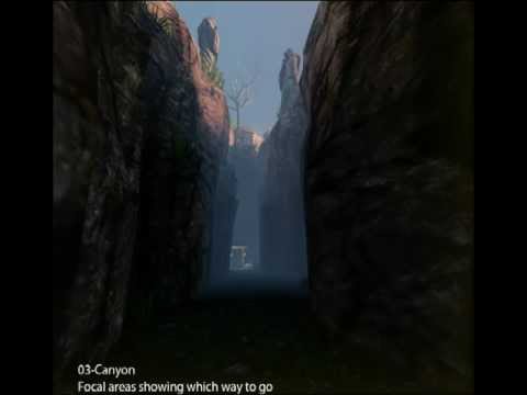 https://www.youtube.com/watch?v=gjm00AmG51k"]UDK Game Project WIP - YouTube[/ame]
I am starting a level in UDK and I still need a lot of work to get up to the quality that I see from so many of you here. I figured I need some dust type particles for the cave collapse at the beginning as well as the fact that I need to probably fix my textures on the cliff walls to make it look right. I am only using the textures inside the cave as a place holder for some possible ideas. I look forward to hearing your critiques. Also, if any of you know some good sites to upload images to so I can post them here I would appreciate it as I always have issues getting any of my stuff into the forums here. I am also way to new to this stuff so I do not mind you being brutal as it will be the best way to learn.
Thanks.
[ame="
https://www.youtube.com/watch?v=gjm00AmG51k"]UDK Game Project WIP - YouTube[/ame]
Replies
I do not know why but the images are not the same size they are supposed to be. I just had an image applied to the post and it was set at 800 width and Photobucket brought it down to 155 width. Do you know how I can submit my images to where they stay the size I submit them as?
Here is a concept of the mines. I like the lighting in this as well as the general structure.
Here is a concept image for the cliff city. I plan on having one main focal point and then a symmetrical dwelling area on either side.
Here is a concept for the lake. I plan on having very saturated blue water though as well as a multi-teared waterfall going into the lake. I plan on having the lighting and fog like this though.
And Finally here is one of my reference images for the shacks the miners live in.
First is a screenshot taken from above the cliffs. (I figured it is early morning in my map so the lighting is not overhead and overly bright and the fog is still on the ground).
Next is the mine that the player just came from. It had a rock fall on it so there is no going back that way.
Next is the exit to this beginning area. These mines are just starting so I do not have anything done inside them.
I hope this helps you out better than the prior images I posted.
This is looking okay, some quick feedback since I'm almost headed home: Firstly, as you're new to this; I would like to advise you that you're likely biting off WAY too much. This is a scene that any professional company would put a large team on.
As an environment artist, it is not merely your job to build an environment. It is your job to tell a story with an environment that you've built.
That's a very important distinction to make as you're planning this; and before you get too far in to your project I want you to go into a room and think about what you're trying to make the user feel and believe, then I want you to sit and think about how you can achieve that.
I'm not trying to be condescending I just want you to understand that this is the first step to a great environment.
Based on the Moria concept art, that cave is fucking spooky. I'm assuming you're shooting for a similar feel.
How can this be accomplished?
What would you find unnerving?
Look at this concept from Amnesia: The Dark Decent.
See how they've pushed the lighting? They've made the corridor feel safe by giving you light, albeit a sickly tone of light. It's VERY important to note here, that the color of the scene is NOT coming from textures. They're just a tool to establish a setting. The color is coming purely from green & orange lights.
The door is not lit up. It's dark, you know that you have to go to it, and you have to leave the safety and warmth of the light to reach it.
The color pallet they've chosen is red and green. Two profound colors to evoke emotions to be sure, but the red is used so sparingly and in unsightly, round shapes. Almost making you feel like they're organs or eluding to something bad up ahead.
One more image:
Look at how they use those exact same principles to make you feel unease.
It's all light, all color. That's what you need to be very aware of.
They've told a story with the pedals on the ground. As the explorer you know someone has been there recently. They placed those pedals there; they were carrying something, or, perhaps more sinister and suspicious, they put them there specifically for you, the protagonist.
But we know as artists that it is just a story device. A very, very successful device.
Now, lets get back to your art. You're off to a good start, you have the design, you have some reference to get your mind grapes a pumpin'.
You first focus here should be the canyon path, your second focus will be contrasting the interior of the cave to your canyon path. The cave should feel cold and empty, yet off putting, while the approach to the cave is just sort of preparing you for bad things up ahead.
So yeah, think of the story you're telling. That will really help you.
Technically speaking: Your canyon is too thin. Your cave entrance is dull and has no brevado. It does not stand out, it's a square hole in a wall.
Your textures are too saturated.
To make your walls feel a bit more canyon like, you should put some small details next to them. Some boulders, and maybe some dead trees will do the trick.
On top of the wall the scale of your statues, trees and grass are killing all scale. You can achieve some very nice forced perspective with those assets by placing them high and making them very small. Especially if the camera will never see them from a high angle, and always from down below you have some really good opportunities to trick the viewer with just some simple forced perspective.
Get rid of the day skybox in this area, maybe when you get to the city / lake area you can use that, but consider making it just night time. Night brings out creepy crawly shit. Spiders and Orcs and Goblins and such. Psychologically it is unsettling to people. So that's one less thing you have to worry about. Plus there is something very beautiful about looking up at stars from a canyon below.
Anyhow, I could go on all day but take my post as a tool to improve your art. You don't have to take my advice verbatim, please understand that this is all just an example of story telling with an environment.
It can be pretty damn fun!
Speaking of telling stories with the design/environment, I think it would be more interesting to keep the canyon scene in the daytime. Despite being the day, the canyon is so tall, that light rarely reaches down into the depths of it. Think of the film 127 hours when feeling the warmth of the light for only a few minutes provided him relief. Being down in a dark canyon by yourself can be creepy as it is, but looking up and seeing the light of day without being able to reach it provides anxiety and drive to make it out. Just my two cents!
Thank you guys both for your critiques. I will begin working on your suggestions at the beginning of next week. I am in mid-terms so this week is crazy enough already LOL. I will probably break this scene up into 2 maps as this is really huge like you guys mentioned and file size and time are going to be a major factor here. I certainly agree with you Seaseme, I need to spend some more time really discovering what the player needs to feel and what is fully going on with the story of this map. I have a couple of pages written down about the story already but I certainly want the story alone to dictate what the environment is going to be (as you mentioned to let the environment tell the story).
Once again thank you both and I hope you check back as I progress on this project.
I have a few updates for you guys. I have tried to incorporate your critiques up to the point where I am in the process (obviously not the cave as I have yet to get that going). First is my Video for your viewing pleasure. Please let me know if I still need to work on certain areas.
[ame="
Next, I have some fresh new Screen Grabs for you guys.
Here is the Player Start
Here is the collapsed cave where the player came from.
Here is where the mines entrance used to be
And here it is now
I have made many of the changes you mentioned Seaseme, well at least to the best I can understand them LOL but I decided to keep it daylight as well as instead of shrinking the size of the statues I brought them closer to the player and enlarged them. The new cliff walls provide some background for the Statues so I thought it looked better this way. Let me know if you think It would be better if I did it the other way or if this is working right. If you or anyone else on these forums have some more suggestions for this area I would love to hear them. If not then I will proceed to start working on the mines. Also, I am debating if I should put some stairs going into the mines or model some platform to create an elevator. Let me know your suggestions guys. I look forward to hearing your critiques again everyone.
Really liking your new changes. You're definitely headed in the right direction. A few quick critiques, It's a bit late so I will be sure to post a bunch more information tomorrow morning.
1) The statues definitely look better there. Consider pulling the rock down behind them in order to give them even more silhouette against the sky. They have a bit more, but more is definitely better in this situation.
2) The cave entrance is looking much better. I'm not completely sold on it though. I think if you're going to for the illusion of it being creepy you should definitely remove the lamps, or make them more mystical with some different, un natural color of light. Definitely avoid symmetry. It does not look neglected or abandoned with symmetry. To fix this, I would recommend you get rid of one of the lamps (This is a good opportunity to tell some story with a smashed lamp on the ground!)
3) The boulders are looking god. I would like to see bigger ones and even more smaller ones. The more you have in there the more complex your scene will begin to appear. A good general rule of thumb for placement of objects like that is by placing a large object, and then gradiating down in the size of objects the further you get from the big object. So, a big rock will have smaller rocks near it and they will get continually smaller the further they are placed from the main, large boulder.
4) For your cliffs, I would recommend you find a new texture for them. The texture on the rock walls is beginning to crush the entire feel of your scene with its low resolution. It looks very strange when placed next to the pretty high resolution textures of the wood, grass and ground.
5) Are you on a polygon budget? \In the rock collapse, I think you could try taking your other cave entrance tunnel from the other side and Just fill the small tunnel with rocks and wood chunks and such to indicate a collapse.
7) lastly, you're going a good direction, but still you need to work on some story telling in your work. There is nothing particularly creepy about your scene yet. It is very Myst-esque.
Keep going!
Thank you very much, I have been thinking of replacing the rock textures as they just do not look right with the scale of the textures on other objects. In the collapsed cave area there is no actual tunnel leading out. Should I model a tunnel there or do you think it just needs more debris to fill it in? Also, I am really not going for a creepy or scary mood on my scene at all. That is why my original cliffs were so saturated. I realize the caves would be darker naturally but so far it is an early morning scene in the canyon. As such the sunlight would not be fully flooding in the lower parts of the canyon and since I still wanted to allow the player to see details I added the fog because it is something common in the morning. The basic mood I am trying to get would be a spring morning about 6:30 or 7:00 AM. The sun is still coming up hence the very orange light hitting the tops of the cliff and the light blue color in the fog. I want the player to feel a bit uncomfortable though as he will not know what does lie ahead but comfortable enough to not feel in immediate danger through this area. The only really dangerous area for the player should be the city in the cliff which is way ahead of here. That is where I want to pull out all the stops on creating a creepy mood to the scene. So far I am actually trying to create this scene more like a fantasy world like you might see in most of the Fantasy RPG's, hence the low resolution textures on the walls LOL JK. I certainly do not want to make the player feel like it is extremely dangerous to go down into the mines (which are by nature going to feel more dangerous as it is). If I created this area creepy then I need to create some enemy encounters in the mines to justify the feeling I pushed onto my audience by making them scared in the first place. If I create some encounters then I need to create a story as to why those encounters are happening there. This would change the whole dynamic of the story I created for my scene already. I hope this info helps your critiques.
Secondly, I spy a few pre-packaged UDK assets and I think that these really ruin any scene. Stuff like the statues and the default sky can be spotted a mile off by anyone that uses UDK. They can undermine all the work that an artist does on fully custom assets, as a viewer/player might dismiss the environment as being lazy.
If you want to use them as place-holders, by all means go ahead but I'd suggest replacing them eventually with your own work.
@Seaseme also brought up the point about the cliff and rocks looking very low resolution. You could try having a look into Detail Textures, which are essentially another image tiled on top of your existing texture. That way, you still have decent resolution when looking up-close to a surface.
As well as this, your rock textures are quite dark and might need to be a bight lighter in tone.
The colour of a diffuse texture is the colour of the object when fully lit, so a dark texture will only ever be dark, no matter how much illumination it receives.
Just some things to keep in mind and I hope they help
Good luck, I can't wait to see where this goes.
I know it has been a good while since I have updated this but I am still working on it. I think I have the first part done for me but the caves still have a lot of work to get them looking right. I also need to rethink the way some of my traps work. I hope the video quality is good enough for you guys. If you need any specific areas in an image so you can look at it better let me know and I will post it up for you. Thanks
[ame="
It actually reminds me of Doom a bit, with similar room lay-outs and switches (not sure if that was intentional
One thing I will say though is that the cave area could do with some more work defining its general structure.
At the moment, it looks like a man-made low-ceiling room. But perhaps creating a more natural-looking rock formation would serve better?
Try looking at Nerja Caves as reference to how uneven and random the formations are.
Skyrim also does a good job of capturing that underground feel too.
Hope that helps!
And keep up the good work
I notice in Skyrim that a lot of the walls in their caves are actually quite square and they use meshes to fill it in and make it look rounder. Maybe not all caves, but the couple I studied to help me understand this project were surprisingly quite flat on closer inspection.
I put down this project for a long time. I recently started it up again. I have rounded out the cave walls a bit like Sir Calalot suggested. I have also been working on placing props around the Level. Here is a quick run through show some updated progress of the Level. P.S. since this video I have been working on some ventilation holes and some water puddles in my second big room (since it is the lowest area in the Level). I will try to get some still images to really highlight some specific areas as soon as I can.
[ame="
Enjoy