[UDK] Sci Fi Tram Station
*EDIT - Updated to tailor for my masters course in 3d Games Modelling, im looking for peoples experience with mobile modelling and anything they can share on the matter of optimization, please read the bottom post for more, the following thread is over a month or two old - /EDIT*
Hey Everyone!
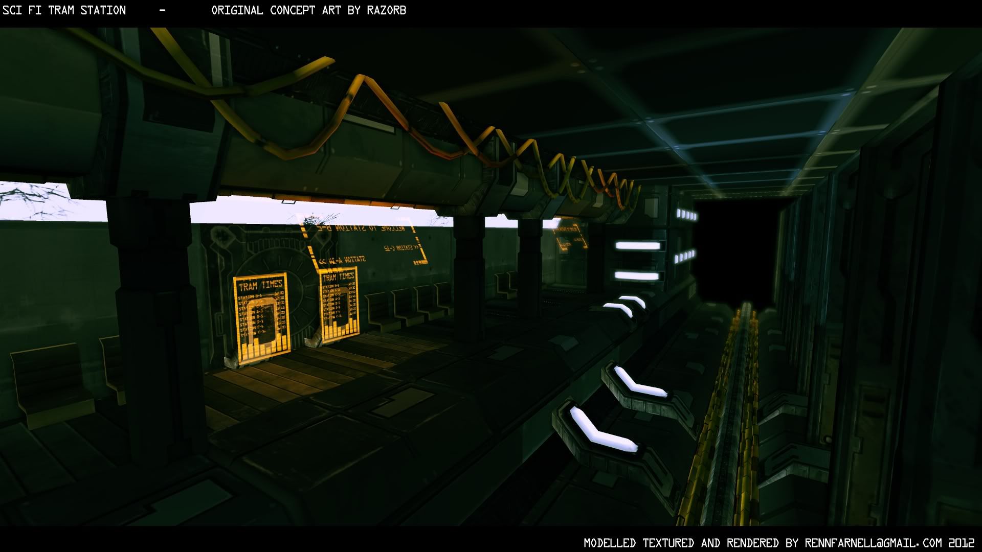
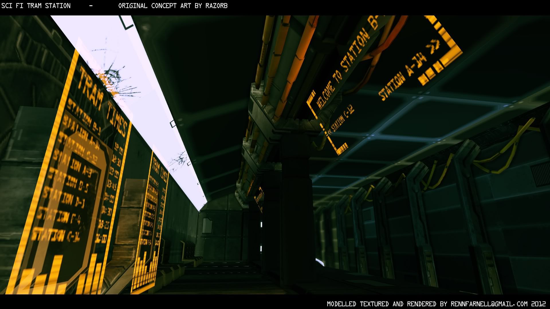
I've been working on a sci fi scene over the last week, its based on concept art by Razorb
Here is where im at so far, its under 20,000 triangles, using hand held specs (most models under 100 triangles) and once all the modular assets are welded together to reduce draw calls and help lightmass, the 1024 diffuse/specular, normal/glow and 256 hologram texture will be the only other things being called into the scene at run time =]
Hope you like! All C&C welcomed, im looking to add things like vent steam, a moving tram and some evidence of use, like trash cans, newspaper etc
Take care all.
Hey Everyone!
I've been working on a sci fi scene over the last week, its based on concept art by Razorb
Here is where im at so far, its under 20,000 triangles, using hand held specs (most models under 100 triangles) and once all the modular assets are welded together to reduce draw calls and help lightmass, the 1024 diffuse/specular, normal/glow and 256 hologram texture will be the only other things being called into the scene at run time =]
Hope you like! All C&C welcomed, im looking to add things like vent steam, a moving tram and some evidence of use, like trash cans, newspaper etc
Take care all.
Replies
-the lighting is too dark and not very 3dreadable ... the columns are entirely black whilst the hanging cables are totally drawing attention because light seams to leak in from above. take a closer look at the concept art.
-the lamp strip kind of meeds abetter transition to the none lit geometry right now it looks likere there is a polygone missing at first glance.
-alot of people i know build absolutly everything out of instances others swear on building everything unique. i think its all about the balance and doing what ever is the most optimal thing to do on an object by obejct basis. that green blue lighting artifact on those ceiling panels makes me think you are instancing around a simple quad with that grate textureon it ... those ceilings and the floors would be stuff that i would build as one big unique chunk to have no seems /artifacts and to be able to build/uvmap unique trims and decorations that considers the rest of the geometry around it.
-i always try to stick close to conceptart but sometimes you have to deviate from it the concept art clearly shows dark streaks on the hanging cables which looks okay there but in your 3d model it looks like an artifact id get rid of it.
-most places where you have a 45 angel in your geometry you have distored uvs that lead to seams between panels in your texture to get kinda broken/skewed in a way no man made object has ever looked in real live ... uv it more carefuly map it onto a completly generic piece of grey metal if you have to.
-its good to see that people start to activly think about drawcall reduction and how to squeeze the most out of as little texture memory as possible
show us pics of yout texture sheets and the individual models for more detailed workflow feedback
I then started my first ever texture atlas, also started using techniques suggested by yourself Soenke and tutorials from artists like Thaigo Klafke and Philip Klevestav, downloaded some free grunge, cracks and shattered glass brushes for GIMP to start editing the base colours i laid out.
I used a plugin for GIMP that creates normal maps from textures / heightmaps (similar to photoshops Nvidia filter) Heres the results of all that:
Im going to make a load of changes to the scene during the rest of today, had my first break on uncharted this morning after working on that texture atlas and the highpoly/low poly models all week!
A few friends on facebook have recommended some changes too, many are similar to what your saying, i tried the lighting in plane white like the scene and it looked really bland, so i tried some colour correction in the lightmass / world render settings to up the greens and reds/oranges in the scene, gave it a slightly deus ex over tone (could have done this easier with a Post Process volume to be honest! Oh well)
It doesnt matter too much what i did to the settings as ill be playing around with the lighting alot once ive welded everything into one object today (there are a fair amount of gaps on certain meshes) Most however were modelled to the grid, using 256 and 512 sizings (and 3rds in some cases)
Thanks again!
Leave post process at default for now and experiment with using slightly coloured lights - add some very slightly yellowed lights by the seats, and some darker blue lights around the tracks and observe how the contrast makes the scene more visually interesting.
Good luck!
-models seem propery modular(even more so than what i would do) --> good !
-the structure in your texture is very obviously made from custom brushes it just has that spongy look id use more simple generic textures for overlays --> could be improved
-normalmap almost everything was generated from 2d ... that never looks good. model it ! all of it ! it will pay off ---> needs to be improved
When i tried to get the same effect on some of the high poly to low poly ao/normal bakes (pillar worked fine) they tended to give bad artifacts, im not sure if it was because I was attempting to bake at low res (maybe I should bake at high res and size down in GIMP)
To answer your question James I used 3Ds max for modelling (had massive problems realligning the pivot with snaps, i'd align it n one view port, and then in another it would be miles away >.<
I did some highpoly work for the floor tile, the 2 pillars and the 2 panels with diagonal surfaces, nothing like zbrush could offer though! I found that making major details kept causing the assets to look clearly repeated, so tried to tone it down and just use GIMP (Saved a lot of time imo but if its looking too generic still I'll try my best to mix it up with some more CG textures (used them on the concrete sections)
Thanks again guys, I got struck by an epic migraine today so i don't know if I'll post anything until tomorrow :-)
I defaulted the high/mid/shadow tones back in the world settings and have enhanced the blue and orange lights, also used emmisive lighting from the back panels this time, they still need down-brightening in the diffuse as they still stand out too much, but heres a shot so far:
Thats rendered with production lightmass, it may the fact that it is a mobile spec scene, so all the models are low poly, or the fact that my normal map needs, and will soon have work done to it, but i still feel that its much to be desired!
There is a massive lack of solid, readable shadows, i know the global illumination is partly to blame, any help on that, and professional lighting solutions would be a massive help =]
Thanks everyone!
Thanks for the comments guys!
Games such as ShadowGun, and Infinity Blade are exactly what interests me the most. Obviously with this level of detail and quality, there is ALOT of optimisations being made. Thats where my masters piece is being aimed.
An Investigation into the optimisation of 3D Environments for Hand Held Gaming Platforms
Thats a mouthful, and is to be worked on but it sums up my aims nicely
This summer i've looked at Unity and UDN for tips and tricks on optimisation, including Unity's draw call batching, the techniques of texture atlas'ing, which i've done many times previous to my research anyway, and EPIC's simplygon to name a few.
What im looking for help with, is any other ways to optimise that arent always apparent, especially in terms of low poly modelling, and creating that perfect silhouette with a low cost, any tutorials or renound artists are obviously welcome!!!
Thanks Guys, hope you all had a great Summer!