The BRAWL² Tournament Challenge has been announced!
It starts May 12, and ends Oct 17. Let's see what you got!
https://polycount.com/discussion/237047/the-brawl²-tournament
It starts May 12, and ends Oct 17. Let's see what you got!
https://polycount.com/discussion/237047/the-brawl²-tournament
Green goblin
hii i am terry and i made this piece for a contest only my texture skills arent that good anyone have an idea how i can improve and what?
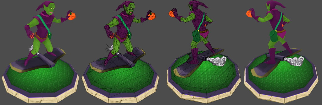
texture size 512x512 for character
and 512x512 for the rest
2362tri's
texture size 512x512 for character
and 512x512 for the rest
2362tri's
Replies
http://www.polycount.com/forum/showpost.php?p=1515379&postcount=170
http://www.polycount.com/forum/showthread.php?t=88799
There are a lot of helpful things on Conceptart.org too.
http://www.conceptart.org/forums/forumdisplay.php?f=7
And reinforcing what I said, the only way to improve is practice, post here, or in ConceptArt.org, get some feedback... and correct your work, post again, and so on.
Good luck!
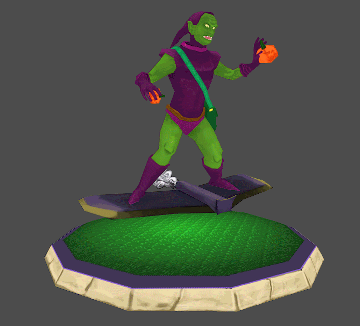
The model turned out great.
True the texture could be improved. The face is pretty decent, you really show some detail especially in the forehead and ears.
The major things I think need work:
1- contrast is low, there just isn't a lot of definitions of shapes.
2- definition of shapes. The face, muscles and clothing all seem to be a bit lacking in proper forms (lines down from side of nose to side of mouth, arm and leg muscles aren't defined etc...)
3-Top of wings is too dark. Probably good to some shadow of the character but it should be much less drastic, that side of it should be catching a lot of light.
4- back of legs have a bright crease, should probably be dark.
5- I don't think the base platform helps it at all, in fact I think it drags the model down. It's kind of ugly and low res, doesn't really 'fit' the model at all. Concentrate on the model, if you need a back drop I'd do something more like you'd see in the comic, he'd be flying around the corner of a building or something.
(I gave same crit to someone else a few days ago, they had an airplane hovering above gravel...)
The model is great, I'd like to see you polish up the texture and have a nice finished piece.
What's up Shinsen? Please don't start spamming these forums with stupid post and unrelated gifs.
You have a critique give it, other wise don't bother. This is Polycount not Reddit.
It's not a terribad unwrap. Sometimes it's hard to get alot more efficient than that. Would be good to see the painted tex ext to it, easier to see what pieces are.
Have you tried the checker pattern technique?
Bascially make a texture of small checkers and apply that to your model, it will show of inconsistancies in pixel density and stretching.
So you can clean up your uv's really nicely before painting.
3DMax lets you apply a checker board in the uv tool, not sure what you're using.
Some stuff I can see. The face is almost as big as the body. I don't think it's bad to have extra res in the face, lots of small details and a 'close-up' area. But if the density is too far off it can be noticeable.
(on the flip side things like underside of gloves/backside of ears could even be scaled down a hair)
(speaking of backsides of ears, you can just wrap them around the front of ear, weld all the verts so you have fewer seams [fewer verts in game]. You'll get some wicked stretching, but it's pretty well hidden and small, will anyone notice?- same with hands, the edge along the pinky could be welded up and the hand would be one island)
You might want to just try uv mapping the entire face and making it same density, that way you can add unique details to one side of face (scars and whatnot)
The biggest 'offense' I see is the U shaped piece at the top, I suppose that's the belt. You can probably just straighten those pieces out into an even rectangle. If you don't have specific details like belt holes or buckles you won't notice stretching and it'll save a lot of space.
I think this is a solid start, but I think the texture as it stands now should serve as a rough color block-in for your final asset.
OK lets get started on the BASE first before moving into detail.
I put your image in photoshop and started color picking and noticed that your colors tend to be very close to each other. WHat I mean by this is that you're using the same hue but changing the value. This is fine, but the end result tends to be abit musshy (Which you don't want). What you want to do is change the hue abit while changing the value.
Example of what you are doing: As said above ^
Example of what will give better results:
Heres the paint over by its self:
I think the face needs to be edited with the ears being the same length as the head (maybe even longer) the noes needs to be pointy as the is a common feature of the green goblin with a evil smile.
I didnt spend time doing the eyes and teath, first get the form and value correct the move into the smaller details.
If I've not mentioned something, then that would sound about right XD
Hope this helps .
Micah
(forgive me if this edit doesn't actually look better on the model, I'm kind of flying blind here)
I believe you need to be more daring, right now everything is one flat color and this makes things hard to read. You have some points where you have some baked/painted AO but it's all a bit meek. Try to not have small line parts like at the knees and elbows, but shadow actual shapes.
Oh and a simple trick is to always have a slight shadow at sleeves and such things. Adding some fake drop shadow or AO will make it feel more volumetric.
edit: between Micah and me, this should give you a good idea of where to start =P
btw tnx allot all of you this is really good advice
I like using a combination of 3dcoat and photoshop for low res stuff
Another tip is to bake a light map for your model. It doesn't have to be anything fancy. Just a skylight + light tracer can give you some good effects already. Do put a plane under your model when baking. Here's an example:
You don't even have to use it in your final diffuse. It could also be great as a visual guide for where your strokes need to go.