Need Help Please!
I've posted this in the general discussion forum, though since I'm new here, I'm not to sure where this is suppose to go, so I'm posting it here too, if anyone can redirect me to the proper spot, I highly appreciate it thank you ")
 I can't get it right
no matter what I do, I can't think of any way to make this more realistic
by my boss's view, this is too toonish and not even semi-toonish
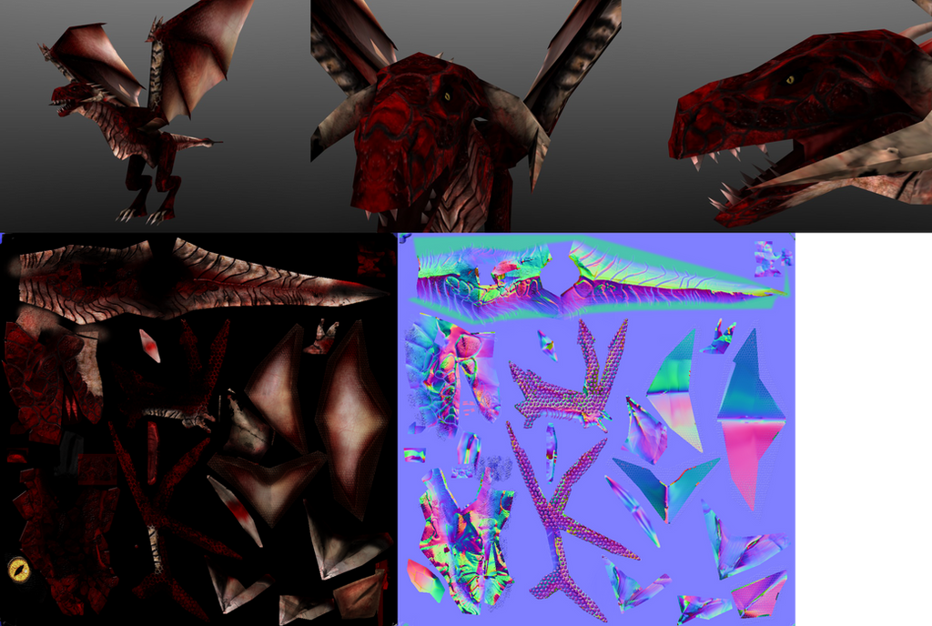
1294 poly ( MMORPG )
can anyone help?
or direct me to help?
please I need this
I'm tearing hairs out trying to get it right over 3 months now
Any help would be appreciated
I can't get it rightno matter what I do, I can't think of any way to make this more realistic
by my boss's view, this is too toonish and not even semi-toonish
1294 poly ( MMORPG )
can anyone help?
or direct me to help?
please I need this
I'm tearing hairs out trying to get it right over 3 months now
Any help would be appreciated
Replies
Your major issue is that your materials are not reading well. If your materials read well, you can skate a bit on the anatomy of the dragon, especially since they're fantasy creatures.
If you can use a specular map, I'd start by making one. Look up some photographs of snakes and lizards to see how the light reflects off of their scales - you get something of a broad, highly diffused specular that gets spread out by the scales. It's not very strong, but it is wide.
Your mesh could use a lot more work, too, rounding out the shapes, and following more of a T-Rex musculature, with better definition of the anatomy of the wings.
Stop shading with black, your texture is nearly monochromatic - it's all red and black. Put some color into the shadows (this is very easy by just overlaying a gradient map that replaces blacks with dark blues to help you build a base) and you'll get a much richer, lively look to the color.
Stop panicking, take a step back, and rebuild your work. You can't polish a turd (although they can be lacquered up nice) - it's better to blow away some of your bad work and repaint textures than assume you can tweak the existing one to perfection.
I'm not to sure spec maps can be used in game, so I do not use it
and its not shaded with black, its a very (very) dark red
I can remove all the scales and start over
but I can't start over without knowing what to improve on?
Is it the position of the scales?
the texture?
If you say details what do you mean by it?
As for the shadowing, it is pretty much black. Photoshop is showing brightness values from 0-3% around the hips, inside of the legs, and other places. As a result, it's pretty impossible to read any kind of detail in those areas; if there are scales or any hints of an underlying muscle structure, we can't see them. If this was the result of a baked in Ambient Occlusion, it's intensity/opacity was too strong.
I would try to get more out of the UV layout as well. The way the islands are currently broken up, it just looks like there's a lot of wasted space which is going to make it harder to try and paint in the kind of detail you're probably looking for.
I know it is hard to admit, but you need to nuke the texture and start from scratch. You need to put more color into it, you need to get some specular lighting in there.
I want you to find some reference images for the skin based on real animals and post them here - photos of lizards and snakes most likely, but anything that has the effect you're looking for is fine. I want you to examine those and break down what you believe are the important qualities to those surfaces that sell them as real, living animals.
There is way too much lighting, highlights and shadows in the diffuse material. The diffuse is just color information with hints of lighting to help the real time engines along. With so much lighting info burned into the diffuse its going to constantly be fighting with whatever lights are in the game and never really react to lighting like it should. This is why you define the different properties of the various materials and let the engine work out the lighting.
Right now you're combining all of these 3 properties into the diffuse and its killing the overall material.
It's as if you're drawing a picture of the entire surface into the diffuse instead of breaking it apart into its separate pieces.
It seems like your "make it look real" slider is actually the "saturation/darkness" slider. By this I mean its way too saturated! there is way too much dark burned into the diffuse and all of that burned in lighting makes it look toonish.
When everything is outlined in black it looks like a comic book. If you do a color select/black on your texture you get a lot more than just the background.
You should change the background color to something that compliments the dominate color in the model which should be red not black. With it set to black right now you're being influenced to make things overly saturated and dark. What looks like a bright spot on the texture (because its drowning in black) comes out dark and harsh on the model.
If you're going to combine any lighting info into the diffuse you should include Subsurface scattering. It's light scattering around inside of something, like candle wax or a sail at sunset. All of this bouncing will help wash out the pure blackness of the shadows. This would be the opposite approach to what you did. You want almost no black instead you have way too much.
I completely agree with Ghostscape, you need to spend more time with reference and really dig into what makes the reference look like it does. The images below are a combination of the 3 properties above (plus a bit of sub surface scattering). When you look at these images you need to break apart the elements so you can recreate them.
Armadillo Lizards make great dragon reference:
Notice how there is a good amount of subsurface scattering going on in the spines on the tail and in the scales on the back in the lower part?
Notice the subtle shifts in hue and tone in areas like the the nose and eye in the upper image?
Notice how the scales around the head in the lower image are outlined with a darker brown instead of pure black?
TL:DR
1) Use each component to define the material, stop making the diffuse do all the work.
2) Reference, reference reference.
3) Subsurface scattering would lighten things not make them darker.
4) redo your UV layout, don't be afraid to straighten a few pieces and cause some minor distortion if it means the pieces will pack better and you can use more pixels.