Low poly characters- demon princess and steed
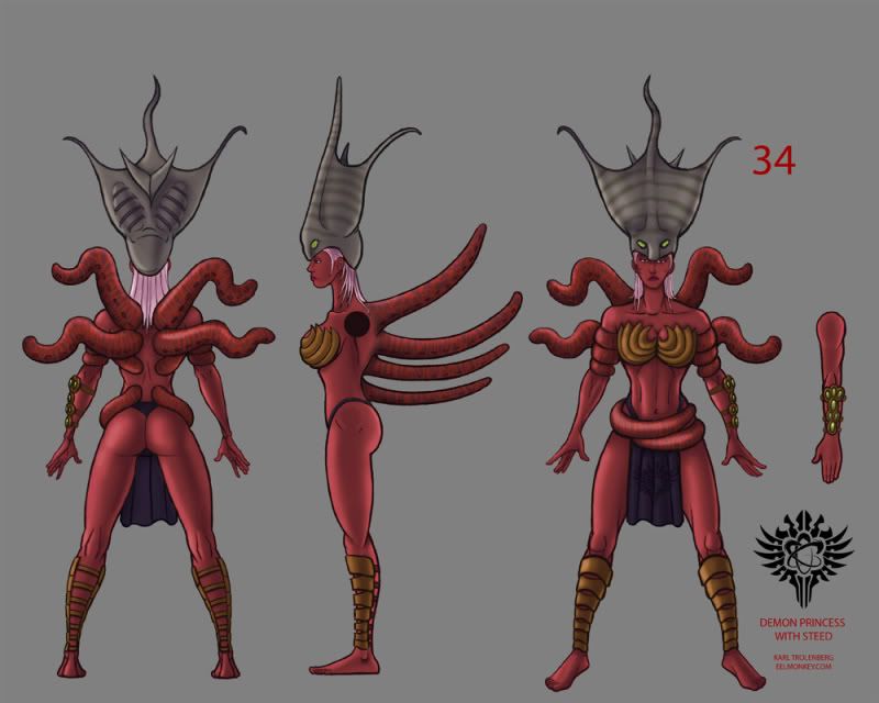
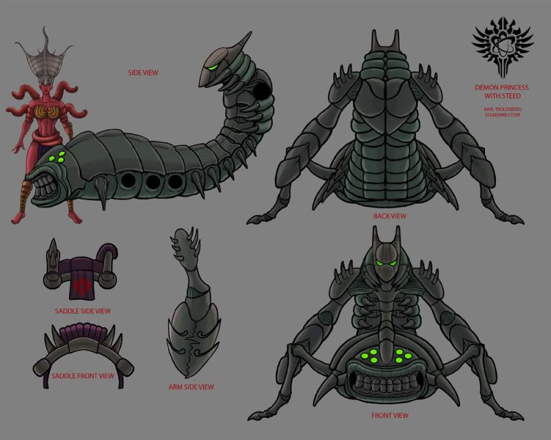
I am making a low poly version of a charcter concept I made for dominance war 3. I am looking for some professional critiques of my poly distribution and modeling. Any improvement to the character design are also welcome. Here are the original concepts.
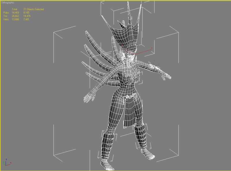
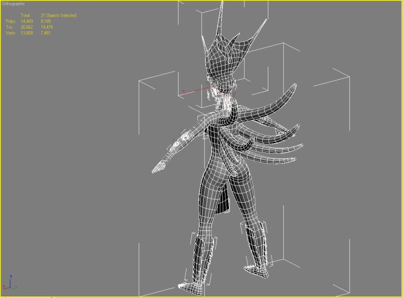
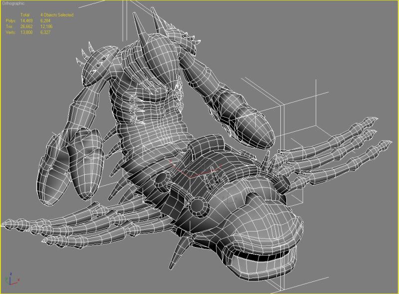
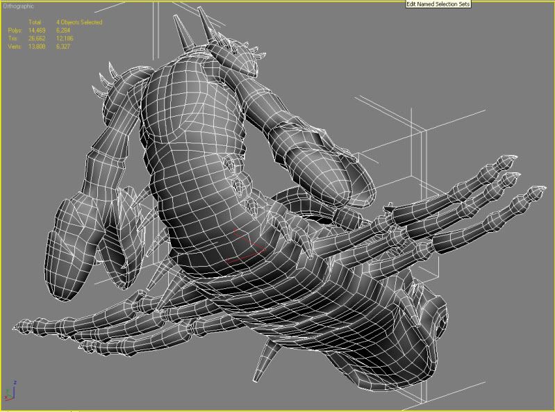
Here are some screen shots of the models in max. I am aiming for a hero character poly count for the princess and steed individualy. The saddle will be part of the steeds poly count but will stay a separate object. Let me know if more information or images are needed.
Demon princess
Demon steed
Here are some screen shots of the models in max. I am aiming for a hero character poly count for the princess and steed individualy. The saddle will be part of the steeds poly count but will stay a separate object. Let me know if more information or images are needed.
Demon princess
Demon steed
Replies
praetus- I wanted these to be more on the realistic side of things. When you say handpainted what would be a good example of that look? Should I just avoid using photos?
Thanks
This is just my personal opinion though. By all means try some things out and go with what you like.
Time to start unwrapping!
The princess has changed from a fiery red to an oceanic blue. I ended up changing the colors on the princess based on a friends critique. Although now I wonder if she looks too Navi'.
I have had more time to work on these since I was laid off in April, so if anyone knows a company in the Virginia/North Carolina area that needs a modeler let me know.
Now with that out of the way, I think your color schemes are too analogous. The colors used on the princess character and her gear lack saturation and contrast. Especially the details on her back tentacle thingies. You can barely see the striped detailing on them from a distance. If her armor pieces and the creature's helm are made of metal then I think that they are too diffuse. Metal has sharper shadows and more intense specular.
Same goes for the mount creature. His colors are too flat. Play around with a broader color scheme, like a different color for the underside of his thorax(?) to break up the sea of flat green. Maybe paint in some shading around the head area and the tip of his creepy spider legs, etc. Basically more color and depth/shading in the textures!
I also kinda want to see the squid thing helm's skin texture looking more "wet" and.. squidy.
Can you post your texture maps?
edit: Here's a quick and dirty Photoshop example, i would push it even more, but then again I'm obsessed with color. :}
Here is the same models rendered with only default max lighting as opposed to the mental ray renderer from the other renders. I think this is closer to how a game engine would light them although I am not absolutely sure as I haven't tried them in any yet.
I changed the maps per sybrix's advise. I really like how the steed came out but I am on the fence with the princess. What does everyone else think?
I think that the skin contrast looks WAY too high in the specular areas. Having too much spec on skin is one of the mistakes a lot of students make. I do think that there should be more variation of colors, but this would be done through costume or maybe different skin materials/details, not from cranking up the levels.
This isn't really a bad thing, and non-3d people wouldn't notice, but your skin tone looks almost identical to the colors of a tangent space normal map. It makes sense for a blueish skin tone to be a bit teal in the highlights and a bit more purple in the shadows, but I don't think I've ever seen anything so similar to having the normal map as the color channel.
The monster is a lot cooler looking than the girl, but it too suffers from having the same sort of lack of variation in the design, materials etc. It's kind of hard to explain this, but look at 3d models that place high in dominance war or other contests and compare them side to side with your models. They all have very interesting form, details, varied materials that yours seem to be lacking.
You called this "Low Poly" but it doesn't seem very low to me. How many tris? In fact, it seems like you have a lot of edge loops that aren't doing a ton. Some would help with deformation, but aren't adding much form. The monster's arms have very long rectangular quads. There should be more edge loops going around his arms, especially near the elbows, and less going up/down . There are other areas as well like the monster's spikes, legs, little leg things and the bent over abdomen area.
JMT
Here a better look at the face. Her expression is a neutral pose at this point as I have not rigged her yet. Give me an idea of what needs fixed.
Trust me I didn't use the normal map for the diffuse even though there are similarities:)
The demon steed with saddle is 12186 tris and the princess is 14476 tris. I was making these with the idea that they would have hero character polycounts similar to God of War on ps3.
Thanks for the crit!
I don't see anything about the face that really stands out as a major error, but a lot of little flaws that add up to make the face not as good as it could be. Her mouth is in an awkward position. You want it to be a neutral pose, but it looks like she's making an "E" sound. Also, the lip color extends too far away from the corners of her mouth. The eyebrows don't look that feminine. The form of the nose doesn't seem that appealing. It's kind of stubby. The shape of the eyes could be a lot better, the eyelashes are a solid piece and her irises are massive. Her cheekbones are also very bulbous and wide. I can see what you're going for, but all of these proportions don't come together as a whole as well as they could.
Look at real life reference. Take an image of a girl that you want her to look like and put it next to your model. Really take a good look at determine exactly what need to be fixed to make it look better. 2d and 3d art can also be helpful if you want to make her stylized - Jason Chan, David Rapoza and Slipgatecentral to name a few.
Ask yourself some questions. Why does she even have a tattoo? Why does she have an alien squid hat? Why does her creature have a robot head? What is her armor made of? I cannot tell. What is the purpose of her tentacles? Please think about these things, and if you do not have a good explanation those elements should be changed.
Something else I realized: How would she sit on that saddle? It looks extremely uncomfortable. Are those spike things handles?
It doestn seem to be based on a too low texture resolution though but
a) on a lack of contrast like jmt mentioned
b) on an overuse of small brushes scaled up too much or blurred down random noise
Keep it up!
Good luck with the competition tho !
JMT- I worked on shortening her neck and making the muscles less bulging. I also took your advice and used a real reference for her head.
HAL - I think some of my contrast issues came from from the poor render setup, I think I've improved.