Home 3D Art Showcase & Critiques

Environment Projects: Requesting Feedback

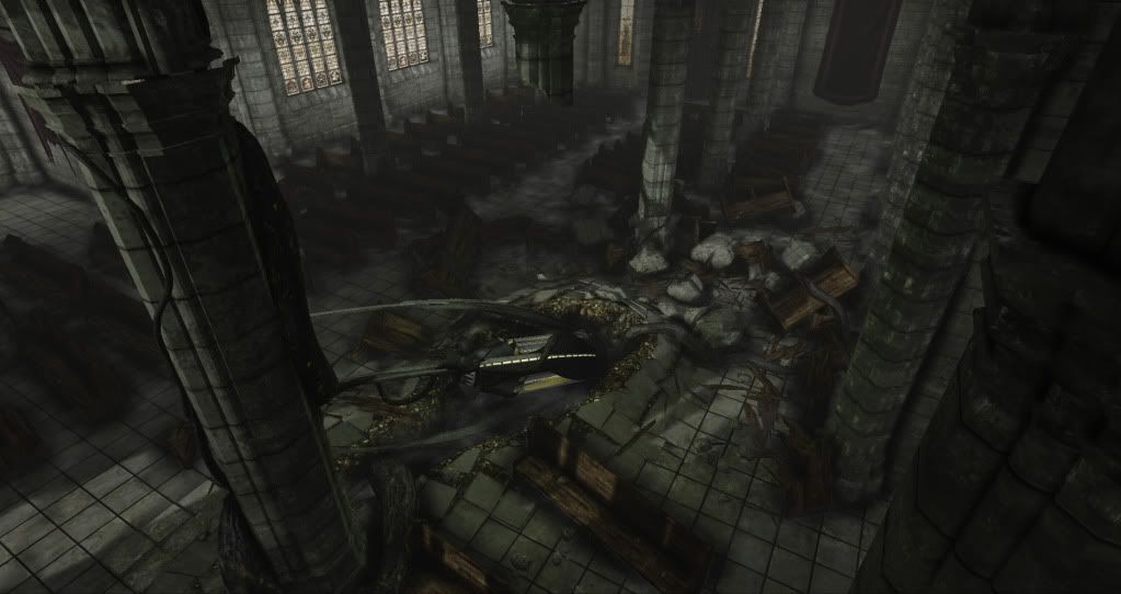
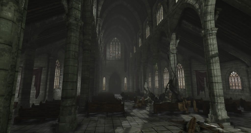
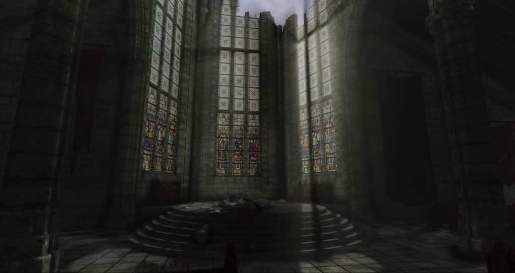
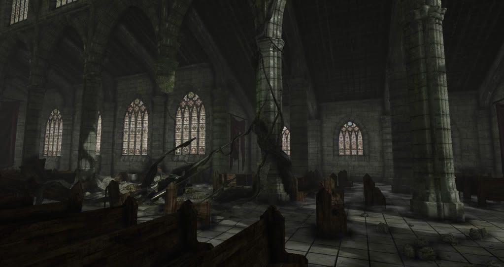
The first project that I would like feedback on is a church. I decided that I wanted to create a small Gothic cathedral and figure out a way to clash that visual theme with a futuristic one. I thought it would be really interesting to have a biological capsule that had crashed through the church and embedded itself in the floor, sprouting necrotic vines. It seemed like conflicting themes in an unexplained occurrence would create a mysterious atmosphere and prove challenging.

I designed the piece to have an abandoned and rotting/mildew feel to it.
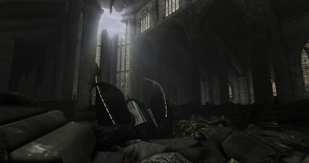
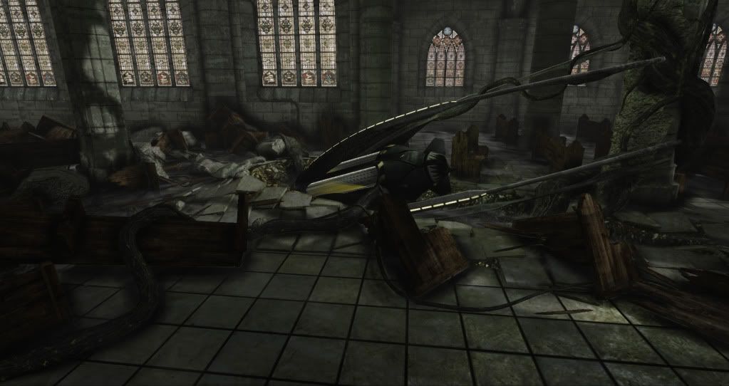
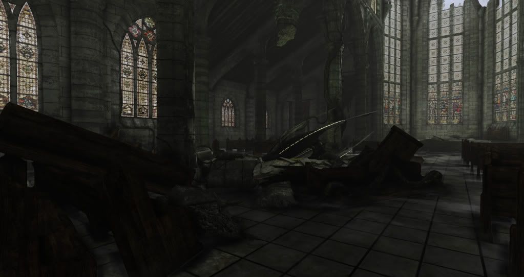
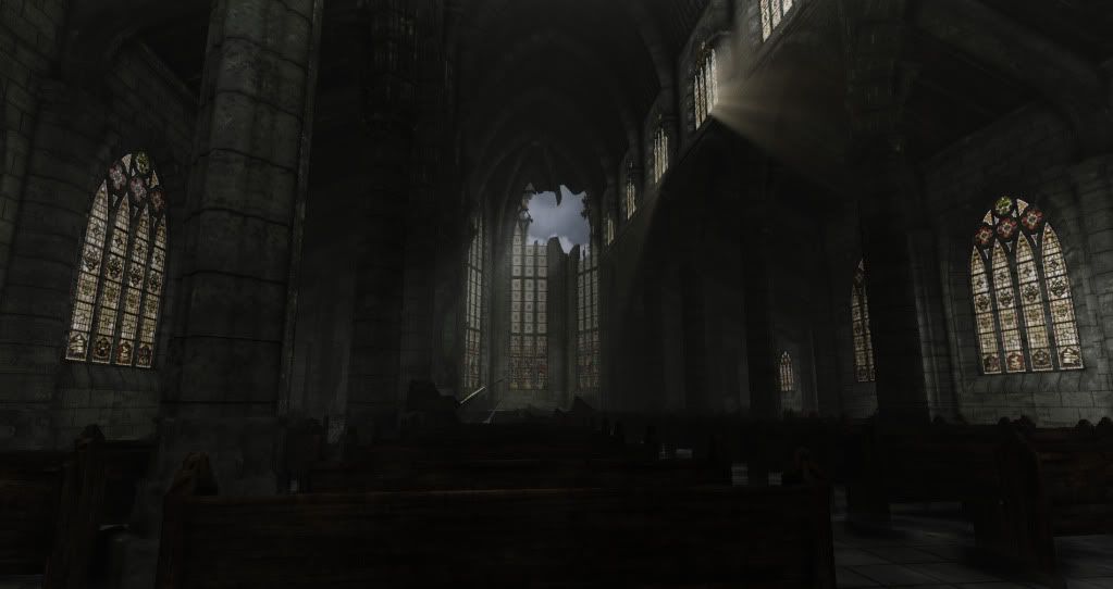
Church_08.jpg


Church_07.jpg


Church_06.jpg


Church_05.jpg


Church_04.jpg


Church_03.jpg


Church_02.jpg


Church_01.jpg


Please, I am desperate for critiques :) I am most curious about how everyone feels about the lighting.

-Also, if people feel that the pictures do not convey enough information, I could probably get around to uploading a fraps of a walkthrough as soon as possible.

Replies

  • Sean VanGorder
    Options
    Offline / Send Message
    First thing that came to mind was the fact that the scene feels very desaturated and flat. A lot of that may have to do with the lighting. I think having the light and shadows contrast more would help out. Brighten up the light coming through the roof and shining on the crash site to make it pop a little bit more.

    Also, the stained glass windows and banners hanging on the wall give you a great opportunity to add some color to the scene and help get away from the overpowering greenish-brown theme. I'd expect the stained glass to be a bit more vibrant.

    The modeling looks pretty solid, keep it up :)
  • glottis8
    Options
    Offline / Send Message
    glottis8 polycounter lvl 9
    Everything here is looking great! I think your lighting is pretty solid, but you could still push a lot more into it. Have some more solid rays of light coming in that really light some areas a lot more. Instead of just being one color. Maybe some more light coming in through one side of your stained glass windows making some cool colorful light display. I really like your work so far tho. hope my comments on light help!

    notre-dame-cathedral-interior.jpgely3.jpgnave_l.jpg
  • JTerry
    Options
    Offline / Send Message
    I tried to project the light through the semi-transparent windows to the floor so that it would be colored on the floor. I just couldn't seem to get that tech in UDK working properly. I guess I could try to add some color around the windows like I did with the bio-bomb (a green hue) using point lights. The problem with making the windows too vibrant is of course that I will loose the mildewed feel and that they might contrast too greatly with the surrounding stone.
  • itsmadman
    Options
    Offline / Send Message
    i agree with the other comments and i also would suggest making the scene brighter. over all its pretty solid love the god rays. I would ask around about that colored transparency with the windows i have had the same problem. if all fails maybe try an emissive with the colored windows.
  • chinups
    Options
    Offline / Send Message
    chinups polycounter lvl 17
    Hey bud i like your scene, one thing that stands out to me is the floor. I think if you switch up the material on your floor it will change the look of the entire scene. punch the lighting, and maybe try some marble or polished stone, something with a bit of reflection. Everything is Grey right now. Hope this helps!

    -Chinups-
  • Rurouni Strife
    Options
    Offline / Send Message
    Rurouni Strife polycounter lvl 10
    I really like the scene. I agree with the others, add some color some how. This is very Gears of War feeling which is fine, but it feels like its Gears 1 and not 2/3 which is to say it's a step back from what current game color palettes are doing. Extra saturation will definately help the scene pop more.

    I also notice tiling on the pillars. That could be just me, but it really looks like you need to break that up with either vert painting or decals (the latter of which I know nothing about lol).
  • JTerry
    Options
    Offline / Send Message
    Thanks for all the helpful comments. I'm going to mull this info over and try to touch it up. It seams like the most important thing that everyone is saying is that I need to figure out a way to add some color. I think that the most logical place for this is near the windows. I'll try increasing the power of the dominant light source and maybe up the saturation on the wall hangings. I'll start there and then post new pics when I get a chance.
  • ariofighter
    Options
    Offline / Send Message
    ariofighter polycounter lvl 13
    The thing that I would adjust is the glow on the stained glass windows. Stained glass windows with that much light threw them really pop, regardless of how destroyed and dingy the interior is going to be.

    Right now your windows are really not punching it enough for how elaborate they are almost looking extremely dirty.

    I really like the scale and the feel of the environment though.
  • PLyczkowski
    Options
    Offline / Send Message
    PLyczkowski polycounter lvl 14
    This is the direction I would take. Look at your histogram, it's offset pretty hard.

    4534541.jpg

    Or:

    67671.jpg
  • JTerry
    Options
    Offline / Send Message
    that's an easy adjustment on the windows to increase the glow. And thanks for the color adjustment panels. I think they look better than what I have, so I'll try to work toward that.
  • Oniram
    Options
    Offline / Send Message
    Oniram polycounter lvl 17
    you may want to do more with damage and decay. if this thing has been sitting there for a while, you'll need to show the "life" of the scene through that. more intense lighting may help a bit too. check this scene out done by Jim Magill

    CrashSite01.jpg
  • Delerium
    Options
    Offline / Send Message
    Why not add more glowing stuff that emit lights to the sci-fi bits, it is kinda hard to see any of the sci-fi stuff as it is now, it blends in with the rest of the environment.
  • JTerry
    Options
    Offline / Send Message
    This is my first pass at relighting the scene. I brightened the windows according to the references that people posted. I also increased the saturation of the banners. I tried to add color to the scene by faking bounce light and transmission from the windows and banners. Also brightened area around bio capsule (the focus of the environment). What I ended up with are these first 2 pics.

    NewChurch3.jpg

    NewChurch1.jpg

    I then used a post process volume to adjust it to match PLyczkowski's suggestion.

    NewChurch4.jpg

    NewChurch2.jpg

    I don't really know which one is more effective.
    After I get the lighting more solidified, I'll start trying to implement the texturing suggestions.
  • Fomori
    Options
    Offline / Send Message
    Fomori polycounter lvl 12
    Looking better I think! Like the way it's looking generally but feel it could be improved. I think the second two images look better but feel quite blue. I think a bit more variety in terms of colour is needed. Looking forward to the finished piece!
  • Cheese_Shinobi
    Options
    Offline / Send Message
    Cheese_Shinobi polycounter lvl 9
    Hah, all I can see in my mind when I look at the scene is the day that alien thing burst through the roof.

    "Dear people, we have gathered here today to-" KABOOOM

    But seriously, nice work, keep it up!
  • SHEPEIRO
    Options
    Offline / Send Message
    SHEPEIRO polycounter lvl 17
    more contrast between the env and the prop... pick it out with lighting and colour as currently its lost
  • n88tr
    Options
    Offline / Send Message
    wouldn't hurt to light the scene a bit with some torches or a stray fire somewhere
  • glottis8
    Options
    Offline / Send Message
    glottis8 polycounter lvl 9
    Looking better! i like the examples that PLyczkowski gave you.

    Your pass on light works well, but i don't think you are doing much with the color from the stained windows. But definitely going in the right direction.
  • JTerry
    Options
    Offline / Send Message
    wouldn't hurt to light the scene a bit with some torches or a stray fire somewhere

    I've considered this a couple times, I think it would look nice, but I'm concerned that it would compromised the abandoned theme. Maybe I should just do it anyways? I could add more color than I already did to the walls around the windows. I'll try to address the contrast issues with the bio-capsule shortly.
  • TheMadArtist
    Options
    Offline / Send Message
    TheMadArtist polycounter lvl 12
    Great work so far! Ever see Final Fantasy 7 Advent Children? There's a scene where Tifa fights Loz in an old abandoned church that this really reminded me of. Maybe take a look at that to see how they handled the lighting.
  • itsmadman
    Options
    Offline / Send Message
    Oh man i have looked at this level multiple times and didn't even notice the space ship that had crashed through the ceiling. i know how crazy that sounds but i kind of looked just like random rubble. If you have a crashed space ship in a church it should definitely be the focal point of the level. In fact the first thing that people should see is that. Its not just your lighting, you also need to give the ships color that makes it stand out from the church. Its just the fact that you have put so much effort and detail in to the church while the ship is kind after thought.

    P.S. Put some work in to the ship
  • galen linnett
    Options
    Offline / Send Message
    incredible lighting difference looks so much better now
  • Cyrael
    Options
    Offline / Send Message
    Cyrael polycounter lvl 10
    agreed the entire scene needs another light source in the first image (of the redone set) you can barely make out anything in the scene, the second image looks better, but it could still stand to be lightened(brightened a bit) and torches or some other form of light will be a great way to do that. Great work though, I really like this piece.
  • itsmadman
    Options
    Offline / Send Message
    JTerry wrote: »
    I've considered this a couple times, I think it would look nice, but I'm concerned that it would compromised the abandoned theme. Maybe I should just do it anyways? I could add more color than I already did to the walls around the windows. I'll try to address the contrast issues with the bio-capsule shortly.

    so u want to give it light but want it to also look abandoned. Right now the church looks some what Drury but does not feel abandoned. Mabe you could add some trash scattered on the floors. Even go to the extreme of putting some graffiti on the walls. And for light you could have one of those barrels that bums burn trash in to get warmth. That could be a strong light source. and maybe a few flames near the ship. over all make the church looked lived in. But be careful what u have is good. keep going in the right direction :)
  • PLyczkowski
    Options
    Offline / Send Message
    PLyczkowski polycounter lvl 14
    Hey, looking better! Glad I could help. I like the second image in post #14 the most.
Sign In or Register to comment.