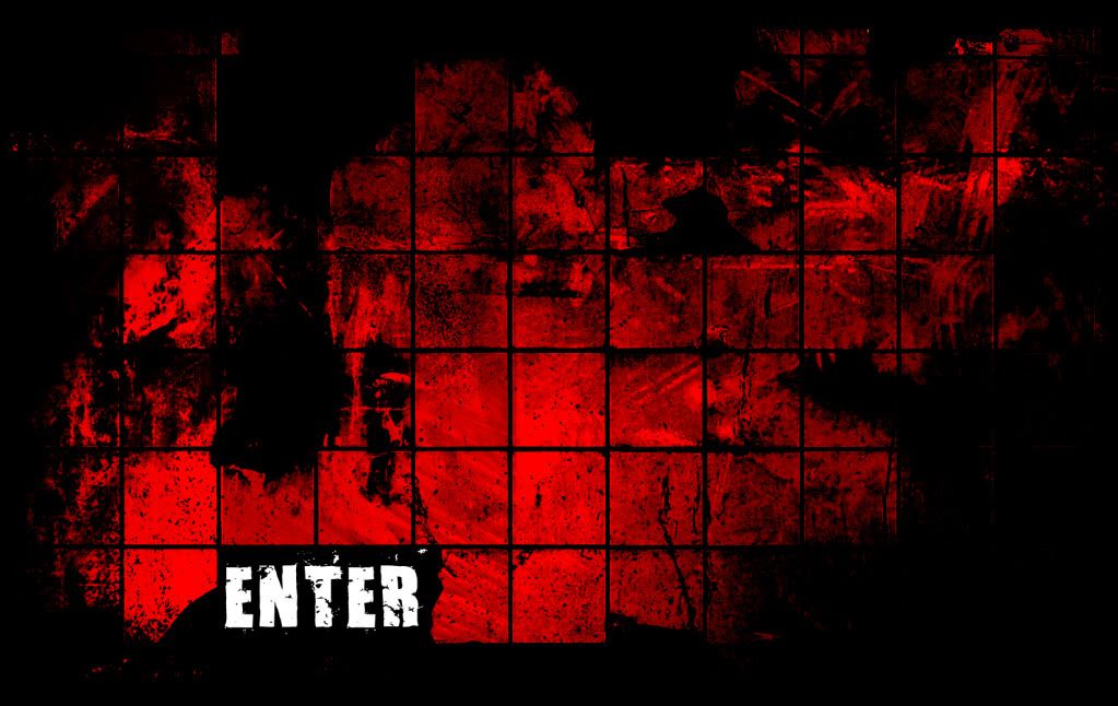
I'm going to start a thread on my website that I'm building for myself. Not much to it yet. In this update, it will only be a .jpeg of the front page. C&C
Ofcourse I'm going to want to Enter! That's why I'm visiting your page!
Seriously though, leave the splash screens in 1990, where they belong. Employers do not care. Art directors and leads are busy people, they just want to see your work and make an informed decision. Give them an easily navigable gallery of your work, split up between different disciplines, a link to your resume, and contact information. Done.
The one thing I learnt from people here and their portfolio's is that you should try to display your work immediately, or at least the thumbnails. everything else is fine, just try to minimize the amount of clicks it takes to see anything. For instance, on my site, you can go to any 3d piece from any page, even the about/information page. (except the 2d page but that doesn't really matter atm)
Here is a new update on what I was thinking (yes the drawings are cheesy). The design layout you're seeing is very basic. The background is final though. I just want it to be like a satellite view. I would have more numbers and gadgets on the sides when actually taking it seriously.
The yellow arrow points to the altitude. In those spaces between the bars I would have blog entries and updates. For example: (spaced and nice looking when final)
JAN
01
JAN
02
ETC
Also, the green boxes and lines are were I would put my stuff. One would be my bio and about me. Another to my gallery, music, resume etc.
I'm biting off more than I can handle at the moment for I don't know a damn about html, css, etc but I'm willing to learn. Ralph Winter once wrote and I quote I am willing to fail. Risks are not to be evaluated in terms of the probability of success, but in terms of the value of the goal.
I want to thank those with all the new advice and opinions, more updates coming soon. C&C
It's for my portfolio. I am complicating things way to severely. It's hard for me to accept that such simplistic designs will due. It is was it is. Will have an update of another design *simplistic* that won't look like it should be for a movie, viral add, etc.
A grey background, a narrow box as a frame and place your pictures on top of each other (large) so that they can just scroll down and go "Yep, he's good enough, let's phone him."
I'm going to have to third everyone else, some of the best websites are simple and to the point, you can spice up the bg a bit, but you're making it your focal point, instead of focusing on what the employer will focus on - the art.
I'm going to drop some info on you that's a major secret in our industry.
It's not actually any type of secret.
Get rid of your splash page and throw it into the trash. Then burn it in a fire. A good way to look at your website is how easy is it for someone to access your art from the first page.
The answer is put it on the main page. If I were a hiring recruiter and had to click through 4 links to see your art, I would probably ignore it on the principle that you were wasting my time.You can make something with style, don't get me wrong. But it sure as hell better be easy to read and have all your art goodies front and center. Otherwise it looks like you are hiding a lack of talent behind smoke and mirrors. I can say that with experience on the matter.
Also, as a sidenote don't get screwy with Flash. Flash runs shitty on occasion, people can't save your art out for review later, and not everyone has the latest update to properly view it.
I also sense that you are about to make a big web design no-no. It appears that you are about to make links that have no label, and make you search for them. For example, when someone places a row of circles on the header of a page, and you have to hover over them to find out what it links to. It's very inefficient, and many times, a turn off.
Maybe I interpreted your design wrong though, but keep it in mind.
notman: I wasn't going to go that route for that reason exactly but thank you for the input!
Here are some samples I did last night but nothing is final. I'm a little iffy about the content on these and I have heard all of you and thank all of you for your responses. Although it may look like I'm still playing with design and colors more than showing my art, I'm just playing around with ideas. I want some uniqueness to my site but not to the point were it looked like a viral add website.
I will be drawing up some more concept pieces tonight, with the mindset of limited time for the site to be fully live. Once again I cannot stress the thank yous for your opinions, examples, advice, etc. This is my first time posting a thread at this site and let me just say you have one great community here.
I like the one on the left simply because it is simple and wouldn't detract as much from the rest of the page in my opinion. Also, something that was told to me once and something of personal flavor to ponder:
Keep finished work to your main page. If you have WIP stuff you may want to make a separate page or even a blogspot account to link to. You don't want to give the impression you can't finish a project and placing WIP with things that are completed can sometimes give off that feeling.
I'd keep it even cleaner than that, the proposed layout similar to Bram Eulaers portfolio is a good choice. Although I'd spent a tad more time on the content spacing, since it seems to be irregular on his site - no offense.
I wouldn't over complicate or design the portfolio - it's not the website they are there to look for.
Not a good idea methinks. Chadwick is right, follow that guide. Keep it simple, easy to update and make it all about the work. Let your work show your creativity and artistic talent.
Unless those buttons are entirely compromised of your work, get rid of them.
You want your site to be so simple that the entire site only has a couple of pages.
The IDEAL portfolio website has all the art split into sections but on one page, with contact information and your name on every image and on every page.
I'd go even farther with WIP work as well... you shouldn't even post something you consider a WIP on your portfolio.
You don't need anything more complicated than a portfolio page that you'd make with Carbonmade or Behance or Virb. In fact, I think we'd all prefer it (along with anyone who will potentially hire you in the future) if you try to do as little as possible with your web site. I happen to prefer Virb because they have nice templates and it gives me more control than something like a Blogger page, but the latter is free and that's hard to beat. Be as minimalist and straightforward as possible, and make it extremely easy to find your work (either zero or one click).
I don't think my site is the best in the world or anything, but it's simple and friendly and straightforward. The only downside is that my reel is private (NDA) and ideally I would have a public reel available, which will happen soon. But do you see the difference with where you're heading with your designs?
I'm no genius on the topic, but I might suggest this [semi-detailed idea that you might want to look into - feel free to ignore]:
header = name/logo + <a href=mailto:youremail>your email id</a> + nav etc etc.
(Maybe make this a fixed div, so it stays where it is on the browser page. This would make your email always available to be clicked on.)
Other pages can be designed however you like, but the homepage:
Lay out a bunch of square thumbs, below the header, in a grid (6x3 or something to that extent). This should take up maybe 1/3 of the height of a 1024x768 page.
Below this grid, your page is empty. However, when one clicks on a thumbnail, all the related images/info open up below. Viewer scrolls down to read/see all the related imagery. You can keep a 'return to top' button to the side (also fixed, so it's always there), so that the viewer can just press that to return to your thumbnails whenever he'd like.
Perhaps on the homepage, keep featured pieces from all fields you make art in. You can then have separate pages, designed in a similar way, to show all your best pieces per category.
Just a random idea - figured I'd post it, in case it interests you, and works with the other advice here.
Image that an employer goes to your site with the question of, "what is (insert name) good at?" If they don't see the answer to that question on the first page, you failed. Also, remember the golden rule of web sites: don't make me think. If a person has to try to figure out how to navigate the site, you failed again.
Thank you everyone that responded since my last post.
indian_boy: I appreciate the information you gave. I will have to play around with that idea once the design is done.
Here is a new update of the design. Simplistic and one I am actually content with. I will be playing more with the grunge feel at the top. Also in the solid box with grunge is were my information will be. I might play with the color scheme a bit too. C&C
It may be easier for us to visualize with some content on it. Right now, I think it looks good.
I get the impression you want to impress them with your web design, but honestly, guys here have gotten jobs with the most basic of presentation. It's what you put on the site that counts. Start putting in the content, then let people try it out. I've seen a lot of portfolios posted here, that flat out suck to use, because they put to much content, or image files that are too large (making it REALLY slow to load).
I recommend you focus on the artwork first, presentation second.
If the actual artwork is not up to par, a pretty site design will not make it look any better. It seems this basic fact is difficult for new artists to understand, but I do see it often. I can understand the temptation though to focus on the site design instead.
Chadwick: Your last two sentences hit the head on the nail. Thanks for your responses.
So I am starting to put content on it at the moment. I'm moving around stuff seeing what pieces I want to show up on the front page. I don't plan on every piece being on the front. To see everything one must click on a gallery tab?
At the moment this is all work from early 2009 when I was working on a short film for Steam Golem Productions which got canceled due to insufficient funds. I took a little break from 3D and focused on music, design, film and editing. I am starting back up at my 3D work so new content is coming soon. Unfortunately non of its game meshes. I worked with high poly for two years which seemed like "Poly limit?" I didn't have to worry about the limit that much. As with art for games there's not that huge leniency (that I know of). After the web image you can find my WIP of my new project. C&C
Right now the image is just a .jpeg. I have no link to the actually site yet, it will be up tonight.
Yeah, in the header (the yellow on top), you should get your name and contact info there. You may have already planned to do that, but it's not in your screenshot yet, so I'm just making sure it's mentioned.
Stick with just putting some of your best pieces, then a link at the bottom for more work. The obviously, the pieces can link to more detailed pics of that project.
Is all of your work 3D? If you do other work, sometimes people will make the first page look similar to yours (rectangle crop of a piece), and have one image for each category, like 3D, 2D, concepts, etc...
Something I do and it seems pretty common is to make sure any image I put up on the site has a small tag with my url on it. That way if someone in a hiring position were to save something off your site they know where they got it from in case they want to contact you.
Replies
http://www.polycount.com/forum/forumdisplay.php?f=42
Seriously though, leave the splash screens in 1990, where they belong. Employers do not care. Art directors and leads are busy people, they just want to see your work and make an informed decision. Give them an easily navigable gallery of your work, split up between different disciplines, a link to your resume, and contact information. Done.
Good luck though, looks interesting.
edit:
oh, and try not to use flash or anything! heh
The yellow arrow points to the altitude. In those spaces between the bars I would have blog entries and updates. For example: (spaced and nice looking when final)
JAN
01
JAN
02
ETC
Also, the green boxes and lines are were I would put my stuff. One would be my bio and about me. Another to my gallery, music, resume etc.
I'm biting off more than I can handle at the moment for I don't know a damn about html, css, etc but I'm willing to learn. Ralph Winter once wrote and I quote I am willing to fail. Risks are not to be evaluated in terms of the probability of success, but in terms of the value of the goal.
I want to thank those with all the new advice and opinions, more updates coming soon. C&C
Zack Dembinski
Zack Dembinski
Here's example minus the frame I suggested.
http://www.brameulaers.com/
It's not actually any type of secret.
Get rid of your splash page and throw it into the trash. Then burn it in a fire. A good way to look at your website is how easy is it for someone to access your art from the first page.
The answer is put it on the main page. If I were a hiring recruiter and had to click through 4 links to see your art, I would probably ignore it on the principle that you were wasting my time.You can make something with style, don't get me wrong. But it sure as hell better be easy to read and have all your art goodies front and center. Otherwise it looks like you are hiding a lack of talent behind smoke and mirrors. I can say that with experience on the matter.
Also, as a sidenote don't get screwy with Flash. Flash runs shitty on occasion, people can't save your art out for review later, and not everyone has the latest update to properly view it.
Maybe I interpreted your design wrong though, but keep it in mind.
Here are some samples I did last night but nothing is final. I'm a little iffy about the content on these and I have heard all of you and thank all of you for your responses. Although it may look like I'm still playing with design and colors more than showing my art, I'm just playing around with ideas. I want some uniqueness to my site but not to the point were it looked like a viral add website.
I will be drawing up some more concept pieces tonight, with the mindset of limited time for the site to be fully live. Once again I cannot stress the thank yous for your opinions, examples, advice, etc. This is my first time posting a thread at this site and let me just say you have one great community here.
Zack Dembinski
I like the one on the left simply because it is simple and wouldn't detract as much from the rest of the page in my opinion. Also, something that was told to me once and something of personal flavor to ponder:
Keep finished work to your main page. If you have WIP stuff you may want to make a separate page or even a blogspot account to link to. You don't want to give the impression you can't finish a project and placing WIP with things that are completed can sometimes give off that feeling.
I wouldn't over complicate or design the portfolio - it's not the website they are there to look for.
Unless those buttons are entirely compromised of your work, get rid of them.
You want your site to be so simple that the entire site only has a couple of pages.
The IDEAL portfolio website has all the art split into sections but on one page, with contact information and your name on every image and on every page.
I'd go even farther with WIP work as well... you shouldn't even post something you consider a WIP on your portfolio.
I don't think my site is the best in the world or anything, but it's simple and friendly and straightforward. The only downside is that my reel is private (NDA) and ideally I would have a public reel available, which will happen soon. But do you see the difference with where you're heading with your designs?
http://bit.ly/jimanimates
header = name/logo + <a href=mailto:youremail>your email id</a> + nav etc etc.
(Maybe make this a fixed div, so it stays where it is on the browser page. This would make your email always available to be clicked on.)
Other pages can be designed however you like, but the homepage:
Lay out a bunch of square thumbs, below the header, in a grid (6x3 or something to that extent). This should take up maybe 1/3 of the height of a 1024x768 page.
Below this grid, your page is empty. However, when one clicks on a thumbnail, all the related images/info open up below. Viewer scrolls down to read/see all the related imagery. You can keep a 'return to top' button to the side (also fixed, so it's always there), so that the viewer can just press that to return to your thumbnails whenever he'd like.
Perhaps on the homepage, keep featured pieces from all fields you make art in. You can then have separate pages, designed in a similar way, to show all your best pieces per category.
Just a random idea - figured I'd post it, in case it interests you, and works with the other advice here.
indian_boy: I appreciate the information you gave. I will have to play around with that idea once the design is done.
Here is a new update of the design. Simplistic and one I am actually content with. I will be playing more with the grunge feel at the top. Also in the solid box with grunge is were my information will be. I might play with the color scheme a bit too. C&C
Zack Dembinski
Zack Dembinski
I get the impression you want to impress them with your web design, but honestly, guys here have gotten jobs with the most basic of presentation. It's what you put on the site that counts. Start putting in the content, then let people try it out. I've seen a lot of portfolios posted here, that flat out suck to use, because they put to much content, or image files that are too large (making it REALLY slow to load).
I recommend you focus on the artwork first, presentation second.
If the actual artwork is not up to par, a pretty site design will not make it look any better. It seems this basic fact is difficult for new artists to understand, but I do see it often. I can understand the temptation though to focus on the site design instead.
Chadwick: Your last two sentences hit the head on the nail. Thanks for your responses.
So I am starting to put content on it at the moment. I'm moving around stuff seeing what pieces I want to show up on the front page. I don't plan on every piece being on the front. To see everything one must click on a gallery tab?
At the moment this is all work from early 2009 when I was working on a short film for Steam Golem Productions which got canceled due to insufficient funds. I took a little break from 3D and focused on music, design, film and editing. I am starting back up at my 3D work so new content is coming soon. Unfortunately non of its game meshes. I worked with high poly for two years which seemed like "Poly limit?" I didn't have to worry about the limit that much. As with art for games there's not that huge leniency (that I know of). After the web image you can find my WIP of my new project. C&C
Right now the image is just a .jpeg. I have no link to the actually site yet, it will be up tonight.
Subway WIP:
Zack Dembinski
Stick with just putting some of your best pieces, then a link at the bottom for more work. The obviously, the pieces can link to more detailed pics of that project.
Is all of your work 3D? If you do other work, sometimes people will make the first page look similar to yours (rectangle crop of a piece), and have one image for each category, like 3D, 2D, concepts, etc...
At the moment I have a somewhat functioning website. Only the 3D Environments work and 3D Props.
http://zackdembinski.webstarts.com/index.html