Home 3D Art Showcase & Critiques

Hangin' around in the Dungeon.

polycounter lvl 9
Offline / Send Message
PatrickL polycounter lvl 9
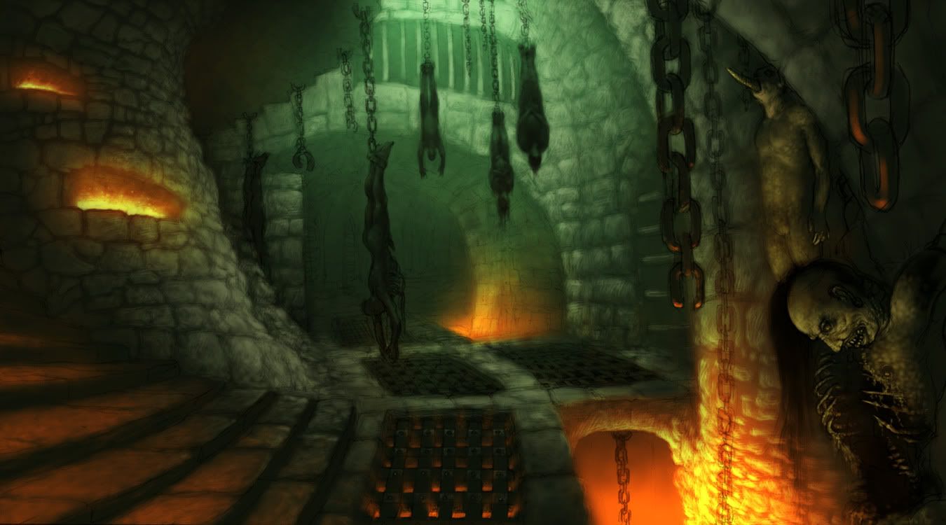
Alright, so I've started my next little piece, and I'd love to get some input on what I've got so far. Here's the concept art (I actually have no idea where this concept is from, if anyone knows, please let me know!):
dungeon00.jpg

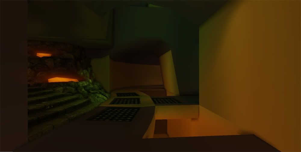
And here's how it looks so far:
dungeon01.jpg

Hand painting each of those rocks in Zbrush with Clay Tubes wasn't that fun, and left me with considerably fewer rocks than in the concept. I still like the look of it, but I really need a better way to approach all of these stone blocks.

Replies

  • MainManiac
    Options
    Offline / Send Message
    MainManiac polycounter lvl 11
    Woah! You definitely need more rocks. Couldn't you make a universal stone texture and just touch it up a little bit when you make more rocks?

    Also those cages on the floor look like they need to be bigger and take up more of the floor tiles their on.
  • tharle
    Options
    Offline / Send Message
    tharle polycounter lvl 9
    good start, i'd agree with frell on the grates on the floor needing to be a bit bigger.

    as for the stones - it depends if you want it to be done quickly or look better. sculpting each one by hand would result in the best looking piece but obviously take way longer. Could you sculpt the one closest to camera and then clone stamp the texture maps to make the objects in the back?

    how did you create your base mesh for sculpting too? i tend to work in Maya to block out the stones - just cubes with a couple of subdivisions. This makes sure i get the scale and number right before the sculpting starts.

    tharle
  • PatrickL
    Options
    Offline / Send Message
    PatrickL polycounter lvl 9
    @Frell: After pairing the two images side by side, it became pretty obvious a lot of my scaling was off. I'm currently enlarging the grates, raising the roof, and re-doing the rock wall.

    @Tharle: I made a regular cylinder in Max, shaped it up, and brought it into Zbrush where I painted each rock with Clay Tubes. I then decimated it back down to 2000~ polygons. It was a lot of work, looked wrong, and was a much higher poly count than what I had intended. I'm going to re-do that entire section, and try to take a much smarter approach.

    I've always been mediocre at doing stone structures, so this project is to intended to remedy that. I now know one way not to do it!
  • Tili
    Options
    Offline / Send Message
    Tili polycounter lvl 7
    Concept art is from Blizzards Diablo 3. Good luck! looks promising.
  • tda
    Options
    Offline / Send Message
    tda polycounter lvl 16
    As you've mentioned, the first thing that pops to mind is that the scene is really off scale compared to the concept. Here's a quickie drawover of my thoughts

    2hp2c21.jpg
  • Habboi
    Options
    Offline / Send Message
    Habboi sublime tool
    As everyone has already stated, the angle and scale is off. I'd take the concept and overlay it on top of your 3d environment and compare to see what's wrong. Other than that it's a good start!
  • PatrickL
    Options
    Offline / Send Message
    PatrickL polycounter lvl 9
    I've been working on the scale for a few hours now, and I think it's to a point where I'm happy with it. The wall on the left between the camera and the stairs is annoying me, so I may change that spot, but other than that, I think this is the final block out.

    @Tili: Wow! I really didn't expect Diablo 3, thanks for clarifying. Actually, your comment got me to try out a more Diablo-esque style while recreating that one rockwall piece. I'm now torn between doing it in a realistic or stylized fashion.

    dungeon02.jpg
  • Tili
    Options
    Offline / Send Message
    Tili polycounter lvl 7
    I'm not sure but I think you need to change the field of view of your camera. I think you need a more wide angle approach.
  • yiannisk
    Options
    Offline / Send Message
    yiannisk polycounter lvl 7
    Camera angle is one thing, and another is the flow of the lines in the scene. Compared to the concept the final 3d model feels too "tight"

    you got to loosen up those lines and make it feel more free flowing, more organic.
  • PatrickL
    Options
    Offline / Send Message
    PatrickL polycounter lvl 9
    Still a lot of place holders here, but it's shaping up slowly but surely.

    dungeon04.jpg
  • PatrickL
    Options
    Offline / Send Message
    PatrickL polycounter lvl 9
    Alright, this is almost done. If all goes according to plan, tomorrow will be wrapping up the bulk of the work left, with another day of final touches. Is six days too long for something like this? I'll admit, I started off being way too tedious and now I'm taking shortcuts like a bat out of hell.

    dungeon05.jpg

    Also, a lot of odd spots seem to be picking up my lava's emissive light when they shouldn't be. I keep fixing and breaking it over and over again. I don't think it's my lightmaps.
  • yiannisk
    Options
    Offline / Send Message
    yiannisk polycounter lvl 7
    perhaps if you broke these straight lines it would look even better.
  • PatrickL
    Options
    Offline / Send Message
    PatrickL polycounter lvl 9
    A few things in the scene, the bodies in particular, are pretty expensive. I've started being a bit too skimpy with my triangles, though. Definitely going to improve the flow of lines and give it that organic feel when I get these next few pieces done!
  • PatrickL
    Options
    Offline / Send Message
    PatrickL polycounter lvl 9
    yiannisk wrote: »
    perhaps if you broke these straight lines it would look even better.

    Bet you didn't think I was gonna take your advice, huh? POW! Right in the kisser. And this is only the start. Tomorrow, breaking more lines!

    dungeon06.jpg
  • Tili
    Options
    Offline / Send Message
    Tili polycounter lvl 7
    Hell yeah! Awesome progress!
  • PatrickL
    Options
    Offline / Send Message
    PatrickL polycounter lvl 9
  • Tili
    Options
    Offline / Send Message
    Tili polycounter lvl 7
    Kinda needs more glowing coming out of the grates. And lighting is just a tad too red.
    Loving this, moar!
  • cholden
    Options
    Offline / Send Message
    cholden polycounter lvl 18
    You used a lot of polygons modeling in all these stones, chanes, metal grades, bodies, but have left your base geometry extremely low poly.

    This really flattens your scene, and makes it look low poly.

    I'd also suggest modeling out more bricks out on the walls, and cutting in recessed areas, because it's just so flat looking.

    derp1v.jpg
  • PatrickL
    Options
    Offline / Send Message
    PatrickL polycounter lvl 9
    This one is for you, Cholden.

    dungeon10.jpg
  • Mask_Salesman
    Options
    Offline / Send Message
    Mask_Salesman polycounter lvl 13
    Nice start, I'm digging the curvy furnace wall on the left. Feels like its time to start adding some texture variation colours/brickwork/floorgratingthings. Dirty it up, what happens to stuff in a room with that kind of heat. I would imagine blackening around those furnace holes and bridge edges. Google burnt houses, windows all have black marks trailing upwards.

    Those peeps are gonna drip n stain too. ;)
  • brandoom
    Options
    Offline / Send Message
    brandoom polycounter lvl 13
    Looking good Patrick.

    Like Cholden mention, add some more polys into your meshes to break up the straight lines and sharp edges; notably the floor pieces.

    Other than that, maybe continue to play around with the lighting some more - see what you can do to help make the bodies pop a little more.

    Coming along nicely though.. in a weird and morbid sort of way :P
  • PatrickL
    Options
    Offline / Send Message
    PatrickL polycounter lvl 9
    I'll admit, I've been rushing this to completion so I could finally get around to reformatting my desktop. (Desperately needs it.) Looking back, that was a huge mistake that's cost my scene a lot of quality. So I'm gonna go ahead and reformat, and get back to this probably later this week.

    I really appreciate the C&C guys, I'll not let it go to waste!
  • PatrickL
    Options
    Offline / Send Message
    PatrickL polycounter lvl 9
  • Habboi
    Options
    Offline / Send Message
    Habboi sublime tool
    Very good but I think the light coming from the lava is too red and needs more orange like the concept.
  • Tili
    Options
    Offline / Send Message
    Tili polycounter lvl 7
    I think it also need something on the foreground. Now on the right side we see only walls. The concept show a nice rotting body there. Your scene also needs something like that.

    I like all the detail in the walls/floor, the stones look nice now.
    And I agree with Habboi, you need more yellow in the the lava.

    And I'm not too sure about the blood..
  • PatrickL
    Options
    Offline / Send Message
    PatrickL polycounter lvl 9
    Aww, what's wrong with the blood? I thought it gave the scene a bit of character, and broke up the colors. I want this place to feel like somewhere you REALLY don't want to be.
  • Gannon
    Options
    Offline / Send Message
    Gannon interpolator
    Yeah the light pools are spreading too far as well as they're off in color. If you're using point lights then try adjusting the fall off so you can tighten up the spread.
  • vcortis
    Options
    Offline / Send Message
    vcortis polycounter lvl 9
    Dude your lighting is killing an otherwise great piece. Look at the original concept and try to hit that. Right now everything is washed out and you aren't creating any focus point or emphasis.
  • tharle
    Options
    Offline / Send Message
    tharle polycounter lvl 9
    seconded with regards to the lighting. the original concept has 3 different coloured light sources and more areas of shadow/darkness.

    i think the trouble with the blood is that it's too obvious, try toning down the saturation and or opacity.

    can't help looking at this scene and not thinking of amnesia - great game that really does the distrubing horror thing very well.
  • PatrickL
    Options
    Offline / Send Message
    PatrickL polycounter lvl 9
    Alright, I'm a dumb ass. Not going to lie. When I reformatted, I forgot to change my monitor settings, and that left me with my monitors ridiculously terrible default colors and brightness. I realized this only because I noticed my pictures looked entirely different on my laptop.

    dungeon12.jpg
  • Tili
    Options
    Offline / Send Message
    Tili polycounter lvl 7
    Way better now!

    Is there a way you can get light coming out of the grating?
  • Rurouni Strife
    Options
    Offline / Send Message
    Rurouni Strife polycounter lvl 10
    I still feel your lighting needs work. The concept has more of a blue fog/hue to it than your does now.

    I also don't like the mix of texture densities on the right wall closest to the viewer. You have some cut out large/normal sized stone and then stone made for a tiny walkway. I really love the look of the stone on the back wall so try to match that closer (with out being exactly the same) if you can. At the least try to get a better match on the sizes.
  • PatrickL
    Options
    Offline / Send Message
    PatrickL polycounter lvl 9
    Nice catch with the lighting.
  • NoctyQ
    Options
    Offline / Send Message
    Starting to look really nice!
    The things I reacted to was mostly that the wall closest to your right still seems rather flat compared to the rest, It might help if you'd place the camera a bit more left, or add more geo.

    Also adding an alpha to your gratings and adjusting the light.

    You've been catching on to a lot of crit and it has obviously served you well.
    I like where this is going and I'm looking forward seeing it 100% finished! :)
  • PatrickL
    Options
    Offline / Send Message
    PatrickL polycounter lvl 9
    Another update, might be my final piece.

    dungeon02.jpg

    dungeon01-1.jpg
Sign In or Register to comment.