The BRAWL² Tournament Challenge has been announced!
It starts May 12, and ends Oct 17. Let's see what you got!
https://polycount.com/discussion/237047/the-brawl²-tournament
It starts May 12, and ends Oct 17. Let's see what you got!
https://polycount.com/discussion/237047/the-brawl²-tournament
[Demo reel] Galen Linnett
polycounter lvl 17
this is my first thread so please bare with me. this is a link to my demo reel. [ame]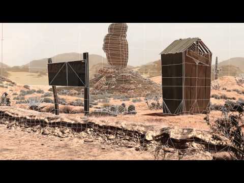 http://www.youtube.com/watch?v=T7obdvv32FU[/ame]
I'm hoping to get as many critiques as possible in the next month to take my environment modeling reel from a 7/10 to a 9/10. I would love to get a job modeling/ texturing environments for tv/movies/animation.I'll have another month to tweek it and then I'll feel confident in mass spreading it. All work in this demo is mine and I realize how shitty the alien animation is so don't bother commenting on that or any animation for that fact. I'm mostly concerned with Eye sores. I've watched the thing so many times I don't know what naturally stands out as looking unprofessional, out of place, floating or in need of color correction.
here's my portfolio http://galenlinnett.daportfolio.com/gallery/148474
I'd appreciate a critique but I'd prefer your time be spent critiquing my demo reel. I also don't mind critiquing other people's work in exchange for your critique
http://www.youtube.com/watch?v=T7obdvv32FU[/ame]I'm hoping to get as many critiques as possible in the next month to take my environment modeling reel from a 7/10 to a 9/10. I would love to get a job modeling/ texturing environments for tv/movies/animation.I'll have another month to tweek it and then I'll feel confident in mass spreading it. All work in this demo is mine and I realize how shitty the alien animation is so don't bother commenting on that or any animation for that fact. I'm mostly concerned with Eye sores. I've watched the thing so many times I don't know what naturally stands out as looking unprofessional, out of place, floating or in need of color correction.
here's my portfolio http://galenlinnett.daportfolio.com/gallery/148474
I'd appreciate a critique but I'd prefer your time be spent critiquing my demo reel. I also don't mind critiquing other people's work in exchange for your critique
Replies
Take a look at Digital Domain's reels, in particular the environment or feature films ones and see how they go about pacing them out and showcasing the work and breakdowns.
Looking at your site as well, I'd lose the about me section or at least reword it so you are not talking about yourself in the third person.
No but looking at your portfolio I see some nice detail among almost all your work but the thing that lets them down is the final render. I don't know what you used to render your scenes but maybe there's something better? I get this CG vibe from them which I always treat as in-between game art and film art. Neither real nor fake.
Then again let me use an example picture.
http://fc02.deviantart.net/fs71/o/2010/351/7/6/760456623008a208d005f83a65af2075.jpg
The flower pot appears too bright and could use more shadow. Heck the lighting is too washed out and needs more defining shadows. The floor texture is a bit weak in that there's no real detail in the diffuse. It looks like a browny/grey colour with a normal applied to it.
http://fc04.deviantart.net/fs71/o/2010/351/2/6/26473631648c34d23a049a60143549a9.jpg
Why is everything blurry in this picture? Also the picture at the back, although seamless, doesn't seem to be the correct angle to trick me into thinking it goes on.
http://fc09.deviantart.net/fs70/o/2010/352/a/e/aead8ffac6fe52cfb164b357b282dd30.jpg
This piece is nice but it's a shame the cave appears un-textured.
Oh I also forgot to critique the actual website but you've got a sort of splash page going on there. Why make me click onto your gallery when that could be the first page that's loaded? I also want to see texture sheets, wireframes.
As for the demo reel there's some good work on there. The most impressive piece for me was either the car or the scene with the alien ship in the cave.
Font is horrible. Change it to something more neutral and professional. Look up some prof' fonts.
Your projects all seem to take on a huge sense of scale which is one of the impressive parts of your reel but perhaps you should work on smaller scenes to really pump out the best work you can produce. Something like a hallway.
Overall you've got some good work, some needs improving texture and lighting wise with more defined shadows and mood. Colour theory is good although that cave is let down by its boring grey/gray. Hope that helps and good luck finding a job if that's what you're doing.
I agree with Mad though, drop that purple orange and red beveled text. It almost seems ironic to have it there, but i think you could come up with a better design/visual motif
during the 3rd bit, the hand-cam piece, the static goes on for about 3 seconds too long. Would rather see it static for a second or less, then visual tape blip to the recorded stuff. I thought the reel was over until i looked at the timeline of the video.
Not sure i agree with the presentation of the jeep, seeing the things fly in is neat, but i think you have them stick to the car too early without much easing out of the motion. In general i think the reactions to the pieces being attached are too short, and could use more bump & life.
@ site: I think its cool you do comic art, but i would drop that content from your site. Just doesn't fit, and doesn't seem to match the same quality as everything else. There are a few pieces of concept art too i'd drop:
http://fc03.deviantart.net/fs71/o/2010/352/c/0/c0be971183a8adcaf5094f01845361b8.jpg (or at least crop to the center figure)
http://fc02.deviantart.net/fs51/o/2010/352/c/7/c7f0af1fb81b13729c65d80ecccd7e2a.jpg
http://fc08.deviantart.net/fs70/o/2010/352/3/2/327f44e2497cd89c33bbc8bf5fb134bd.jpg
http://fc00.deviantart.net/fs48/o/2009/247/9/e/9e59b3da1608b5e2570ef95af8c9ca34.jpg
http://fc04.deviantart.net/fs70/o/2010/352/0/b/0bd431909062a3f997e966b660ee3ba8.jpg
not sure of the purpose of the "Home" section. make your portfolio focus "home"
love the outdoor outback stuff. looks nice!
I especially enjoyed the sense of scale going from close range to distance shots.
I have to strongly agree with everything that's been said about the font/pacing/static.
One thing I think you should decide on is your specialty.
I loved everything about your reel until I saw the monkey/aliens characters.
You are very strong in creating environments and the character work drags your reel down.
Its good that your trying to convey a sense of being a generalist but I wouldn't put that in the reel at the moment there's just too big a difference.
Same thing about the birds in the city environment. their animation was basic at best and that distracts from the environment.
The modeling on the high poly environment in the end looked great, I would have loved to see breakdowns for that but some of the shaders where off.
The textures looked good with just the right amount of wear and tear to them but something was off.
Anyway, keep up the good work!
Cheers!
anyway I can't thank you enough for the help and advice. keep in mind I'm not working right now and if you come across any open source volenteer projects outside of the polycount threads gimme a pm.
1)Its way too long
2) You spend way too much time being cinematic, adn not enough time showing what employers care about, the final image, and your wireframes/texture sheets.
3) Theres a lot of animation and effects sneaking in. Unless you think they are professional quality, remove that stuff. You reel is as good as the worst thing in it.
I'm not sure whether or not too many people know about this, but this is an invaluable source of both learning techniques and a lot of colour, perception, post effects and general tips about drawin, composition and the entertainment industry. Huge inspiration.
Also, the tips don't stop at 2D conception, tips apply to all fields. Will even help with 3d environment conception and planning.