Color
Alright everyone, for the last 2 and a half months I have been working with a small team in Unity on a very unique game that's come to be known as Color. We have put a lot into this but still have a lot to go! Sadly we have hit a pretty big road block, we need money. So we have decided its high time we show this game to the world!
Here you can help us out by; watching, donating, and sending this to all your freinds! - The Color kickstarter
Also expect updates frequently here! We at Dream Dev would love to stay informed on what you guys think!
Replies
I hope you find money cause it'd be a shame to see this unfinished and fade into dust.
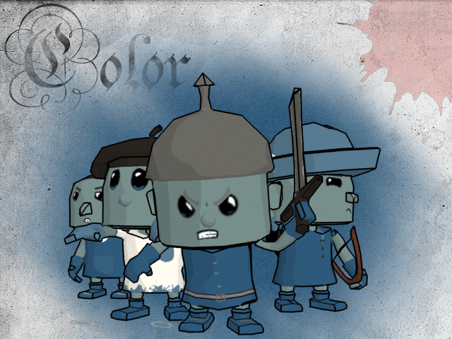
The first issue is visual. To get to the point, the current style and art of the game feel very underdone. Black and white base environments can certainly work, but if you're going to use blue and red as team-colors, there's not really a need to limit yourself to black and white environments. You lose a ton of life, color, and interest by doing so. Think of tony Hawk's graffiti design, Essentially the same, each player tries to cover the map in their color, but they still used fully realized environments.
Having stylized "cartoonish" characters is more than fine, but right now, the characters aren't defined visually. They're excessively simple, particularly in silhouette. The general concept of your environments is entertaining, seeing things like the giant paintbrush and platforming elements.
You're also suffering from very inexpressive animation. It quite simply lacks flare.
I of course realize that you're still in the base stages of prototype production, but these are things I think you need to address quickly. It looks like you have enough back-end support for a prototype, and right now, I'd say you need to nail the visuals in order to convince outside sources to support you.
As for the colors, Im really not wanting to add color, however basic to the world but I do agree that it looks drag right now, so after I finish revamping the map I plan to work with maybe some hues and things of that nature...
Once again thank you so much for all the advice.
We have been trying to think of ways to make the world seem more vibrant, so we decided to start working with some detailed hand painted textures for. This means we will be redoing a lot of the enviro. A little peak of what we are working with now...
Comments welcome!
Also the detailed textures are look good and should make the game look better, are you planning on keeping everything grey though or try out what other people have mentioned?
Also I suggest putting more color into your blue team. When you have a grey environment and about 50% of your blue team is covered in a cool grey it makes the blue team a bit less appealing to play as from an aethetic level. Get as much blue in there as you've got red in for the red team. Don't be afraid of using some variations of team colors or complementary colors on your characters.
Another thing I find a little strange though is how your promising an already planned DLC pack to donators? Wouldn't it be better to just add any DLC plans to the main game and if you really have to promise something just suggest that donators get whatever the first DLC pack will be? By having a name and everything for the DLC expansion it almost sounds like you already planned to leave stuff out of the main game.
I also think a nice touch would be to make the colors on the floor look less feathered and blurred, if possible if you could make the edges of the colored areas look like paint splatters or something that would be pretty neat, especially for when those giant buckets get tipped over.
But yeah, the overall concept is interesting, will be fun to see how the game develops. Goodluck dudes!
I get that the game is focused around adding color to areas where there's no color, but looking at the video what's apparent is that after a few minutes the entire game looks a bit formless and dead. It's like you skinned a game with my 3dsmax ui or something. In theory I guess the idea works, but longterm I can really see this being a major presentation issue.
I hate to bring up the cliche comparison, but mirror's edge did a good job of taking a relatively lifeless texture base and turned it into something colorful, without really adding color. I'd think about experimenting with the coloration schemes of the atmosphere and sunlight to give a little more depth and life to the scene. As others have mentioned as well, adding color to specific world assets, or points of interest likely wouldn't kill the style your going for as well.
Note - 58 days left to gain $8,000, we plan to keep making the game something you guys can look at and be super happy with! Of course, to continue the development process we need a budget, thanks for the help guys!
For the next video Im going to try and cure that problem, thanks for the advice!
ALSO -
I have been working on some more hand-painted texture stuff today, I did play with the walk cycles a bit but I will definitely need to do a lot more with them, I want to make each one really reflect the class. Anyways here is a little picture of what I have been working on!
Lastly, the programmer will be back tomorrow so we will be able to get some tech stuff done also! hopefully we will do some playing with the lighting.
There is a new video showing everything we have been working on for Color now on the kick starter- https://www.kickstarter.com/projects/1748857694/color
Colors seem to be really bad though.
Id maybe soften up the charaters also maken them a bit freindlier.I think younger ages would be your target.
I think alot needs to be reworked and id probally just use this setup you have now as a rough layout for a game.The game strategy though is very impressive.
Good luck with this game. I look forward to its release