Home Digital Sketchbooks

Sketchbook: Der Hollander

Thought I'd finally make one of these here digital sketchbooks.

Critiques are appreciated, of course.


I'm a lot less familiar with digital painting, so I don't have many paintings I feel are really worth showing, but I'll use this thread to try to improve on that and hopefully learn new ideas.

To kick things off, I'm posting some of my best (and favorites) that I've got on hand, because everyone wants a wall of pictures.

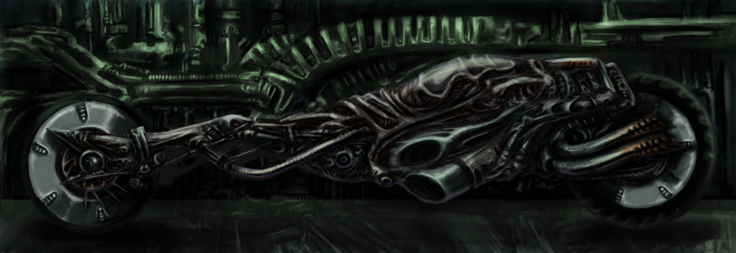
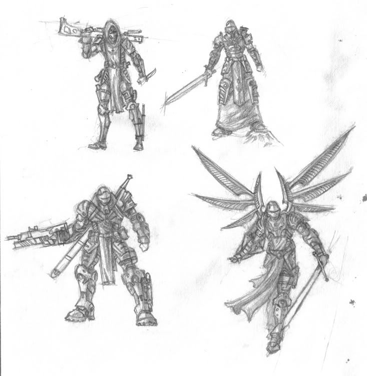
H.R. Giger inspired motorcycle
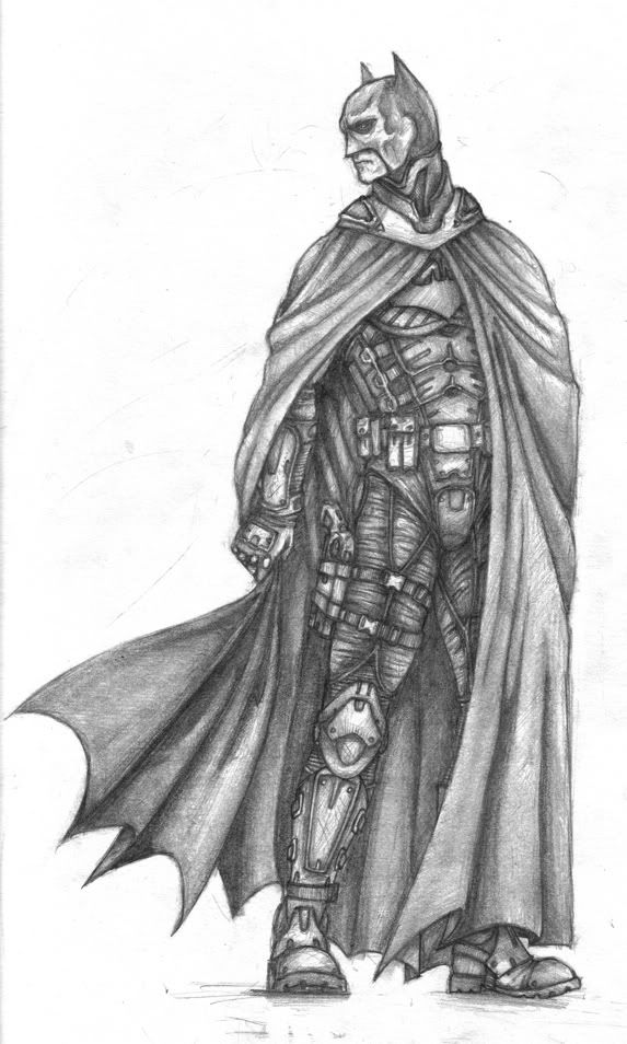
GigerBike2.png

The Goddamn Batman
BatScan01.jpg

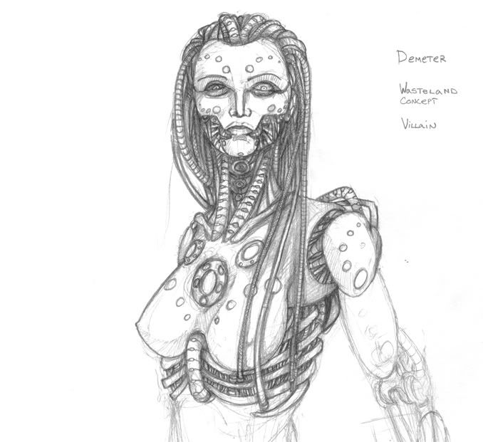
"Demeter" A villain concept for a pet project, working title "Wasteland" for my own organization.
riceC_demeter.jpg

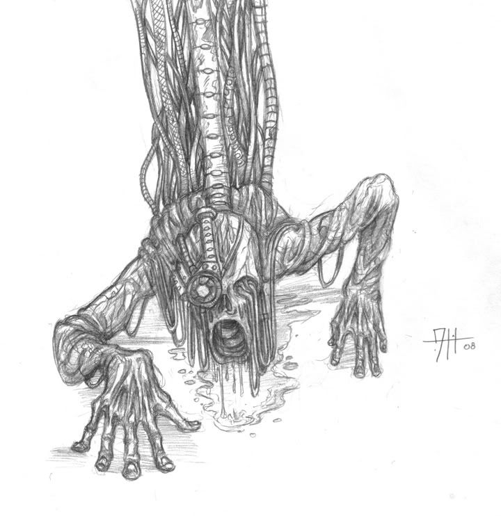
A creature from my Wasteland project.
cute.jpg

"Archangel" special forces concepts for Wasteland.
Archangels01.jpg

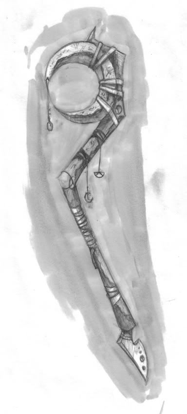
A staff concept for the Dark Sun D&D Campaign Setting, inspired by Brom's works.
dsFinal.jpg

Replies

  • CW89
    Options
    Offline / Send Message
    some nice sketches dude! What I noticed from these drawings is that you try to mask anatomy with detail. I don't know your drawing skills but try to post some anatomical studies :)
  • Eoq
    Options
    Offline / Send Message
    Eoq polycounter lvl 8
    Keep em coming :)
  • Der Hollander
    Options
    Offline / Send Message
    Experimented with a square brush approach and some general lighting/painting practice. Took about 2.5 hours or so.

    LightingStudy1copy.png
  • Der Hollander
    Options
    Offline / Send Message
    For no other reason than because I can, some traditional arts pimpage.
    Triptych of Gorillaz' album "Demon Days", Sumi-e ink and white gouache on illustration board.

    Objective was to illustrate the album using only black and white as a composition exercise, illustrated in 3 different styles as a style matching exercise to make the project a two-fer.

    DemonDaysTri.png
    From left to right:

    "Last Living Souls" - style of Mohammad Haque

    "Demon Days" - style of Jamie Hewlett (no real homepage :( )

    "Every Planet We Reach is Dead" - style of Bill Sienkiewicz
  • Der Hollander
    Options
    Offline / Send Message
    Updated my demo reel this morning. Should have some new flat stuff later this week.

    [ame="http://www.youtube.com/watch?v=q-CknxPjI9k"]http://www.youtube.com/watch?v=q-CknxPjI9k[/ame]
  • Eoq
    Options
    Offline / Send Message
    Eoq polycounter lvl 8
    Hey there! If you want some feedback on the demoreel, here it is.

    I found your work pretty intresting and well made, though something caught my attention, why are your resolutions so high? For example, the first character you showed on the reel (which btw was really nice) was on 1.2k triangles, meaning that this would be model used for games that run smoothly on not so demanding engines, but you have a texture that is 1k? My point is, doing lowpoly often means optimization, and if you can make a low resolution texture look badass on a lowpoly geometry - that is something very impressive and probably something your client would think aswell. Same goes for your other work on the reel.

    The mecha you did, I believe would catch the viewers eye more if it was posed somehow, showing off the inside and outside parts of it. Note - this is just my personal opinion.

    Keep it up dude, nice to see some showreels on this forum :)
  • Der Hollander
    Options
    Offline / Send Message
    Thanks for the feedback, Eoq. I was thinking of knocking the low poly character's texture res to a 512 and a 256, I think my shoe model could also handle something like a 256.

    The BattleMech was really just put in there to show that I can work with high poly geometry, I've got another project to replace it down the line. Though I agree it would look better posed, it would also look better with some textures, a lower poly mesh, and a cockpit :P
  • Der Hollander
    Options
    Offline / Send Message
    Mmm more sketchbook spam. I've been working on a re-work of an environment I did about a year ago, I seem to have hit a wall on the grayscale. I know it can be pushed further, but I'm not sure how to tackle it.I'm thinking I might need to hit it up with some reflected light in the back, the tree does seem to blend in a bit much with the background. Any thoughts? TreeLighting.png
  • JeremyRM
    Options
    Offline / Send Message
    JeremyRM polycounter lvl 8
    I like it man, cool idea. A tree cathedral haha. What I think would help is maybe push foreground middle and background further. Like the second tree seems to be further away looking at the door sizes lighten it a little and darken the foreground tree a bit then lighten the background. maybe give us a light grey silhouette with the background trees. Should give it more depth.
  • Der Hollander
    Options
    Offline / Send Message
    Updated the lighting to less suck, and working on the color pass.
    Still have a fair bit to go, but will hopefully be able to wrap this up later today (is 3:25 am so today is yesterday's tomorrow)

    EDIT: "Finished" the picture this evening, didn't feel like a new post.

    TreeLighting-1.png
  • Der Hollander
    Options
    Offline / Send Message
    Doing an update of an old pencil drawing, but this time she'll have a complete body. Aside from some of the life drawing sessions at school, I don't have a whole lot of practice with the female figure, so there's bound to be issues. Legs aren't pictured yet since they're in the roughing in stage, like everything except the head. The idea is to make her a crazy cyborg (note: almost all of the character is robot, except for the skull, left eye, brain, and a bit of the spinal column), I'm not sure what to make the plates she's wearing... so far I've considered some sort of ceramic, metal, or some sort of semi-translucent plastic.

    Just to make this post harder to read, I'm going to be inserting some disjointed comments under this sentence, I can't seem to formulate a cohesive paragraph right now.
    Concept keywords are: Classical, Biomechanical, Horror, Graceful
    The initial idea behind the character in terms of visuals was to take a classical beauty approach, and then robot it up with some Giger-style sensibilities in an attempt to make a design that illustrates a perversion of perfection through cold, mechanical precision and a touch of psychosis.

    Brainstorm: should I make more plates, and them make them all look like they'd fit flush in a static pose, but when the character moves, the plates shift, revealing more of the robot bits under? Might be interesting.
    DemeterPaintWiP.png
  • Veneficus
    Options
    Offline / Send Message
    I like the character design you've got going there so far. One thing that stands out glaringly for me though is the torso. If you look at the ribcage, it almost seems as if it is collapsing in on itself. Like instead of being a round shape, it pinches into a fold along the middle? This could be something with the shading you have on her left side, or the direction of her ribs. Also, the perspective on her breasts look weird. And easy way to check that is to compare the level of the nipples. Right now, her breasts are below the horizon line, yet it seems to me we are looking up at the character.

    I really enjoyed your forest cathedral! Great colors, and really good atmosphere, and attention to details! keep it up
  • Der Hollander
    Options
    Offline / Send Message
    Been doing some sketches lately, this one turned out pretty decent. My personal preference is to do a gestural line/hatching style, I enjoy art that's got so much grit in it you could use it to remove splinters. I may do a background and color to this, haven't decided yet.
    SpektreUpdateConceptcopy.jpg
  • Der Hollander
    Options
    Offline / Send Message
    Been a bit since I've gotten a finished sketch down, much less scanned. I did this one during my trip to Chicago. I'm in the middle of giving it some color, but I'm not sure how it's turning out right now.

    Oddly enough, I was inspired to do more Space Marines art after watching the Ultramarines movie. The CG made me sad, but I do love me some Space Marines.

    RiceC_12272010.jpg
  • Der Hollander
    Options
    Offline / Send Message
    No flat art to speak of recently, I've been caught up in working on more 3D type stuff. To that end, I'm gonna post the weekly sculpts from my "zBrush for 'tardeds" class so that I may hopefully improve myself in those regards.

    I'm a week behind in posting, but oh well.

    Week 1 - Sculpt whatever from a sphere, time was around an hour or so. Things got out of hand with the TrimDynamic Brush.
    ZSketch01.png
  • Der Hollander
    Options
    Offline / Send Message
    Week 2 of zBrush for nubs.
    Sketch Assignment - Sculpt this amazing mofo from a sphere.
    old-man-statue-Copy.jpg

    My resulting mess:
    ZSketch02-1.png

    learning done: Clay Buildup brush = bonera, using the Equalize Geometry tool works decent when given requirements like "build this mofo with a Polysphere".
  • Der Hollander
    Options
    Offline / Send Message
    Latest thing inspired by this comic:
    215543608_oPsC3-L-2.jpg
    Monster1copy.png

    Lots of broken anatomy, centered composition, fairly uninteresting pose, etc.
    Mainly a practice to make something largely foreign in terms of nature.
  • Der Hollander
    Options
    Offline / Send Message
    Started doing a Cthulu for some zBrush practice and for fun.
    ftaghn2.png
  • Der Hollander
    Options
    Offline / Send Message
    Been forever since I actually put stuff in this thing. This already got into Speed Model thread, but I figure I can at least use this thread to keep track of my progress as an artist.

    TauBust.png
  • Der Hollander
    Options
    Offline / Send Message
    Did an hour sketch before bed, thought I'd give zBrush hard surface another shot. Still not a huge fan, but I could see the benefits. Eldar helmet.

    EldarHelmet.png
Sign In or Register to comment.