The BRAWL² Tournament Challenge has been announced!
It starts May 12, and ends Oct 17. Let's see what you got!
https://polycount.com/discussion/237047/the-brawl²-tournament
It starts May 12, and ends Oct 17. Let's see what you got!
https://polycount.com/discussion/237047/the-brawl²-tournament
Young Sloth Wizard
polycounter lvl 15
Hello!
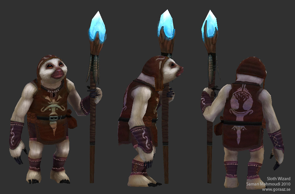
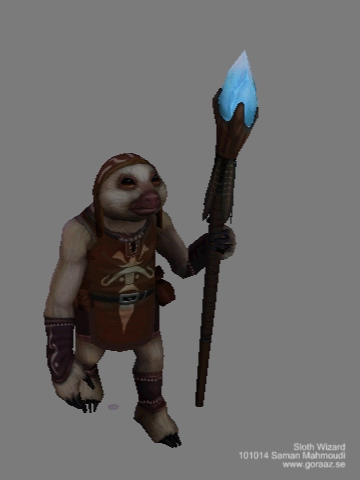
Here is my latest work. A lowpoly-ish character with hand-painted textures. It's a young sloth wizard. I don't know any background story for him yet. Hope you like him!
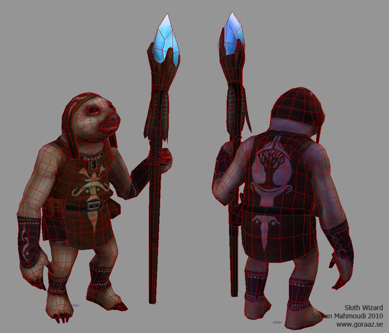
Wireframe:
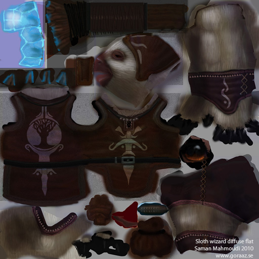
Texture flats:
And a simple walk-cycle for testing the rig:
References:
http://media1.break.com/dnet/media/2008/12/52%20Baby%20Sloth.jpg
http://funnycutepic.com/wp-content/uploads/2009/03/baby-sloth.jpg
Here is my latest work. A lowpoly-ish character with hand-painted textures. It's a young sloth wizard. I don't know any background story for him yet. Hope you like him!
Wireframe:
Texture flats:
And a simple walk-cycle for testing the rig:
References:
http://media1.break.com/dnet/media/2008/12/52%20Baby%20Sloth.jpg
http://funnycutepic.com/wp-content/uploads/2009/03/baby-sloth.jpg
Replies
Hope that helps! Good stuff, keep it coming.
edit: The bright amber color in the lower part of his eyes is a little distracting. At first I thought it was his eyelid or something.
But I also think there isn´t much light information on the textures. And also a blue light from the cristal would be realy cool!
This includes:
- 1 more layer of light
- Continuing the little dots framing the cloth (might be excessive dunno)
- Implementing some blue highlights on the more reflective surfaces (wet nose, mouth, eyes & claws). Really going in and adding softer blue light everywhere will prob look cool but may not be necessary. Some "volumetric light" around the crystal may suffice, but I did add reflections right on the wooden "cup".
The strong orange on the eyes is my fav part, it adds the pop to all the brown, just like I suggested to u on the Orc model from b4.
Goraaz> definitely way better! I think shogun points out one more thing you should do if you can, and that's to indicate the border edging on the brown loin cloth. It blends a little bit too much, and having an edging will give more sense to the shapes going on there.
I can't see any update on the last post -- wrong version posted?
As for the leather - I agree the highlight should be a little darker and more saturated, in general the relief more matte. In my paintover also it was too light.
Also, some grain would help push the texture, now that u'r pretty much finished with lighting/coloring him (relatively early on, notice the improvement) u could start working on that.
@ Cap hotkill: Yes, I know that it's not looking very sloth'ish in the face. I increased the eye-size to make it look less realistic... Check my references in my first post to see the ones I followed though, might give you a better understanding.
@jrmenace: ",and add a lil contrast on the fingernails ntoes" - Do you mean more highlights? Or more color? Do you want me to make it more saturated? I have a fever right now so please excuse my lack of comprehension.
- BoBo
Looks cute though
He's a bit speedy for a sloth =P
I'm an aspiring animator so don't really take my comments all too seriously. =]
Amazing model and texture.
Thanks for the feedback, jrmenace. I'll look into that too.