Sketchbook: lampekap
Hi, Im fairly new to 3d, so Im opening this sketchbook for other people to criticize my works, to help me improve .
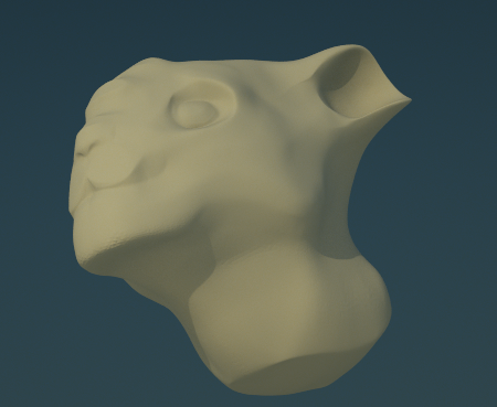
here is my first sketch, please crit it apart. the harshest critisism will be apreciated, but it would be helpful If you would sandvich it in some good advice
As you can see, its a quick concept sketch in sculptris of a fantasy feline like creature. I used it to get fammiliar with sculptris because i was kinda used to blenders sculpt mode. I didn't want to do demon heads because I see them around too much, and I thought that a creature in this cartoonish style might be fun to learn the program with lol.
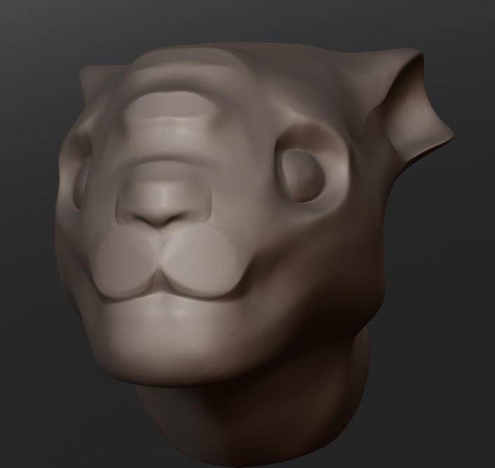
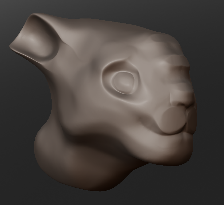
the following two were rendred in octane, its much fun and incredibly fast
though im not sure if this is the wway to present a sculpture (after all, this is just a sketch lol)
here is my first sketch, please crit it apart. the harshest critisism will be apreciated, but it would be helpful If you would sandvich it in some good advice
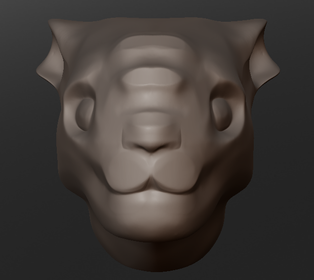
As you can see, its a quick concept sketch in sculptris of a fantasy feline like creature. I used it to get fammiliar with sculptris because i was kinda used to blenders sculpt mode. I didn't want to do demon heads because I see them around too much, and I thought that a creature in this cartoonish style might be fun to learn the program with lol.
the following two were rendred in octane, its much fun and incredibly fast
though im not sure if this is the wway to present a sculpture (after all, this is just a sketch lol)
Replies
I lol when I see the dumb look I put on his face, it isn't really upload worthy but anyways:
Both your busts have good mass to them, you just need to start refining your understanding of anatomy. For example, part of the reason why the guy has a silly expression is because he's bug-eyed; there are no visible eyelids enveloping the circular orbits of the eyes, so it just looks like you have cylinder-shaped eyeballs shooting out of the sockets. Start spending some time looking photographs of faces. Start learning the vocabulary of the face-- this bust lacks both epicanthic folds and a philtrum, among other things. As you increase your understanding of the face, like when you know what the Zygomaticus Major is and how it's shaped, the resolution of your artwork will increase. If you know what it's called, you're more likely to put it in and render it correctly.
Keep it up man, good work.
the eyes I did on the guy were only fillers because I hadnt figured out how to add sphere eyeball s inthe sockets, but I admit that I still can't make it look right, ill just k,eep practasing
heres some trollish head i made but it wasn't my intend to make him an orge lol.
as u can see, i fail with the area around the eyes
And don't worry about the end product differing what you intended-- it happens to me all the time, so unless you have some very specific guidelines it's good to roll with the punches.
What will help is to start looking at sculptures of faces and artists' studies of faces. Seeing how they simplify information can help you to read the face more easily and readily.
Try looking a some of these sculptures, and actually pixologic has a nice little introduction to the digitally modeling a face
here is some of the reference material:
I had much fun with figuring out which facial features made the king recognizeable, and i was amazed how much information some simple black pixels can give about the overall look of the face.
but reference like this obviously isnt great for mouth and mustache as they are a bit too simple to work with
I hope I improved a bit with the area around the eyes sorry for the sloppy look lol
thx for the cool links & advice
During the making of this I realised few things: Im absolutly horrible with mouths and I still can't make the eyes look good.
and the problem with this all is that I KNOW whats wrong, yet when I try to fix it I only mess it up even more and I ALWAYS end up smoothing out the entire area on which I wanted to improve upon. for example his "mouth" atm.
I find that I always want something to be better and I always think that what I do isn't "perfect" enough.
I have the feeling that this perfectionism is going to distract me from practasing and slowing me down A LOT.
I also feel I went in some areas into too much detail while at the same time completely ignoring for example the ear and the back of his head.
Id love to hear some advice how to deal with issues like the above.
Recently ive been busy with some other things (a lame excuse for being lazy)
But here goes my last sculpt:
Critisicm is welcome, as always
I almost put horns on him lol
the back of the head and the ears could use some love
Anyone got some simple tips on how to make ears in a few simple steps?
I saw a thread earlier with the same for lips, it helped alot.
Feedback is always welcome and MUCH apreciated
Im still sculpting in sculptirs though, and i found out about the letter q.
Not continiously adding detail to the mesh will make the sculpting 10x faster and more enjoyable.
meanwhile, : my first zbrush creation, using zspheres.
Ill keep on learning the program and hopefully ill get some good out of it
The sculptris flatten tool doesnt really work for me, it feels quirky.
I hope Ill soon be able to do the same practise but then in zbrush, and c how it turns out.
meanwhile im also learning topogun.
one of the reference:
I can imagine that my sculpts look sometimes very simple and basic and therefore its hard to give any proper critisim
I hope to improve and be able to put more time in scullpting , and i think zbrush will help me to improve
Also, some of your facial features are still a little petite-- don't be afraid to widen the mouth a little or thicken the nose.
I have to admit Ive never really paid attention to the neck, and some other parts.
So heres a new basic shape sculpt, this time from scratch, and refining on the neck strucutre.
I hope to do another sculpt from scratch, but then refining on another certain part. 'm just hoping i didnt over do the neck, but it wass good practise.
also, I tried to sculpt a female head, but it didn't turn out well, even if I was looking all the time at the reference. Is there any basic guidelines for makin a face/head have feminie features?
anyway heres it:
You're overdoing it a bit with the sternocleidomastoid muscles, and you're recessing the volumes between them and the laryngeal prominence (adam's apple) too much. Remember that you basically have these raised areas around the body over which skin is then stretched. Throw some skin on that neck.
As for the differences between men's and women's faces, here's a few general rules:
1) men are more angular and squarish while women have softer, subtler lines. This goes for pretty much the entire figure.
2) women's eyes tend to be proportionally larger, their chins smaller, and their cheekbones more accentuated.
3) hairline is usually higher than in men
4) neck is thinner and not as defined as the male neck, though in thin women you can still get some strong lines.
5) mouth is bigger and lips are fuller, while the nose tends to be smaller and more curved
6) women rarely have a very accentuated brow ridge-- the side profile of the face has a very gentle curvature while the brows are more noticeable with men.
I'm sure I'll think of some other stuff but that should get you off to a good start. Keep it up with these, you've already improved a great deal.
Ive now got myself a very very basic female headshape, and ive been practasing alot on it.
then I thought it would be interesting to make from the female headshape a male looking head, and here is the result
I feel that Im exeggarating some proportions, and lacking completely with others. especially when im doing something new like those neck muscles i tend to overdo it.
as u can see the back head and neck look still very feminie , and the nose could be wider again i suppose. the area above the eyes look very disproportionate, and adding the creases around the mouth wasn't much of a good idea.
his cheecks look wrong too somehow althoug im not sure what it is.
ears are completely lacking, iam ashamed
on this head i focused on the mouth area, because i always suck with that area. (NO PUN INTEDED FOR GODS SAKE)
The skin is pulled a little too tightly across the lower jaw line, especially further in where it's closest to the sternocleidomastoids.
Other than that, post some more and bigger views so I can get a better look.
Keep it up man.
I hope thesse pics display it better, but im not sure if the material is good for it, atleast it makes it look 5x better then it actually is
as for the ears, ill give them hopefully soon the same practise as with the lips, hope ittl turn out good. tried it right now but it turned out horrible.
Ill hope to use this same head sculpt to practise the eyelids , nose and ears on, once the basic proportions are alright. igrnore the eyes for now :rolleyes:
Anyway, your head model is suffering from lateral shifting. Your portrait appears accurate from the front, but there's a lot of distortion when it comes to the depth of the features, as revealed from the side view. The lower features like the mouth and chin have been pushed forward while the forehead is too sloping and has its own giant playground back there. This is why your bust appears to be looking up even though it's rendered head on.
Having accurate and matching front/side references are important. If you look up Bertillon cards, they'll help you to establish good ratios. I did a paintover to help illustrate some of this
Also, take a look at Bertillon's facial cataloging system. This is the best image I could get, but it helps convey all the different types of facial structures that you'll see:
the amazing paintover helped me tonnes, and i started fixing the head.
I also made my first ears, damn, theyr soo complicated
heres the update:
areas that need more fixing: the eyes ( obviously,, right now its just bulging out no detail) , the neck and jaw line ( not statisfied with it), and mayby the overall shape of the face, because of it lost some of its form when i used the grab tool to shift it to the correcter position.
i spend much time trying to get the neck look right but i messed up, so now it looks even worse than before.
also defined the nose bit more.
please tell me what u think! i aprreciate all comments enormously!!!!
i have the feeling i strayed of off the right proportions , but b4 i get on with fixing that id like to post what ive been up to till now:
the major things botherying me now are: face needs 2 be in proportion with head, the forehead is waay two big. ill widen up the shoulders a little bit too.
ears are a bit big too.
then there is the area where the jaw connects to the neck, and about where it conncects to the ear and the lenghty side muscles. as in sculpts uve seen before this is where i always go wrong.
this is my first female head sculpt, so please i welcome all critisism
got few questions though: is this a good way to practise?
and: do u guis like the viewing material? it hink it looks awesome and reads good too, but if its better for uall to view them in zbrush redwax material then ill change.
thanks again everybody with their usefull feedback
i made this head from scratch in sculptris, then i imported itnto zbrush and fiddled with the planar flatten tool, and adding in assymetrical features. zbrush is really powerfull but i still prefer to block in the proportions and basic features in sculptris.
the planar flatten tool makes him look like a kind of rock gollem, and i can see that zbrush many tools are excelllent for making something awesome and stylistic
this is using the same reference as the one head without mouth on the previeous page. thanks for looking, take care
i was just recovered from a minor brain bleeding and today i tried out the updated sculptris... after not sculpting half a year it was very fun , reccomend to try it out too.