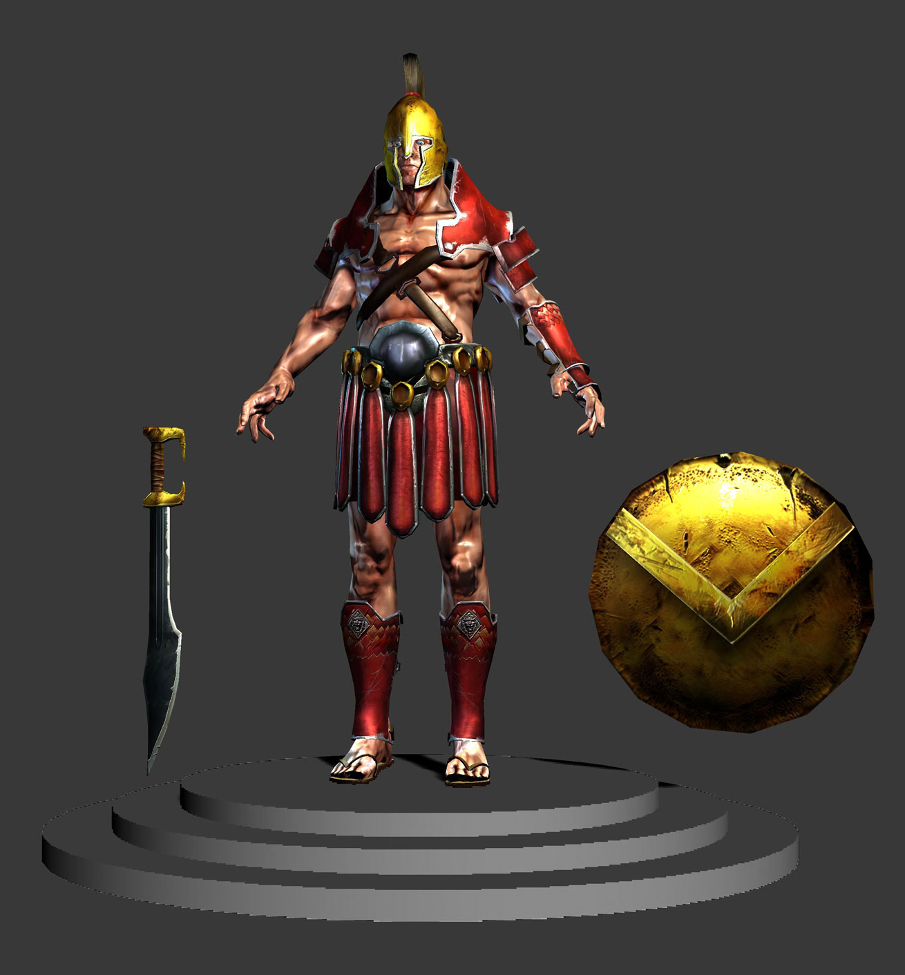
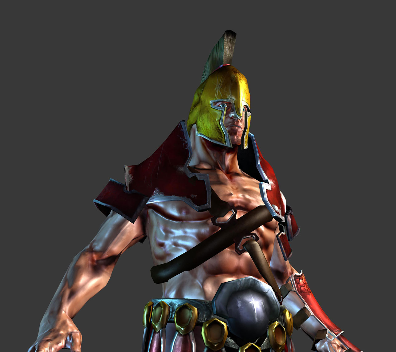
Your shoulder piece's diffuse is too saturated and bright. Try lowering it. The normals on his skin in some parts don't help the form of the low poly. Lower the intensity of your normals, or put it in a game engine. (concept's really good!)
Way too much white, glossy spec on the skin (well, pretty much everywhere).
Pull that spec down lower, soften it out and try making the spec color of the skin a dark purple or wine red. Should improve the appearance significantly. Adding a good fresnel term to your shader will improve the whole model's appearance as well; you're making heavy use of several materials that suffer badly without fresnel terms: skin, polished metals, and leather.
Yeah, I agree, I am tired of the spartan thing. Seems like a bunch of people started a spartan character all at the same time and are posting it about now. I had fun with it despite the unoriginality. Here you go jackablade
Your pretty good at concepts, i wonder why this hasnt carried through to the textures? (unless it isnt your concept?) Spend more time on it and look at other ones people have done.
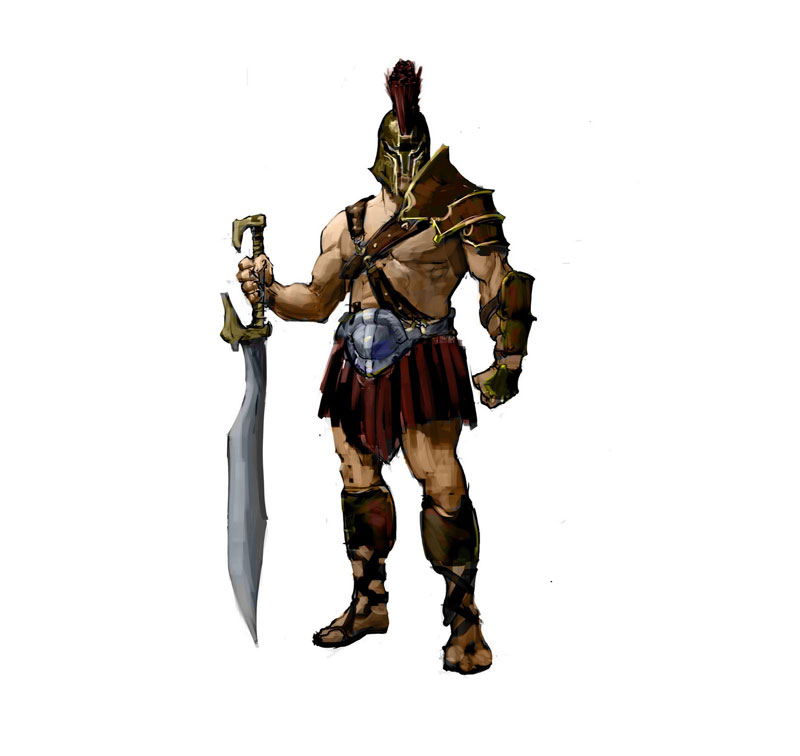
Yo, Nice ta meetcha. Definatly have some issues here as far as construction goes. First and foremost, the final dosnt capture the proportions and silhouette of the concept. which as folks have already said is pretty awesome. The second issue that i see is that you are modelling parts of your mesh and carrying them through to your lowpoly, that have absolutly no visiblility whatsoever on your model. dont waste polys and texture space on the bottoms of feet, unless the character will be seen with no shoes on:poly124:. Thirdly, you are wasting about 60% of your texture space, because your UV layout needs tons of work. the face is the most important part of just about any character and you are giving it less textures space than the palm of this guys hand, also you can never actually see both sides of a sword at the same time, and it looks like yours share the same texture anyways, so why not mirror that to save space. you could easily redo your uvs and fit this whole character into one sheet, without loseing any of your texture res. On a more nitpicky note, he would probably have his heavy armor on his right arm, being that his other one is covered by a massive shield. Srry if it comes off as a bit harsh, but your definatly showing promise so keep cranking these out, but try and keep stuff like this in mind!
o also try using this for your final textured shots. ...its free and saves you from getting overly black shadows.
Thanks woogity. I definately appreciate the intensity of the critiques. At school people just say it's good because they are afraid to REALLY critique it. I was hoping posting it on PC would get me REAL crits. I definately knew most of the things wrong with it, I just thought for some reason I could get away with it. I did this piece before I did my mech suit (which is in a different post) and I definitely learned from my mistakes on the spartan.
It would be great to see you rework this guy and beef it up, it has potential to be a really nice concept -> final piece. I hope you can spare some time for it - I'm keen to see the progress.


Replies
Pull that spec down lower, soften it out and try making the spec color of the skin a dark purple or wine red. Should improve the appearance significantly. Adding a good fresnel term to your shader will improve the whole model's appearance as well; you're making heavy use of several materials that suffer badly without fresnel terms: skin, polished metals, and leather.
/loves me some fresnel ramps
Also it would tickle me if you can post a version with flat grey diffuse textures, I'm curious about the normals.
Cool stuff!
o also try using this for your final textured shots. ...its free and saves you from getting overly black shadows.
http://www.8monkeylabs.com/tech/marmoset
-Woog
Just do it
Yeah, I get it, you don't need to be rude.
you already know what you gotta fix.
I see potential in this piece, people critique you because they what you to be better
well at least most people want to help you, some people are just whiny ass holes!! =O
lol