[UDK] Himalayas Styleguide
Hello everyone, my name is Sam, I'm a student from the Central Ohio Area. For the past 6-7 years I've been building maps for various games (UT2K4, UT3, CoD, etc), but only recently have I started to make my own models and assets. I started making my own models about a year ago.
This summer I've been on a crash course in texturing models using 3DS max and Photoshop. I've been a lurker for the past four months and I finally happy enough with one of the styleguides I've been working to show it off.
I'm looking for any constructive feedback, particularly with the models and lighting.
Thanks, and I hope you like it!
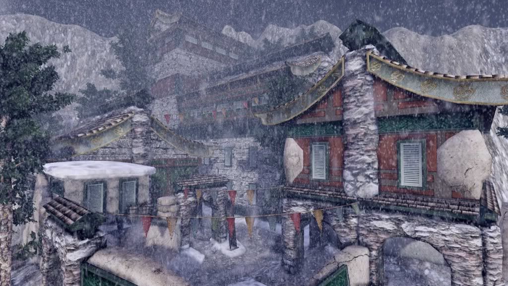
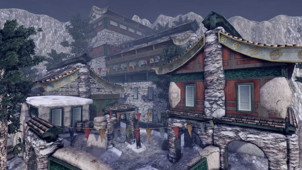
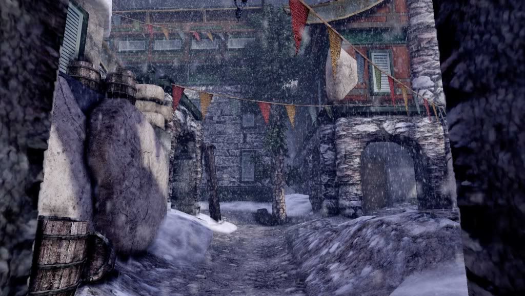
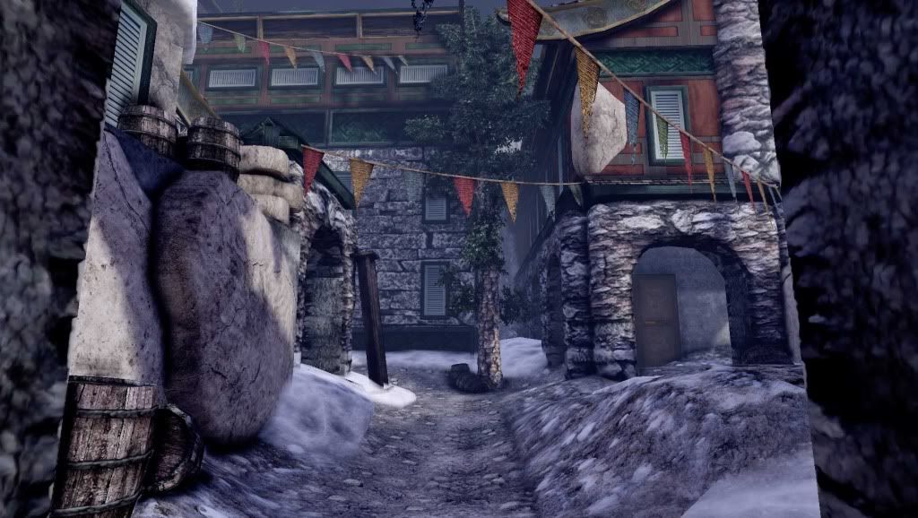
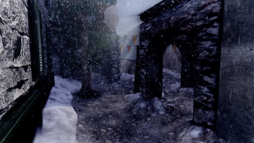
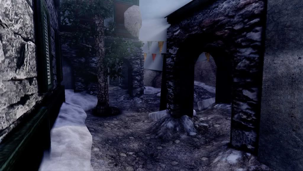
Note: I'm posting two pics of each, one with snow and one without so you can see the models better.
Thoughts?
This summer I've been on a crash course in texturing models using 3DS max and Photoshop. I've been a lurker for the past four months and I finally happy enough with one of the styleguides I've been working to show it off.
I'm looking for any constructive feedback, particularly with the models and lighting.
Thanks, and I hope you like it!
Note: I'm posting two pics of each, one with snow and one without so you can see the models better.
Thoughts?
Replies
Sorry for the bump.
http://tomallwood.com/images/locations/nepal/prayer_flags.jpg
That's more in the tradition of the Tibetan culture, than the triangle pointed flags.
That rock foundation texture on the bottom of the building seems really blobby and doesn't have defined rock forms like they have been stacked or whatever, some more work on defining individual rocks would make it look better.
which kinda brings me to my next point, everything feels kind of soft, the snow blends are all soft and would look better if you used a mask to push the snow into the cracks between the small rocks and stuff on the ground. I'm not sure what those 2 white big rock things are on the 2nd story of the house, so maybe work on defining that some more too.
the lighting could benefit from a bit more contrast for some highlights and shadows, right now its extremely even and flat. I would de-crease the contrast on some textures to avoid it looking noisy and increase contrast through lighting. example: the bottom 2 shots that rock arch is all black and smudgey looking, try to avoid stuff like that.
its a really good start, totally getting an uncharted 2 vibe off this, and when i saw it out of the corner of my eye i thought it was maybe some DLC or something. upon closer inspection it breaks down, and to fix that shouldn't be too hard I think. cool work man, now just polish'er up!
Nice catch, I didn't spend too much time researching the appropriate type of flag to use.
I'm pretty new to texturing models. For most of the pieces I've done here I've used 1024x1024 textures, would you recommend a larger ratio or just gun for more detail in the texture itself?
Do you mean the arches? I agree, I need to redo those.
I used quite a bit of fog in the UDK; I was hoping it would add to the snow effect (maybe it did, but too much). Like a mask on the texture itself? Took care of the 2 white rock things. I agree that they were pretty distracting.
I'm working on the lighting and Post Process effects right now, I can already see a dramatic difference.
Thanks, I really appreciate the feedback! I would be lying if I said I wasn't inspired by Uncharted at all.
I post some more screenshots once I tweak the textures. Right now I only have time for the lighting and post processing.