Home 3D Art Showcase & Critiques

Priske's art dump

So Ive decided to sit down and make a portfolio, and where better to post it then the wonderful Polycount forums! Would love feed back, thanks guys.

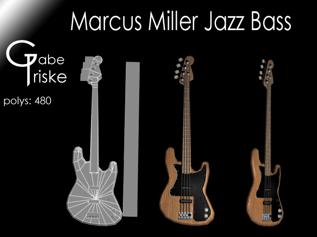
1st off, the Marcus Miller signature jazz bass...
MarcusMillerJazzBass.png more to come...

Replies

  • Priske415
    Options
    Offline / Send Message
    Just finished an desk model, would love to hear what you guys think:
    desk.png
  • ZacD
    Options
    Offline / Send Message
    ZacD ngon master
    Your renders are a bit too dark to be using a black background.
    The gradient and giant white text are kinda distracting, if you want to make sure your name is on the image come up with a small logo you can put on the image.
    Are these real time renders? or mental ray or vray ray?
  • Priske415
    Options
    Offline / Send Message
    Thanks dude, Ill through them on a white background and make the logo black. Also yes these are all real time in 3Ds max.
  • ZacD
    Options
    Offline / Send Message
    ZacD ngon master
    Try something more neutral for the BG color. The lighting is a little bit plan, try experimenting with more lights, key lights, rim lights, fill lights, etc.
  • Priske415
    Options
    Offline / Send Message
    Well Im definitely not trying to show off my lighting skills because they are lacking. But here is a slightly better lite render for you:
    bassforzad.png
  • Priske415
    Options
    Offline / Send Message
    added some glass's to the desk, thought I might as well render it out with some decent lighting also, as long as I have an update:
    desk-2.png
  • Razgriz
    Options
    Offline / Send Message
    Razgriz keyframe
    I don't think this is game-art ready, though, it looks to me like a scanline with uv-map (not unwrap) used to project the textures, though I could be wrong. In either case, the wood texture is really killing an otherwise adequate model. The wood grain isn't consistent, and even runs the opposite direction in some spots, making it seems like the texture is just stretched way out of proportion. This is especially evident on the right side of the desk. Some of the smaller details on the wood, like the bottom of the right side below the bottom drawer, and the noise running along the middle of the tabletop - they just don't make any sense from this direction.

    Also, given the amount of tris that you spent on some parts, I think you can at least bevel the vertical edges so it's not so sharp when viewed from an angle

    I would really like to see this with a heavily reworked second pass on both the model and the texture, because your the proportion and realism of the desk itself is spot-on; it also needs far better presentation, though the second version is a vast improvement over the black-background one. The font choice is especially tawdry, and the biggest offender here.
  • Priske415
    Options
    Offline / Send Message
    Thanks so much for the advise! I did some rewording with the model and the texture and came up with this: desk-3.png

    Also, are there any crits you guys got for the guitar or is that one ready to go?
  • Priske415
    Options
    Offline / Send Message
    Started on a antique stool today, just thought I would upload the work Ive got done for some feedback. Obviously I still got to do the texture but here is what I got as of now: stoolworkflow.png
  • Priske415
  • Priske415
    Options
    Offline / Send Message
    Got a texture in there, would really love feedback on all this: stoolposter.png
  • Priske415
    Options
    Offline / Send Message
    So Ive decided to start on something a little bit bigger, found this concept and thought it would be fun to model:turretconcept.png

    Not very far yet but here is the start of the highpoly. not following the concept to a T but staying close: roboleg.png
  • samgriffiths
    Options
    Offline / Send Message
    A fine start, though I would strongly recommend following the concept as closely as possible, there really is no point is doing it any other way when working from a concept. Especially when it's just about scaling problems and not an alternate design.
  • Priske415
    Options
    Offline / Send Message
    Thank you and I agree, the only part of the concept Im not following are a few details here and there that I will be adding or not adding.
  • Priske415
    Options
    Offline / Send Message
    I found some time to work so, progress:
    roboleg-1.png
  • Priske415
    Options
    Offline / Send Message
    found a little time to work, would love some feedback on the direction Im taking the turret.
    roboleg-2.png
  • ZacD
    Options
    Offline / Send Message
    ZacD ngon master
    Front leg is too big, the back ones are too small. Proportions are way off, it doesn't feel as aggressive or heavy. Lots of missing detail, stick with direction of the concept art.
  • leibarg
    Options
    Offline / Send Message
    I agree with ZacD look at your proportions and the drawings and you can see a difference . an easy way to do this is grab a pencil and measure all the pieces on the pic to your model . this should help to give you better proportions as for the feel of aggressiveness and heavy remember to exaggerate things. in the drawing there are slight curves/ breaks also the top is just a lot thicker and lager in it . your model is very static. alot of it is because it is flat gray and you not able to see the edge highlights. reember the only reason for highpolys are to show off the edges for normal maps but are still there to make a model look cool when lit.

    hope this helps

    you are getting lots better man . just need to draw and learn more about the art side not just the technical .
Sign In or Register to comment.