The BRAWL² Tournament Challenge has been announced!
It starts May 12, and ends Oct 17. Let's see what you got!
https://polycount.com/discussion/237047/the-brawl²-tournament
It starts May 12, and ends Oct 17. Let's see what you got!
https://polycount.com/discussion/237047/the-brawl²-tournament
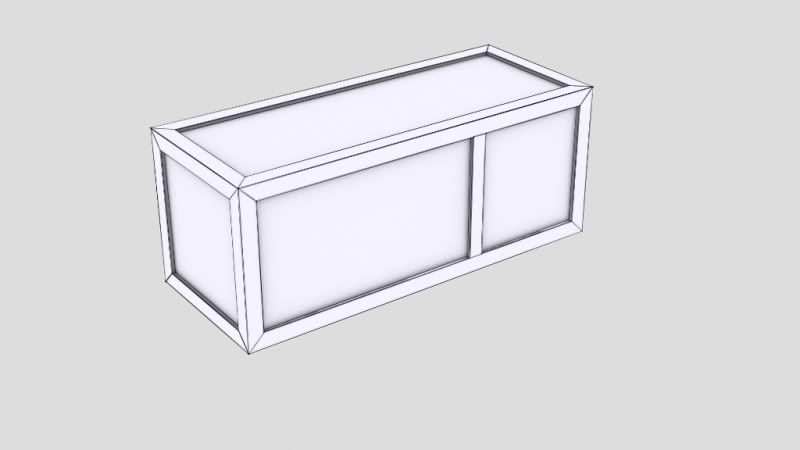
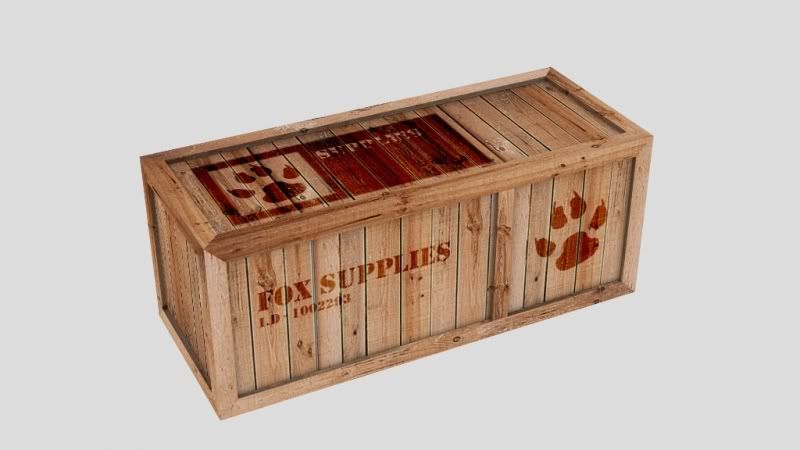
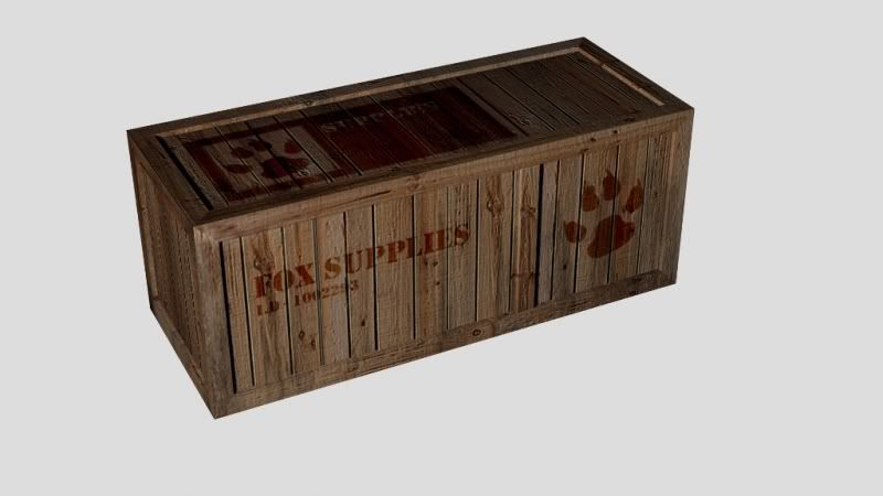
Simple Crate (Everyone starts somewhere)
As I've been trying to learn the ins and outs of 3DS Max, a crate seemed the simplest prop to start off with, after watching a few tutorials and such I decided to give one a go myself.
It's nothing spectacular compared to others but it's still nice to gain any info from even the small pieces I'm doing. Any crits welcome.
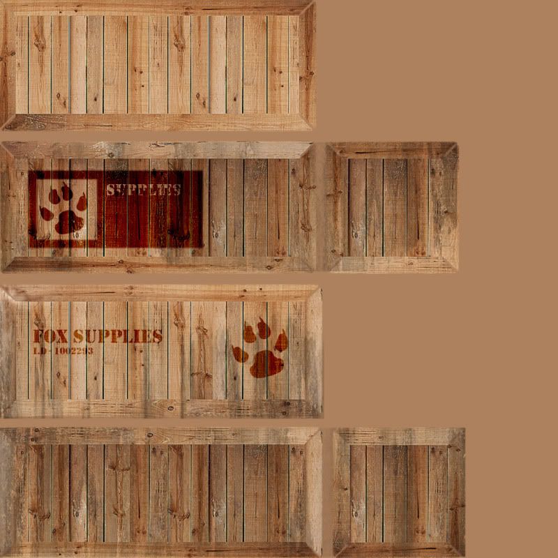
The designs on the box are just a quick mock up I threw together in Photoshop, the paw print is one of the shapes included with Photoshop. i wanted to mainly focus on the wood itself which was edited from a source photograph.
Just rendered through light tracer.
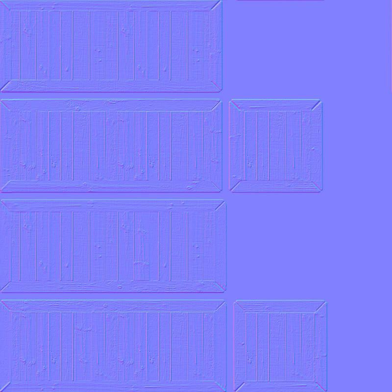
Normal map + spotlight.
Normal map.
Remmember im just starting out so judge me based on inexperience
And thank you in advance.
It's nothing spectacular compared to others but it's still nice to gain any info from even the small pieces I'm doing. Any crits welcome.
The designs on the box are just a quick mock up I threw together in Photoshop, the paw print is one of the shapes included with Photoshop. i wanted to mainly focus on the wood itself which was edited from a source photograph.
Just rendered through light tracer.
Normal map + spotlight.
Normal map.
Remmember im just starting out so judge me based on inexperience
And thank you in advance.
Replies
My crit would be at the corners where each face meets, the wood doesnt match up right, so sections go from a light colour wood, and jump quickly into darker wood, might want to try and fix that. Oh and you should have connected the Uv's together to conserve space.
I also see no nails in your model. If this was a wooden crate it would need to be both industrial glued and hammered with wood nails on upper edges and such
the edges could use a bit of highlighting
(you can achieve this by taking your normal map, desaturating it and then playing with its brightness and contrasts till only the edges are white and then taking that as a overlay on top of your model )
Really fantastic for a 1st timer! keep going and make more awesome gogooggo!
If you make those changes you will earn another gold star
Although I can see how I will find it harder on much more organic and less square shapes.
Kaburan - Thank you!
asteric - Cheers
Ill get working on the normal map straight after and see how things go
Gold stars are now my aim as well as another portfolio piece @.@ haha.
What is the concept behind the edge work? have you got any tips/ references so that I could maybe change them, see how to sort them and such.
in this case, you only need 3 long sides and 1 short side on the texture page.
in the unwrap, take the long side on the very top, move it over to the same spot as the bottom one. select everything and scale up uniformly and refit the texture to match the new UV layout.
for a crate (something the player walks past), you almost never need a unique unwrap for each side. at most you really only need 3 unique sides since thats the most sides you will see at any given angle. obviously, with decals its different becuase you dont want the same decal on every side.
pretty good for a first prop though.
Well, before I say anything, is 800x800 the actual res of your texture? Because that just won't work. Scale it to 1024x1024 or 512x512, but nothing inbetween. I won't touch on UV issues as this is your first model and to be honest, you can fix those up easy enough.
Right with regards to your normal map, the problem is you took your diffuse into crazy bump (or, what looks like nvidia filter), which is ok as a base texture (if you tweak it) but you have to remember that it works as a height map. In other words, any "shadow" you have on the texture will appear deep on the normals, likewise anything bright, such as edges, will appear high.
Now, I'm guessing you wont be doing anything high poly for a little while. So, for that, we can use simple height maps to help with your piece. As a very rushed and quick example, see below:
As for the Normal map and UV tips, for a quick throw together they were very helpful
Cheers for taking the time to put that together to help
When creating the heightmap, there was some strange shading (correct?) and i think it was due to the unstraight lines, is there a way to snap the uv lines to a perfect angle without having to move each individual side?
The bizarre shading can clearly be seen on the bottom two.
Cheers.