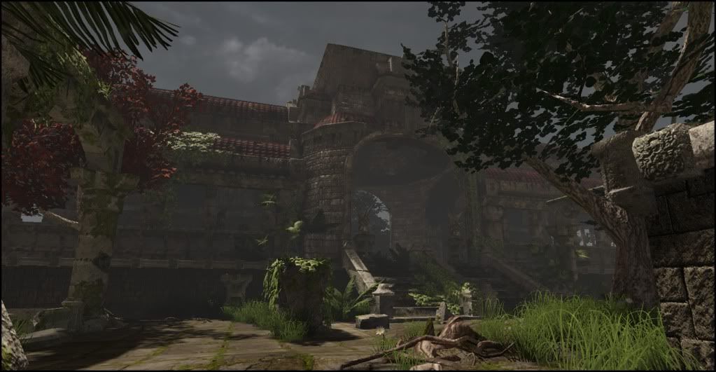
Home 3D Art Showcase & Critiques

Ruins Scene UDK

Hey guys, i need some help to make this scene better any constructive crits would be appreciated.

my lighting knowledge of udk isnt spectacular by any means, its being light by a dominant directional and a skylight

Preview1.jpg
preview2.jpg
preview4.jpg
preview3.jpg

Replies

  • ZacD
    Options
    Offline / Send Message
    ZacD ngon master
    Looks too foggy IMO.
  • Daniel Doerksen
    noted, and i agree i decreased it, also notice the roof seemed flat, fixed that aswell
  • pliang
    Options
    Offline / Send Message
    pliang polycounter lvl 17
    There seems to be a fair bit of sun light, but the scene is lacking the light source.

    I would tone down the distance fog as well.
  • Daniel Doerksen
    changed a few things
    preview5.jpg
    preview6.jpg
    do you think the fog seems a bit thick still

    im having bit of trouble getting the exposure i want out of the sky
  • Boyo
    Options
    Offline / Send Message
    Boyo polycounter lvl 8
    The skylight is useless with dominantdirectional light and lightmass.

    To have the good exposure, maybe a postprocess volume?
    I've got the feeling that your lights are pure white? Am i wrong? And the fog seems too grey and very intense.

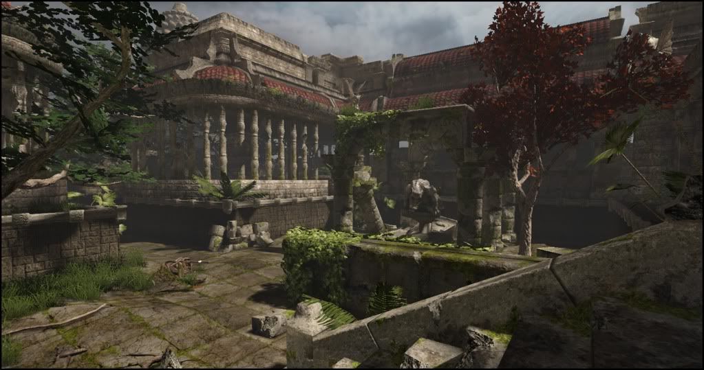
    Anyway, the scene is great.
  • vj_box
    Options
    Offline / Send Message
    I would agree with ZacD here,there is too much even fog in the environment which sort of takes away the depth in the scene. It will be better if its just seen in the distance.The Sandstorm level which comes with the UDK is an ideal example for such a lighting setup,where some areas would need that over exposure. Also,i guess the color tone of the level can be tweaked to make it more vibrant? Such a set piece reminds me a lot of locations from Uncharted 2 and it had the perfect color tone with well balanced lighting. Great work so far!
  • Daniel Doerksen
    thanks guys im gonna dissect the sandstorm see what i can gather
  • Daniel Doerksen
    alright, i essentially copied sandstorms lighting setup and post processing effects, then toned them down a bit, my scene is blooming a bit much i think, but id like to get your guys opinions on what should change. also im having trouble finding a tutorial for lens flare do you guys know of any?

    preview7.jpg
  • geeshin
    Options
    Offline / Send Message
    It looks pretty good man. To me the roof textures look like they're concave, was this your intention? Are there normals on it as well? That's all I've really noticed other than what you have said already. It's looking great and I'm eager to see the finished lighting scheme.
  • Mazvix
    Options
    Offline / Send Message
    The sky texture needs love, it is too dark for the last lighting setup that you have- maybe put an emissive on it? Also the only reason you feel that it is bloomy is because your stone texture themselves are light. Darken them in photoshop and you will see the difference.
  • garriola83
    Options
    Offline / Send Message
    garriola83 greentooth
    you could tone down the bloom a bit so its not as obvious like it is right now. great job keep it up
  • albino_goldfish
    im with mazvix, the skybox should definitely be brightened up, or the bloom turned down, or a little of both? either way, great work so far keep it up!
  • ZacD
    Options
    Offline / Send Message
    ZacD ngon master
    it looks a bit over exposed, but better.
  • vj_box
    Options
    Offline / Send Message
    Yup,looks a lot better now. Guess you might also wanna work out the over all color tone. Now it very well strikes that UC2 feel. Nice job m8!
  • ZacD
    Options
    Offline / Send Message
    ZacD ngon master
    depends on the mood and setting, but with the saturated colors less fog is better, personally I like the 2nd set of pictures best.
  • Daniel Doerksen
    im gonna work out the color tone a bit more like suggested then come up with 3 or 4 good shots,
  • crazyfingers
    Options
    Offline / Send Message
    crazyfingers polycounter lvl 10
    The trees are bringing the scene down in my opinion, the leaf volumes are just too plane-like, they need a bit of work. A bit of it is the diffuse is too dark i think, makes the shaded areas too contrasted and they pop out too much. I'd either fix up the leaves or remove the trees altogether.

    It looks pretty nice, but my main issue with this scene, espcially considering the lighting is esssentially taken directly out of another, is that it doesn't bring anything new to the table. Just lots of stonework that's been done a thousand times before. It'd be nice to see something new brought in that hasn't been done before. Doesn't need to be massive or over the top, even just unique engravings in the stone would go a long way, or small statues.

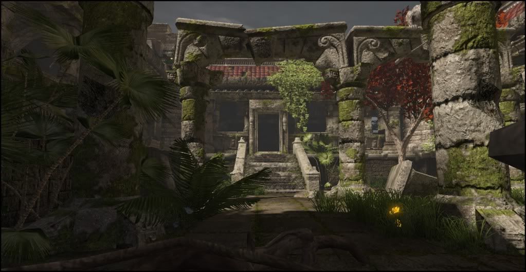
    Edit: the red tree looks pretty good, you might consider just taking the green one out and replacing it with another red one.
  • AstroZombie
    Options
    Offline / Send Message
    AstroZombie polycounter lvl 18
    Look at those nice, ceramic tiles on an "ancient ruins" scene. I guess the decorators that came to update the look of the place never got past the roofs before they ran out of funding, eh? :/

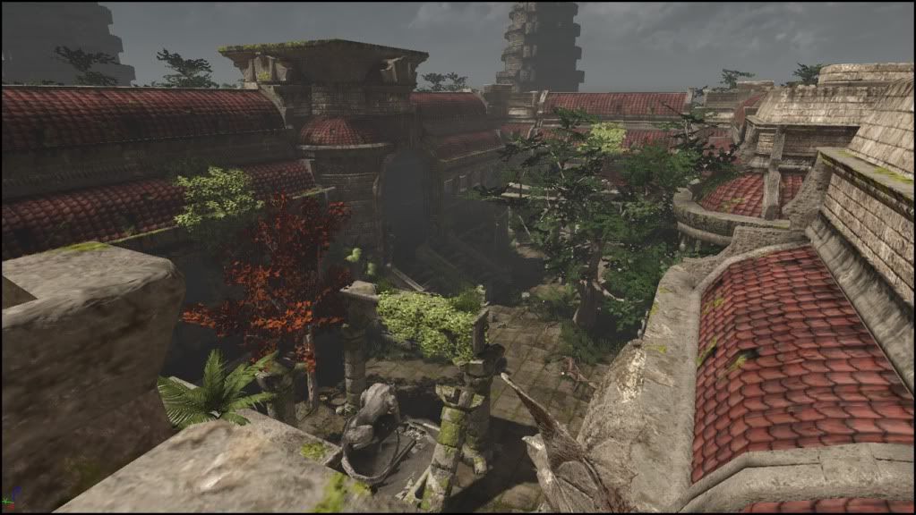
    Seriously, those nice looking roof shingles pretty much throw the entire scene off for me.
  • Daniel Doerksen
    astro zombie, are you saying the roof tiles make it shit or what? you seem to be prancing around insults not critiques either way, say it, dont half ass it. if you refering to the ceramic roofing shingles, they were taking directly from the references of cambodian ruins. im not here to bitch i just want helpful oppinions

    Im gonna work on that tree today and come up with something better, thanks for the input crazyfingers
  • Devin Busha
    Options
    Offline / Send Message
    Great job Daniel! Things are really coming along. I agree with Crazyfingers and am glad you're working well with the feedback. I think it'd be great to spread the color variation through the scene a little more. I don't know why, but I just keep focusing on the bright moss above that statue in the foreground. Then I'm kind of having to force my eyes to look elsewhere in the scene. The next spot I'm lead to is the red tree on the left and just naturally I'm wanting to head back to the tree Crazfingers suggested replacing. Please keep in mind, this is just my opinion. I think I'm probably focusing too much on the overall composition of the piece. I'm sure it'd look entirely different from another angle. Regardless, good luck and keep at it! :)
  • AstroZombie
    Options
    Offline / Send Message
    AstroZombie polycounter lvl 18
    No, I am not saying they make it look shit, I am saying that they look out of place. Can you post the photo-ref you used?
  • Shogun3d
    Options
    Offline / Send Message
    Shogun3d polycounter lvl 12
    The shingles look fine to me and adds a nice color tone to the ruins, there are places though I would suggest breaking up with decals, if not it's no big deal. Simple enough to throw in vines to break up some areas as well.

    Lighting can still be pushed however Daniel, i'm with the crits above. Some very good stuff in this scene!
  • teaandcigarettes
    Options
    Offline / Send Message
    teaandcigarettes polycounter lvl 12
    I'm with Astro; the roof tiles are too nice and clean compared to the rest of the scene. Try to make them slightly darker, blend in some moss texture, or use decals as Kaburan suggested.

    I didn't read the whole thread, so ignore this if someone has already mentioned it. Your sky is underexposed, compared to the rest of your scene. Try to make it brighter and more intense; that should really help it.
  • morganjames
    Options
    Offline / Send Message
    the shingles on the roof are a little bright and some of the vines and plant life doen't appear natural. You have brown fall-like leaves and lush green. The trees also don't all look like they are natural to that environment... you have a south-east asia looking scene with north american trees.

    aside from that it's a great looking scene.
  • Daniel Doerksen
    hey so got some progress on it, tree is still shit, when looking at it i tihnk part of the problem stems from the leaves atm having too similar of color and not enough depth as well as the branches seem to be to noticible that they are planes, a bit harder to see from this shot. anyway increased exposure in the sky rotated it so the clouds helped bring that out. i faded the rooftiles a bit and browned them a bit. i think im going to age them some more yet, and decal vines into the scene like suggested earlier.

    also im strongly considering remaking that pillar you can see left of the image. it sucks, lacks alot of detail, in comparison to the other assets

    preview8k.jpg
  • AstroZombie
    Options
    Offline / Send Message
    AstroZombie polycounter lvl 18
    It looks as if you took down the saturation and possibly weathered those shingles a bit. Either that or the lighting is different(?) Either way, it looks much better to me. Overall this scene is coming together nicely. Keep at it :)
  • PhilipK
    Options
    Offline / Send Message
    PhilipK polycounter lvl 10
    Last shot looks great! As you already said about the tree(s) could use a bit more work. I think the problem with the vegetation overall is that the leaves feel very solid like they wouldn't let any light through them. I think you can definitely create some cool shader effects for that in udk, but as you said it'd also be good with some more brightness and hue variation between the different leaves. Also it'd probably look great to play around with some vertex colors on that tree both on the trunk (making it darker around the top parts) and the leaves (making them darker the closer they are to the trunk) to add further depth.
  • Thewiruz
    Options
    Offline / Send Message
    Thewiruz polycounter lvl 16
    Did you make all the static meshes yourself?

    looks awesome!
  • divi
    Options
    Offline / Send Message
    divi polycounter lvl 12
    tried your luck with translucency for the vegetation yet?
    scene looks so much better now.
  • AstroZombie
    Options
    Offline / Send Message
    AstroZombie polycounter lvl 18
    PhilipK wrote: »
    I think the problem with the vegetation overall is that the leaves feel very solid like they wouldn't let any light through them. I think you can definitely create some cool shader effects for that in udk

    Transmission mask FTW.
  • Nizza_waaarg
    Options
    Offline / Send Message
    Nizza_waaarg polycounter lvl 15
    very cool man. I like how at first glance i thought i was looking at a photo upon opening this thread :P

    the tiles on the roof are buggin me a bit. They seem really flat (to a point where they stood out from the surroundings which were quite nice). Maybe some parralax or somthing could help?

    I like philipK's idea on handling the colour variation on the tree too (darker the closer it gets)... and seconding translucency (transmission idd ftw :P)
  • Daniel Doerksen
    hah yea i was gonna ask that transmission mask for the vegetation, ive been cleaning up the house this morning havent had a good chance to work. im gonna work on getting a better feel from the vegetation and some of the other things that have been mentioned. i tihnk a bump offset might be a very solid solution for the roof, i did desaturate the roof and edit the hue a bit to see if the color would was the problem, and it deffinitly is, so i got lots to do ill post when its i have something to show.

    thewiruz everything in the scene was created by me, cept the sky texture was taken from cgtextures
  • ZacD
    Options
    Offline / Send Message
    ZacD ngon master
    That last update was great, I think the leaves should be translucent, and the drunk needs to be a bit dark, but its looking really great now, I wanna walk around in that scene (in a game of course).
Sign In or Register to comment.