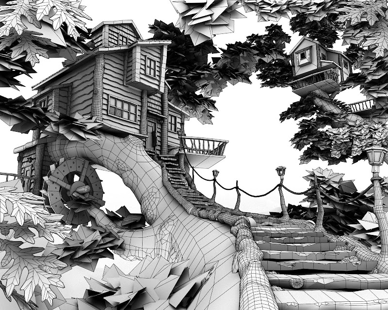
Looks great, but whats up with the wood at the side of the stairs? Way too heavy. I say get rid of it and keep the lamposts, it should still look good. Great normals on the tree.
I'm digging it. I like the style and the flow. Looks awesome.
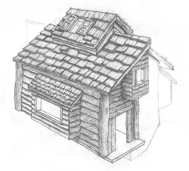
The house seems slightly big imo. That would have to be a helluva strong tree to support what looks to be a normal sized house on it. (3 story tree house? pretty gnarly for a tree) With that said it still is a very interesting scene and I like where it is going. I like the idea behind it. Good effort thus far.
I think some good support structures would be cool. As it stands right now the section of the house on the middle left hand side looks funny just floating there on that tiny branch.
Good compisition. The grey background's really killing it though. Also the any flate color on organics is going to look a little cartoony, you should try to break up your browns and greens by overlaying some other hues into the texture (yellows and reds). The dark brown in general is a little too saturated i think and breaks up your sillhouette too much.
Once you get a little broader color range, flush out the grey, it'll look great .
I wonder why is nobody mentioning the wheel! What it is for, there is no water!?
Overall it looks cool! But what also bugs me is that the main branch is very thick and the branches that get out it are quite thin and too short and there is not much foliage.
Also better present it on a heaven blue background that would make it look lots better.
Should it be game art? That are much too much polys spend in it and they are also very uneven used!
2) The modelled leaves. The leaf planes look great, why bother modelling individual leaves?
I would agree with MartinH about the windmill as well. It would make more sense and allow you to get a bit of colour variation in the scene with some canvas-like sails: http://tk.noblogs.org/gallery/5476/mill_2.png
Looks good man, but there are some crits i have as well.
Theres some poly distribution problems on the large branch that is supporting the house seems to have much more poly's than the smaller branch that forms part of the walkway.
The house supports have way to many poly's in them adding nothing to the form, put the poly's where the camera is in your image.
I think you can remove quite a lot of geometry in your scene without ruining the forms.
This is fantastic, and I love the camera angle you chose! The bright lime green color of the leaves in the foreground is bugging me a little bit, maybe tone it down just slightly?
I'm really diggin all the textures and the really organic feel to the whole thing. Real quick, but why are some of the leaves alpha'd while others are actually modeled out. When I originally looked at the scene I couldnt notice the difference between which ones were models and which were opacity mapped, I think if you opacity mapped more of these you could save a ton of tris and wouldnt loose any of the details.
That being said though, this is still a really great piece and its some very inspirational work
Wow thank you everyone for their very helpful comments.
I am probably going to do all the changes mentioned soon.
Polycount has the best c&c's, thanks again everyone!
I'm really diggin all the textures and the really organic feel to the whole thing. Real quick, but why are some of the leaves alpha'd while others are actually modeled out.
Really like that scene since you don't care too much about the polycount, I would model some mountains for the background instead of having them in the skybox. Some more darker green leaves would also help I think.
You ever thought about making a nighttime version of this scene? I think it would turn out great with all those lamps leading to the building.
I think I would elongate the bark on the limb in the foreground. I know it wouldn't "technically" be correct but the perspective has turned the bark detail into noise. Stretching(faking) it a little in that area would give it back it's bark feel.


Replies
The house seems slightly big imo. That would have to be a helluva strong tree to support what looks to be a normal sized house on it. (3 story tree house? pretty gnarly for a tree) With that said it still is a very interesting scene and I like where it is going. I like the idea behind it. Good effort thus far.
Once you get a little broader color range, flush out the grey, it'll look great
Overall it looks cool! But what also bugs me is that the main branch is very thick and the branches that get out it are quite thin and too short and there is not much foliage.
Also better present it on a heaven blue background that would make it look lots better.
Should it be game art? That are much too much polys spend in it and they are also very uneven used!
1) The lamps. The metallic look just doesn't fit the scene for me. Why not go with something more natural looking, for example: http://images01.olx.com.ph/ui/1/38/60/8293860_1.jpg
2) The modelled leaves. The leaf planes look great, why bother modelling individual leaves?
I would agree with MartinH about the windmill as well. It would make more sense and allow you to get a bit of colour variation in the scene with some canvas-like sails: http://tk.noblogs.org/gallery/5476/mill_2.png
Theres some poly distribution problems on the large branch that is supporting the house seems to have much more poly's than the smaller branch that forms part of the walkway.
The house supports have way to many poly's in them adding nothing to the form, put the poly's where the camera is in your image.
I think you can remove quite a lot of geometry in your scene without ruining the forms.
There's way too much moss on that tree! looks like it was dragged up from under a swamp!
Hang on, it that moss, or ivy?
looks sweet dude!
Is it for a pre-rendered adventure game sort of background?
That being said though, this is still a really great piece and its some very inspirational work
I am probably going to do all the changes mentioned soon.
Polycount has the best c&c's, thanks again everyone!
I've tweaked the color of the leaves. Do they look more natural?
Same here! What's up with the modelled leaves?
You ever thought about making a nighttime version of this scene? I think it would turn out great with all those lamps leading to the building.
I think I would elongate the bark on the limb in the foreground. I know it wouldn't "technically" be correct but the perspective has turned the bark detail into noise. Stretching(faking) it a little in that area would give it back it's bark feel.
- BoBo