The BRAWL² Tournament Challenge has been announced!
It starts May 12, and ends Oct 17. Let's see what you got!
https://polycount.com/discussion/237047/the-brawl²-tournament
It starts May 12, and ends Oct 17. Let's see what you got!
https://polycount.com/discussion/237047/the-brawl²-tournament
PC-CSGO | MP9 - Starfighter (WIP)
Hey guys,
So when this contest showed up on my in-game news feed I had to jump on it! Might as well just get straight to it then:
......this may take a bit.
Inspiration:
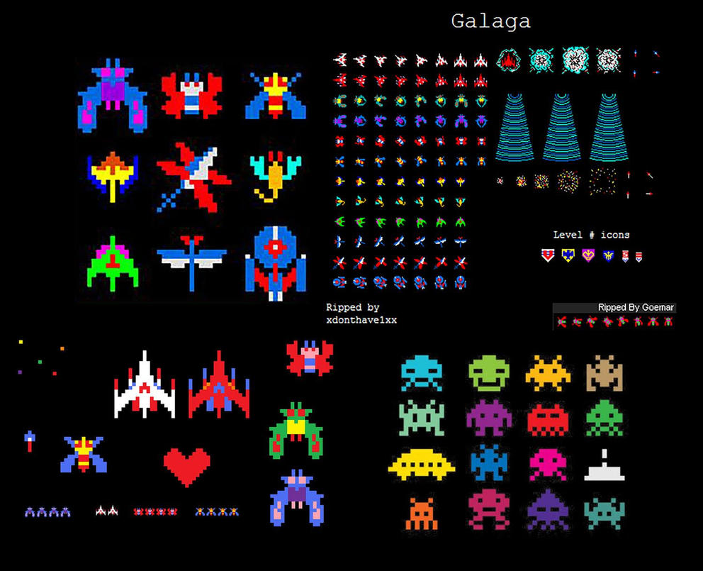
I decided to go with some retro 8-bit arcade games! Galaga was always one of my favorites when I was little (thanks, parents) so when I saw the theme for this contest I went straight to it and Space Invaders. Because the enemy ships in Galaga are "bugs" that's where I decided to pull inspiration for my own design.
The Art:
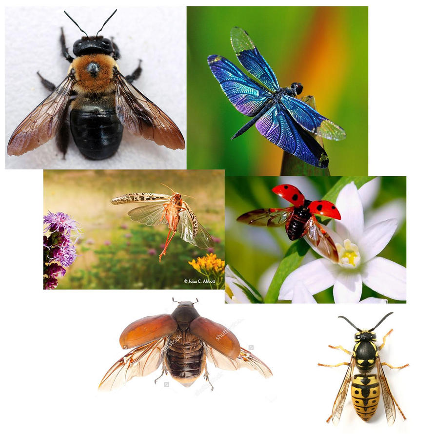
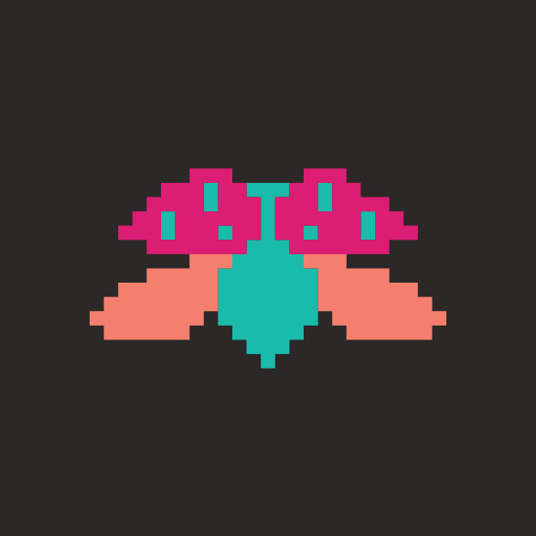
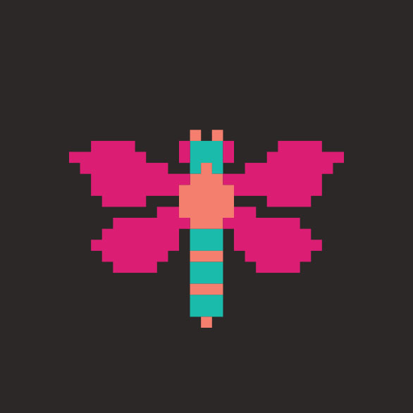
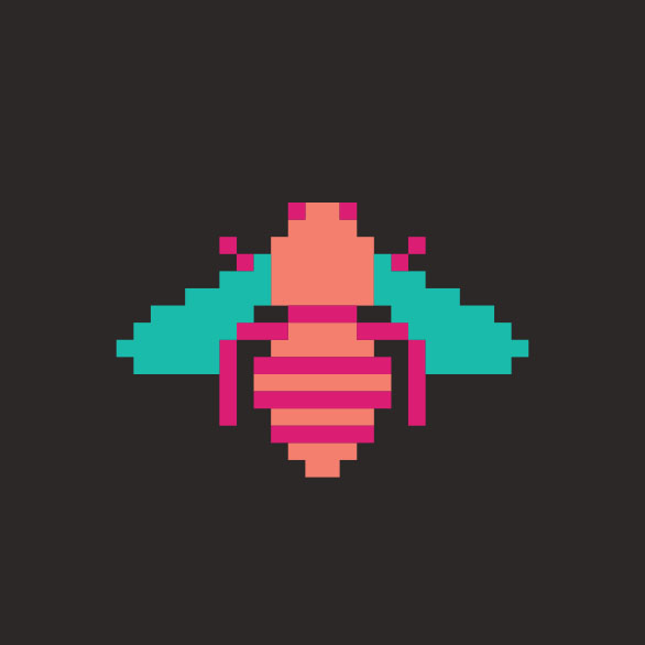
I decided to maintain the retro look and go with pixel art for my design - to give it that "sprite" look. I chose 3 bugs (a ladybug, dragonfly, and bee) and then based my starfighter on a NASA shuttle. I also picked a particular color scheme to go with:


Composition:
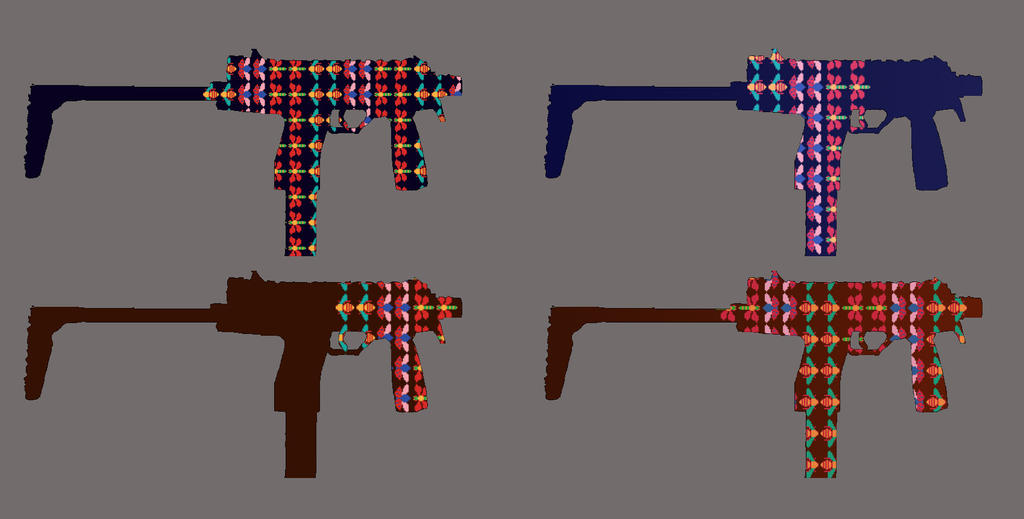
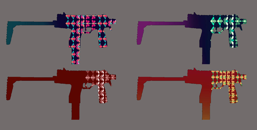
Here I am just playing with some colors and positions before getting to the actual model:
The Gun:
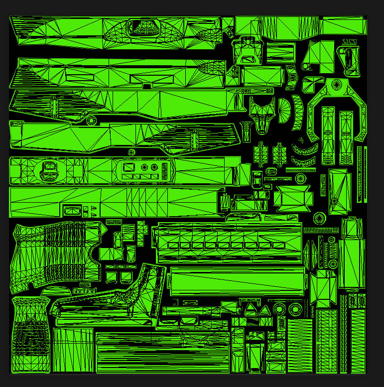
Since I'm a scrub and don't have any training with 3D modeling (2D artist here), I'm not able to use any of the pretty softwares like Blender, 3DMax, Maya, Cinema 4D, or whatever it is you crazy kids are using these days. Luckily, when I first got into making skins I discovered a guy with files made for Photoshop! So, as clunky and limiting as it may be, I can accomplish what I want without being a skilled modeler. First, I have to map out the UV sheet so I know where everything goes. Then it was a matter of putting everything in the right place:
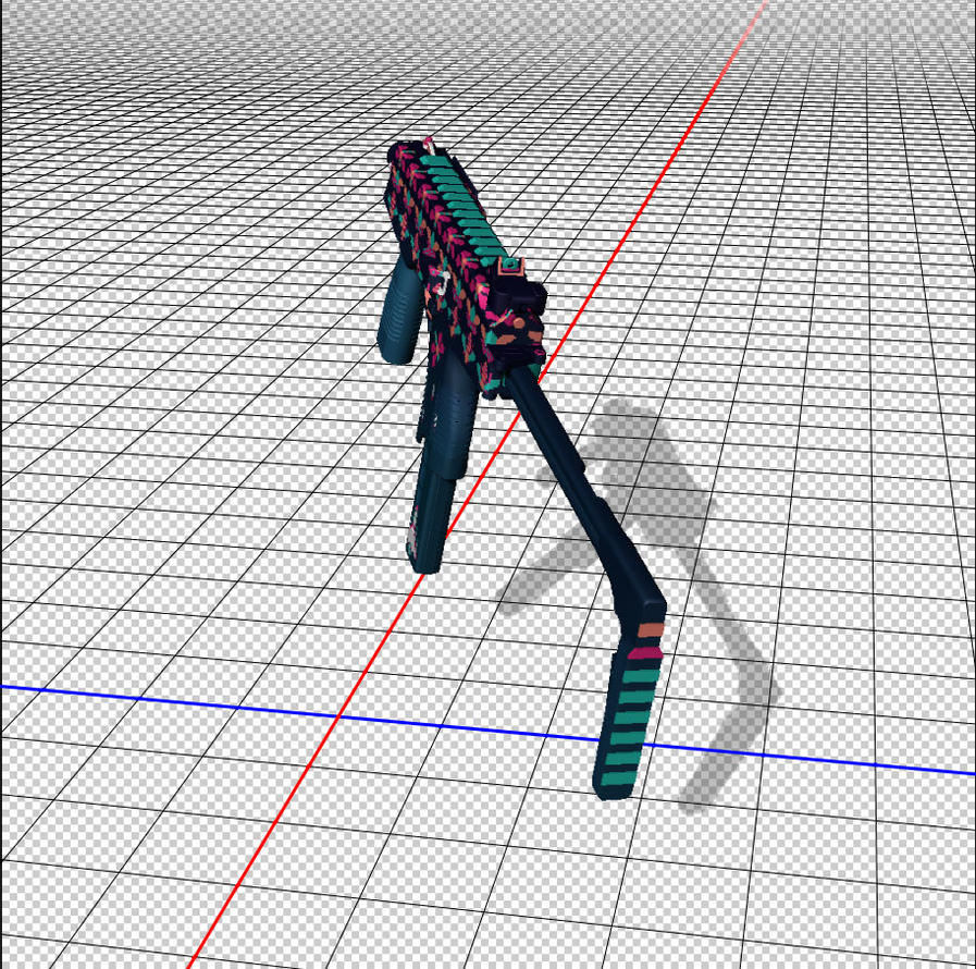
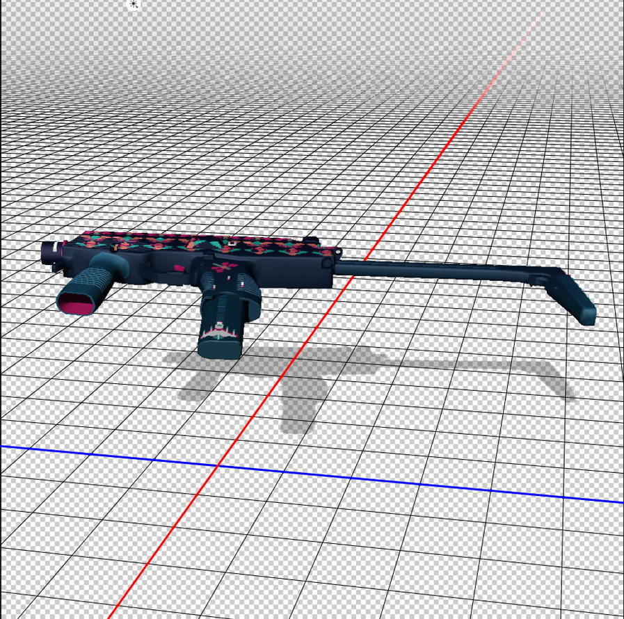
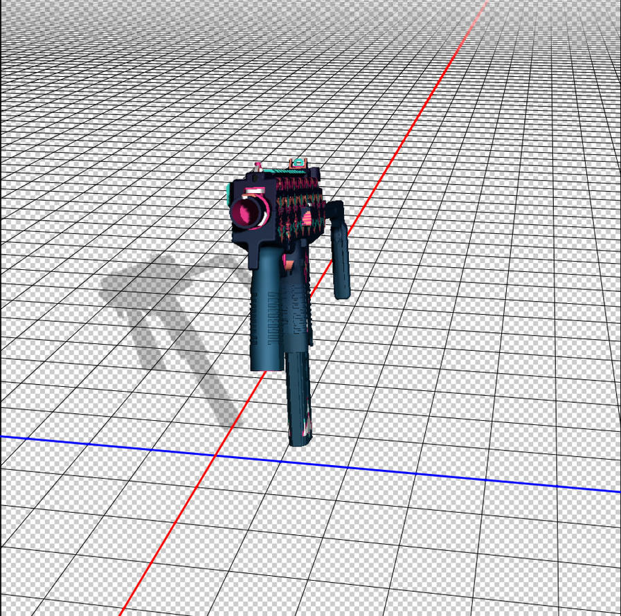
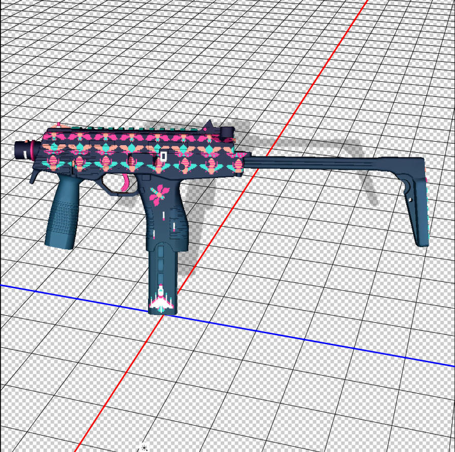
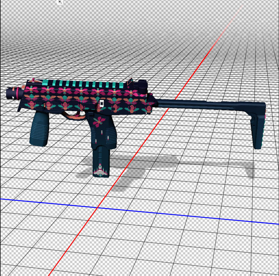
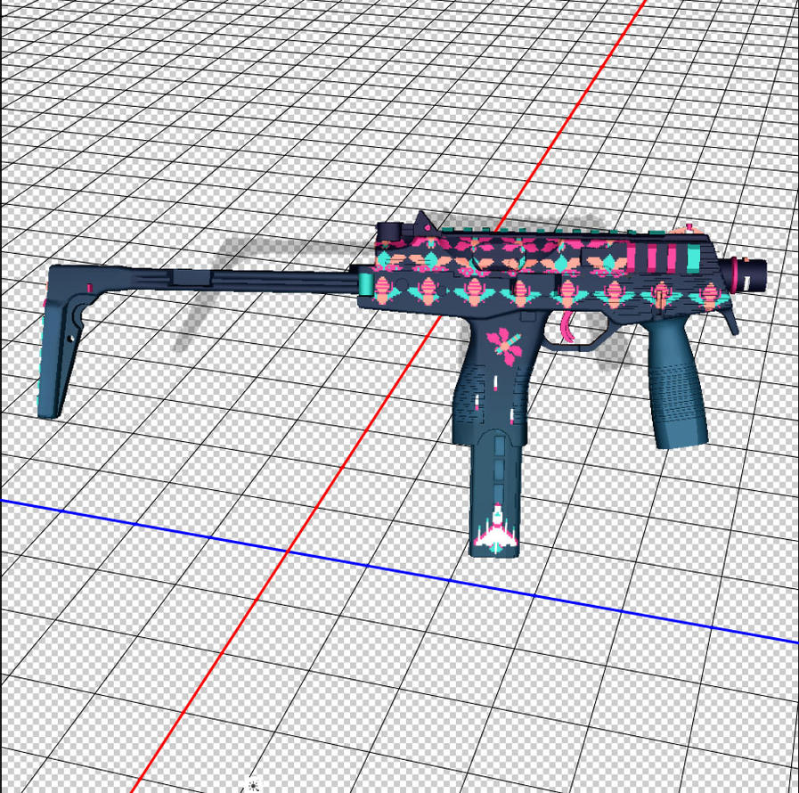
So yeah! This is where I am now. Not quite happy with it just yet...want to make a few adjustments and trying to figure out what I can do do that front handle and the front sides near the muzzle to make them more interesting. I'd totally love to hear what you guys have to say about this - constructive criticism is greatly appreciated!
Again, I'm new to this whole process and working in photoshop and illustrator only. So keep things in laymans for me while I learn the ropes
This is my 3rd CS skin and 1st MP9 (my others are an AWP and Negev on the Steam Workshop).
Cheers!
CT
So when this contest showed up on my in-game news feed I had to jump on it! Might as well just get straight to it then:
......this may take a bit.
Inspiration:
I decided to go with some retro 8-bit arcade games! Galaga was always one of my favorites when I was little (thanks, parents) so when I saw the theme for this contest I went straight to it and Space Invaders. Because the enemy ships in Galaga are "bugs" that's where I decided to pull inspiration for my own design.


The Art:
I decided to maintain the retro look and go with pixel art for my design - to give it that "sprite" look. I chose 3 bugs (a ladybug, dragonfly, and bee) and then based my starfighter on a NASA shuttle. I also picked a particular color scheme to go with:


Composition:
Here I am just playing with some colors and positions before getting to the actual model:


The Gun:
Since I'm a scrub and don't have any training with 3D modeling (2D artist here), I'm not able to use any of the pretty softwares like Blender, 3DMax, Maya, Cinema 4D, or whatever it is you crazy kids are using these days. Luckily, when I first got into making skins I discovered a guy with files made for Photoshop! So, as clunky and limiting as it may be, I can accomplish what I want without being a skilled modeler. First, I have to map out the UV sheet so I know where everything goes. Then it was a matter of putting everything in the right place:


So yeah! This is where I am now. Not quite happy with it just yet...want to make a few adjustments and trying to figure out what I can do do that front handle and the front sides near the muzzle to make them more interesting. I'd totally love to hear what you guys have to say about this - constructive criticism is greatly appreciated!
Again, I'm new to this whole process and working in photoshop and illustrator only. So keep things in laymans for me while I learn the ropes
This is my 3rd CS skin and 1st MP9 (my others are an AWP and Negev on the Steam Workshop).
Cheers!
CT

Replies
I decided to play with my design a little bit. I worked on the placement of my bug pattern and then worked on some details to bring it together. I'm pretty happy with it now but open to any thoughts you guys might have
Here's a progress shot where I was playing with placement and how the color gradates over the gun:
I'm still not sold on "Starfighter" as the name....maybe I'll think of something better before upload haha
Here's the UV Sheet:
It's also up on the workshop. You can find it here.
here are the UV and Pattern Sheets: