The BRAWL² Tournament Challenge has been announced!
It starts May 12, and ends Sept 12. Let's see what you got!
https://polycount.com/discussion/237047/the-brawl²-tournament
It starts May 12, and ends Sept 12. Let's see what you got!
https://polycount.com/discussion/237047/the-brawl²-tournament
Mesoamerican Environment
Hey all,
LATEST;

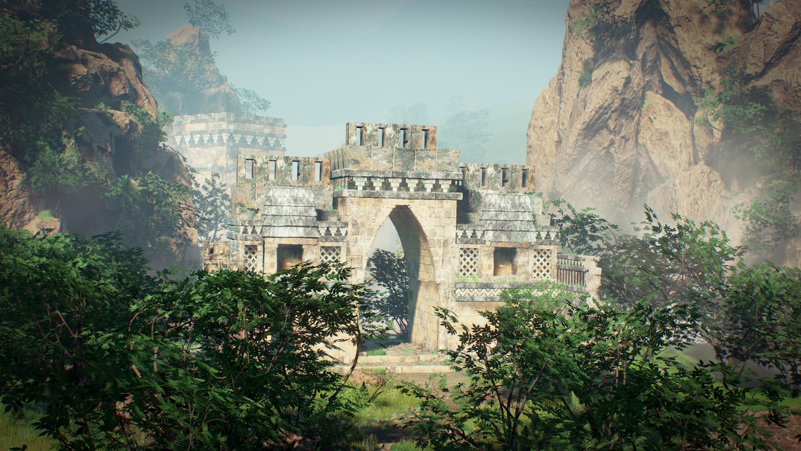
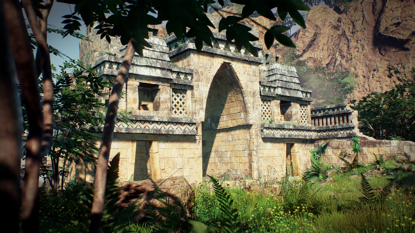
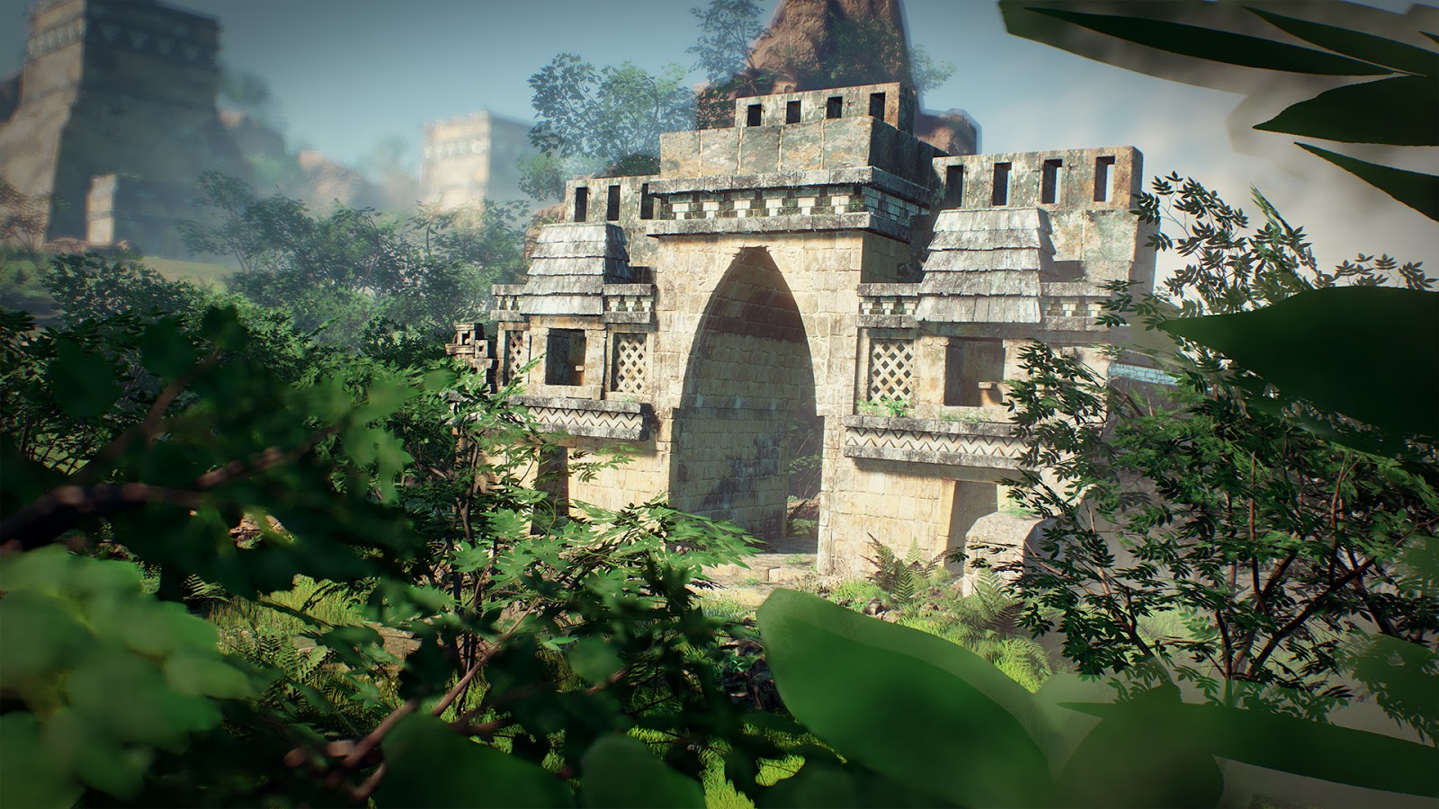

So I am committing to uploading this on to the forum as I am now in a position to show some stuff.
I have photo bashed a few concepts to get me in the mood of the 3d side of things which can be seen below;
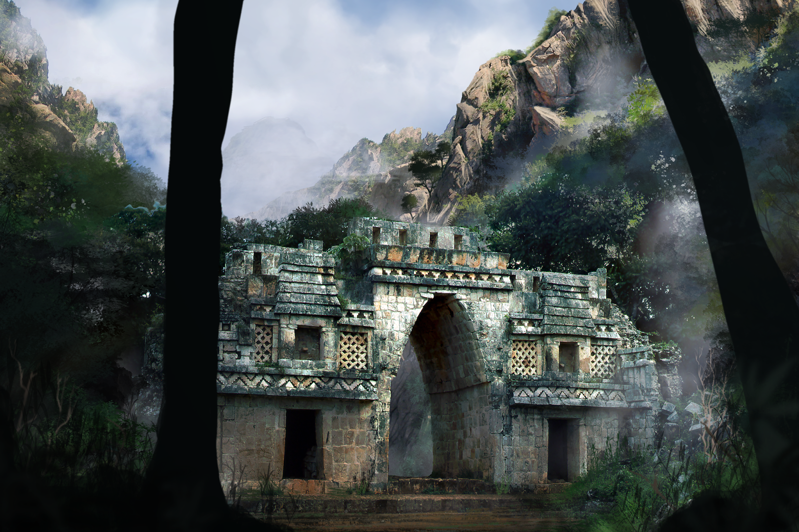
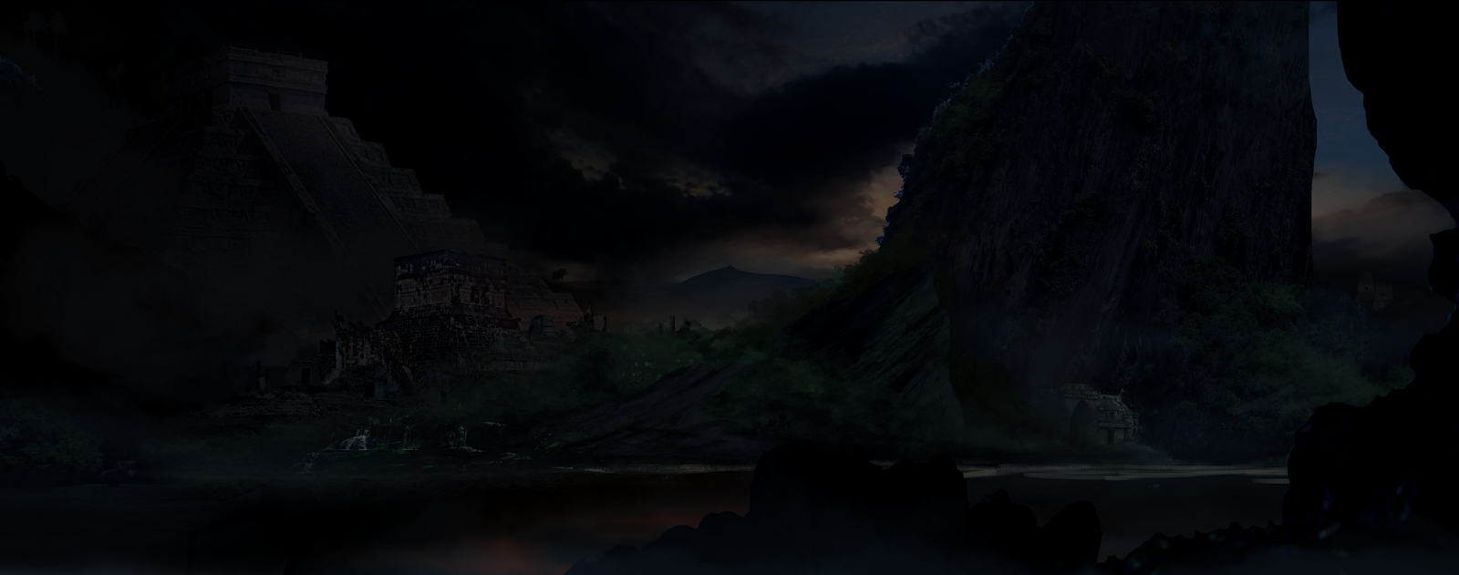

From these I decided to focus on the arch concept and have created blockout of this arch using other references of this arch to understand some of the details that are in the piece.

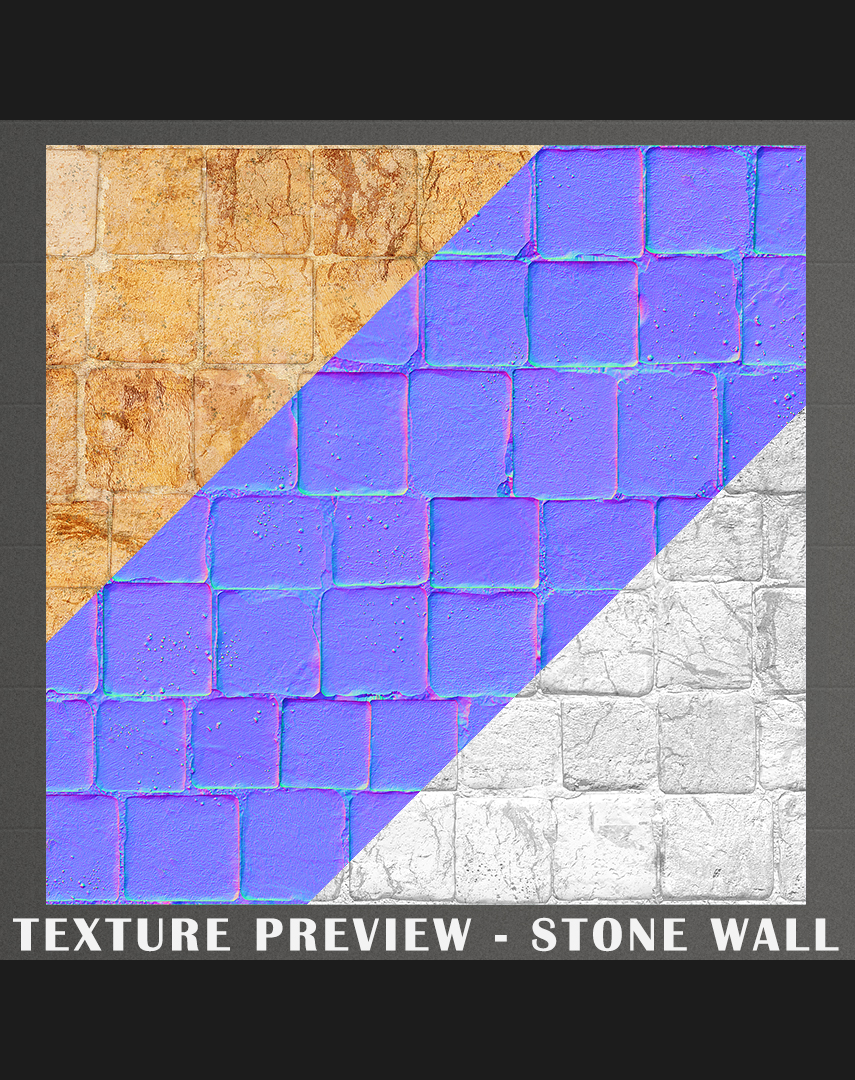
Have also played a bit in zbrush, have watched a few tutorials and created some of my own alphas too below is my texture preview and setup a unreal preview so that I can quickly assess the materials I create.

Let me know what you guys think so far of everything. I don't get much time to create this with my full time job and other commitments, but will update it as much as possible and respond when I can
LATEST;


So I am committing to uploading this on to the forum as I am now in a position to show some stuff.
I have photo bashed a few concepts to get me in the mood of the 3d side of things which can be seen below;


From these I decided to focus on the arch concept and have created blockout of this arch using other references of this arch to understand some of the details that are in the piece.

Have also played a bit in zbrush, have watched a few tutorials and created some of my own alphas too


Let me know what you guys think so far of everything. I don't get much time to create this with my full time job and other commitments, but will update it as much as possible and respond when I can
Replies
Have worked on a few things with this regarding the blockout and some other areas of the piece, but for now I just want to show an update to the earlier texture... IT BLENDZ!
I feel the almost black texture is a bit too much and might tone that down and I feel the light needs a tad bit of colour variation in it.
Here's a pic showing the blending.
Not much of an update here, I hope to have some more stuff added soon. So here is what I am thinking at the moment for the blending on the arch. On some of the hard edges I am going to add some meshes to allow for a more unique texture and look. Rather than use this texture everywhere, I have also added more bricks than the reference shots I feel this works better, but might come back to this later on.
So, have a bit of an update on this... Getting through some textures and adding some details were possible... I'm reworking some old textures and after watching some uncharted and tomb raider videos I think I will rework some areas, for example the crosses I am thinking of doing that as actual geometry and so on... Will try and get some zbrush renders on here soon of some of the pieces.
I plugged an ao map in for that window piece and it looks really dark, has anyone played with the ao settings and if they put them into their materials might be correct but it is a bit attention grabbing I feel. Ohhh and I have some bad stretching in the uv's that I am aware of
I hope you finish this. Is this going to be ingame or a render ?
Have been looking at a few tutorials and made a starter/base of the landscape using world machine.
Have also had a bit of time working on some textures and assets for this. The arch is getting there still a lot of wonky uv's and placeholder textures, I just felt like having a little break from it and trying to get some of the surroundings worked on a bit. I might start trying to do foliage for the piece (grass) as I am unfamiliar with doing this and will be something else I can learn
Thanks for stopping by...
The past week or so i have been looking into foliage and taking inspiration from the Redwood project by Fozworth, so far i have created a basic grass and some ground leaves.
Apart from this i have been tweaking a few of the textures on the arch as well, so that they are a bit more consistent with one another.
Still getting through this adding some new foliage that i will prob go over this again at some point to clean it up make them better
Thanks!
Still going at this in my lunch breaks, not too much to show. I followed another great tutorial on rocks, i have just created one and duplicated it a couple of times i plan on doing a few different ones especially for the background cliff that i am going to do at some point.
Hope you like;
Unreal
3dsMax
Zbrush
But i think the scene is coming along a lot better than it was a month ago. I have also been playing around with post processing in unreal which is so awesome
Next up will be some rock clusters one of random scattered rocks the other a selection of rocks clumped around each other. Once i have done that i will get back on to the building and finish that off as i still have some awful uv's on it.
Hope you like the improvements.
Just for fun (DOF)
I just wish you made the scene a bit more believable. I can immediately tell it's just one building in the middle of nowhere. You could put some hints in there that the scene is actually bigger than it really is.
Rocks and foliage are awesome btw.!
But i am glad you like foliage, its interesting to try and recreate something that in real life can be quite delicate
I have also created a few rock piles to scatter through.
Learnt a lot from this project and aim to take this knowledge onto my next project.
Final images below.