The BRAWL² Tournament Challenge has been announced!
It starts May 12, and ends Oct 17. Let's see what you got!
https://polycount.com/discussion/237047/the-brawl²-tournament
It starts May 12, and ends Oct 17. Let's see what you got!
https://polycount.com/discussion/237047/the-brawl²-tournament
The Fixomancer - Steampunk Shufflin'
Well ladies and gents, I guess it's about time I stopped lurking and started posting. So...TA-DAAAH! My first character/post up on Polycount!
Yay!
Finished this lovely lady, the Fixomancer, the other day so I thought I'd show you awesome folk. She began her life as a prototype model for a doomed Unity game, but she was way too cute to scrap. Saved her from the trash and recycled her into a diffuse-only experiment with a nod towards Gearbox Studios' awesome Borderlands franchise and Telltale's recent endeavors. Enjoy!
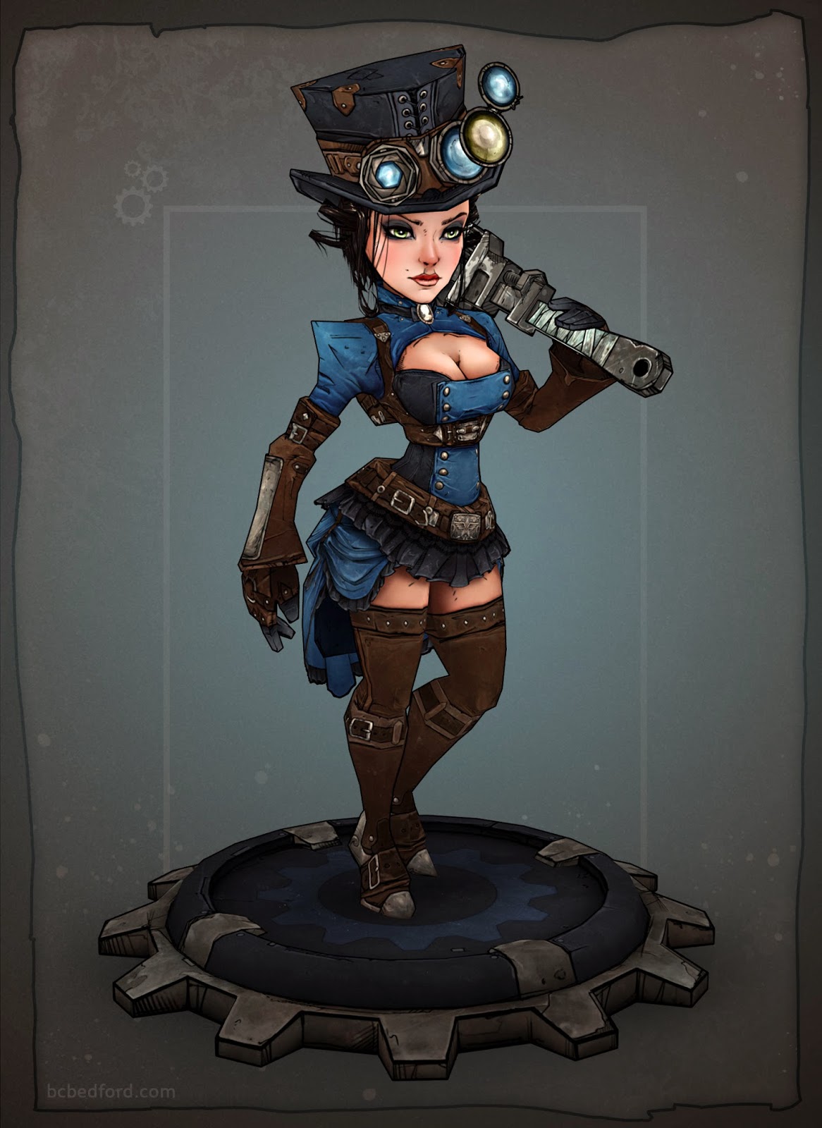
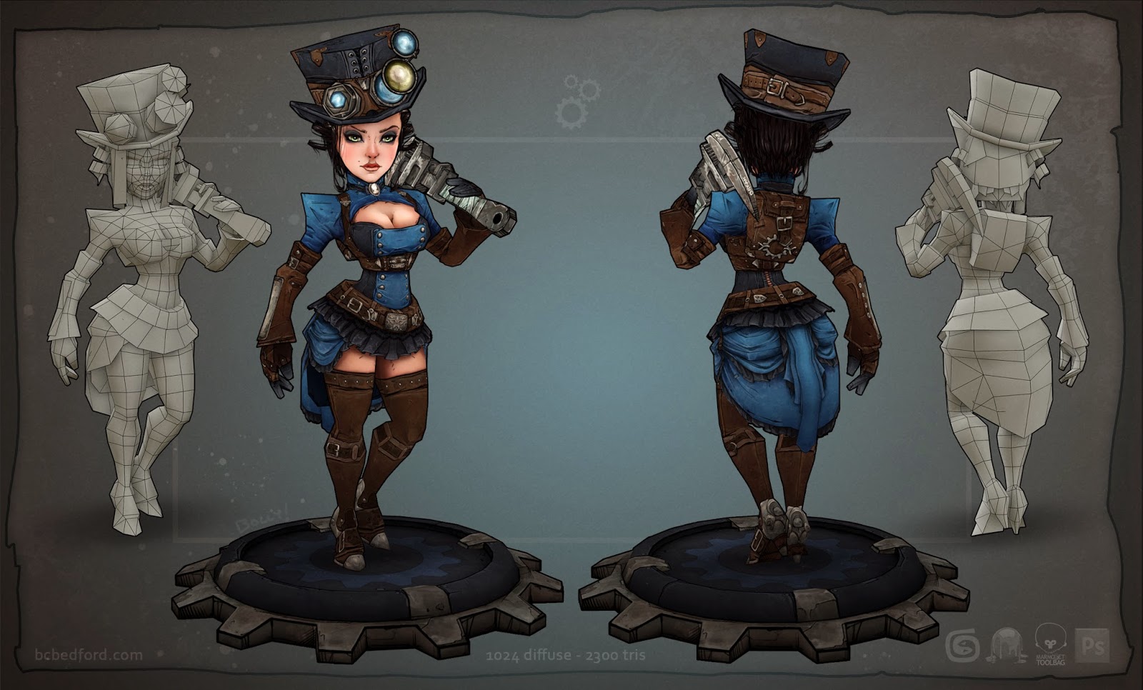
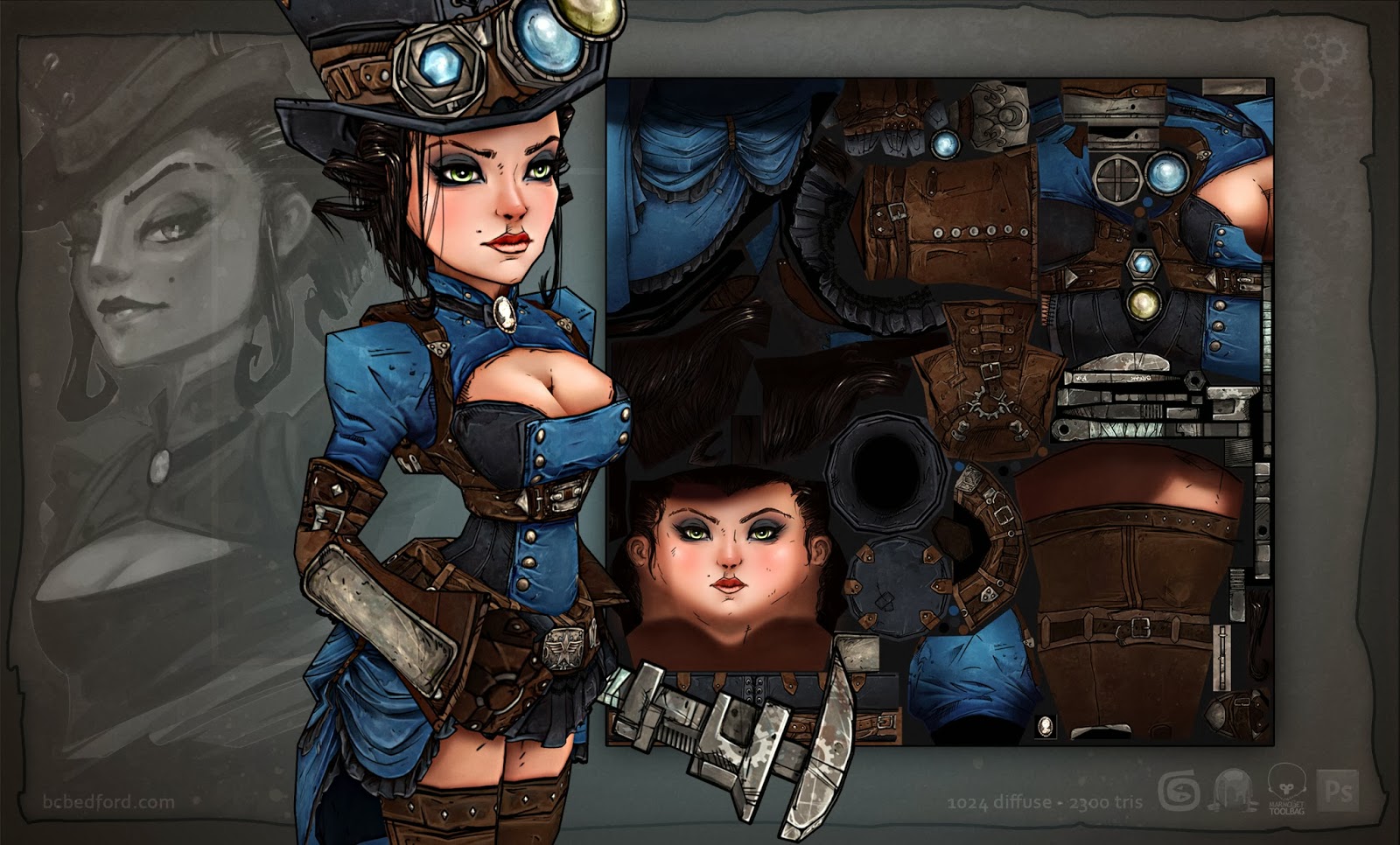
Critique is of course always welcome, but I shall apply feedback to future projects. Always keep moving forward, right?
Anywho, I'm slowly transitioning back into 3D these past few months while I look for a new position. Backstory-cut-short, I was hired as a 3D artist at a start-up indie right out of school...and then ended up doing effectively ZERO modeling for two years while there. Indie development, amiright? 3D skills atrophied a bit and I have a lot of technical knowledge to tackle if I want to even THINK about doing character art (lol how do ZBrush?), but I'm excited and up for the challenge.
Yay!
Finished this lovely lady, the Fixomancer, the other day so I thought I'd show you awesome folk. She began her life as a prototype model for a doomed Unity game, but she was way too cute to scrap. Saved her from the trash and recycled her into a diffuse-only experiment with a nod towards Gearbox Studios' awesome Borderlands franchise and Telltale's recent endeavors. Enjoy!


Critique is of course always welcome, but I shall apply feedback to future projects. Always keep moving forward, right?
Anywho, I'm slowly transitioning back into 3D these past few months while I look for a new position. Backstory-cut-short, I was hired as a 3D artist at a start-up indie right out of school...and then ended up doing effectively ZERO modeling for two years while there. Indie development, amiright? 3D skills atrophied a bit and I have a lot of technical knowledge to tackle if I want to even THINK about doing character art (lol how do ZBrush?), but I'm excited and up for the challenge.

Replies
Torch: I definitely love the style - very illustrative and a neat way to rethink "hand-painted" textures. It's also just cries out to be used in a Steampunk-esque setting.
Was able to get her uploaded to Sketchfab too, but she's having some wacky alpha sorting issues on her hair with whatever engine they're using to render. Looks to be a pretty common problem with Sketchfab models, but I'll definitely be reconsidering use of alphas in the future.
Any ideas on how to improve the alpha performance? I'm thinking...separating the alpha'd materials even further as right now they're just multiple objects with the opaque and alpha'd polys assigned two different materials.
[SKETCHFAB]53a019613abb4b049e4119ada723b46d[/SKETCHFAB]
Awesome model, you've nailed that Borderlands style!
As for transparancy on Sketchfab there's a blog post on how it works:
http://blog.sketchfab.com/post/57726641144/how-to-deal-with-transparency-on-sketchfab
I think you need to have each part with opacity on separate material channels. Pain in the ass, but I didn't notice the alpha weirdness until I zoomed in on the hair.
Oh man, I was so relieved when I found that post the other day. She used to look AWFUL when I first uploaded her (a process I was also figuring out at the same time). But I ended up getting that "Congrats on your first model..." e-mail 13 times from Sketchfab because I kept deleting the upload. lol
I think you're absolutely right though, might just have to split off all that hair into their own mats. Hooray for corroboration!
Given the way sorting works on sketchfab, it works much better on objects that are just flat planes, rather than objects that are curved.
She's such a beauty! I really love her shapes, the only thing that disturbes me a little is the area under her nose. I don't like the lines there...
I guess they might be a little over the top, at least for my taste.
But it's an awesome model!
Fenyce: Ha ha, I went back and forth half a dozen times on the facial lines. It's definitely a tough call on female characters in that style. You can see in one of my reference layouts, Maya from Borderlands sports a central line so its less prominent, but she also has normals to help define the facial features. If I do another character in this style though, I'ts gonna be male...so I can put lines on ALL THE THINGS!
Alemja: Oh man, thank you for that feedback! You're the first person to point out that discrepancy to me and I think you're spot on. I think I originally intended that plate to just add a little asymmetry to one side, but keep it as an area of visual "rest". HOWEVER...looking at it now, I think her left sleeve does that fine, so I could have easily gone back and plused up that piece.
....I know I said I was moving forward, but that might be a neat change to go back and fix.
Ha ha ha! You should definitely do another character! That stlye is gorgeous. Nice ref sheet btw. And I still think the line is a little hard, even on Maya, but it might be due to personal preferences.
I'm...still a bit new to serious posting, but if I'm working on a new project, should I make a new thread in the P'n'P section or the Digital Sketchbooks? I'm a little confused because it seems like some people do both. X)
Great work, I love it!
Now make a game.
I'd say post a new thread here in PnP, but I think you're right haha seems tons of people do either/or
Snader: Inoright?! I should get right on that. lol
But seriously though, after working at a start-up that basically imploded in on itself, you'd think I'd want to avoid indie work for a while, but honestly I'd be more excited than ever to start my own studio in a heartbeat if I could. Makin' games yo!
no critique whatsoever,
there only seems to be a little bug in the sketchfab model,
from one side the skirt looks transparent, but you probably already saw that,
and man, if you would make a game with this quality art I would buy it just to look at it so I would say go for it!