The BRAWL² Tournament Challenge has been announced!
It starts May 12, and ends Sept 12. Let's see what you got!
https://polycount.com/discussion/237047/the-brawl²-tournament
It starts May 12, and ends Sept 12. Let's see what you got!
https://polycount.com/discussion/237047/the-brawl²-tournament


Replies
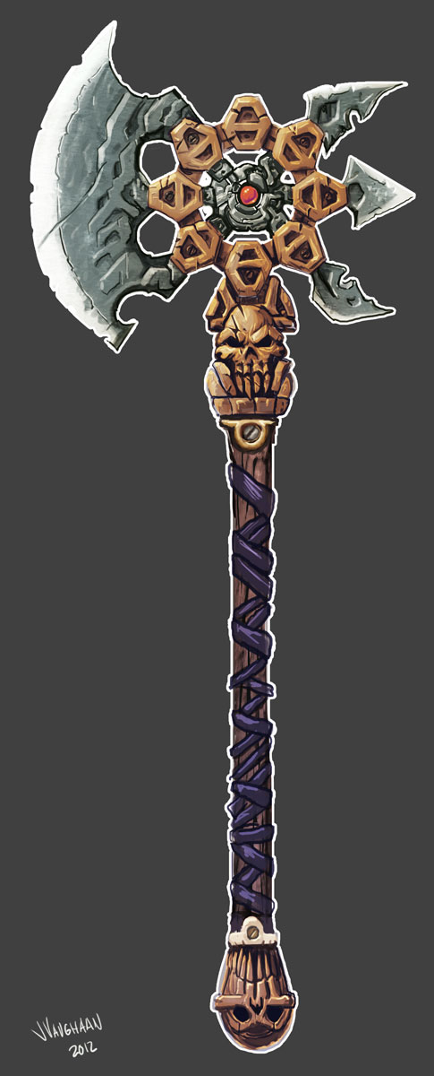
This was my first pass at the axe. I am pretty certain that the newer design is a significant improvement.
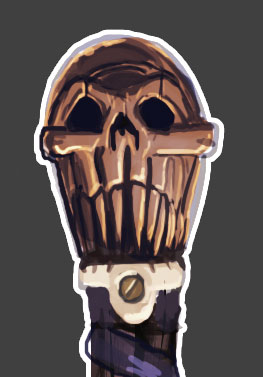
So I took the main pommel skull a little further:
and massaged the handle up a little more:
So time to model, I'm feeling good about this.
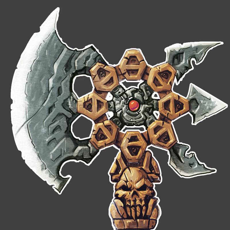
After I put this together I made a couple of small tweaks to the Axe Head linkage, and fleshed out. I spent a lot of time get nice clean quads together so one I take it into zbrush I know I can get really nice smoothing. I think it will help come time to texture it too. It's going to be tricky to get all of the optimizations in for the texture map, but with 512's being the max size it's going to be crucial for the overall look.
Hope you like em, any comments or thoughts would help! Thanks.