Creating First UDK environment - The trainyard
Hi guys,
So ive been floating around on these forums for a little while now and I wouldnt use the word embarrased however I have been very reluctant to post my work here because frankly it is so amateur and basic compared to what ive seen here... however I realise to improve I need good constructive crit from people that know what they are talking about (you guys!):)
I am looking to create a portion of an open world environment in UDK. The area i am focusing on is a trainyard... I already have initial designs and a mock up I did last year in my 2nd year however I have learnt alot since then and hoping to really create the world I envisioned.
The trainyard is leading to a central transport hub (in the shape of a giant pyramid) The world is post apocolyptic due to a weakening atmosphere and a series of solar events. The remaining populace live within the slums of this trainyard as a slave working force under a dystopian dictatorship.
[ame=" http://www.youtube.com/watch?v=2DKB7ZlZk0k"]PREVIOUSLY...[/ame]
The above link shows how limited my understanding of games creation was last year and this does not justify the vision I had... (A trailer I made for my assessment)
A few quick concept ideas and rough paintings to try and develop the kind of atmosphere and mood I want to bring into this world.

A quick painting done of the motorway leading to the Heart of the hub (The pyramid) The browns convey a really polluted atmospheric setting which is relevant to the type of mood I am trying to create however its not quite there yet as it doesnt convey the horrors of the disaster.

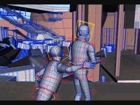
This painting was done using a very very quick Maya mock up, a spot light to create tone and then the screenshot imported into photoshop with digital painting over the top. I like the tension and mood in the environment as well as the sharp contrasts between hot and cold. I can imagine this world being very hot and stuffy with toxic air and very unstable weather.

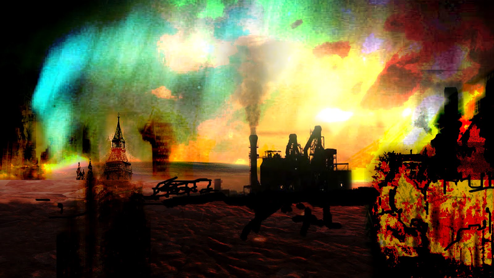
This is not really a concept of the city, rather just loads of resource images compiled in photoshop as I wanted to experiment with the use of Northern lights in the sky to see how they would fit into the contrast of the world.
This link will take you to my blogpost from last year showing all the top down layouts and the different layers as I want this to be a very layered environment working from sub-underground tunnels right up to the motorways above.
LEVEL DESIGN LAYOUT - PREVIOUS

All the layers on 1 image.
As I said I am still in very early concept and design stages yet and not had any real experience of putting together something like this in a game engine so your guidance and wisdom would be greatly appreciated! (Also I kno the work from last year is shocking)
Thanks guys... look forward to your views and comments :poly136:
So ive been floating around on these forums for a little while now and I wouldnt use the word embarrased however I have been very reluctant to post my work here because frankly it is so amateur and basic compared to what ive seen here... however I realise to improve I need good constructive crit from people that know what they are talking about (you guys!):)
I am looking to create a portion of an open world environment in UDK. The area i am focusing on is a trainyard... I already have initial designs and a mock up I did last year in my 2nd year however I have learnt alot since then and hoping to really create the world I envisioned.
The trainyard is leading to a central transport hub (in the shape of a giant pyramid) The world is post apocolyptic due to a weakening atmosphere and a series of solar events. The remaining populace live within the slums of this trainyard as a slave working force under a dystopian dictatorship.
[ame="
 http://www.youtube.com/watch?v=2DKB7ZlZk0k"]PREVIOUSLY...[/ame]
The above link shows how limited my understanding of games creation was last year and this does not justify the vision I had... (A trailer I made for my assessment)
A few quick concept ideas and rough paintings to try and develop the kind of atmosphere and mood I want to bring into this world.

A quick painting done of the motorway leading to the Heart of the hub (The pyramid) The browns convey a really polluted atmospheric setting which is relevant to the type of mood I am trying to create however its not quite there yet as it doesnt convey the horrors of the disaster.

This painting was done using a very very quick Maya mock up, a spot light to create tone and then the screenshot imported into photoshop with digital painting over the top. I like the tension and mood in the environment as well as the sharp contrasts between hot and cold. I can imagine this world being very hot and stuffy with toxic air and very unstable weather.

This is not really a concept of the city, rather just loads of resource images compiled in photoshop as I wanted to experiment with the use of Northern lights in the sky to see how they would fit into the contrast of the world.
This link will take you to my blogpost from last year showing all the top down layouts and the different layers as I want this to be a very layered environment working from sub-underground tunnels right up to the motorways above.
LEVEL DESIGN LAYOUT - PREVIOUS

All the layers on 1 image.
As I said I am still in very early concept and design stages yet and not had any real experience of putting together something like this in a game engine so your guidance and wisdom would be greatly appreciated! (Also I kno the work from last year is shocking)
Thanks guys... look forward to your views and comments :poly136:
Replies
Another layout drawing
some reference collated along my various journeys and experiences
Photo Reference moodboard
The youtube vid was pretty neat...animation wasn't the best but it doesn't seem like thats your focus.
Like the other guys said...that is wayyyy to big. I think the trainyard itself would be a great environment enclosed by itself. Maybe just start with that.
I end up mostly applying it to my work... what you want to do, take a third of it off, what you have time to do, take another third off, and the third your left with is your project. Which to be honest does fall under the enclosed trainyard category. Try and be as modular as possible that short animation demonstrated, that maybe you cant animate, and maybe you cant texture (as there wasnt any) but you definately have an artistic eye for composition, that and passion gets you really far.
Get some work done, get it in Unreal and lets see some progress
http://www.youtube.com/watch?v=q7AWhr8U0JQ&feature=youtu.be
http://www.youtube.com/watch?v=blgXH_0Ok6o&feature=youtu.be
I'm pretty sure that isn't what rule of thirds means. Rule of thirds deals with composition.
Dark_JediBains: Looks like you got a start there, but be very mindful of your scale. I'm not sure what the structure above the players perspective is supposed to be...looks like a highway bridge maybe?? Either way...its really high up there. Overall the scale looks like it might be too large.
Make sure you are judging scale based on the correct size of a character in UDK.
Also a quick update.. dont have time to do any UDK stuff today so I did a very quick paintover of a cargo container which will serve as the main building blocks of the trainyard slums
Well you sir are correct the rule of thirds is definitely about the composition of a scene/piece, its usually used to discourage the artist from placing the focus of interest in the center of the piece using grid lines.
I was more or less ripping it off for the lack of a phrase of dividing ambition into thirds.