warehaus - UDK
well i'm gonna make this environment to learn some fancy shader and sculpting stuff mostly. hopefully you will all give me tons of your sweet tricks and workflow tips along the way. feel free to throw hard crits at it along the way, I want to make the best of this.
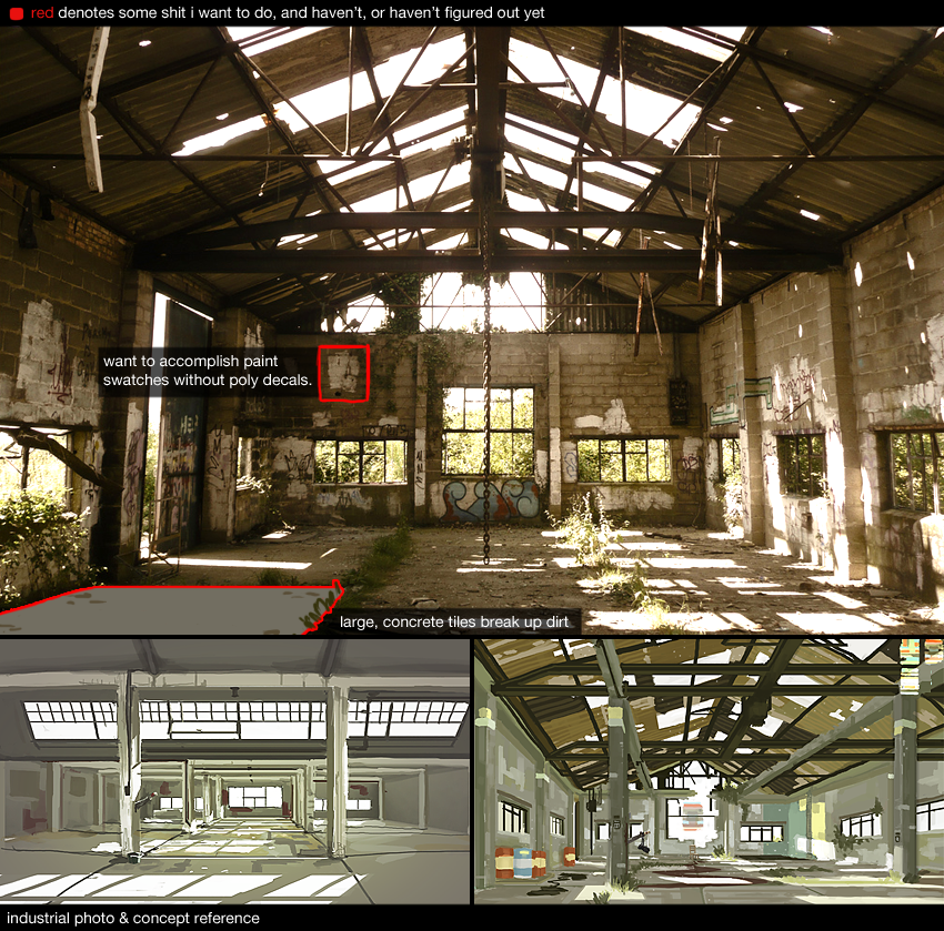
here's the primary reference photo I'm basing this off, with two little concepts below to throw in some of my own ideas.
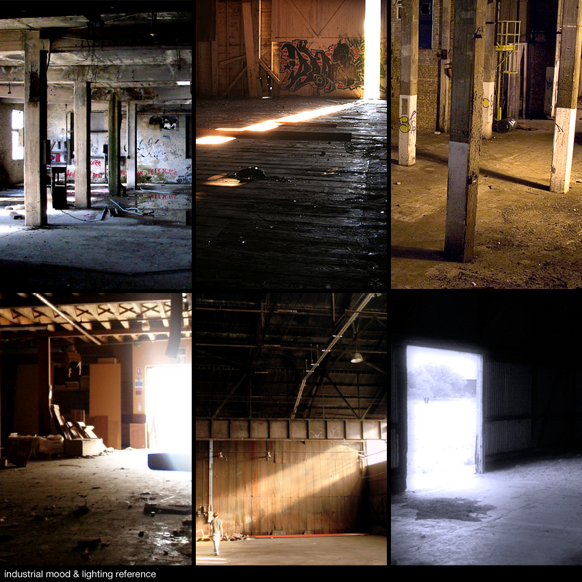
and here's a handful of lighting and mood shots.
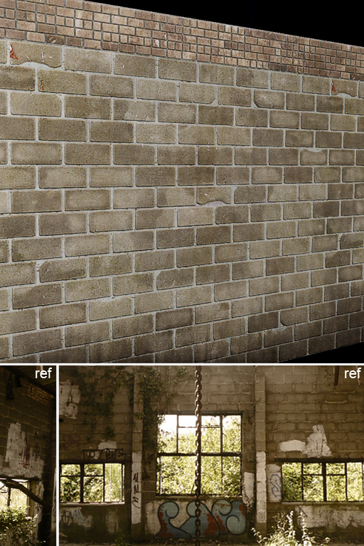
here's a material test I did earlier. just the start of the base wall material. its diffuse/spec/normal. in the first, big reference pic I posted, I'm not quite sure how I'm going to be able to achieve those directional, graffiti clean-up swatches without decals. (i'd really like to have that nice effect where the paint has collected in between bricks, and isn't worn down as much.) i'll worry about that later though
I'll post a rough, not-too-far-along version of the environment later tonight hopefully. In a misguided attempt to stay true to a planned schedule, I'll make my own personal mistake of committing the first step to completing most of the base materials and modeling for the walls, ceiling and floor.
here goes!

here's the primary reference photo I'm basing this off, with two little concepts below to throw in some of my own ideas.

and here's a handful of lighting and mood shots.

here's a material test I did earlier. just the start of the base wall material. its diffuse/spec/normal. in the first, big reference pic I posted, I'm not quite sure how I'm going to be able to achieve those directional, graffiti clean-up swatches without decals. (i'd really like to have that nice effect where the paint has collected in between bricks, and isn't worn down as much.) i'll worry about that later though
I'll post a rough, not-too-far-along version of the environment later tonight hopefully. In a misguided attempt to stay true to a planned schedule, I'll make my own personal mistake of committing the first step to completing most of the base materials and modeling for the walls, ceiling and floor.
here goes!
Replies
as mentioned earlier, next big push will be the rest of the major surfaces. mainly, the corrugated ceiling.
professionally, the engines that I've worked with offered no support for instancing environment assets, so it's definitely a different feeling than what i'm used to. in the image above, the yellow highlighted object (which is a metal frame that runs the entirety of the warehouse) is very long, and won't unwrap for lightmaps very well. now that I give it a bit more thought, (this also isn't very important at the moment, but hey) I'll probably add a few divisions along its length, and manually break the edges so there's not such a horrible waste in resolution.
tomorrows update should be a bit cooler looking.
Looking good so far. bit on the generic side but i dig the brick texture. For this thin metal frames i would probably just use vertex based lightmaps. Get a few subdivisions in there and you should be good.
@Stefan: haha yeah man, i'll do my best to make this warehouse very interesting. I haven't shown everything yet. ;] I've some neat set dressing planned to give the whole locale a bit of history.
here's a start on the corrugated ceiling. (textures and paint wear are far from final, placeholder for the moment. going to move onto some other stuff in meantime.) just nailing down colours and how much paint wear will be on each of the three generic, reusable tiles.
I was just thinking the same thing. I think it would be a lot cheaper than using say multiple uv channels in a single shader or multiple material ID's on the mesh.
we have a crazy shader here at work that does this kinda stuff but its really expensive, so its used rarely, while decals and overlays are used all over the place.
nice ref collection, itd be great to get the grout looking all squished outta the cracks like the main refs you have, right now its looking a bit sterile/unnaturallly perfect.
: ) will definitely discuss it more in-depth when I get to that step. (fairly soon) here's what I'd like to achieve though.
so example one represents a traditional, alpha card decal. i’ve got my wicked mad tag over the brick wall. nice. now what if I wanted to take it a step further and wanted it less opaque in the grout? (eg2) Adding additional information to the decal’s alpha channel would render it useless for reuse, unless it was overtop another identical brick pattern and rotation.
I admittedly don't have a lot of experience with blending/overlaying materials. (throwing another UV channel on a surface, projecting and clamping an alpha overlay) I'd really like to take a look at some shader examples. I'll dig through UDK's documentation to see if I can't figure out the most basic one, and work my way from there when I get to this step. For now, I need to continue getting all the major elements roughed in.
mash: thanks man, i'll tweak that on the first polish pass.
i talked with some people at work and have a good idea how I'm going to approach it. in order to maintain focus on what's important at this stage, i'm gonna refrain from any more shader talk until I actually get to that stage. its just diffuse, normal and spec for a while from here on.
1- you dont really need to use an opacty map that matches the brick...if its a diffuse only decal that takes on all the lighting but modfies the underlying spec
2- if you have one type of brick make the decals for that brick... duplicate and push the geometry and then you can pick where you want them to be...if you need them to be somewhere particular... its a case of offsetting the texture in pS and tweaking the underlying UVs......also if you make the texel density half on the decal means you can cover way more space than your tiling underneath and if its using the lighting from the underlying normals it wont look less detailed
When you talk about using vertex paint for decal blends do you mean stuff like this: http://www.chrisalbeluhn.com/UDK_Advanced_Vertex_Painting.html
or this: http://www.youtube.com/watch?v=0V6bit8PrZo
Where it takes the bump and underlying texture into account?
I'm not sure how you could use that for paint swatches, typically it uses two tile textures. It would be an interesting trick if you could position a paint swatch anywhere and have it blend...
Vig: thanks much for those links! chris actually sits behind me at work, so I think you just unwittingly signed him up for giving me a hand with this shader stuff. he can deal with it.
also got the diffuse and normal done for the pillars & supports that cover the space. looked up a video on how to apply detail normal maps in UE3 and this is what I ended up with. this the best way of going about it? this method also doesn't offer me control over when the detail map fades in, but the mipping seems to do a good enough job.
next update should include more basic texturing and a first lighting pass. (and a replacement to the unfitting skybox in there right now.)
thanks for the discussion and advice so far, guys. : )
edit: holy moly photobucket butchers image quality. i hope it reacts better to PNG's next time around.
and hey, i've been gone for a while. after working four months in an eastern european salt mine based a satellite state of the former Soviet bloc, I managed to obtain a plane ticket back to canada via their local airlines. in exchange for the flight, I cried on command repeatedly while they demonstrated to their youngest children what a failure of a man looked like. the service completed and my local reputation tarnished, I was no longer of any use as the official salt mine greeter, similar to my previous job at the local Walmart in Vancouver. Hopefully this scene will break me into the games industry.
i made a quick mattress earlier today. polycount on the low is really high cause im gonna be bending it over things, just havent deformed it yet. : ) other exciting bedding will come tomorrow! ill start the proper texturing when the rest is done. playing with clothsim soon. im excited!
well i've been all over the place except for 3d lately, but now I'm back to wrapping this baby up. feeling good for the end of this month, give maybe one week for love & polishing.
check the "The Pit" udk environment on the fourms and you can see vertex paint and a material shader used for sand and damage and the idea could defiantly be adapted. and i dont think it would need detail in the normal maps since it uses the height map of the base of the material to decided how it goes over crevices.
fearian: that was me learning how to set up vertex blending.
evil: yeah man, though i wanna play around with the HDR so it's not super bloomy when it's not being directly stared at. that will definitely be one of the last steps though, when i throw in the skybox and all that fun.
passerby: thanks a lot man, I'll definitely take a look at that shader.
piippo: glad to help dude
still a lot to do! that doesn't mean I cant to a lot fast though. : ) uh, i might update more frequently than usual over this week. thanks for your guys lovely comments. one thing to note, is that a lot of these textures are just a first pass diffuse without any normal or spec maps. cant wait to tackle that in one fell swoop
edit: oop, btw next update should have all the set dressing done on the floor. dirt shader however still might not be final. that's been the ultimate thorn in my side all this time
StefanH: I wouldn't worry about it too much at this point. Pretty much every rendering feature is disabled at this point so the environment can be baked in sometime around a minute. All I've set up is the general sunlight angle and played around a bit with the environments overall colour tint. I'd love to get your critique after I've posted a attempt at final lighting though.
- Jordan
jordan: hey man, I'm no expert, but there's usually 2 key things (in UDK) that will affect the softness/hardness of your baked shadows. First off is lightmap resolution. Each static mesh or BSP surface will by default have a resolution value you can play with. Just like how your colour/diffuse maps' resolution will affect how sharp details are on your models, lightmap resolutions will affect the level of detail of the lighting on your models.
An easy way to think about it with baked lighting is:
Soft Shadows: Achievable with low and high lightmap resolutions.
Crisp Shadows: Achievable with high lightmap resolutions.
The second thing that will affect your shadow's crispness is the 'Shadow Exponent' value. This affects how strong light bends around corners for the selected light. Here are the settings I've got in my temporary setup:
Good luck dude!
whats_true: thanks man :] ill have the sky in next time i post progress. I pinky swear.
small update tonight. I've got a good deal of stuff that's dependent on more set dressing before I can show it off right & proper. having a lot of fun tying this guy up though. anyway, here's playing around with some broken glass, and spending way too much time on a very simple shader that should only take minutes to hook up.
I looked up how to render out cubemaps in UDK. It was ridiculously easy, and should be a feature in every engine (if I had my selfish way in everything) I haven't yet figured out how to properly hook it up, tho. The reflection, regardless of the angle you're looking at a reflective surface, is always reflecting the top image of the cubemap and not taking the camera's direction into account. Can't find an equivilant in UDK's database yet either for reference.
also, im apologize for the continued harm to your eyes with my largely diffuse only + piss poor lighting at the moment. next update will be more significant. (im just hoping somebody will be like, 'oh hey, check out this sweet glass shader man.')
This is all from memory so maybe I forgot something. The problem with the VectorTransform is that its a pretty costly node in terms of instructions (20-30 instructions IIRC). So if its possible to have the UV chunk oriented upwards its cool to leave it out and can increase performance quite a bit.
Thats bout it !
Cheers
close to the finish line. still some stuff to do, but its very fun here on out :]
here's the first pass at lighting. the brighter lighting on the right side will not be as bright in the final, and will have a more pronounced falloff, it's kinda flat at the moment.
here's that mattress, all grown up. this bit of the environment needs an additional light source to really sell it, i think.
here's a girder trolley. (currently not lightmapped. it's not lightmapping well, cant figure out why yet.)
so i fucked around with my grass' normals today in order to make it light more naturally. it doesnt look planar anymore, but holy shit does the sunlight blow it out. ill be playing with it tomorrow.
also, it's casting black, opaque shadows at the moment. while I don't want it casting black shadows, I *do* want it to cast a less opaque shadow with a green tint like you'd see in real life. anyone here know how to achieve this effect in UDK?
finally, here's the original lighting mockup that i started out with. i still want that haze that i put in on the right side, and like i wrote in the image, im gonna try and achieve that with some lightshafts and post settings, though i'm unclear on the specifics. ill figure it out (and if you guys help, thats extra cool)
thanks for looking, dish on me your comments and criticisms. there's still some major changes going in, but this thread kinda serves as good reminders about what i have left to do, so dont be shy! :]
Also, for the foliage, did you just point the vertex normals straight up 90 degrees to get that lighting like that?
Otherwise, coming along beautifully!!
You should flesh out that living area too. There's maps and lots of papers on the walls, so we can assume the person has been living there a long time, but there's nothing to cook and eat there (like an old chair, tin cans, and a crate as a table for example), no clothing, no bags, and nothing to suggest the person's profession (like guns or ammo boxes for a hitman). If you cluttered the scene with clues like that, it would really make it tell a story, and make it more than a warehouse with a mattress in it.
You should create a grass material (for the ground I mean) and vertex-paint it under your grass so the intersection of the planes with the ground isn't so obvious.
Also, those red flyer thingies (that's your logo right ?) are kind of distracting, they're all over the place and we kind of wonder what they're supposed to represent. Be careful where you place your maps and post-its, don't put them randomly in the scene. There are some that are on isolated pillars, and even over windows (?), logically they should be in a single "workspace" the character has set up (along with clues as to whatever it is that he/she does).
What are you gonna put outside ? The kind of environment the scene is in (jungle, harbor, abandoned airport) can really help to tell a story.
dduckworth: thanks for the nice words
urbanmelon: good crits man, thanks. the current lighting scheme is a dominant directional light, some smaller fill lights to brighten up the right side of the scene, and some additional spotlights pointing in through the windows on the left to give an additional softer falloff of light in addition to the harsher shadows.
i agree that the shadows could contribute a lot more if they have an interesting colour. I'd never known about UDK's skylight until you mentioned it. i'll give it a peek. i'm also gonna be playing with unreal's post effects at the end, so I don't want too many workarounds stacking up on eachother, but these shadows shouldn't be so dark and desaturated in the first place. ill post a more final lighting pass soon.
yeah, set dressing is still a work in progress. i'm gonna add what I can in a reasonable amount of time. I'll put in some changes to more clearly telegraph what I'm trying to get across from whoever the inhabitant is. At the same time, I'm not a big fan of spoon-feeding obvious details, so I'll try and strike a careful balance. If it's still shit after I've done some fixes, tell me so. :]
here's a bit i haven't shown off yet, for good reason as you can see. it'll be the 'work' / lunchtime area though when I've finished off the assets for it. im hoping this bit will give the place some additional purpose.
I agree on the grass as well. I'd rather get the grass to properly cast lighting first, though. That would have a far greater effect than an additional layer on the ground shader. if it does come to that though, i'll just do it with some decals on the floor.
good on the red papers. i'll be playing around with those. though i do like the splash of colour they add to areas i want the eye to be drawn towards, I can certainly do far more in a less repetitive fashion. i'll probably resort to some coloured paint swatches, since they're quick to make.
outside will more or less be thick brush and greenery, not jungle'y brush though. :] if you look at the photo that most closely resembles this place on the first page, it'll be similar to that. should give the base level some nice green bounce lighting.
whatstrue: yeah yeah yeah. :] new website is up in 2 days or so. (new URL is in the images) most of my portfolio is still in my sketchbook if you actually care.
Edit: This is where it's at right now. I'd love a few additional critiques to wrap this up. I mention it below as well, but im worried one of my monitors is a bit too dark, and some of my stuff is turning out way way too bright.
Any comments or criticisms still very welcome. (particularly whether or not the lighting is way too overblown. my two monitors arent syncing up and I dont know which one is more correct. The sky is supposed to be bright, but the light on the ground shouldnt be blinding.) :] I might still be able to sneak in a fix here or there if its high impact and is quick to implement. I'll post some texture sheets soon, too.
Nice use of decals however, such as the painted areas and the crane looks great although it may be a bit expensive on poly count (especially if the chain links are modelled out). Really great job, i'd say you're ready to move on and take what you've learned from this scene. Grats.
The assets are also real cool.
If I were forced to complain I would say, that the whole scene looks a tad empty asset-wise. I see that you primary reference looks this way, but you're making a portfolio piece and if I was working at a company, judging a portfolio scene where there's almost nothing but walls I might've felt a bit disappointed. As much as you want to follow your original idea, the primary goal of your portfolio art should be tresent your abilities at their best. Plus I doubt you're going to be showing potential employers reference saying that that's how it was there.
You've got enough little stuff going on, but no much of anything else.. If it was a warehouse then there should be objects scattered around telling us what it was. 'Cause it looks like a band of extremely hungry marauders wiped the place clean.
There could be some shelves(broken?) left, which are plenty at a warehouse, some boxes, the wooden thingys you put stuff on so forklift can lift 'em(wonder what they're called), lamps hanging from the ceiling or lying on the floor broken, some wires hanging around, fire emergency box, a table, etc...
I see, that you're close to calling things done and I doubt you're gonna add much stuff. And well it's your call, buddy. I just hope you feel like you've squeezed everything there was from the great job you've done so far.
Can't wait to see dem breakdowns)
Cheers!