[Riot Art Contest]-Lissandra
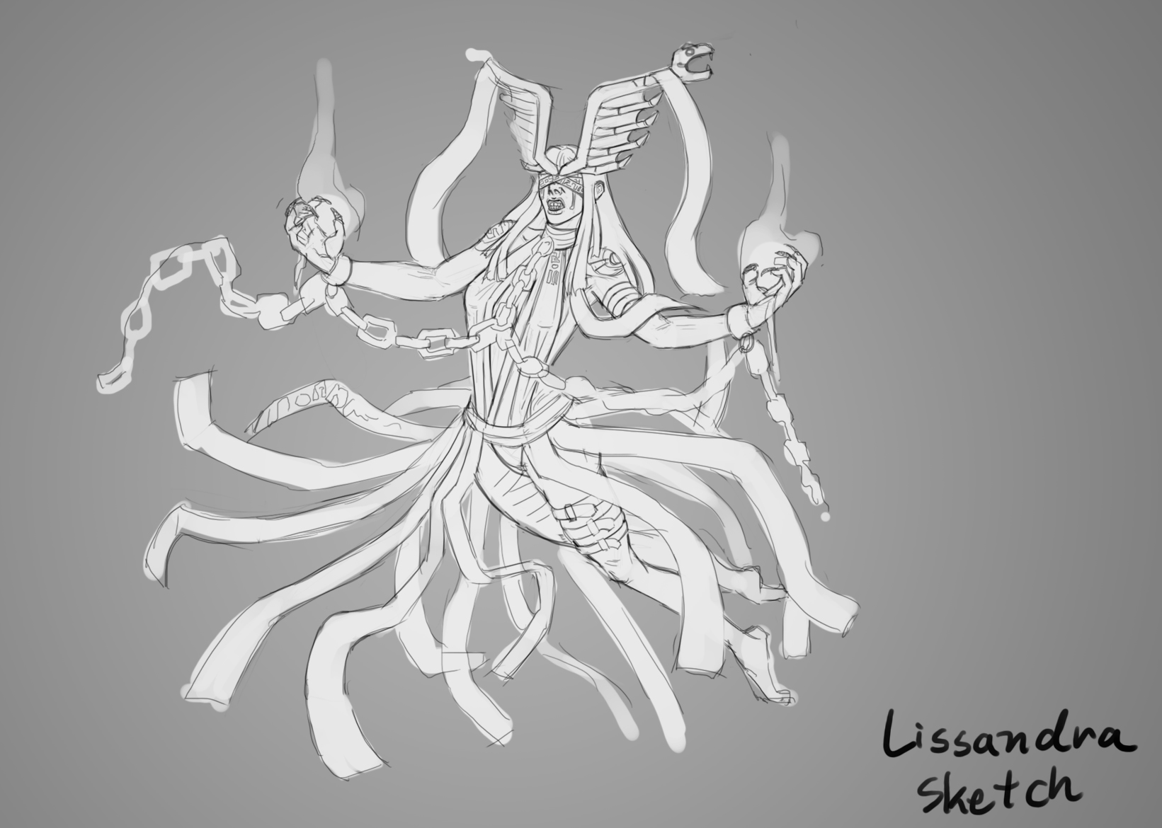
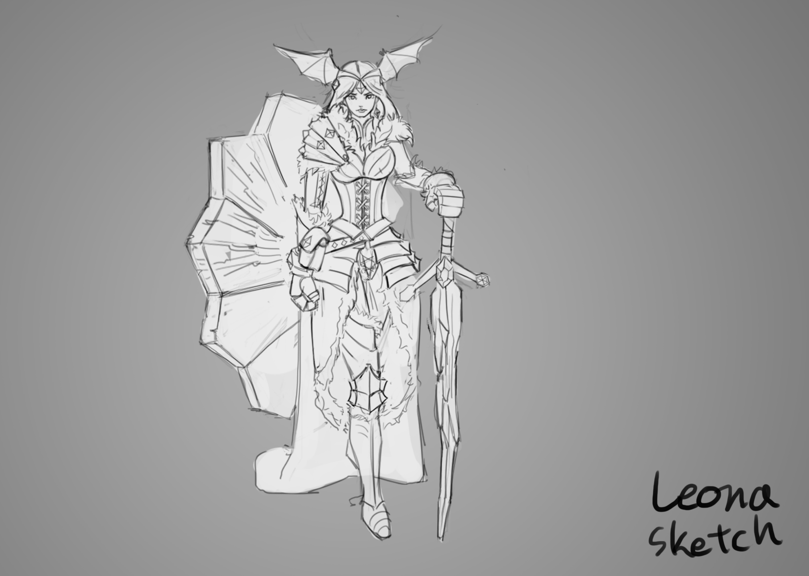
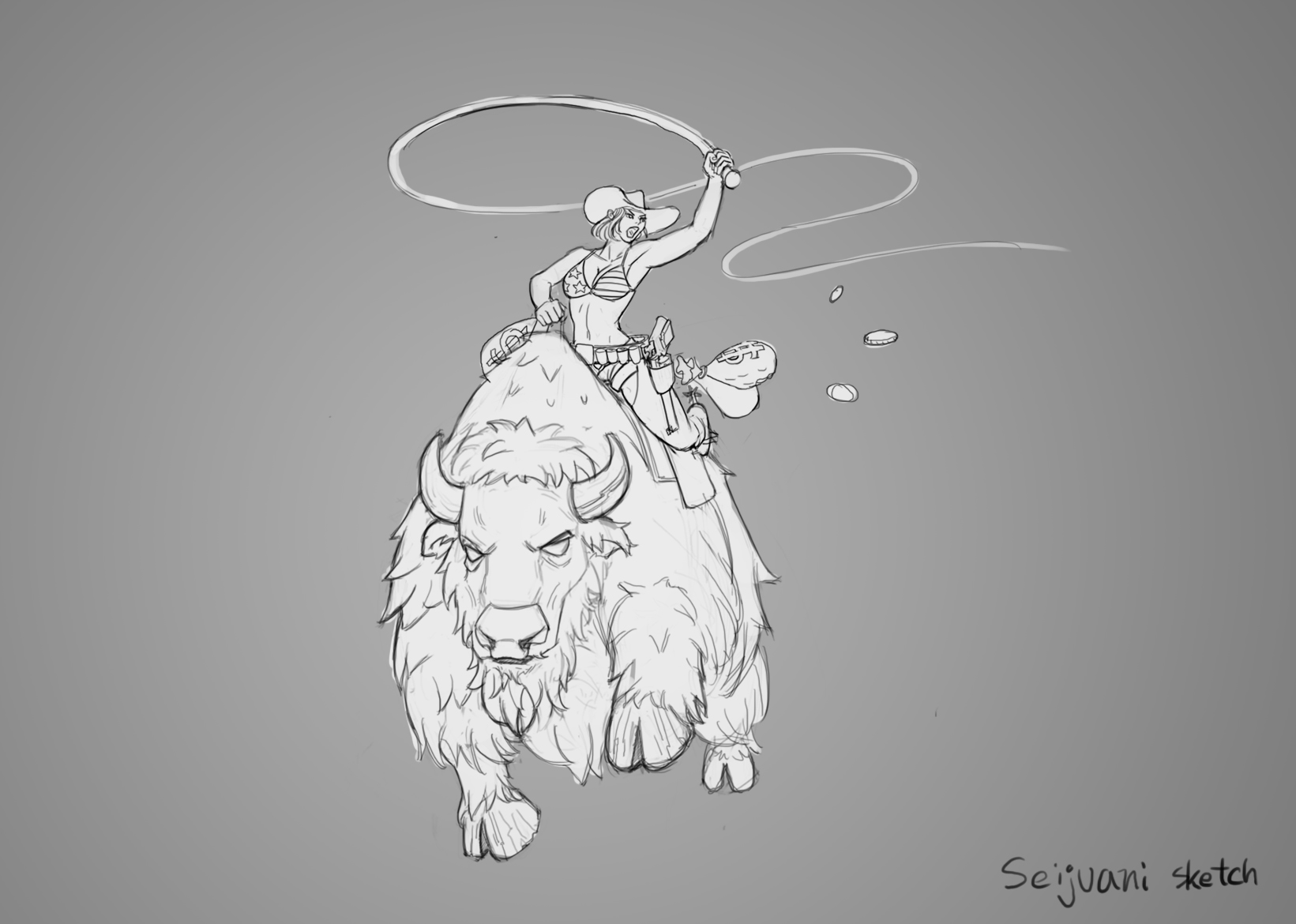
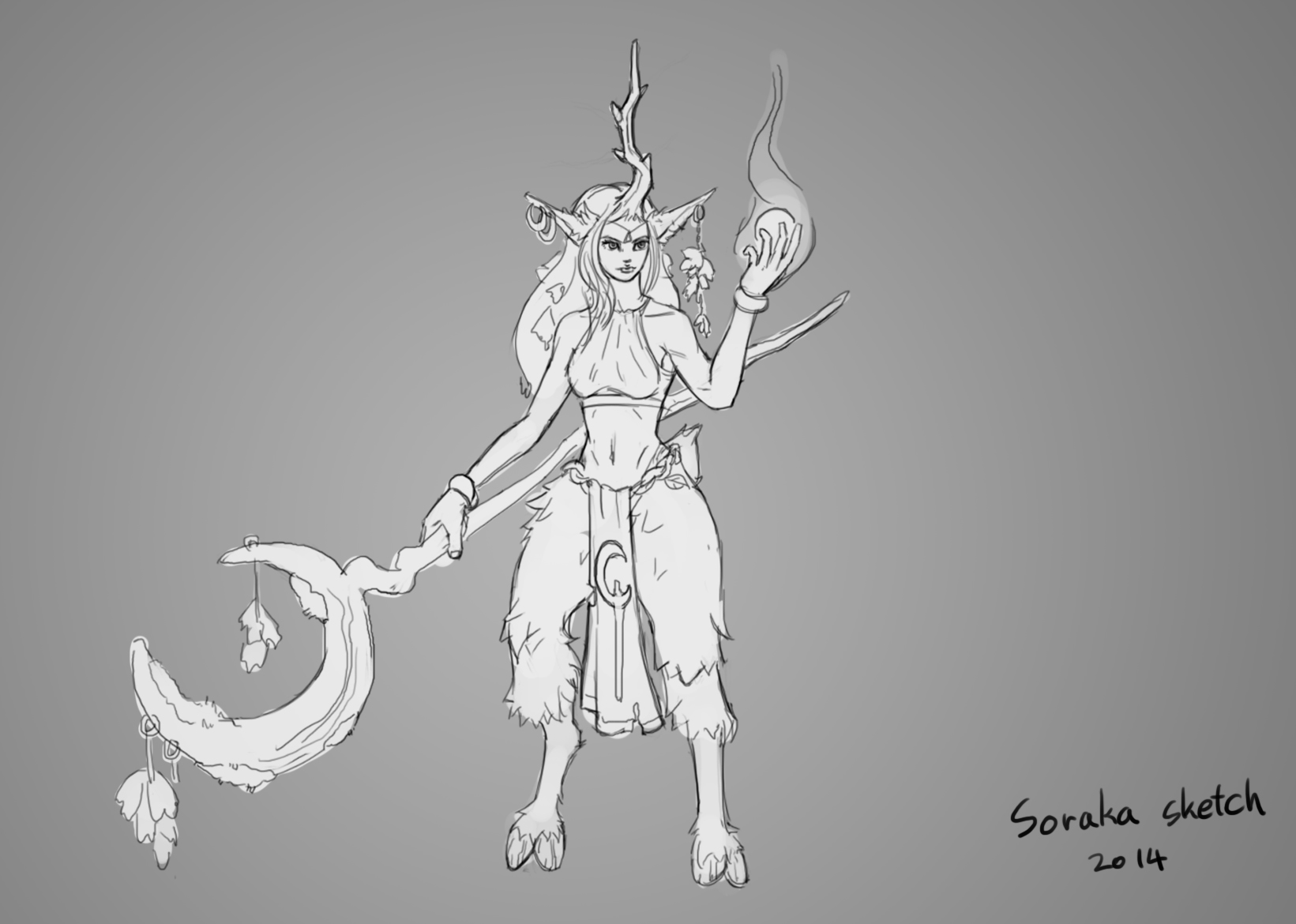
Hello, everyone. After I reviewed every LOL champions, I sketched some champions I'd like to work. Then I asked friends which one is their favorite. some sketches got pretty even vote, but I decided to choose Lissandra. Any critic would be appreciated.


Replies
But I do love the second ones helmet and the purple colors are really sweet. So I would love to see you push that design even further.
Think in terms of shapes and design right now. What is the main big shape going to be, then add medium and small details around that. Right now it's too many shapes that aren't really related to each other. Half the model is her rock base, but that doesn't integrate into the model very well at the moment.
Now, my goal is....
Simplify and Unify the design. Make CRYSTAL(not a stone tablet) more integrate into the model.
I changed it's design a little bit.
Two major goal was simplify and unify the design.
If there's any critic, I'll very very appreciate.
Thanks again to Nuclear Angel and Uhni20. : )
Blocking in Maya. Sometimes it's easier to make base mesh in Maya.
I'm starting to sculpt the character. It's always fun to sculpt.
If there's any critic or suggestion, please leave the message.
It's always helping me to make a better model.
I exaggerated the raggedness of her bandages, but it's not working nice. I think I'm going to work again. If you have any opinion or critic, please tell me. It's always good to get some critic.
Head progress.
After I looked into my model, I took some note for myself.
Put better wrinkles at skirt part.
Bandage on arm.
After I do some more work, I think I'm going back to the body and finalize it.
If there's any critique, please let me know.
I'll very appreciate. : )
Hair tale
Rock hand
Skirt wrinkle -> This one is barely visible...but anyway. good to have something.
I think I'm almost done with high polygon.
Any critique comments is appreciate, thank you.
I would do rock around palm and face more simple than now
Rocks near legs need more variety of size. And lines of them are a bit too "curvy" for rocks. But after retopo curliness will go away I guess.
I guess you`ll do 2-3 crystalls with textures and duplicate them in lowpoly version?
Hairs are awersome
About the hand, I wondered if the details are a little bit small and busy. I asked some friends and couldn't get enough opinion. Thank you for your opinion. About the face, I kind of like it, but I don't want it becomes a visual noise at a distance. So, I'll try a little bit different way.
It's too bad that I forgot to put a little bit more polished rock....I put some details on the rock but forgot to take screen shot.
In case if anyone willingly give some opinion about updated rock, please tell me.
Hand is simplified.
Helmet is simplified
Base rock is a little bit sharper and has more varieties.
Unless I find something later, I'm done with High polygon : )
Any critique comments is appreciate, Polycounters!
Low polygon is done. For now, it is 10968.
After I made all face topology, I remembered that she has a blind fold.
So I simplified it a little bit.
Any critique comments is appreciate. Thank you. : )
Here's my AO and UV.
It's not perfect enough but I think this is okay to use as a jump up point.
If you have any critic, I'll appreciate.
Before I start to paint, I blocked the color and photoshoped it with LOL screen.
I think I'm pretty satisfied with this color for now.
Any critique comments is appreciate, thanks guys
Here's an update. I barely touched the helmet, hands, neck, part yet.
At this stage, I'm constantly questioning if the purple color is too strong.
However, after I put it on the game screen, I decided to keep the purple. Especially, at the Summoner's rift map, the purple color reads much better.
For now, I need to work untouched area first, then maybe I need to fix the chain.
I'm not sure yet, but it feels like the chain has too much contrast compare to other parts.
Any critique comments is appreciate. Thanks.
Today, I skinned the model to pose. I think I'm going to polish it tomorrow.
I'll appreciate any comments or advice. Thank you.
I'm pretty satisfied with work this time.
After I bound the skin, I made some poses for beauty shots. If anyone sees this, please choose your favorite. Thank you. Also, any critic comments are welcomed.
Pose 1
Pose 2
Pose 3
Pose 4(Looks familiar?)
Constrcution shot.
Because of the nature of Lissandra, her poses are a little bit limited. Still, it's fun to play with my rig. I hope I can take some time to animate a little bit, but unfortunately, I didn't spend much time for the rig. So, it's just for temporary posing.
This shot is for the back and legs. I painted the feet at first time but now it's gone.
2k color map.
Maybe the purples can be a bit darker - gradient from top to bottom at her ribbons for example. I miss some harder shadows (sorry for the vague explanation ^^').
It's done. I'm gathering images and organizing now.
Thank you for your opinion. Don't worry. it's not vague.
Actually, I thought about it too, but I decided not to make it darker because the ribbons going to float around her.
....wait...hm.....
Maybe it's still worth to do it. I'm going to do final tweak.
Thanks a lot!
Done for now. : )