Female Ranger Portfolio Piece

greentooth
I'm currently redoing one of my personal projects from last year, now that I got a proper workflow with ZBrush and 3DS Max.
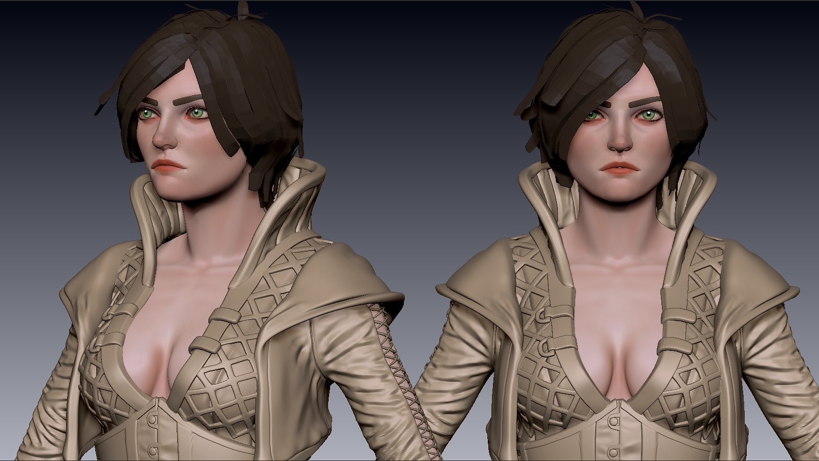
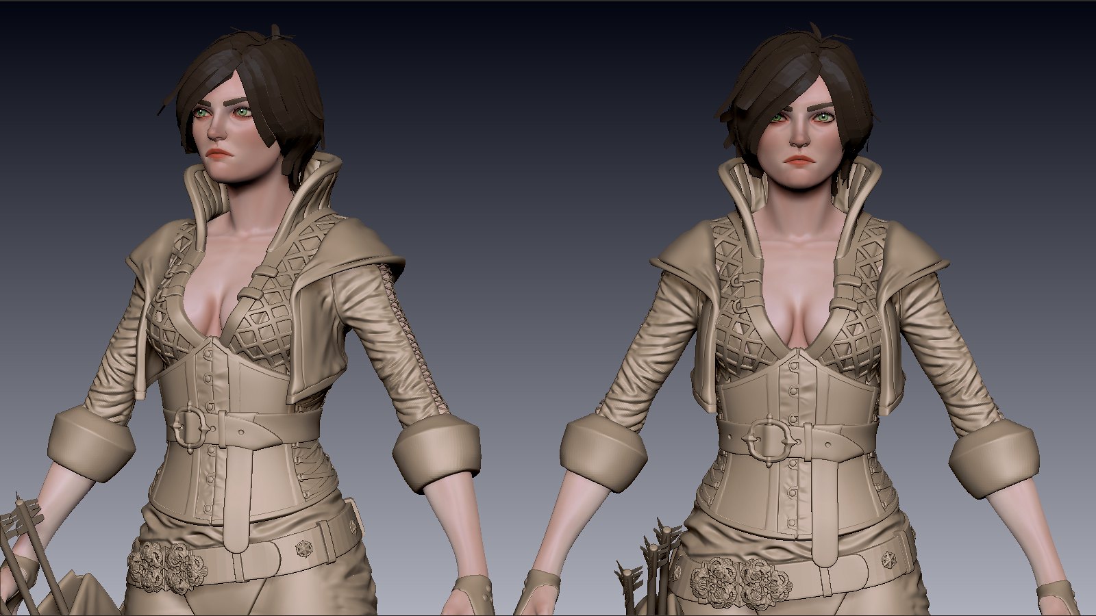
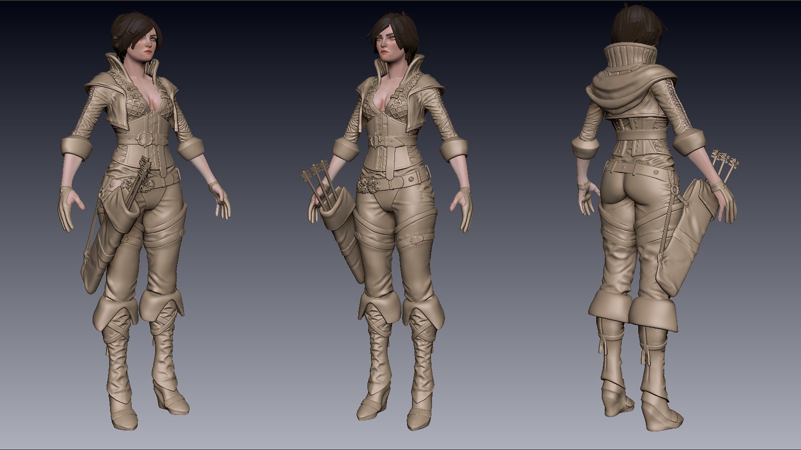
I already started poly painting, but some crits and suggestions are welcome.
I already started poly painting, but some crits and suggestions are welcome.
Replies
it looks like she got suit with sleeves that had double length and pulled them up.
If material type of suit should be something like silk, which can get such folds, i'd suggest to make folds much wider
just imo, from realworld experience
I have no folds on the hands yet. If you mean the arms, I changed it on the arms a bit and as for boots...
look up thigh high boots folds...but looking at it now, i need a little more gravity and silhouette on the leather
The suit is multi-layered, consisting of re-inforced cotton(shirt, pants) and custom leather (corset, leggings, boots, archer's gloves, jacket with a cowl)
lol, but seriously the folds are super intense on the sleeve ans boots
Yes your ref is littered with folds on the boots, but it still has areas of sharp intense folds and larger softer creases/folds
Ontop of that, it also looks pretty skin tight, in which your reference indicate the opposite. In your design the straps on her shins indicate design (pretty straps!) as well as being legit (to help tighten and keep in place)
Yet i see no folds/creases from those straps?
Biggest oddity I see (also like to say I have very little experience in creating folded leather/clothing) you have it laced in the back...the tightening of those laces I feel like should cause pressure and PULL the material, in which the folds are generated through them throughout the boot. In your design, this area is the smoothest. Can I get someone else to clarify this issue?
As for the shirt; idk how it should look, but id suggest hitting the reference again for it. Clothing drapes on the outside of the arm pretty much because of gravity with how it connects, and then of course vertical folds are created through it being scrunched. Your laces there will add/enhance/detract from this in a specfic manner id think
Good luck!
Also, its a hood short coat, not a shirt you are referring to, so the material will be thicker than usual but not as thick as heavy leather. The shirt is inside, with the reinforced interweaving leather bands.
Also there was that post a couple weeks past about the female knight and her impractical armor. Honestly I don't see how people think that's impracticle, but high heals on a ranger is fine.
Anways, just style stuff, but looking good.
Some people also say that about guns or vehicles. Sure some designs are wild and out of this world, but honestly....guns are made as cheaply as possible so the less profile made with enough materials still sporting the best function wins. Same with cars, the best cars that last a long time are the ones that have a vanilla, compact, fuel economic look; exotic cars are pretty but impractical in every sense of the word. So we make them interesting, but with a sense of function.
But I feel ya dude. Also thanks.
You mean like run? Through a forest? Fight? Etc etc?
Anyways, I was just pointing it out, but I don't really care anymore than I cared with the female knight one. Mostly I'm just giving you a hard time. My own portfolio is filled with its own impracticalities where design were valued over function.
Women can do amazing things in high heels. Just not for a whole entire day.
for points of critique
1) Your "diamond" folds seems odd and forced everywhere I see them (thigh leather and sleeves)
2) Your folds on her shirt ABOVE the belt look awkward and as if it is a different material in comparison to beneath the belt...I'd tone down the fold'age above her belt
3) Personally the way the pants cup her ass seems incorrect, however, if you are trying to make a sexy ranger and like the look it establishes, then ignore this
4) The folds you have created look great in some areas and look awkward in others; I think something that has happened due to you listening to critique (which I say that as a good thing, but make sure you AGREE with your critique; just because someone doesn't like something doesn't mean you should change it);
What I'm trying to say in this point is the folds and creases aren't consistent throughout your materials...the boots could be argued that the leather is a different type of leather from the rest of her armor, but regardless the sleeves/jacket, abdomen, thigh, and boots also have different intensities...maybe try and reach a middleground of intense and softer detail?
In my personal opinion, I love the folds on the back of her arm, around the knee, and the boots (though I feel some of those could be made a bit more sharp).
I hope I'm not encouraging you to get caught up in details that take you forever to fix
I took a moment to google some ref; I hope some of these you find helpful
Nice thong btw :P
You should take a look at some ref images of Triss Merigold from the witcher series. The character art for her in Witcher 2 was outstanding. I've included a few ref images if you haven't already taken a peek.
Looking at the latest turnaround I fell that her head is tad small for the body and her face may be too far forward but its hard to tell without a full on side view. Also I know that this is WIP but the boots could have a sharper crease to them.
Keep it up mate. You've got me subbed.
i made a few tweaks to the face and polypaint, time to retopo
just a basic bake test, more to come
Now comes the fun part of adding dirt and detail. Plus at this point you can try adding colour to the belt buckle. It could be chipped and flaking.
But keep at it mate, cannot wait to see the next pass.
as for the hair, i first sculpted the overall shape of it, then used polydraw in 3DS max to create strips. The one thing you gotta keep in mind is that the strips have to be of the same or nearly the same width from beginning to end, otherwise the texture will look janky.
this might help
http://wiki.polycount.com/HairTechnique
here are my wires
if you want more specifics, lmk, thanks!
just a small update, fix that thong a bit, haha
im calling it done. i'll make a pdf making of the ranger from all this.
http://www.youtube.com/watch?v=PMlmgqn7W2M&feature=youtu.be
But I have to say I'm still a fan of wear and tear and I feel it could really add to this piece further. For example take the arrow pouch, around the rim I would expect to see scratches, dirt build up from the constant use of arrows being removed or place back in. The boots are also another place where you would expect mud and dirt to collect on the toe and heel area.
I have to say I'm glad to hear you're also creating a pdf of you process and Ill look forward to a good read mate. Just keep going as this piece is looking awesome!
Really liking the style on this. Looking forward to the pdf!