The BRAWL² Tournament Challenge has been announced!
It starts May 12, and ends Sept 12. Let's see what you got!
https://polycount.com/discussion/237047/the-brawl²-tournament
It starts May 12, and ends Sept 12. Let's see what you got!
https://polycount.com/discussion/237047/the-brawl²-tournament
Sketchbook: tot tot
I wanted to start a sketchbook here for feedback and to track my progress primarily focusing on the 2d side of things. Here are two hand painted textures I've done recently. I would GREATLY appreciate any critiques and advice, I think hand painting textures has become a drug of sorts for me. I cant get enough of it.
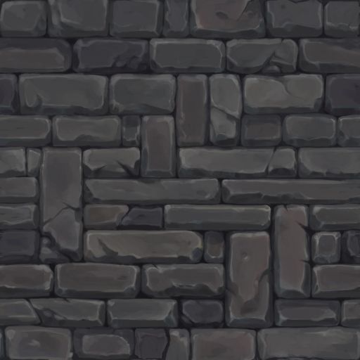
A standard stone brick:
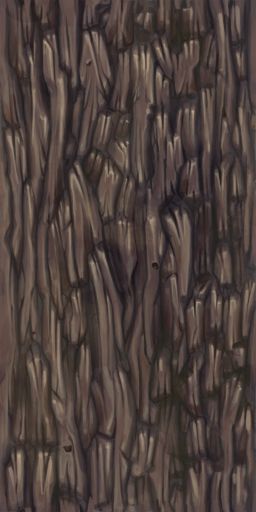
Some tree bark:
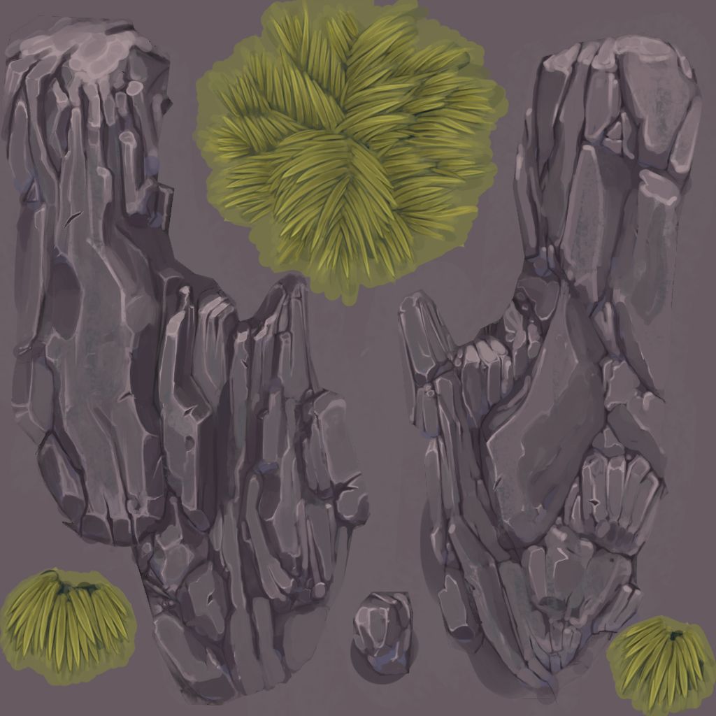
Heres a unique map for a rock with some moss (I'll update the texture and post the model per critiques):
I have a few that need some more love before posting. More to come.
[EDIT] After looking at these on another monitor other than my cintiq, seems the levels and colors are a bit off, I tried to update them to compensate. I need to find/make an action that compensates for the darker screened older model cintiqs.
A standard stone brick:

Some tree bark:

Heres a unique map for a rock with some moss (I'll update the texture and post the model per critiques):

I have a few that need some more love before posting. More to come.
[EDIT] After looking at these on another monitor other than my cintiq, seems the levels and colors are a bit off, I tried to update them to compensate. I need to find/make an action that compensates for the darker screened older model cintiqs.
Replies
depending on how you wanted to make it look this could be either good or bad!
The inbetween areas are a bit undefined too. I think there is too much value change on that surface.
The faked interior is a neat idea just make the shapes more defined. Add some contrast highlights on the window too.
@Jessica Dinh thank you! Im a huge fan of your stuff so it means alot!
Im still not sure if the levels are reading properly, it looks fine on my monitor, but on my cintiq (the original 21x grey ones) it looks dark. So Im trying to balance a happy medium.
the wood looks good too, just make sure you keep an eye on the interior shapes you're designing. some subtle flowing shapes and gnarled areas might help sell the 'wood' feeling better, but they read well as is, and it depends what 'type' of wood you want it to be (if anything in particular).
but yeah man, lookin sweet!
Heres a quick (like 10 min) metal/bronze I did, hopefully it doesnt look too dark on your monitor. It looks fine on mine, but a bit dark on my cintiq (ongoing problem....)
A bulk of these textures are for a project Im updating which I'll post at some point in the future when I feel these textures are improved upon.
Love these textures so much, I can't wait to see the project you're working on :0