Devolution of Design

greentooth
If you´ve seen windows 8´s metro surface, then you probably know what this thread is about.
what the hell is happening? now google is on the stupid-train too?
one could think that interfaces were invented to display information, and since we are kind of over the showing-new-visual-effects-to-display-progress-thing, design goes back to displaying only information.
well i say screw this!
visual appeal and clear display of information don´t stand in contrast imo.
i always thought graphic designers were bonkers somehow but i´ve had enough of this stupid, ugly interfaces.
if i use those interfaces every day, i don´t want to look at something that looks like a powerplant controll panel from the 50´s.
just look at the new youtube design. it has in no way improved upon its predecessor, wich i imagine must be realy hard.
TLDR;
graphic design is bombing itself back to 1995.
whats your take on this kindergarten design trend?
Replies
What's google doing?
thats what google is doing
the new youtube design goes that way aswell
"SWEET! I've somehow warped back in time by 5-8 years. I can look at YouTube without ads..."
I was wrong.
If you use Chrome:
https://www.google.com/url?sa=t&rct=j&q=&esrc=s&source=web&cd=1&cad=rja&ved=0CC4QFjAA&url=https%3A%2F%2Fchrome.google.com%2Fwebstore%2Fdetail%2Feverplex-youtube-dark%2Bbla%2Fhipmkeejhafdjjcnhmjibpgfheoicokl&ei=j-bDUJfcIeGJ2AWfj4HYCg&usg=AFQjCNHBfLoyDp8D6Bdk0xBngLfWo6EtjA
The youtube changes don't really bother me much. As for Win8, the OS is build for PC's and tablets alike. You don't need to run that interface on a PC - you can make it look exactly like Windows 7. There's nothing to get upset about. The design itself might be a bit clunky and has bad use of color, but those are things that be fixed in time.
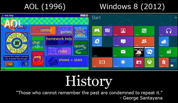
Metro on the other hand, is something I've only gotten to use for a few seconds, though soon that will change. I imagine it can be customized to some extent? It still looks far more pleasing than the AOL example.
I mean only slight offense to people who prefer the old chrome logo, but it is JUST like a stereotypical games artist to think that 'shiny' = design and effects like 3d = 'future'.
FWIW, the new design trend is not 'lets make everything windows 8', but 'let's simplify'. It is in no way a regression, and for now it's one I prefer to the 'effects' driven design that plagued mac, then vista. Microsoft struck a decent balance with 7, and 8 is a nice progression, even if it could be organized better. Just my opinion.
Cause we aren't really ready for an upgrade and I don't think we ever were.
Also youtube has not made a good change at all, is their a revert to old style layout anywhere in there?
Bring back the Diffuse.
I know this is unfair, but sometimes I feel like the people hating on win8 and simple, solid colors want something like this.
I'm not a huge fan of windows 8, but I dont understand all the hate. It's a relatively clean, inoffensive format that cleverly uses (pleasant, not distracting) animations to convey a lot of information. It's certainly a plausible direction to take UI/OS design, even if its not my personal favorite.
I think a lot of the hate comes from people who made up their mind before they actually saw it running -- https://www.youtube.com/watch?v=3l7rg-Psobg what exactly is so offensive about this?
Yep but then you'd have to connect with Dial up :poly118:
(chill the fuck out)
well there is nothing offensive there, i am just saying i don´t like the windows 8 visual design.
i like rounded corners, i like transparent effects, i like the little, totall unnecessary animations in the win 7 UI that react to my cursor hovering over stuff.
it makes the UI feel organic and reactive, and not like a chalkboard that simply accepts my orders, and nothing else.
i am using this interfaces all day, all my life, and therefore i would like to look at something that doesn´t look like it was made for 3-year olds.
to me these little effects are like plants in a city.
shure noone needs them and they only distract from the important stuff, but i like to be distracted from my boring everydaylive.
just a little bit so it doesn´t get too sterile.
A good design only needs to be recognisable, and remove everything that could confuse the viewer. IMO the new windows / youtube design is a big step up... Sure us experienced users might have a harder time readjusting to where to find specific settings, but we'll learn to adapt. For inexperienced users these new interfaces are an outcome to quickly do and find the things they need.
Less is more!
What was so good about the old verison that the new version lacks? That it had a black background behind the menu instead of white? That's the most immediate difference I can find. I recall people hated that version too when it was introduced until they realized they actually liked seeing updates from people they subscribed to instead of just a grid of videos featuring Justin Beiber since he was getting the most global views that day.
As for metro and a lot of other things, it's really worth noting that user interface itself has been changing. Six years ago we didn't all carry around touchscreens in our pockets, and we didn't check our facebook feed on our TVs. But that's where things have been moving. Computers are taking a bigger role in our lives and people don't want to spend all day sitting at a desk just to use one. We're getting more instant access to the things we use so that we don't need to have browsers open to know if we have mail or if a site we frequent has been updated. If I can glance at a screen and get that kind of information as passively as I can tell time by looking at a clock, awesome.
And really, gradients, fancier mouse-over animations and transparent windows don't add to the principles of UI design. They can even get in the way when people want operating systems that aren't bloated, boot fast and run smoothly on any device.
That's always going to be where the majority of computer usage happens and if there's need for a different type of UI for different type of devices, that really should be a different sku for the software so as not to impact negatively on the experience of the majority of the user base.
With smartphones, tablets and even gaming machines becoming what they are, I highly doubt that the majority of computer usage will always be chained to a desk. And to have different versions of sites and software for different devices would be almost backwards if you're trying to create a consistent user experience across every device. Having an operating system that can run smoothly on both machines isn't a negative impact by any means. Change can be scary sometimes, but it's less productive to try and have Microsoft stick to a layout they created twenty years ago while pretending computing hasn't been changing since.
and having to emulate fingermovements with a mouse is in no way hampering the usability of a UI.
Like for example playing egoshooters with a controller, or racing games with a keyboard, or any regular game with a touchscreen.
they are just different things, and you can´t try to force one controll scheme into another. and thats the same way with User interfaces imo.
Current trend for UI seems to be simplifying stuff to bare minimum so that users can focus on actual content. This is a good trend and hopefully it will stick. OS might be quite complex under the hood, but majority of people use it to access files and launch software. That's it. I don't understand why complex UI is required for this.
this.
It's really like fashion. I still remember the "Rhapsody" UI boom on Mac OS. Which then got traded for the Aqua look, which then got dropped for the brushed metal look, etc, etc. MS is just more radical with Windows 8. After all they don't release as often as Apple.
just wait until one brand wants to stand out again from the mass of simplified logos and until everyone is so bored out of their mind of flat zen-like UIs...
But that's the point; the new Metro layout is worse at than the Windows 7 Mode. If Windows (or any other desktop OS) is there for 2 purposes
1: launch programs that use their own, dedicated, finely honed UI, and
2: move and manage files
then shouldn't progress be about bettering the way those things are done? The touchscreen interface isn't for that kind of thing, which is generally what a desktop PC is there for.
windows 8 isn't for desktops
it's a very well made tablet OS for regular computer users. regular computer users do not own desktops anymore, and less and less people are even buying laptops. power users like us can continue to use the desktop mode and tweak windows to our will while average people can just press the twitter/facebook button to see the latest in really unfunny images.
back on topic--i quite like the flat colored, hard edged design of microsoft's "metro" theme. very modern. that said, i still think windows 7's subtle glassy "aero" theme is probably my favorite ever so i am sad to see that get phased out so fast.
I'll bite.
The old YouTube didn't have a near-invisible 2px thick ratings bar.
This new ultra-thin one is extremely hard to digest with mere quick glance, and it makes my overall user experience worse because the ratings bar is often the primary thing I look at whenever I click a video, to see if it's a misleading thumb/description, or just flat out spam.
The off-center video display is also pretty dumb, like somebody mentioned already.
I liked on the old one that I could just have the homepage display my subscriptions uploaded videos. I don't care about their comments and likes.
This new design, it always goes to "What to Watch" and aggregates even more junk that I don't care about. I can still filter it to only subscription upload videos by going to My Subscriptions, then filtering only uploads. As far as I can tell there isn't a way to just make that my homepage, and I have to do it manually every time I visit YouTube.
That starbucks 2011 logo only works because starbucks has been around so long it has become part of peoples visual vocabulary. Initially they needed to state COFFEE or people wouldnt know what this green woman is representing. This is essentially what makes an iconic brand, not the logo, not the words, not the simplicity but the fact that there is a large scale public awareness of the brand regardless of those features.
To apply very minimal design to an interface and remove the text and organisation of the features is not a step forward for those of us interested in actually being productive, for people interested only in information(rss,newsfeeds, social media, email etc) it is probably a step forward.
Then why is it called Windows 8 and you can 'update' to it from Windows 7 on a desktop?:poly122:
For posting on the facebooks and logging onto the twitters, there's plenty of space for that on 99% of desktops.
Win7 had a perfectly working taskbar and those gadget things. With the taskbar basically taking the application shortcuts from the desktop space and the gadgets handling any realtime-updating (things), there's ample room for improvement and updates.
Instead of making just the taskbar take up multiple screens, how about something that is an outright improvement?
Did you try Win 8? You tell it to go right to the desktop at boot and you don't have to deal with anything Metro. It's like a streamlined Win 7 then. I've been using it since release and I had about 0 contact with anything Metro or any metro apps except for the redesigned Start screen (aka the new start button), which isn't really very "metro".
If anything at all you could say it's 2 OSes in 1. Except that using the tablet part on the PC is rather painful - but you can totally avoid that. On the other hand the Desktop/PC part is worth upgrading to, e.g. since Win 8 has been designed to work with SSDs, and it finally gets rid of "Aero", which has been messing for a long time with 3D apps, while keeping an accelerated desktop. Yes, I've been sceptical of it, and the Metro part sucks, but the desktop part is top notch. No reason to look back to Win 7. If you managed to leave the "Program Manager" of Win 3.1 behind you'll manage with the new Start screen too (which is just a Start menu in another guise)
Metro is just one optional part of it if you're on the PC. It's like saying PS3 = PSN Home. But I guess I cannot blame people because MS is really bad at dispelling people's fears that the traditional desktop is gone by pushing their silly Metro interface in every ad.
The taskbar is still where it is in Win 8 Professional. Right on the bottom of the desktop. Behaves exactly like in Win 7. The only thing taking up a screen is the start menu (aka start screen). It's a bit speedier to use since you can now use your mouse wheel to navigate. It's a bit more disruptive because it takes up the whole screen though.
You can also still drag stuff onto the desktop and clutter it up with icons like there's no tomorrow - just like in Win 7.
i have used it and i basically said that already. i like windows 8 a lot (minus the start screen which i replaced with hacked in start menu) but it's very clear from everything MS has been saying that they have designed this around touch--but that's not to say they ignored desktop users, they just haven't said much about that because that userbase isn't as large/relevant as your average ipad idiot.
it's called windows 8 because branding, and you can install an x86 build of android on a desktop too if you really wanted. notice how there is a version for ARM now?
ok, all those things work on a desktop/laptop, but do they work easily on a tablet with touch controls, or do they become too small and hard to use? personally i think it's a bad idea to try and adapt desktop mode to tablets and mobile computing; ubuntu's unity desktop is a real good example of that going all bad. you COULD have your traditional desktop and then a "touch desktop" mode, but you just know that's not going to work right or ever actually happen.
also as kwramm said, everything in desktop mode is exactly how it was in 7, and power users can avoid the start screen all together for a super fast SSD windows desktop experience.