The BRAWL² Tournament Challenge has been announced!
It starts May 12, and ends Oct 17. Let's see what you got!
https://polycount.com/discussion/237047/the-brawl²-tournament
It starts May 12, and ends Oct 17. Let's see what you got!
https://polycount.com/discussion/237047/the-brawl²-tournament
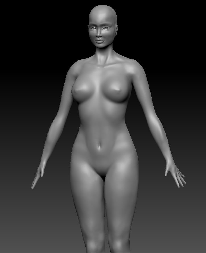
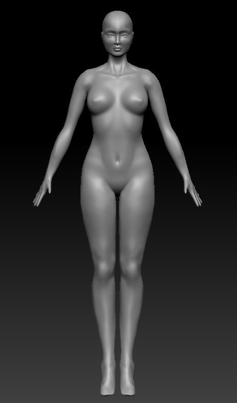
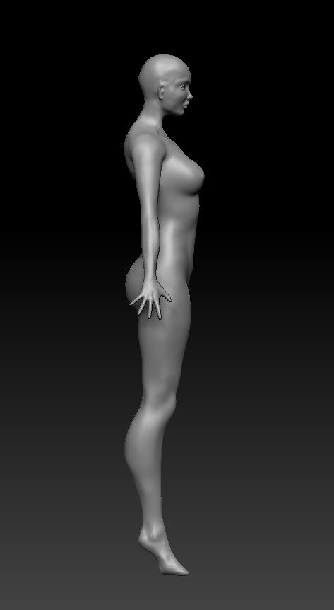
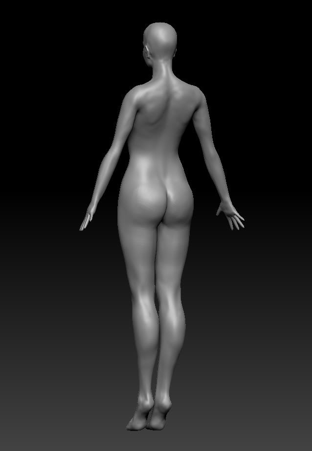
WIP Female Model
Hey all!
This is my first post and my first high poly model and I was hoping to get some constructive feedback on how it's going so far before I add hair, clothes, etc. Anything you can offer advice about would be extremely helpful because I'm very new to Zbrush and this is my first character model.
Thanks so much for any tips or critique!")
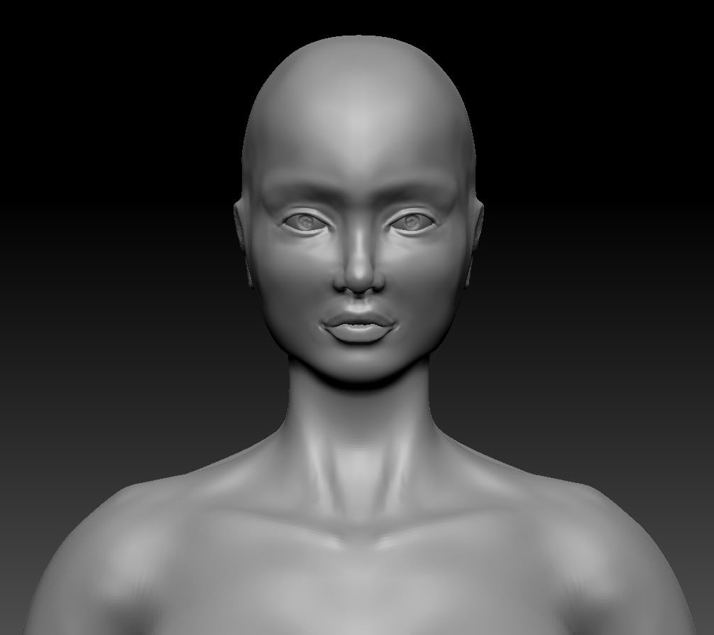
This is my first post and my first high poly model and I was hoping to get some constructive feedback on how it's going so far before I add hair, clothes, etc. Anything you can offer advice about would be extremely helpful because I'm very new to Zbrush and this is my first character model.
Thanks so much for any tips or critique!
Replies
If you can elaborate about the boobs that would be good - I've re-done them a few times now. I'm struggling between looking lopsided or gravity defying but I can't seem to achieve that happy balance, lol.
Thanks again!
Hope that helps, I would've used some pics, but was hesitant to turn your thread NSFW ^_'
Okay thanks so much! I'll keep working on it. And pictures are helpful, I'm not worried about the NSFW part, she is naked at this point anyway ;D haha
Brutally honest critiques are encouraged here! Thank you
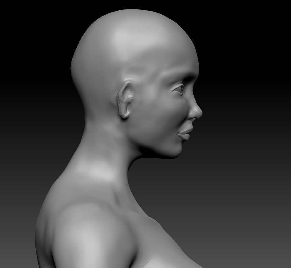
She's almost 8 heads tall which is a bit of an overkill. The average human height is 7 and a half heads tall. I would shorten her legs down a little.
Also, Kot_Leopold, the model is currently standing on tip-toes, making her taller than she actually is. However, I don't know if that's the best way to model the feet, since they're looking a bit awakard. PixelKitty, I'd suggest reworking them so they lay normally, and then you can rig them back into a higher position once you're done. After you do that, it'd be easier to judge if she seems too akwardly tall or not.
Good work so far, keep going!
As for the hands, I'll have to take a closer look at them and try to tweak the size some
Body:
Shoulders too far back, neck too thin, calf muscles too pronounced (smooth out and redefine muscle), fingers spread out very far (looks very uncormfortable), arms look too straight from side view (angle top of foreamr towards elbow slightly foward, then straighten out forearm towards ground).
Head:
smooth transition and mass around tip of nose and nostrils (tricky area to get right, but reference is key!), add volume to lips as they are looking quite flat (inflate brush is great for this), build up clavicles around base of neckline (helps create definition between torso and neck), use move tool with large brush size to pull head up and back slightly, define back muscles at base of neck.
Hope I didn't seem over critical, good luck with it and hope you're enjoying ZBrush!
I'll be making some tweaks to those places based on your feedback as I continue on adding clothes and whatnot.
Thanks again!
This is not your usual collar so there weren't really any tutorials to help me with this sort of thing so any advice is much appreciated. If you look at the previous post with the concept art it will give you an idea of what I'm looking to achieve. The collar should be more 3 dimensional and hard edged than the shirt (somehow).
Here is what I have so far for it:
Much appreciated!
I think you could work further on her face to bring out more femininity.
i personally think her cheeks are too high as it gives her a sort of plastic surgery look like she got them lifted. also i would diminish the smiling lines coming from her nose to make her look cuter. another way to make her look cuter is to give her more of a point at the peak of her nose in the profile view. currently it is very round. also in the profile view she has sort of a pouting look like shes puckering her lips which seems unnatural. id bring her bottom lip back and then level her chin with them more to make them less protruding.
another thing that will make her more feminine as far as her body would be to make her shoulders less broad.
The obvious anatomical mistakes have been mentioned and you should definitely fix them :P(In MOP, you should sculpt ears as opposed to push them out of the scull and the elbows look too flimsy) Even if this is not the work you are going to present, you never know who might see it - might hurt your future prospect...
However, there are a number of things that the TDs will kill you for. Just because the concept artist painted the character that way, doesn't mean its right. Your character must be modeled to make the rigging easier. Spread the legs to avoid effecting vertices on legs that should belong to opposite bones. I would elevate her arms a bit as well (up to you). The hands should def be re-modeled to fit the scale; while you do that shape them to be more relaxed with the thumbs positioned as if they are about to grab something (but still relaxed).
Good work so far, keep going!
I've also just started on her harness but I haven't done much to detail it yet so disregard the shape of that so far. Also, you'll see a little separation line from where I've made her upper body a separate subtool and then continued to adjust a bit. This part will be covered by the upper part of her gloves so I'm not too concerned.
Please let me know what you think of the changes!
-Chin-cheek profile made slimmer (more of a V shape to the lower half of her face)
-The nose is pinching, relax the nose-to-cheek area (where the nose bridge conects to the cheek bones.
-Angled the jaw slightly so it wasn't so square.
-Nasal-labial area also has to be relaxed slightly.
-outer eye lower lid made droopier, lazier. This make her look cuter (note your concept). Inner eye also drooped slightly. See Brittney Spears eyes to get an idea. Lowered the lower eyelids.
-Upper outer eyelid raised.
-Inner Eye apex increased (upper eyelid inner top corner).
-Nose bridge too sharp. To bring her closer to your concept you want to relax the nose bridge as well as widen it. If you were to cut it in half instead of a V it should be a slim U shape.
-Lower lip broadened
-Upper lip clefted. Although I was not able to remove the duck face look. You'll want to bring in the mouth a bit.
-Fixed hair to flow more like your concept and not be so "executive".
This isn't the best but I hope it helps you
-I'd relax the nose some more. Also, careful you're starting to get a bulge on the sides of the nose bridge.
-The tip of your nose is bulging a bit too much. From your concept it seems she's petite and caucasian, so her nose wouldn't be so round at the tip and instead would have a sharper profile.
-The top of the jaw has a strange bulge I normally see in men. You may want to get rid of that bulge and have a straight clean line.
-Chin is a lot sharper in your concept. I'd sharpen the chin some more.
-Cheek is still too high, see my paint over.
-You may want to raise the inner eye apex (inner, top right corner).
-Lower eyelid towards the outside you may want to lower it. She'll match a lot closer later on when you do makeup in your diffuse.
-Upper lip is too narrow. Usually the upper lip is broader than the lower. Your concept shows it.
[Note] The guidelines I put on there are not actual topology/edge flow. They are contour lines only (although edgeflow sometimes follow the contour lines).
Anyhow, hope this helps some more. It's looking good so far!
I've made quite a few changes so I thought it might be a good time to update!
Critiques please if you have them
More here:
http://s1184.photobucket.com/albums/z321/pixelk1tty/New%20Lilith%20Pics/
Thank you!
Good work though, keep it up!
Tenchi - I agree about the feet, in the artwork they are somewhat small but it didn't translate well to 3d
Tobbo - Thank you! Yes I hope to texture her but I need to study up more on how to go about that in Zbrush! I'm still learning as I go
Not too conviced with the face, definately may want to go back to that.
The boots, particularly the soles I'm not too convinced. Could you post an image showing an example of the boots you're doing?
Something isn't right with her hands but I can't quite point it out. Mostly to do with your thumb to hand connection.
Other than those things, she's coming along pretty good.