Home 3D Art Showcase & Critiques

Magic wand- C&C Please

This is an updated first post as I am pretty much calling this one done. Unless someone has some more input on it. Left concept up in case anyone wanted to see it still...

magic_wand_concepts_by_hunqwert.jpg

This is the concept which can be found here. Concept was not done by me...

WandFin_Render1.png


WandFin_Render2.png


WandFin_Render3.png


WandFin_Render4.png


WandFin_Render5.png


WandFin_Render6.png


WandFin_RenderText.png


WandFin_RenderS.png


WandFin_RenderN.png


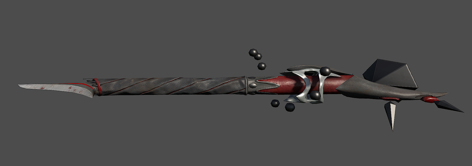
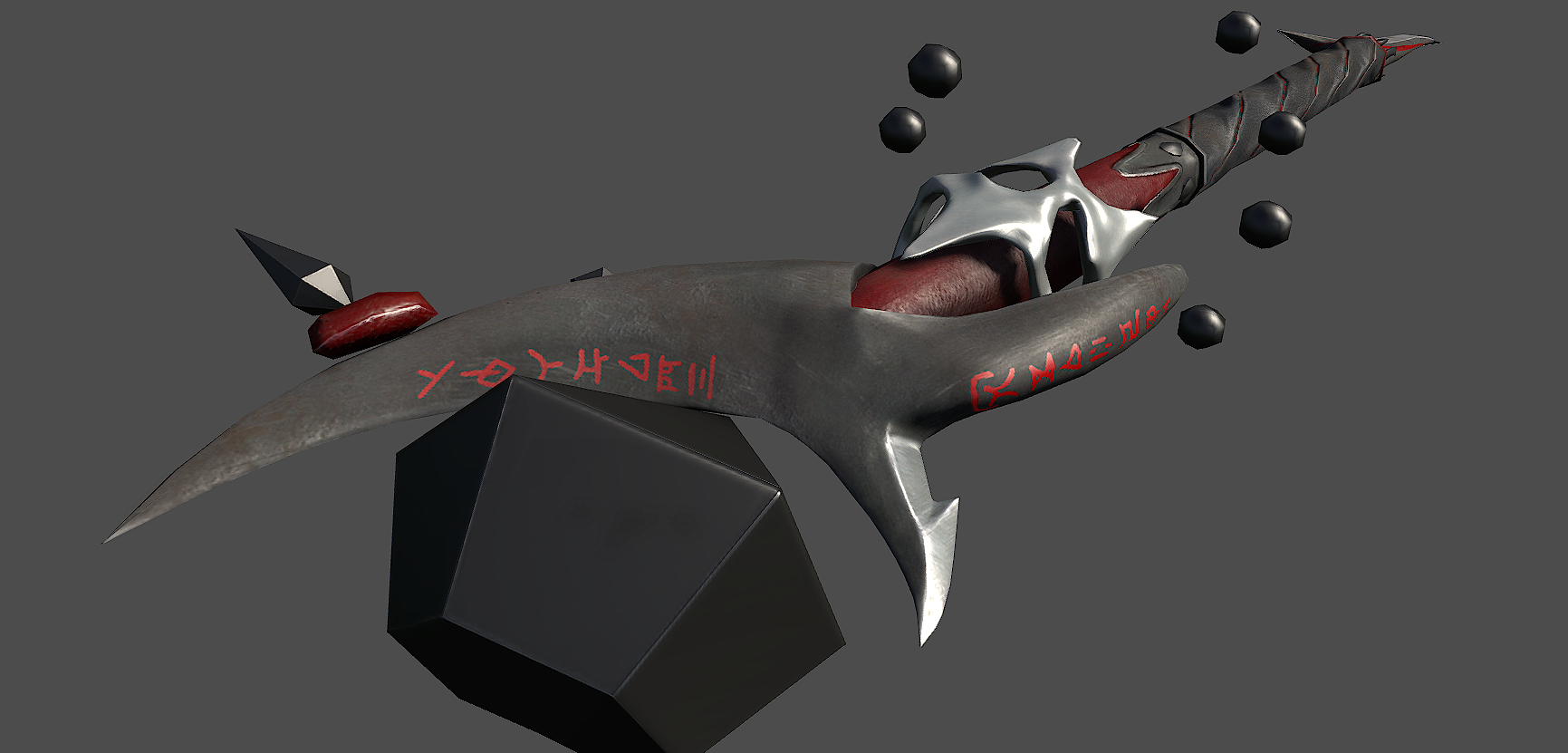
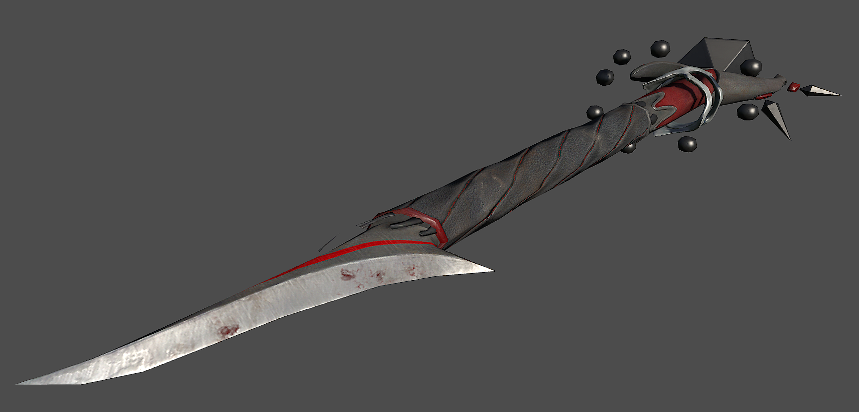
it sits at 2,772 Tris and the maps are 1024. The maps scale down to 512 well but then don't hold up up close.


Thanks for all the help on this one guys. I will be relying on you for my future projects.
Shoeintheman

Replies

  • mr_ace
    Offline / Send Message
    mr_ace polycounter lvl 9
    The main issue with your texture is there's not a lot going on in it. First off, you should look into baking ambient occlusion maps. With that, not only can you add some nice soft shadows to your model, you'll also be able to see where things are on the texture easier.

    Next, if you're going for hand paintyed textures, you need to try and paint in more stuff. Don't take things for granted, you need to add all the form and colour variation, try and focus on tone first in black and white, and add colour later
  • ErichWK
    Offline / Send Message
    ErichWK polycounter lvl 12
    The entire prop just sort of reads like plastic or cardboard. The metal's spec map is really broad leaving an uninteresting. There is no edge hi-lighting to make the blade sharp and even the parts where you painted in seem smudgy and are reading a bit muddy. You have a real big assortment of baking issues it seems on your normal map that are reading pretty bad in the renders, like pinching and what not.
    Can we see the hipoly by any chance? Or maybe a wireframe? You say you aren't going to go back to fix anything, but maybe practicing a few stuff (ie: better baking, better metal) would be a good thing
  • SgtNasty
    I think there are a few problems, but I the main one is likely the geo. In the concept, the big red "head" piece is a smooth, metallic object. In yours, it seems like you tried to make it too low poly or something, and there are a bunch of messed up edges. I can see this problem in a few other areas. To fix that, you would probably pretty much need to re-model most of it.

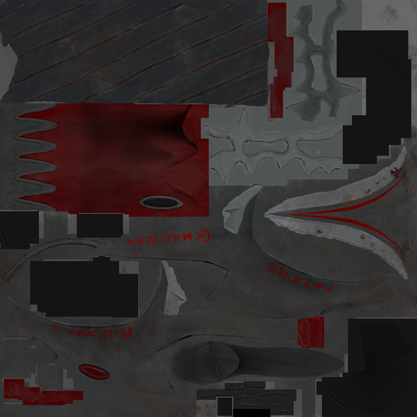
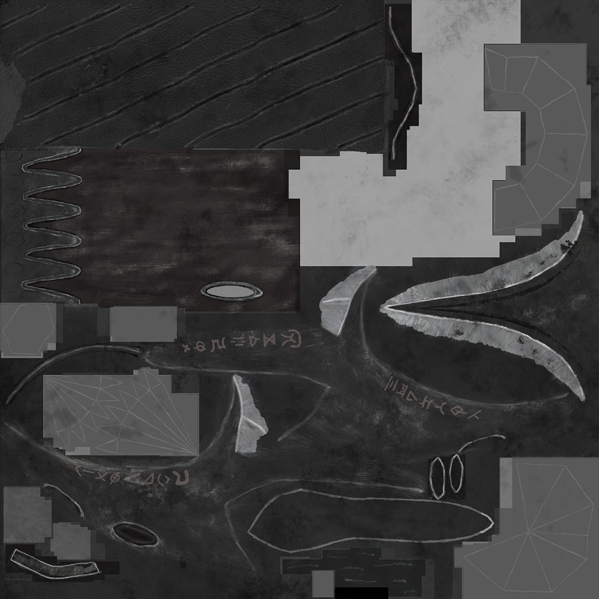
    With the texture, it doesn't look like you referenced real materials. The handle looks like it should be leather, but your's is just a black cloth material with random white splotches everywhere. I would recommend looking for some reference for real world examples of these materials.

    In general, try to get the basics right, I wouldn't worry about AO bakes or anything like that. Just fix the geo, and post it so people can help you with it.
  • MatthewS
    Thank you all for your critiques. First off I should have had more variation in my metal colors, and I am not sure how I had forgotten it... But that will be fixed in the future... Also I will work on the specularity of the metal when I come to it again.

    I should specify that I am not looking for a painterly feel but a pseudo real look without using photo sources...

    SgtNasty (Love the name) You are probably completely correct... I was being lazy and decided to use decimation master to mostly create the low... this unfortunately seems to have lead to major issues with unwrapping and baking... I know I said I wasn't going to change the model any but I can see that defining the piece isn't going to be possible without it. Therefor I am going to be redoing the low tonight at least partly.

    I will post up my progress in the morning along with my old wires, the high from Zbrush, and where I am at with the new low poly.

    Thanks again.
  • ErichWK
    Offline / Send Message
    ErichWK polycounter lvl 12
    You know, Since I'm assuming you are somewhat learning still in the art of 3D, I would recommend you don't Zbrush this. You don't really have to. Even the cloth you can get to look just as with with hipoly modeling. Learn to walk before you learn to run.
  • MatthewS
    Alright. Here is the new low and the high sculpt. I didn't Zbrush this from scratch if that's what you are thinking Erich, it was just used for the minor detail and some of the larger detail as it is more efficient than Sub-d modeling.


    Wand_ZRender2.png


    Wand_ZRender1.png


    Wand_WRender2.png


    Wand_WRender1.png


    I will be unwrapping it later today and then running it through some test bakes to see how it comes out.
  • Mark.N
    Hi Matthew, I've gone and done a paintover detailing how I think you should reorganize your geometry. From the looks of it you're just using a straight decimated mesh and it has resulted in some unnecessary and quite frankly, ugly, geometry. I would highly recommend fixing these issues before proceeding with your unwrap. Basically, if the vert in question isn't contributing somehow to the form/silhouette/structure of your mesh then it probably isn't needed.

    Wand_WRender_POMN.jpg

    Now once ya get that squared away and unwrapped nicely, you'll want some bitchin' textures. Yours above are completely flat and lacking in both contrast and detail and no where near deserving of a 2k texture. I would recommend starting with these quick tutorials on producing hand painted textures as well as focusing on building up contrast in your texture; paint some highlights and shadows subtlety as needed and try to avoid the random noise effects.

    http://wiki.polycount.com/TexturingTutorials (Btw the wiki here is a gold mine, USE IT)

    Hope this helps and keep it up, your sculpts are turning out great, now just to catch the rest of the process up :D

    -Mark
  • MatthewS
    Thanks Mark. A lot of the suggestions you have brought up will be taken into account... especially the alpha planes... unfortunately I think that some of the suggestions will be oversimplifying the mesh and will result in issues later down the road. I will take another look at those parts before I got to unwrap to make sure that there are not portions that can be reduced.

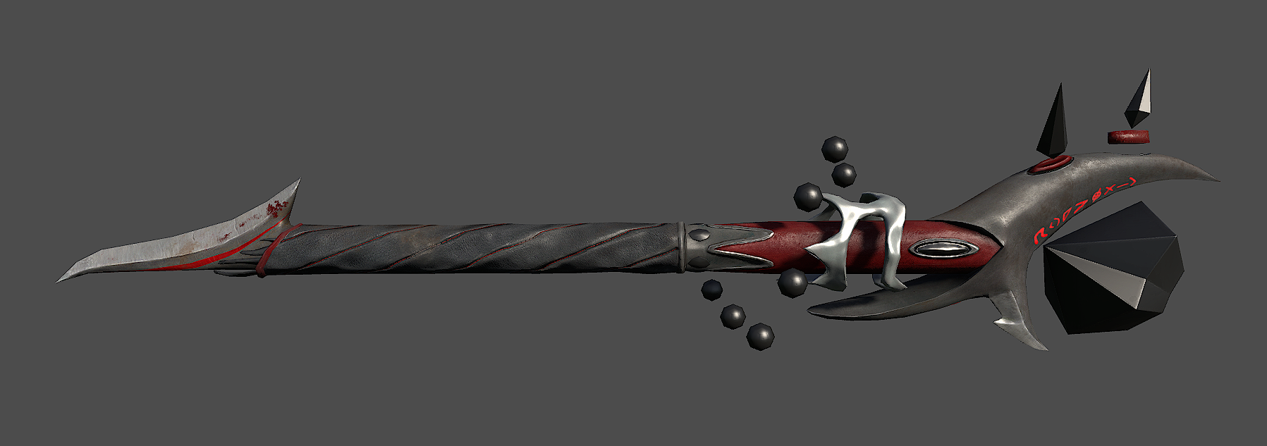
    I forgot to mention I hadn't messed with that ugly thing in the middle of the staff and am planning on changing it in some way...

    Also I am aware that the texture didn't need to be 2k I was just stating that I hadn't resized it yet.
  • MatthewS
    Alright. Been busy over here so I haven't been able to get to work on this until today.

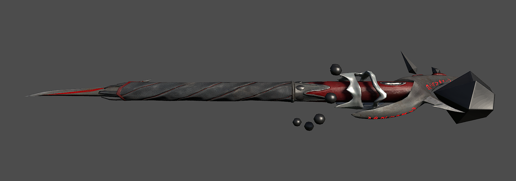
    Here is where I am at... Textures are still WIP but any c&c is more than welcome.

    Wand2_Render2.png


    Wand2_Render1.png


    Will be working on this more tomorrow. Should hopefully have it done then.


    Thanks for looking.
  • MatthewS
    Update. I have this pretty much finished... I don't like the way some of the metal came out but I'm gonna take a step back from it for a bit. Take a look and tell me what ya think.

    Wand2_Render3.png


    Wand2_Render4.png


    Wand2_Render5.png


    Wand2_Render6.png


    Wand2_D.png


    Wand2_N.png


    Wand2_S.png
  • n88tr
    textures are too loud and bright
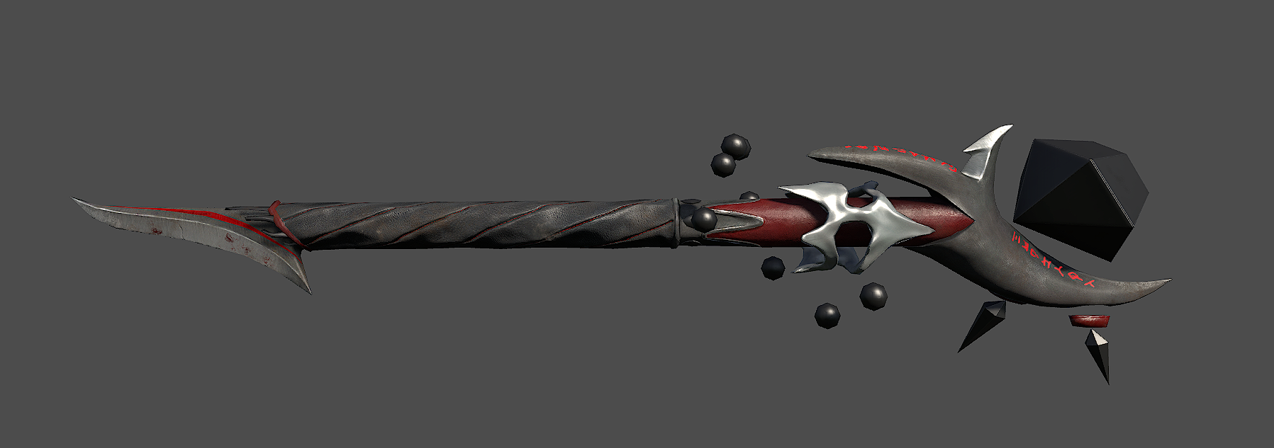
    just rubbing some grey into the red doesn't help any
  • MatthewS
    So are you thinking less saturated or just darker in general? It helps me more if you elaborate on what you are suggesting be done...

    I will look into changing it in these ways and see how I feel about it.

    Thanks
  • ErichWK
    Offline / Send Message
    ErichWK polycounter lvl 12
    Uhm..It's better... But your texture is killing it. It all reads like a big fake rubber wand. Your color map is super flat and your spec map is really bright and isn't showing much variation. Especially the rubber part seems pretty bright to me.
  • MatthewS
    No part of it is rubber so that is definitely a problem... Can you elaborate on what you mean by flat? I want to make sure what I think your saying is what you actually are saying. Also anything you can give me in terms of advice to get it to read more like metal and less like rubber.

    I have been trying to keep the damage to a minimum as it shouldn't be all that much of a close quarters combat weapon. Aside from the blade on the bottom... Do you think I should forgo this in an attempt to create more visual interest?


    I keep getting the feeling I am missing something very simple and subtle that is killing it and I cannot figure out what it is.
  • ErichWK
    Offline / Send Message
    ErichWK polycounter lvl 12
    Sure, Here take a look at probably one of my favorite artists. http://art-machine.com/_AM2009Files/_SiegePlank.htm

    Notice the variations in his color and his specular map. You need to add more life in your maps instead of just a bucket fill in photoshop and some splotching with a grunge brush. Hand painting can take time and practice, so maybe try your hand at mixing in some photo sourcing to get more variation and that super hard hyper detail that so many props lack.
  • MatthewS
    I see what you mean, and I have some ideas. I will continue working on this until I am satisfied that I have a grip on the techniques needed to produce something amazing.

    Thank you for sticking with me and not just dumping it off as hopeless. I really appreciate the help.
  • MatthewS
    OK. I have reason to believe I am heading in the right direction... This is still wip as I need to fix some bad seams and some overblown spec as well as revisit some areas probably.

    Let me know what you think.

    Wand3_Render1.png


    Wand3_Render2.png


    Wand3_Render3.png


    Wand3_Render4.png


    Wand3_Render5.png


    Wand3_D.png


    Wand3_S.png
  • MatthewS
    Updated first post with final results.
Sign In or Register to comment.