[Portfolio] -Branden Brushett, Environment Artist
polycounter lvl 10
Hey Polycounters!
It's been a few years since I posted anything on here. I've been pretty busy and have not been modeling as much as I'd like. I finally did a little update on my portfolio and wanted to get some comments/critiques. (I'm not thrilled with the layout) I currently work as a tester at Microsoft Game Studios and I'm trying to plan ahead for future employment, hopefully as an artist at a local game studio. (WA or BC)
All the work you see on the site is created in Maya, Photoshop and some things in ZBrush. I have the Unreal Engine 3 and thought about importing some of my work in there but I have only watched a couple of tutorials from the DVD's. Would it be worth my time to show some of my future work, in the Unreal Engine? I'm seeing a lot of work posted here lately using UDK. What's that all about?
Also, when you visit my site, my oldest work (from school back in 2007) is at the bottom of the page. Should that even be on my site anymore? Or do you feel even though it's old work, it's still strong enough to be shown? I'm curious.. I feel like I have an emotional attachment to those scenes because I enjoyed my experience in school so much so they're hard to let go. But if they suck, they suck and I'll get rid of 'em.
Enough blabbering.. check it out and tell me what you think!
Replies
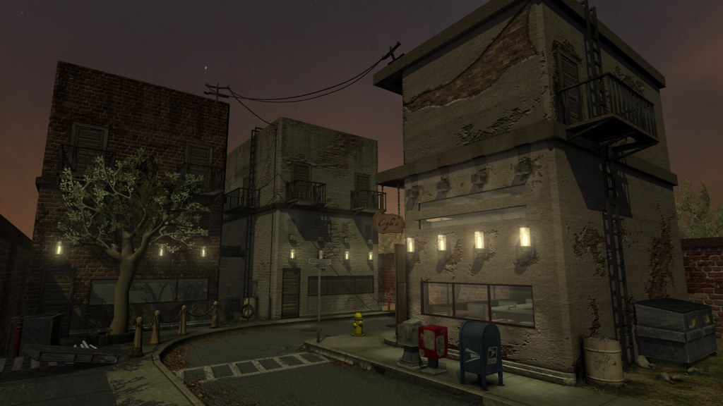
- The tree needs reworking or replacing. It feels flat and rushed compared to the rest of the scene.
- The two buildings on the left are are the same mesh with different textures, and it stands out. Adding props (something on the roof; maybe a rooftop greenhouse/garden/tent thing, widening the balconies so you can put a small chair and table, an overhang for one of the doors, etc.) would help break things up a bit. It isn't that you're off to a bad start at all with these, but you could push them further and end up with a good portfolio piece. If I'm not being clear, the paint-over Vig did in this post is a good example of making something that's just "good" into something great.
- Lighting lighting lighting. Overall the image feels flat. Getting more punchy lights in there and adding some contrast will really add to the mood of the piece. Use this and this to get your stuff into UDK, and read up on lighting in UDK on these forums. There are a ton of good threads that cover UDK in depth, especially adam's Evil Genious Hidden Forest Base thread, and consider getting the eat3D introduction to environment building in UDK. Also, check out any cinematic lighting books you can get your hands on (Google books is your friend).
- Consider making the sidewalks wider. Because things like postal drop boxes are placed by the government, and they have to consider wheelchair accessibility, you'll probably be looking at a 3 foot minimum space between the box and the building, just for one person to get by (wider for two, obviously).
- Unless it's a one-way road, widen the road as well.
Personally, I wouldn't scrap the entire scene. It'll take some time to get things into UDK, but for a game engine it's well documented and pretty easy to pick up where static meshes are concerned.
You have some good work on your portfolio site as well, but it seems image-heavy. Try checking out the portfolios of the people listed in this thread (the folks actually getting paid to do this fun stuff) and see if you can't cut down the number of images to your absolute best pieces.
Hope this helped =]
The scene itself lacks focal point, I see a few buildings, props and a tree but it doesn't tell me much about what's going in there. It'd be better if there was a focal element like say a water fountain to help draw the viewers' eye. Setting up multiple camera angles to show off different points of interest on the level wouldn't be a bad idea either.
Also, try not to just lay over details like the tears on the walls as it makes it look stamped on and not very consistent. I think the big one scraped across the building on the right stood out the most and it hurts the piece.
I'm curious to know if you've compiled a lot of reference because it would've definitely address a lot of what has been brought earlier and help develop your concept. Next time putting together an asset list/simple level block out would help too.
There are lots of great resources on UDK, check out http://book.hourences.com/tutorialsindex.htm for a start.
if you judge scale by that door back there, then the mailbox, newspaper stands, trashbin are way too big. the windows are too low. and everything feels chunky. another thing is the street layout, thats too narrow even for one car. it doesnt seem believable that a car could turn that corner.
I know i havent given any crits about the art side, but these things i mentioned just jump out at whoever is viewing it and distract from the scene.
As for the assets:
spec. they need some specular reflections (highlights, reflections). probably want to get them into unreal for this.
that giant brick smiley on top of the foreground building looks odd. thats not how it would look in r/l
i agree about the two buildings in the back looking too identical even with the different textures. try putting a billboard on top of the left one.
the tree bark is too smooth. looks the most "cg" out of everything here.
with some scale, moving around, you can get a really nice composition going on here. i like how the lighting in the scene works with the background. grass and leaves on the ground are a nice touch too.
biggest advice would be to collect a bunch of ref and then study them closely. how are the buildings made? how are the fire escapes connected to the building? how wide are sidewalks? roads? wear and tear on brick buildings? etc.
(I don't know why, but I can't seem to add images to this reply. I'll have to add as attachments right now. Polycount or Flickr isn't cooperating with me. View the better resolution images on my site.)
@ 00Zero- I brought a model in my scene and the scale is pretty spot on. However, the first screenshot I took I used the zoom tool in Maya and everything kind of warped a bit. I set up a new camera, hopefully you won't think the scale is much of an issue anymore. Gave the tree a little ZBrush treatment because well, it needed it. Glad you pointed it out. Oh and yeah, that street wasn't really meant for cars. Otherwise I would have made it bigger for sure. It's kind of like a back street alley type of setting. It's a dead end.
@pliang- Thanks man! My focal point was supposed to be the main building on the right, the 'Cyle's Pub'. I didn't want to throw anything else in there to take attention away from that building. So I tried to make it stand out a bit more by re-texturing the main building, and turning the lights/glow off on the buildings in the back. So the only building with lights is the one I want as the main focus. What do you think?
your lighting doesnt make sense to me...
@SHEPEIRO & urgaffel
Not sure why I'm having such a hard time seeing the scaling issue. But obviously it's an issue if many of you are mentioning it.
I threw in a body for scale reference and took a screenshot of the Maya viewport for you guys to see.
Also SHEPEIRO, what about the lighting doesn't make sense? Please explain. Thank you.
Try putting the guy in front of the door and see how he fits.
All your first stories are about 18 feet tall and your second stories are 10 feet tall. I think the problem with the lighting in the original image is lights are on, but we have dark shadows and it looks daylight but the lights are on and I can see everything even in the alley way back there so it looks like it's supposed to be 3 or 4pm on a cloudy day, but lights confuse the issue even more.
In regards to the ladder if you have a 6 foot ladder you'd have a new rung every foot or so.
@Jeremy Lindstrom- Now that's some damn good feedback. Thank you. Will work on the lighting some more, I do tend to wash out my scenes with the lighting.
I understand your point on the height of each level, however I will disagree on the need for each level of a building to be the exact same height. I was imagining these buildings being a live/work type of place. Business on the bottom floor, small studio apartment upstairs. I've seen buildings with a short first floor with the second floor being much taller, with vaulted ceilings. I just reversed that with the taller floor on the bottom. (Attached image examples, horrible examples they may be) I'm trying to not sound defensive about this but it's hard. So I'm just giving you my thought process. I wasn't too concerned with real world measurements. That being said, I've learned a lot from creating this scene and will take into account your comments on future projects. I really appreciate it.