The BRAWL² Tournament Challenge has been announced!
It starts May 12, and ends Oct 17. Let's see what you got!
https://polycount.com/discussion/237047/the-brawl²-tournament
It starts May 12, and ends Oct 17. Let's see what you got!
https://polycount.com/discussion/237047/the-brawl²-tournament
Need spaceship help - panel lines?
polygon
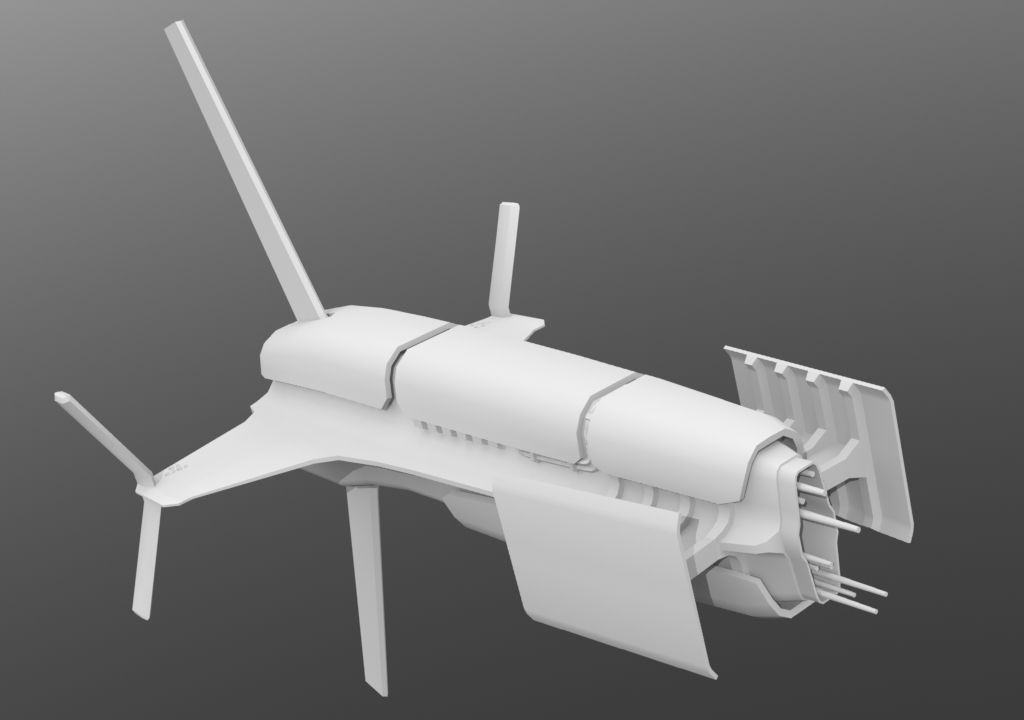
I'm modeling this ship for a contest;
and I want these details...
How should I do this to create the normal map? Booleans? Lots and lots of edge slices? Model each panel as a separate piece and suspend it above the surface below? Draw it on in something like Sculptris?
and I want these details...
How should I do this to create the normal map? Booleans? Lots and lots of edge slices? Model each panel as a separate piece and suspend it above the surface below? Draw it on in something like Sculptris?
Replies
is the way.
edit: Love the design of the ship btw
EDIT: Some tests with ndo2. Definitely missing a lot, any advice would be appreciated.
Does anyone know any quicker ways to draw panel lines, and any procedural ways to scuff them up, especially around the edges? I'm drawing it all by hand using the pencil tool, and would appreciate any faster methods.
A faster way would just be to use the line tool and shape tool in photoshop. Just draw in the lines, you can copy paste. With the shapes, once they're in place, just select them, rasterize, then contract the selection to about the same width as the lines and just delete
Then let nDo work it's magic and voila! Easy panels! That's what I'm going to do at least
Plus the floating geometry to bake a normal map from is also a great idea! I'm going to be doing that too XD
But your ship is coming along epicly! Well done
Final polycount was 5,724. Tools used were Photoshop, modo 601, and the ndo02 trial. I don't know what's up with the seam in the last picture, it only shows at render time.
Here's two beauty renders, I can't decide between them, though I'm leaning towards the second.
Your renders, to be honest, are really terribly framed. There's no focus, the aspect is strange and worst of all, your cropping parts of your ship out (NEVER do that). Also your lighting doesn't work at all: it doesn't match the BG and doesn't bring out the ship at all. Space is really easy for lighting: you've got so much more freedom...
Not much seems to be going on with the spec though, it all feels kinda plastic, with no differences between different material types.
In the beauty shots the orange really seems to pop out too much (or rather, the rest of the hull is too dark), seems kind of weird.
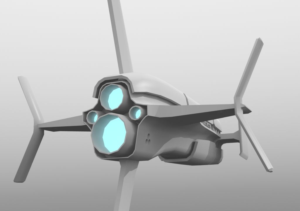
Last thing, the small emissive lights seem kind of randomly spread and colored, maybe it would be nice to have a bit more coherence and overall composition to their placement and colors.
EDIT : yeah as Xoliul said, baking out some curvature map or something would probably help to create a nice specular map, to make some edges pop a bit more etc.
Could you explain how to do the edgemask passes?
EDIT: Bal;
Thanks!
Yea, the spec I had issues with. After hand-drawing all the panels, I decided to add a glow around them on a separate layer, then flatten that and use that feathered radius to act as a specularity ramp; the idea being a quick way to do the paint chips and highlights around the edge of the panels. Is there a way to do specularity better, procedurally? I admit I'm not great at spec maps (or most maps to be honest haha).
As for the emissive lights, they match up with hull geometry; all the RCS thrusters have four yellow lights around them, airlock doors all have at least one window, and various repeated hull panels have repeated lighting schemes (i.e. there's some ovular shaped panels that always have four green lights around them).
I did something like this a while ago, you can see it here: http://www.laurenscorijn.com/portfolio/gz81. Note how i picked complimentary colors (green and red) and have these return everywhere. The ship as well is mainly greyscale tones and red/orange.
The color thing actually goes for your lights as well: don't try and use the entire color spectrum! Pick up to 3 colors (and for the love of god not Red green blue or red yellow blue) that match each other nicely. It's better to stick with 2 main ones, 3 is much harder to balance. I like the orange you have going on, but then going for sooo many different light colors is not a good idea imo. Pick one other color, perhaps blue, as this complements the orange nicely, and use that. (you can keep the white lights ofc, those are neutral).
Try and do the same for your skybox btw: right now it's really busy and noisy. try this: http://alexcpeterson.com/spacescape You'll have full control over colors with that, it's really nice (I used it for my space scene as wel)
And I'm really gonna have to disagree with the framing. I know you can cut parts off, but that would be for closeups, where you're focusing on part of the ship. Right now it just looks really sloppy, especially with all those black debris chunks that are all over the place, leading to zero focus. You're also picking these really weird, disorientating camera angles. Even if it's zero-G and you want pictures to look real, you want to take them as a photographer, not as some tourist who shot them with his cellphone camera
If you want some inspiration on framing/composition for vehicles/planes: http://www.airliners.net/
They have VERY strict submission guidelines, bad pictures never get in, composition always has to be perfect.
As for the current look I think it's way too noisy. You got your main shapes and then tiny details all over it. I'd say simplify the large surfaces to give the eyes some resting area and put the smaller details on focal areas.
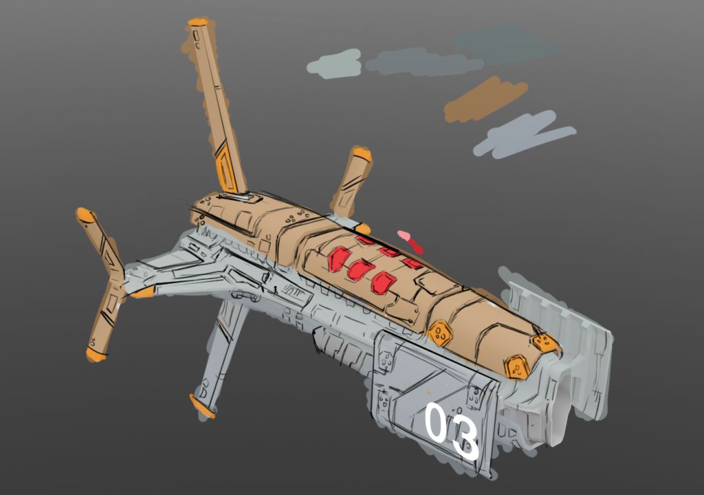
Here are some new renders and a shot of the diffuse and spec maps. What say ye?
Like someone said before, your texture is all small scale, has a few medium scale details, but nothing really large scale. Try and make the color scheme/pattern a bit larger and more interesting, use some blue paint as well. The Homeworld conceptart is excellent ref for this. If you're gonna do a slightly colorful spaceship, it really helps to invest a ton of time into it.
Actually I made an entire PPT on that spaceship, just go read it: http://www.scribd.com/doc/69482451/GZ81-Naganata
Also your specular and gloss are WAY off. you want the spec to be quite subtle, and have some strong glossmap variation in there as well.
Anyway, i like the shape of your ship, try to get your texture to live up to it
Here's the new spec and some new renders. I think I'm pretty close now. I also added some large blocks of color and colored panels (the latter mimicking some of what Homeworld does), to create large shapes that will read well at a distance.
I think I'm pretty close to done now, but I want to hear what you think. I wasn't quite sure what a gloss map does, so I did some reading; it seems like I can use the spec map for both spec and gloss? I put highlights at the apex of radiuses and then gradiated outwards from that highlight.
And then a far shot to see how well it reads.
http://www.laurenscorijn.com/dump/GZ81%20Naganata.pptx
It's much more useful with the words
np, you're welcome. I should probably convert it to html form on my website some day...
When building/ unwrapping did you happen to use a mirror modifier? This will cut your texture sheet by half!
Also I feel like your spec could use a bit more edge highlights, and a tone down ( just a bit) of the over all spec. The grooves between your panels kind of blend into the panels them selves. This is because the normal map could be a bit sharper for panel edges as well as darkening the grooves in the diffuse.
Other than that Its looking awesome! Keep it up!