Home 3D Art Showcase & Critiques

The Joker (comic version) WIP

polycounter lvl 10
Offline / Send Message
Kot_Leopold polycounter lvl 10
Hi there,

I've been working on this fella for some time now and I'm close to finishing him off.

Before I do that, however, I was wondering if I could get any suggestions/critiques on the Joker before I send the final to Photoshop? Is there anything off color-wise? I tried to keep him fairly simple and as close to the reference as possible hence such monochromatic coloring.

If there's something I can improve upon, please let me know.

BPR render:

killingJoke.jpg

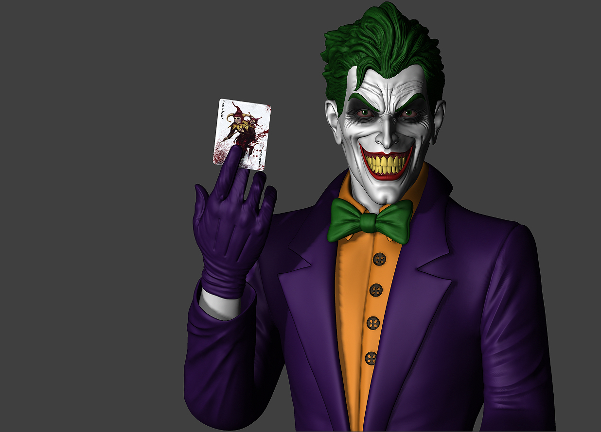
...and here's my reference sheet:

166c5qa.jpg

Thanks in advance!

Replies

  • Alberto Rdrgz
    Options
    Offline / Send Message
    Alberto Rdrgz polycounter lvl 9
    Looks great man! if i had to nitpick i would say the smile would benefit from being a bit wider. The teeth look right but the lips aren't matching the expression i would say.

    but that may be just me. curious to see what others think.
  • JeremyRM
    Options
    Offline / Send Message
    JeremyRM polycounter lvl 8
    Maybe what it is, is how you have the top lip actually cut up at that angle. I think that's what im seeing, hard to tell from the angle but if you bring the top lip across like your refs, then just use the lip paint to further that corner and bulge the muscle a little more it would be more realistic. Im looking mostly at the second and third refs.

    either way it's looking pretty cool man.
  • zakhar2
    Options
    Offline / Send Message
    zakhar2 polycounter lvl 6
    This is super nice but the eyes seem a little off. I think that making them slightly squintier or bringing the lower lid up a little would make him look more evil, but maybe thats just me.
  • Kot_Leopold
    Options
    Offline / Send Message
    Kot_Leopold polycounter lvl 10
    @zakhar2 Great suggestion about the eyes! Followed your advice and fixed them up a little - he definitely looks more evil now which I really like. Here's a comparison shot:

    joker_expression.jpg

    Very slight change but now he doesn't look like he's a little drunk or about to fall asleep. Thanks again!

    @Alberto Rdrgz Hey man, I tried giving him a wider smile and he started to look a bit ridiculous. I also think the expression is off but maybe it is better to leave it the way it is. Thanks though!

    @JeremyRM So inflating the corners and extending the paint would make the character more realistic? Correct me if I'm not understanding you right :)

    Here are some more views (maybe a paintover would be nice so I have a better idea of what to work on):

    1.jpg

    2.jpg
  • JeremyRM
    Options
    Offline / Send Message
    JeremyRM polycounter lvl 8
    here this is really quick but it shows what i meant. the upper lip never curls up, its always straight in a smile, granted you can exaggerate it but i think you went too far, the reason it appears like that in some of your references is because you're looking down on him so when the lip wraps around the gums it seems to be more curled up.

    joker.gif
  • Kot_Leopold
    Options
    Offline / Send Message
    Kot_Leopold polycounter lvl 10
    Thanks for the paintover, Jeremy! I now totally see what you mean. Unfortunately I already went ahead and did the final illustration... Guess this is what I get for not studying human expressions.

    564_large.jpg

    One thing I am certain about is that the next Joker or any "happy" character will have a proper smile!
  • Impala88
    Options
    Offline / Send Message
    Well, is it meant to be a natural smile or a something more like the original batman film with Jack Nicholson? if it's the latter (i didn't read the comics) then your current smile works better, but if it's meant to be a more natural smile (as-in he's in control of it) then yeah Jeremy's paint over is more fitting :) really good work anyway!
  • Alberto Rdrgz
    Options
    Offline / Send Message
    Alberto Rdrgz polycounter lvl 9
    Completely agree with this.

    joker.gif

    good job on this.
  • d1ver
    Options
    Offline / Send Message
    d1ver polycounter lvl 14
    Hey man. Just wanted to say nice job and congrats on recap.
    My biggest nitpick would be that his face is symmetrical, which is somewhat unrealistic for such a strained facial expression.
  • CodeFather
    Options
    Offline / Send Message
    CodeFather polycounter lvl 15
    Very good work , Vik ! Congrats for the model and I dig the final presentation, keep up the good work:)
  • TheGoozah
    Options
    Offline / Send Message
    Awesome! Nice comments by the other polycounters too!
    Also maybe some wear and tear could have been cool.
    But it's awesome too right now ;)
Sign In or Register to comment.