[m21] EBR Sniper Rifle
So I decided to go back to a weapon I made in school, I really like the design and proportions/detail of it. The only issue is when I did it, I did't know how to properly model, and therefore a lot of the edges were really tight. I didn't really feel like going back and softening all the edges though, I just REALLY want to texture this thing after seeing the gorgeous guns in battlefield.
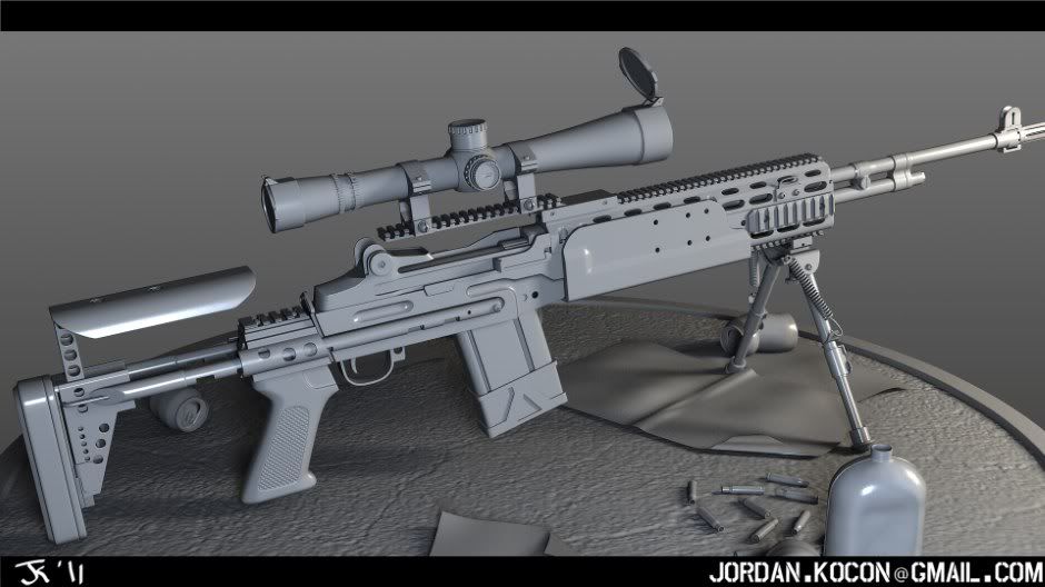
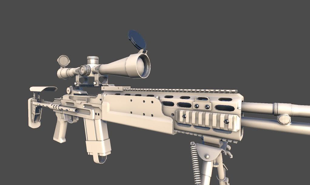
So here is the high poly, then the low poly + AO + normal. I am hoping to do some paint overs tomorrow of different colour schemes, etc.
Here it is C&C would be awesome
HP:
Normal Only:
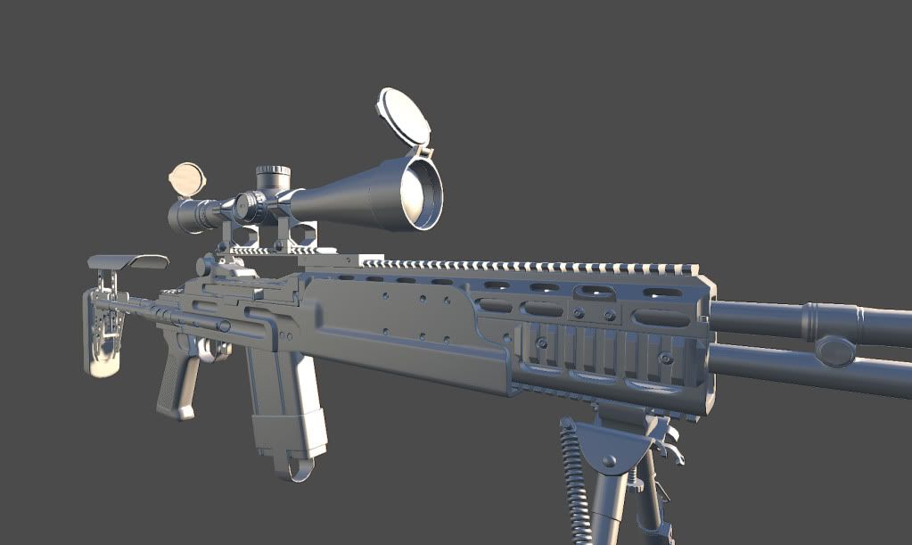
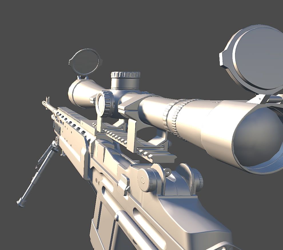
Normal + AO:
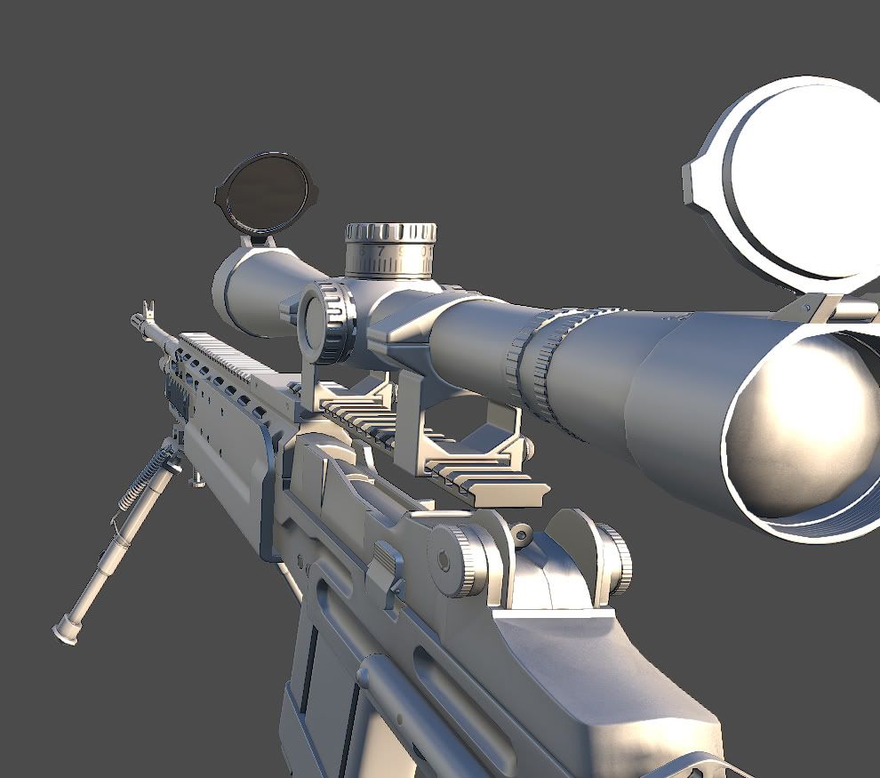
Normal map:
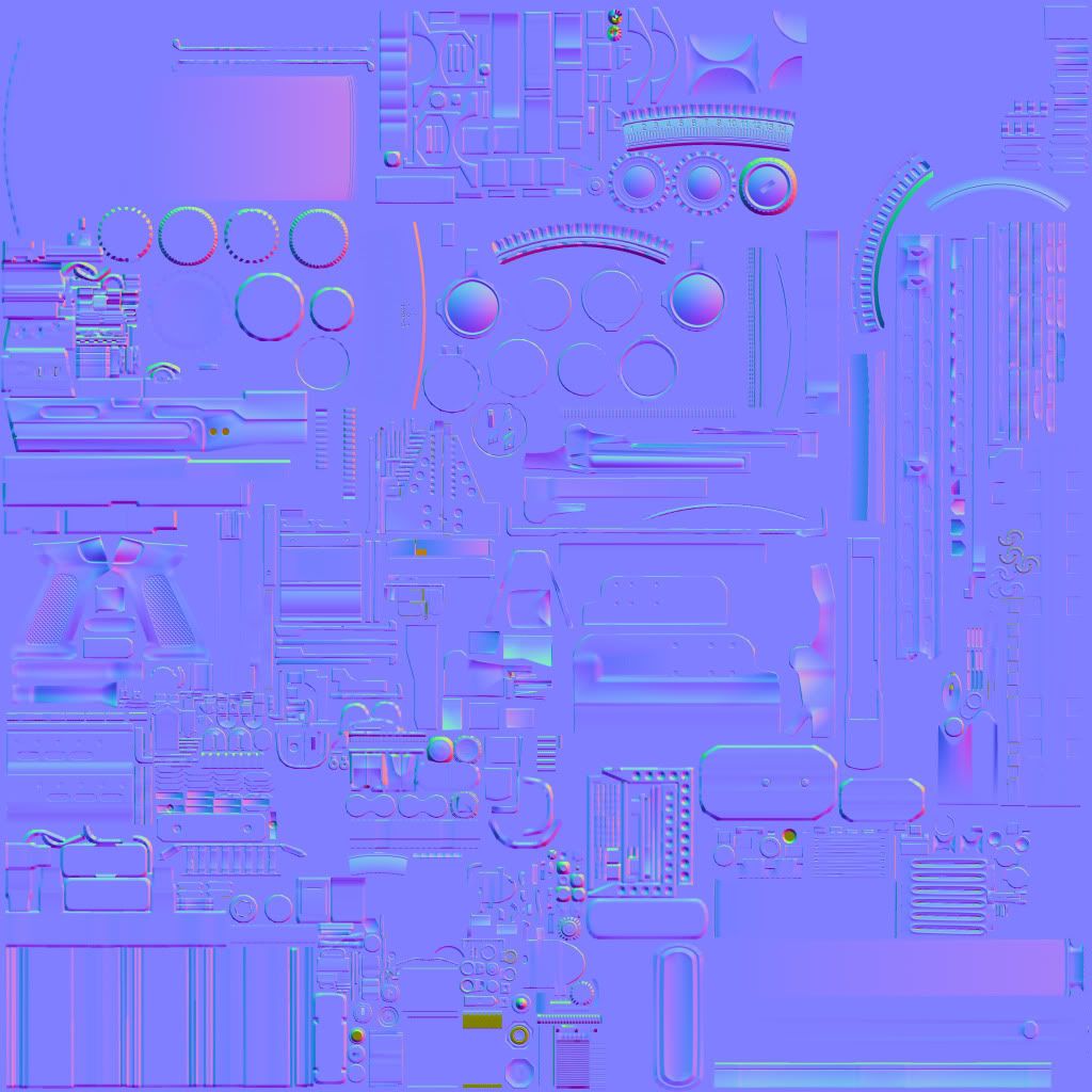
AO map:
So here is the high poly, then the low poly + AO + normal. I am hoping to do some paint overs tomorrow of different colour schemes, etc.
Here it is
HP:

Normal Only:


Normal + AO:


Normal map:

AO map:

Replies
ranek: Thanks dude! It was a combo of maya and xnormal.
So I am trying to figure out a colour scheme, I am leaning towards 2, what do you guys think? I am going to be going for a battlefield 3/Brink style...
-In the top black circle, I feel like your geo is starting to show, and you could spare a few extra polygons to really make that smooth, especially since it's such an important area.
-In the bottom circle, there is a weird normal glitch there, or maybe it's just the compression on your image but the corner there feels sharp?
Overall, I think you did a great job! and I like #2 as well, but those areas just jumped out at me.
and #2 !
jaycons: Thanks!
Korrax: Thanks mate, it will be a lot of texturing, but I can use the practice.
GragGunSlinger: Thanks a lot for the paintover! My screenshots here don't reflect the changes, but I agree with both those points, I'll add them to my next update.
DudeinCA: Cheers, here's some wires
The model is super dense... And not to use this as an excuse (but I will), I deal with tri counts and texture sizes everyday at work, so with this model I just wanted to get it down, and get to the fun part, texturing. So I didn't spend any time optimizing. Though I will go back and do it eventually.
Colour Scheme:
Wires:
And your chipped paint looks mostly like an overlay that doesn't make too much sense at the moment. Try to think more of where it would actually wear like that instead of applying it uniformly.
SasoChicken: I was thinking of giving it crazy colours, but then decided to go more modern/desert. I like the of adding 'Nose Art' to it, it was something I considered before. I ended up going and adding it
Here is an update. I am working on getting the paint feeling, and adding more scratches and dirt. Next update should include an updated spec map, but here is where it's at now:
Here is another update, I am kind of spamming this thread, but I need to stay motivated.. I think the rifle is nearing completion, minus all the little personal touches. I think the brunt of the work is done... the bipod and scope are still left to do.
The major ones are:
The crooked UV-mapping of the cylinders
The big gradients on the normal map (will look wired in some angles in most engines).
The lack of reusing. Your simply wasting too much texture space.
I strongly suggest trying out MIG Normal Tools to get less gradienty normal maps.
But again, the gun looks really good, take these advice and you'll make it perfect next time.
it takes the smoothing into account so you don't really have to care about that gradient.Do you want him to put more edgeloops for that ? Waste of geom if it looks ok in viewport.But yeah the mirroring and other cilinders well...i guess you need to rework a lot of the uvs