The BRAWL² Tournament Challenge has been announced!
It starts May 12, and ends Sept 12. Let's see what you got!
https://polycount.com/discussion/237047/the-brawl²-tournament
It starts May 12, and ends Sept 12. Let's see what you got!
https://polycount.com/discussion/237047/the-brawl²-tournament
Fantasy Villain Character
Hello Polycount! I am making a character based off some concept art a buddy of mine sketched.
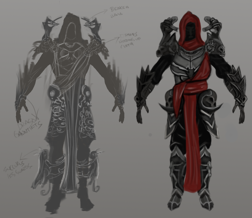
I've taken some liberties to change some things that didn't work in the concept. I should've posted this earlier in my pipeline, but I suppose its not too late for critiques/changes.
Full Body Shot. Cloth needs some work. Gonna give him a burly beard. and eyes.
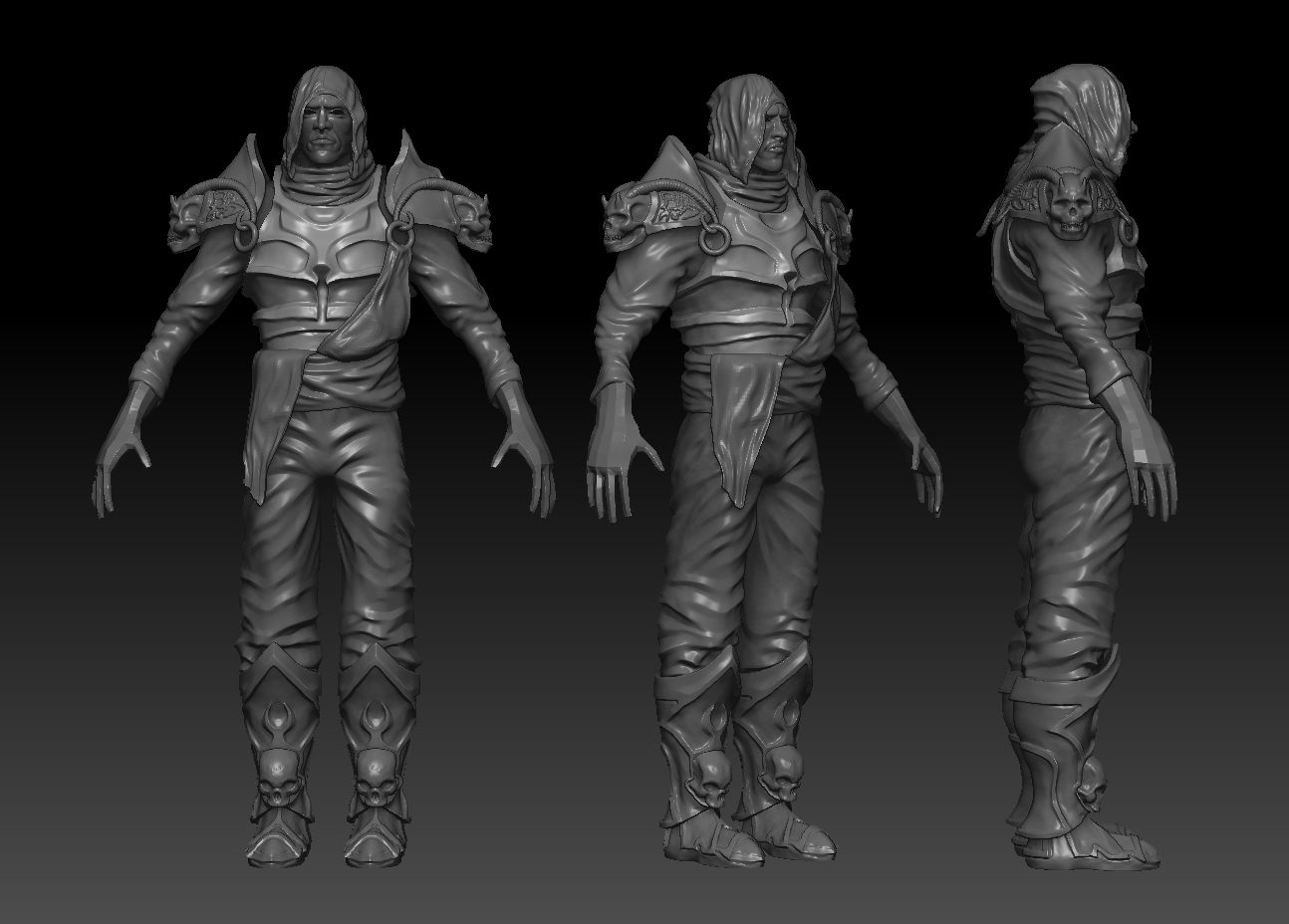
Boots:

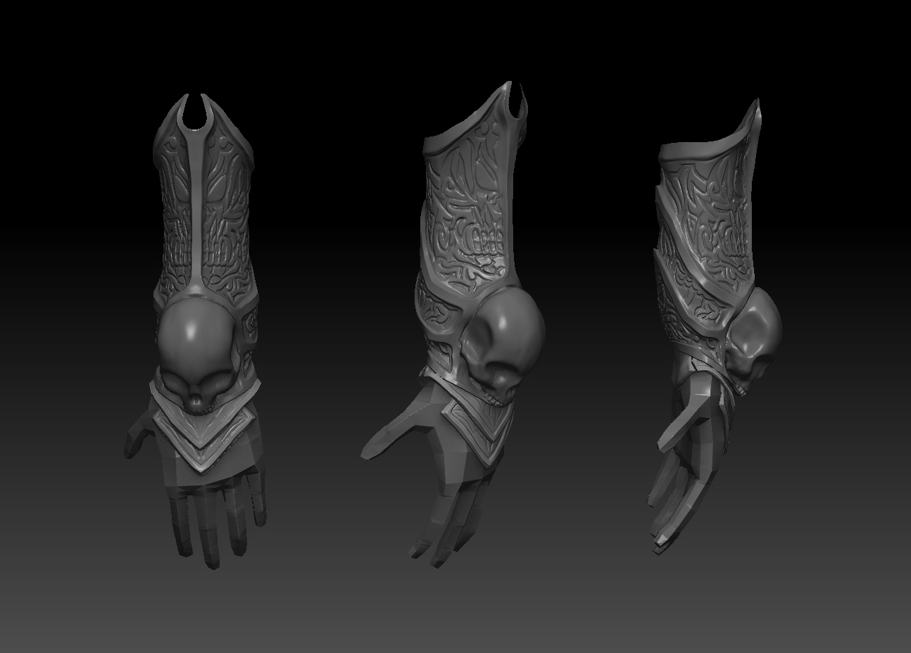
Gauntlets:pieces on top and under hand need refinement. I did the intricate design to make the metal more interesting than just flat. If I keep this idea, I'll have to do it on all the flat metal .
.
I'd really appreciate any and all critiques/bashing/etc.

I've taken some liberties to change some things that didn't work in the concept. I should've posted this earlier in my pipeline, but I suppose its not too late for critiques/changes.
Full Body Shot. Cloth needs some work. Gonna give him a burly beard. and eyes.

Boots:

Gauntlets:pieces on top and under hand need refinement. I did the intricate design to make the metal more interesting than just flat. If I keep this idea, I'll have to do it on all the flat metal

I'd really appreciate any and all critiques/bashing/etc.
Replies
Hood loops pretty lumpy, you might be overdoing it with the wrinkles, be selective where you place them, look at ref, etc.
Facial Anatomy could use revisiting.
The arm gets oddly thin, as if it's been squished, near the elbow on the forearm.
You've added a lot of nice wrinkle details to the pants, but the overall silhouette of the legs is kind of boring. i would like to see it taper more in some places (like at the knee, or before a bulge above the boots.)
I look forward to seeing how this proceeds!
Finally found time to work on this guy and prepare a post.
Still have a lot of work to do, but he's coming along. The arm guards and boots in the images shown are temporary. I have separate Ztools for those so I can make them symmetrical.
I have to redo my chain mail texture, work on his face a bit more, and figure out how to make this leg silhouette more interesting.
I also have to figure out what to do to make his back more interesting.
One thing I've learned in creating this character is: Having complete and well-thought out concept art is VERY important. As you can see by the concept, it isn't fleshed out very well, so I had to kind of..guess what to make how to make it. I often changed things that I didn't like after I spent a lot of time on it. I could have saved time and multiple headaches if I had fleshed out the concept a lot more before I started. This may seem like common sense to some people, but it never clicked until I hit countless brick walls. I hope at least one person reads this and uses my "hardship" to help them.
ANYWHO, I haven't updated since I did the low poly and texture work. So here are some pix.
Moving aside, the design of your piece is overall tons better than before. IMO it still has weak points (uninteresting/strange chest piece, lack of detail on pants). Still it is a part of learning process and I think you are doing good job.
I'd work on color scheme - this green and violet isn't working well for this type of character. But it might be personal preference.
Cheers man and keep on, the direction is right