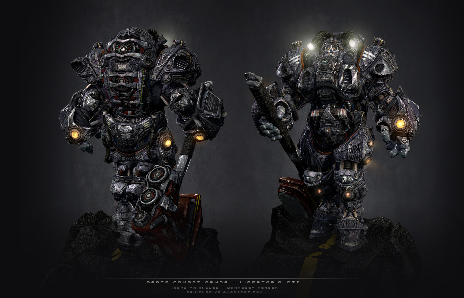
LIBERTARIA-027 - Space Armor Combat-
polycounter lvl 5
Hi!!, i just finish my last personal work Libertaria-027
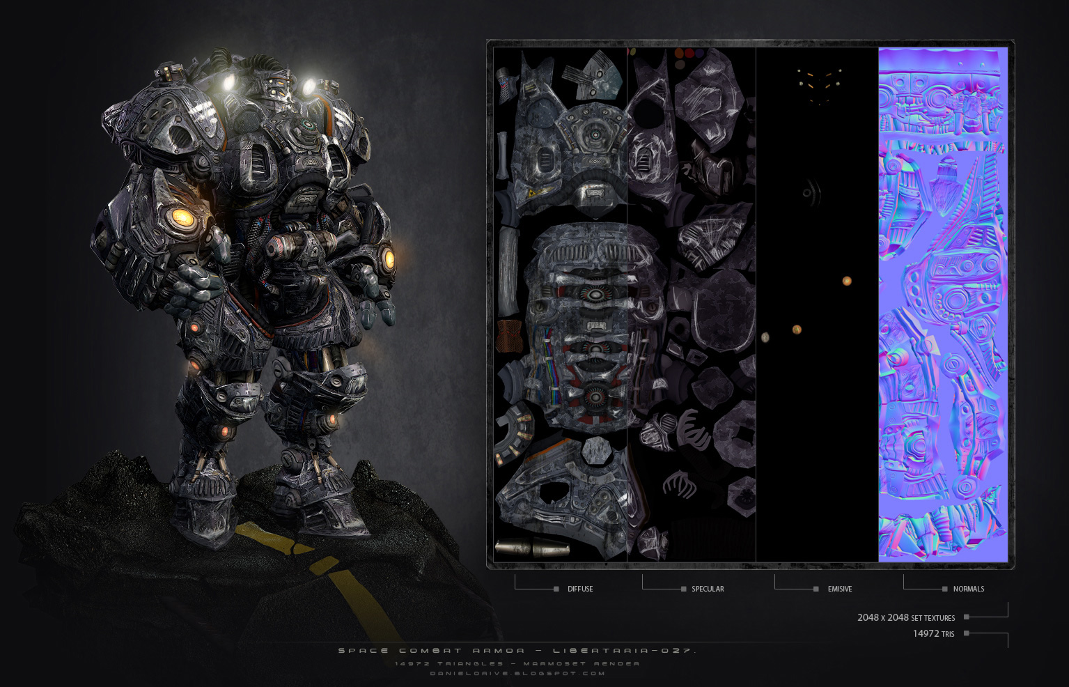
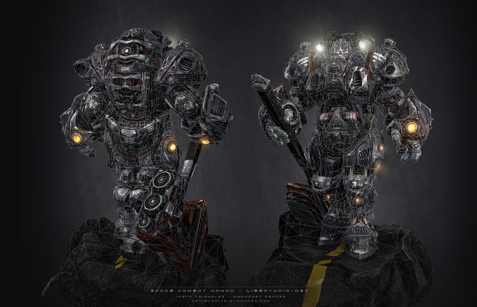
The armor have 14972 tris and use 2048x2048 difusse, normal , spec and glow maps. The hammer have 586 and the base 451 tris , both use 1024x1024 difffuse, normal and spec maps.
The final render its with Marmoset and the focus lights added with photoshop
Thanks for watching!!!
http://danielorive.blogspot.com/
Replies
Still the amount of detail you put into that sculpt is pretty impressive.
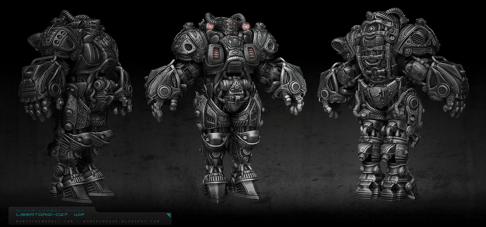
I really dig the high poly. Lot of cool shapes going on there.
I feel like the final, textured version of him comes off as a little noisy. You have a lot of really cool shapes in the high poly that don't read as well on the finished low poly.
It looks like you have a lot of value variation on the diffuse, which almost comes off as galvanized metal.
I think this is mainly just a personal taste thing though.
Perhaps you could ad more color variation between different metal plate pieces. Maybe instead of having different shades of grey he could have some more reds or oranges or something to make some details pop a bit.
What was your process for the high poly?
Good designs provide areas of interest through CONTRAST and COLOR and SMALL DETAILS. The problem with your textured version is that the only areas of interest are the glowing lights. The entire rest of the robot is so detailed that it just reads as noise, effectively killing any contrast, and muddying any color, and confusing the viewer when they try to find a small detail to focus on - because there's too many! The reason people like the untextured version better is that it removes a lot of the noise, allowing people to focus on the actual shapes of the robot. Unfortunately even the sculpt is - in my opinion - overly detailed. Remember that good designs provide a balance between large and small details. Your robot is made up almost entirely of small details. To save this design, I would break it up into large chunks of color. Do some studies in photoshop, just quick paintovers. The things to focus on are
1. Decide what areas you want the viewer to focus on. The head is an obvious choice. I would also choose the gauntlets and the back plate.
2. Make sure those areas have the greatest contrast and the most vibrant colors.
3. Everything is super detailed, but you can hide that by applying the same color to things. Only in areas of interest should you allow the details to stand by themselves, instead of blending in with the larger shapes.