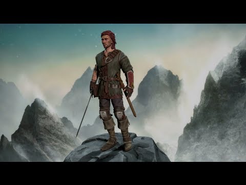
Fantasy Wanderer Character
FINAL TURNAROUND:
(Modelsheets coming soon)
[ame=" http://www.youtube.com/watch?v=ex8hjUF0Jlo"]Maltair Turntable in Unity - YouTube[/ame]
I've been doodling this wandering ranger/warrior type character for the last month or so and I think I've finally settled on a design. I'll post progress here to help me stay on track, and of course I appreciate any critiques you guys have to offer. I'm all about learning how I can improve my work.
I'm planning on doing video captures throughout the project and comping them together into a timelapse when I'm done, which will be an interesting project in and of itself.


*I still need to design the sheaths for the swords and his knife (you can't see it here, but he carries a long knife on his back.)
(Modelsheets coming soon)
[ame="
 http://www.youtube.com/watch?v=ex8hjUF0Jlo"]Maltair Turntable in Unity - YouTube[/ame]
I've been doodling this wandering ranger/warrior type character for the last month or so and I think I've finally settled on a design. I'll post progress here to help me stay on track, and of course I appreciate any critiques you guys have to offer. I'm all about learning how I can improve my work.
I'm planning on doing video captures throughout the project and comping them together into a timelapse when I'm done, which will be an interesting project in and of itself.


*I still need to design the sheaths for the swords and his knife (you can't see it here, but he carries a long knife on his back.)

Replies
@jmt Thanks for the comments! I think I'll design the sheaths and how they attach to the belt before I do anything else. I'll continue to refine the color pallet to something more pleasing as I work, I agree it could be better.
I have blocked out most of the outfit. I still need to bring in a couple things like straps for the gauntlet, his satchel, and his weapons but most of it is in there.
I did some work on his head as well but I'd there is a lot more polish I'd like to put on his noggin'.
A little update on the head.
Some minor crits on the face - the scar on his cheek you may need to make wider/deeper depending on what your final texture resolutions are going to be in order for it to read from a distance.
and his eyelids and brows look a bit off - his upper eyelid for instance looks like it's flat across instead of wrapping around the eyeball. Probably just somehting you haven't gotten to yet.
Really liking the clothing and armor. Has a lot of character.
@polozad - It's the blademaster by Sim Ki Yong: http://blog.naver.com/sim4130
Critiques appreciated!
His head looks a bit long to me, from forehead to back of skull.
That's all I got. I like where this is going. Anything inspired by witcher 2 is cool with me.
@Jessica - Thanks a lot! I took your advice and elongated the legs a bit.
@dirigible - I appreciate the feedback. I keep tweaking the proportions in the head, so that image is pretty old, however I'll take that into consideration!
At this point I'm wrapping up my the sculpt and am knee deep in retopoing. I'm hoping to have that wrapped up by Monday so I can start texturing next week!
Also, for anyone interested, I've been recording the process of me building this guy. I have the first part (concepting/design) posted on youtube. [ame="
Hope you will give a nice "worn" feeling to the clothes.
I've been running into a lot of trouble getting a shader in Unity working that has a Diffuse, Colored Specular, Transparency, and Normal map channel. Does anyone have any leads on a shader like this?
I've also been running some tests (with the assistance of some of my co-workers) to get Kinect mo-cap working and threw it on my character. Please forgive the goofiness of the walk cycle, the capture footage was originally for a stylized fat character that needed more of a waddle.
[ame="
but i dont know if it takes color from the specular
if this is for a game in unity, gues you need to create your own shader with strumpy´s shader editor.
if you want to present it, i strongly recommend not using unity, but UDK or cryengine instead.
also i´d remove most of the specularity on the cloth and skin. it makes your guy look like an action figure :P spec is realy only for shining stuff, wich is mostly metal
I'll take a look at Strumpy's shader editor and see if that can get me anywhere.
The green surcoat is supposed to be leather, and I've noticed that a lot of people who see this character think it is cloth. If the surcoat isn't reading as leather does anyone have any suggestions for how I could differentiate that from the cloth and leather straps?
first of all noone in that time did wear dyed leather. mainly because its kinda hard to do.
everything dyed was mostly cloth, worn ontop of leather armor. leather cloth/armor wais almost always brown or black.
also leather has that unique skin-fold-pattern, wich is not realy visible here.
and while im at it, he has got some folds on his shoulder. the shoulders are one of the few cloth-stretching-points you can be almost 100% certain, no matter the pose or clothing.
learning unity by importing a character is not realy promising btw, since it is kinda the engine that is easiest to access, especially for such a simple task as presenting a model. and no matter what you do, you will most certainly not get anything realy presentable out of there, since unity´s lighting is simply the worst.
even strumpy´s shader editor is just a plugin imitating the UDK-shader editor, and the post effects are not even worth noting.
I'm still working on textures; adding in more grunge and wear-and-tear. The rig is WIP and has a few spots where it is crushing or clipping geo. I also need to put some more work into the eyes and decrease the bushiness of the eyebrows.
Grunge, grunge, grunge!
Modelsheets, wireframes, etc... are incoming. I haven't had time to get them together yet.
[ame="
Just a few suggestions if you're still working on him more -
The hairline - two things could really help, a little bit of shadowing/occlusion along the hairline to sort of ground the hair, and also break up the edge of the hairline with finer detail. Take the swordmaster guy in the upper right on your reference sheet, see how his hairline where it meets his forehead you can start to see individual hairs along the edge? Where your hairline currently is more chunky.
He also has like anti- sideburns right now, most people's hair that is that long will be from their sideburns up and over to go behind their ears.
The material definition still isn't reading so well - your metals look more plastic which is due to the flat grey diffuse and how the highlight is falling. The leather spec looks better but is very even as it falls over the surface, breaking that up/ making it worn or splotchy could go a long way to selling the leather more. Also in the diffuse on you leather adding some more wear to like the edges, especially to the cut off sleeve, and maybe changing the color more of the patch section on his other shoulder. More grunge in general could sell things better too, maybe some rust here and there, mud on his boots or shirt, wear and tear on his gloves and leather bits, not to go crazy with it but to add certain details especially to tell a story, like he's been sleeping in the woods for months on end or something.
You probably don't feel like going back and tweaking the sculpt at this point but some things to keep in mind in the future at least... so the one belt around his midsection is interacting and pulling on his jacket which is a very nice detail, but then you don't really carry that through to the other belts as much, like where the shirt is hanging open in the front is very straight and vertical but has that shoulder belt hanging across it - which would be perfect to drag it to the side or crumple it up some and break up that straight line. Like the models on your reference sheet, all the elements of the clothing, the belts, shoes, pants, whatever - they interact with all the other elements, the cloth bunches up , the belts pull on things, and generally there are very few 'geometric' forms, most everything is asymmetrical and nonlinear.
Also to differentiate more between the leather and cloth in the future - the 'easiest' thing to do is to really push the quality of the folds in your sculpt. The leather would normally have larger folds and creases, and possibly have some patches where it's cracking apart. As compared to the finer/sharper detailed wrinkles of your cloth.
The red stitching on his coat is also very uniform. It's a patch job through a leather coat, the holes would be puckered and the stitches could be a lot more uneven, bunched up, or random.
The turntable looks nice, I really didn't think that was Unity at first. Can't tell if you have a reflection map on your metal bits or not. With all that said I still think he's a really nice character. Lots of personality and I think you nailed the general aesthetic from your reference sheet.