High Res to Game Res Tau Mech
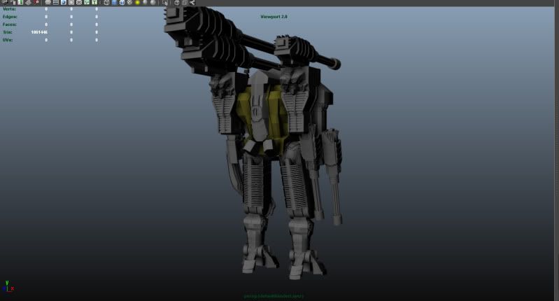
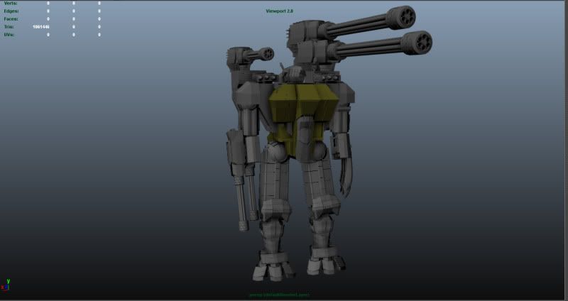
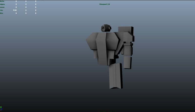
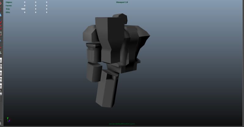
Tonight i started a project to take a my High Res Tau Crisis suite and bake him down to a game Res version of him. I already have the high res to tonight you'll see images of that and the start of the low poly base which ill be backing on. I'm all so playing with some design elements of the suit namely how big the shoulder mounted cannons are. the oringal size is the smaller single mounted cannon, the size im playing with is the twin mounted lager cannons. (Boarder line broadside size)
I'll be posting Edge flow on the low poly as soon as I'm done with it.
I look forward to yalls input.
High res
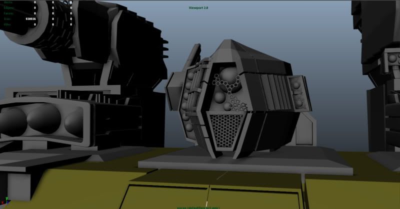
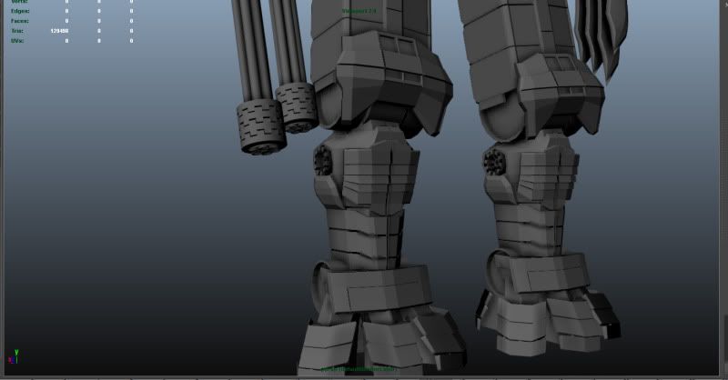
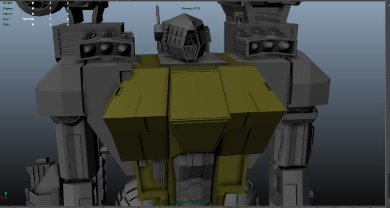
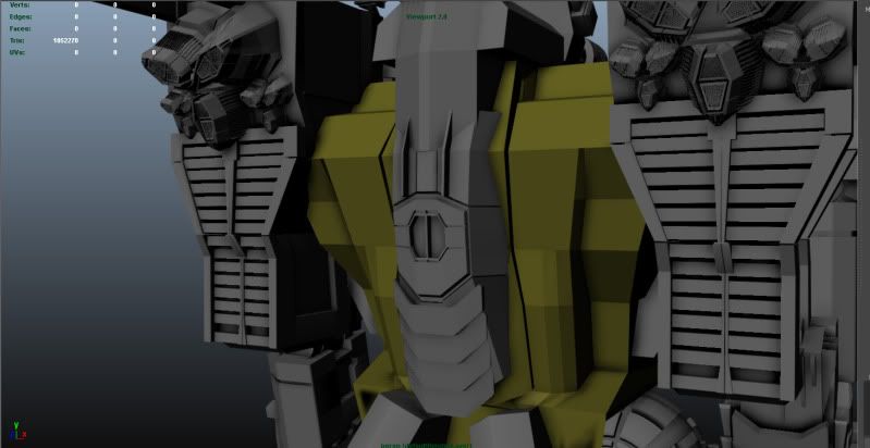
Game Res (Base)
I'll be posting Edge flow on the low poly as soon as I'm done with it.
I look forward to yalls input.
High res


Game Res (Base)


Replies
You also have a really inconsistent level of detail for the model, lots of small areas that are super dense in detail, other areas are kind of cobbled together with no real structural rhyme or reason. The gatling guns don't make any kind of thematic sense on top of them just looking like a present day minigun, which I find really detracts from the piece.
Last but not least, almost all of your modelling is straight 90 degree angles, which will not bake out well in a normal map. Steeper angles cause a shallower line in the normal map, making the height difference look negligible.
Did you come up with the design on your own or is it based on a reference? The design of it could use some work.
The super big gun...I'm not a fan. That thing would throw the weight of the mech off so terribly, it'd be difficult just for it to stand.
The high poly just is not at a good spot yet. There are faceted areas all over, and like Der Hollander said, having 90 degree extrusions will not bake well at all. You have to taper those things.
I would suggest you consider working more on the high poly and doing some more work/rework to it before you do the low poly.
Also, like Der Hollander said, your model is missing that Tau style, the smoothness, the japanese-styled armour. Keep up the work!