The BRAWL² Tournament Challenge has been announced!
It starts May 12, and ends Oct 17. Let's see what you got!
https://polycount.com/discussion/237047/the-brawl²-tournament
It starts May 12, and ends Oct 17. Let's see what you got!
https://polycount.com/discussion/237047/the-brawl²-tournament
Deserted Gas Station - UDK Environment
Working on a deserted gas station currently and taking a break from my other projects. I am running into some trouble and I also want some critiques on what I have so far. I am kind of basing it in the Fallout universe but applying to style to be more similar to Gears of War. I plan to construct the inside of the building at a later point but for now I am just trying to get a cinematic for my demo reel. I am still adding and working on it and I really need to still add rocks.

The big problems right now are these. I am having trouble trying to figure out how to have the road in the scene. I tried painting it through the terrain editor on the ground but didn't like how it looked and now I am just using a piece of geometry but I am having difficulty trying to figure out how to blend it. The only other option I can think of is to extend the road and cover the edge with grass, bushes, and rocks.

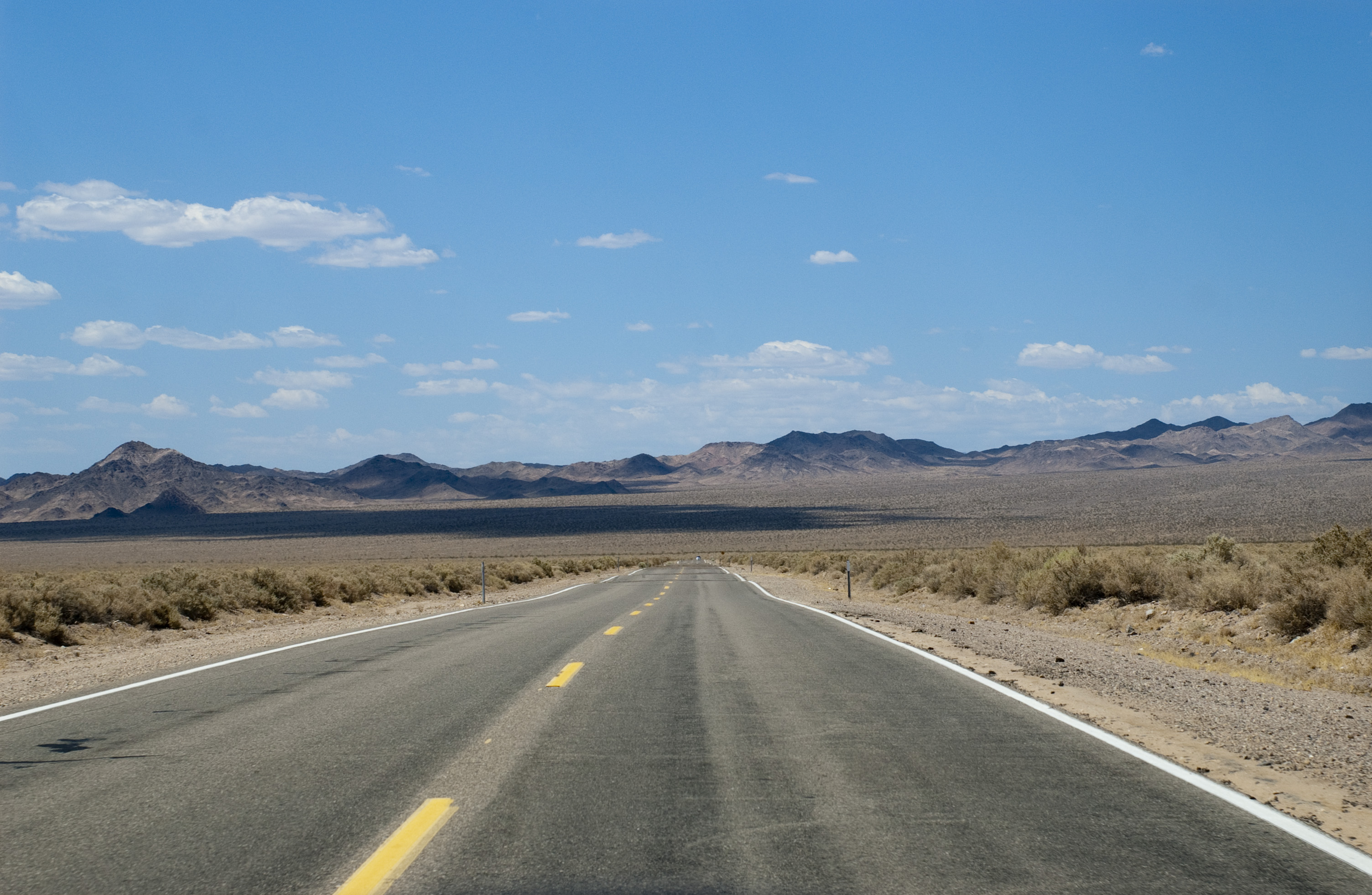
I want the road to look more like this.

The other big problem is the grass. It keeps doing some weird things. More below the image.

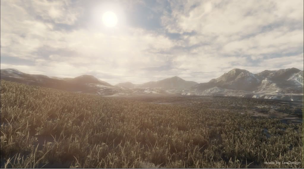
I want it to look a little more like this but still brown in tone. Any ideas on how to achieve this? I tried looking at the UDK august grass they had in the scene but it didn't look like this. Also when I change it to translucent there is the weird alpha sorting problem I cannot figure out where the grass doesn't order itself properly to the camera.

Thanks for any help anyone can give.

The big problems right now are these. I am having trouble trying to figure out how to have the road in the scene. I tried painting it through the terrain editor on the ground but didn't like how it looked and now I am just using a piece of geometry but I am having difficulty trying to figure out how to blend it. The only other option I can think of is to extend the road and cover the edge with grass, bushes, and rocks.

I want the road to look more like this.

The other big problem is the grass. It keeps doing some weird things. More below the image.

I want it to look a little more like this but still brown in tone. Any ideas on how to achieve this? I tried looking at the UDK august grass they had in the scene but it didn't look like this. Also when I change it to translucent there is the weird alpha sorting problem I cannot figure out where the grass doesn't order itself properly to the camera.

Thanks for any help anyone can give.

Replies
Well that shouldn't be the problem. It seems like the grass is unaffected by light, therefore the contrast between light and dark is so great.
Though I got to admit, the shadows casted by the grass shouldn't be so strong. I think that can be fixed by editing the material settings to make light pass through.
Also, I think the blend would look better if the road dirt and the terrain dirt were the same shades, or something similar.
The problem with your lighting right now is that your lighting is far "too" dramatic... you have it lit from the side and not from a "quarter-angle" like in your inspirational image (the last image). What this will do is make your shadows extremely long and try to define them as best as it can.... how do I know this? Look at the shadow your gas pump pillars are casting... they go out like 80 feet.... so this means if you have 300 plants in the scene where your vista is at, they'll all be casting similar shadows from the dominant directional light.
Also, on the subject of lighting, your reference image of the road has a ton of fill light from the atmosphere mainly because of the time of day and the fact that its a clear day out... your scene is very different, you don't get that type of fill at sunset/sunrise... its totally different.
So what I am saying here is that the lighting is building properly... its just that your setup isn't really accommodating to what you're trying to achieve
One last note... variety. The variety on your main plant that you're populating the space with is too stagnant... it needs more variation. You could use that same model with the same texture, but through a material trick you can make it look "more red", "more green", "more brown" etc....
The grass is the biggest issue still. Here is my mat setup:
and here is a even bigger problem. When i switch from soft masked to translucent it gave me some weird errors with sorting the alphas as to which one was in front of the other.
It is even more prevalent when I turn off lit mode.
As for the road I have the exact same texture on the edge as I do the ground below it and I still cant get it to look the same:
@ jimmypopali
That is the real thing i cannot figure out. I have the same exact material applied to the roadside as the sand beside it at the same Tex cord and everything.
@Limewax
I agree on all the points you make.
The sun will def have to change position. I think it makes the scene to intense and I will work on trying to change the clouds to make up for the difference as well as the overall fill lights in the scene.
The plants I am having trouble trying to figure out how to make variants with color. Any suggestions on how to do that?
Hellfire
The foliage had already been set to non directional
salacious_Crumb
I made the geometry in maya and then made two uv maps with one being for diffuse and such and the other for lightmaps
Also constraint to world position instead of using a tex coord that way the textures will line up properly. Tex coord doesnt guarantee the same density as its based on the mesh or terrain specifically not grid space. By using a world position node instead of a texcoord it will always start the texture at 0,0,0. Multiply with a constant 1 to change tiling.
Been working on getting this thing completed and in my demo reel.
I will post a turnaround soon.
Keep it up!