The BRAWL² Tournament Challenge has been announced!
It starts May 12, and ends Sept 12. Let's see what you got!
https://polycount.com/discussion/237047/the-brawl²-tournament
It starts May 12, and ends Sept 12. Let's see what you got!
https://polycount.com/discussion/237047/the-brawl²-tournament
Fantasy Graveyard Mini Scene
This has been a 3 week project for me so far. The reason I started this project was to tackle a few firsts as far as my art pipeline and abilities are concerned. Up to this point I had never touched (in any real depth,) a 3D sculpting app, hand-painted stylised textures or done any work with a fantasy theme. So with those conditions in place I weighed up some options and eventually settled on creating an environment based upon a Victorian Graveyard. I was at first inspired by Games Workshops relatively recent Gardens of Morr scenery set, but my path has slowly diverged from this initial artistic spark.
At the moment I've assembled the pieces I have completed so far into something of a "Mini Scene," the idea of which is to test the direction I am heading in. This will also serve as a temporary demonstration of these new found abilities on my Portfolio while I work on creating a larger hopefully more impressive environment in the same style. I chose to also have my first experiment with the Marmoset Toolbag to present this piece, which I have decided is a fantastic bit of kit.
So enough blabber, heres some artwork! First up is a turntable render straight from Marmoset, be sure to watch in HD:
[ame=" http://www.youtube.com/watch?v=Cz1YwfAgYKE"]Fantasy Graveyard Mini Scene Turntable - YouTube[/ame]
And here are the stills from the video in better-than-YouTube quality (clicky).
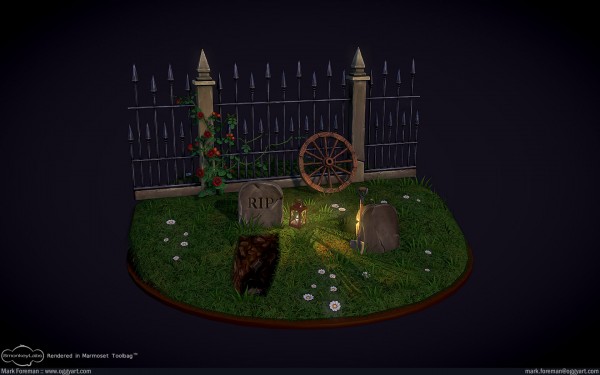
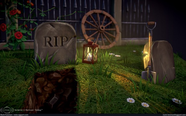
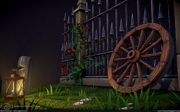
Let me know what you think. Like I say, I plan for this to go in my portfolio so I'd like it to make as good an impression as is possible.
There are some WIP posts up on my (rather new) blog here: http://www.oggyart.com/blog and if anyone wants to know anything specific Ill try my best to answer you. Thanks for your time.
At the moment I've assembled the pieces I have completed so far into something of a "Mini Scene," the idea of which is to test the direction I am heading in. This will also serve as a temporary demonstration of these new found abilities on my Portfolio while I work on creating a larger hopefully more impressive environment in the same style. I chose to also have my first experiment with the Marmoset Toolbag to present this piece, which I have decided is a fantastic bit of kit.
So enough blabber, heres some artwork! First up is a turntable render straight from Marmoset, be sure to watch in HD:
[ame="
 http://www.youtube.com/watch?v=Cz1YwfAgYKE"]Fantasy Graveyard Mini Scene Turntable - YouTube[/ame]
And here are the stills from the video in better-than-YouTube quality (clicky).


Let me know what you think. Like I say, I plan for this to go in my portfolio so I'd like it to make as good an impression as is possible.
There are some WIP posts up on my (rather new) blog here: http://www.oggyart.com/blog and if anyone wants to know anything specific Ill try my best to answer you. Thanks for your time.

Replies
How about varying the heights of the spikes slightly, break a few off, add some bends to the bars etc... It doesn't have to be ridiculous, but it would add character.
You could also make the placement of those white flowers more natural, by bunching a few around the tombstone, near the fence, or the wagon wheel.
Also there is a dug grave and a shovel but no dirt outside of the hole to cover it back up... but thats just a bit nitpicky.
I'll certainly make your suggested adjustments to the fence, kind of forgot that step during the assembly of all the pieces. Not sure about the flowers, at the moment I am using them to fill empty space on the grass. I may make some slightly larger flowers and use them like you suggested. As for the dirt, I did give that some serious consideration. But in the end I felt it would end up a bit too crowded if I tried to fit it in alongside everything else. I think I may hint at it towards the edge of the base though.
I've received other comments about the empty space behind the fence so I am currently working on some bits and pieces to make the rear of the turntable that bit more interesting. Going for a forest feeling outside the graveyards confines.
1) i love the wheel... the way it's painted really feels like miniature paining in table games...but why there's a wheel in a graveyard? it doesn't makes much sense to me...
2) i'd switch the 2 tombstones as having the clean one on the dug grave and the one with the RIP on the "filled" grave... it makes more sense to me... or maybe i could have used more immagination and it's just that the body in the dug grave has been taken out...
2) I kind of like it the way it is for the reason you mentioned, throws a bit of doubt on the wholesomeness of what could be going on in the scene.
Here's what I've been working on for the improvements. Just finished a few bits of dead wood to incorporate into the foresty space I have planned for behind the railing. Gonna feature the mushrooms, bracken and the likes when I'm done with it.
[ame="
As before, some high-res shots (clicky).
If I HAD to complain though, I would say that the rendering is a little bit odd; textures and models are very stylized but lighting and shadows have a rather realistic feel. I'm not too sure either about the Depth of Field (assuming that's what I'm seeing here); it just feels a little out of place.
With a graveyard scene, it should probably be immediatly visible whats going on.
I really had to look twice before identifying the open-grave as an open-grave and the 2nd stone as a gravestone. The lamp is in a quite odd position (i wouldnt put it there, i would probably hang it on one of the spikes of the fence, might also give some nice lighting to your back-side scene).
Maybe add a heap of sand next to the open grave, that might make it clearer that someone's digging a grave. Also, i think you can add some more scale into the scene with smaller letters on the grave. right now its all quite big. Some more text in smaller letters might keep your eyes on the details.
Here's my diffuse textures as they are so far Jessica.
I've addressed more of the points people gave me. Things like the back of the scene out-doing the front, and I gave those nasty seams around the grass some extra attention. That random wheel also makes sense now, in the cart it was always destined to be a part of! I hope this also helps the narrative a bit.
I tried moving the lantern around, but didn't like it anywhere else I put it. I couldn't get the light to cast from it as convincingly as it does on the ground.
There's a few things that I think are out of place though...
1. The pretty white flowers take away from the creepy dug up grave scene.
2. The woods and metal on different objects are a little too different from each other.
3. The lantern looks very small. The handle on the shovel is similar but is twice as large.
4. The texture of the hole is very low res. Maybe you can tile it more.
Overall though, I couldn't do better myself!
Thanks everyone for all your comments
@BlvdNights:
Thanks, I plan on fixing the texture when I do the next polish pass.
@Monster:
1) Call me crazy but that's kind of what I was going for. I've envisioned this as a piece set in the Victorian era. They loved their Cemeteries and saw them as places to relax. I'm kind of angling for a similar romanticised appearance in this piece.
2) There's 3 different types of wood so far, for the coffin, the cart, lantern and shovel and finally the tree-stumps. I've used the same colours and shading techniques in every repeated instance of the wood and metal to get them as similar as possible. I'll go over and see if there's anything I can do to tie them closer.
3) Will try to scale up the handle as much as I can, texture resolution permitting. Maybe tweaking the shovel down will also help the balance.
4) I'll also sort this out for the next update. I didn't feel like going through fixing the mesh and re-applying all my materials for this update to the lighting.
I went back to the sunset lighting because apart from that one shot shown with the night-time lighting, everything else ended up very dark and flat. I didn't want to have that one shot with different lighting mixed in with the rest on my portfolio, so I felt it best to stick to the one sunset theme. I did however improve upon the backdrop, and worked on the lighting so it still has the increased contrast.
[ame="
I am going to work on a couple of brief tutorials / workflow write-up style things soon, with the aim of sharing some of what I have learnt whilst working on this project. I'll post them up when they're done.
Edit: nevermind! Just saw wh
at you said about the writeups
Every solid asset was baked from a high-poly model, with most of them using sculpts from Mudbox. The foliage was a mix of purely hand painted bits, and parts baked from max using Object Paint to arrange separate hand painted foliage pieces to create texture planes. I also used object paint for the grass and leaf textures. Like I say I hope to go into more detail with an article of sorts. I haven't done anything ground-breakingly-awesome, but at the same time I had a hard time finding similar explanations from other artist and I'd like to give something back for all the help I've got on this.
And just for interest here's the final textures:
I gotta say I wasn't feeling what you were doing with this till now. It came together really nicely. Tons of style in everything.
That said you need to retexture or rework the cart thing. The texture is killing everything around it. The wood texture is busy and doesn't make a ton of sense.
But all in all it's a great mini scene. Really motivates me to do some smaller pieces like this instead of giant areas.
Here's the first of the articles I have planned. Boy did I underestimate the amount of work these things take to assemble well, makes me respect everyone else who goes through the trouble with their work even more. I started with the grass because it has received some attention, and the majority of search engine hits on my blog are from people looking for painted textures. I'm going to do all the talking first as it's a bit on the epic-big end of the length scale.
So, in short this is exactly how I handled the grass in the scene. With a few refinements that I was able to make going over the process again with the gift of hindsight. In all truth, I'm not sure the crazy camera set-up is completely needed, and I would love to hear from anyone here who may know a quicker, simpler alternative. That being said, once it's set up once you can basically just import that se-tup into any scene you may want to render in a similar fashion. I tweaked this method to also produce the leafy texture used at the back in the forest area. Next I'll probably tackle the foliage in another similar tutorial, and after that a more general walk-through. If anyone want's to know something specific now's the time to say.
There's a sharper HTML version on my portfolio for anyone who can't stand JPEG artefacts
Epic-Picture-Time:
And if your scroll wheel has gotten you this far, here's the diffuse textures for the examples
I would give you an A+ but you went right past A+ a few times and wrapped all the way around to A-... Cause this was at level 4 awesome A+ then you added the tutorial and made it level 10 A-... the level system only went to 5... so I'm not sure how you got to 10... but you did it sir or madam... you did it. congratulations, we're all very proud of you.
Finally back with the rose tutorial like I planned. Had a really busy week, and on-top of that, Skyrim! But I've managed to find some free time amongst all the chaos and dragon slaying to put it together.
I picked the rose over all the other foliage as this is much more complex, it's also the next most viewed/searched item on my blog after the textures. I realise it's not quite as unique as the grass texture was perhaps, but hopefully some of you may find it of use.
As with the last, here is a link for those who want to forgo the jpeg artefacts.
And here is another epic-long picture.
http://wiki.polycount.com/CategoryEnvironmentFoliage
http://wiki.polycount.com/GrassTechnique