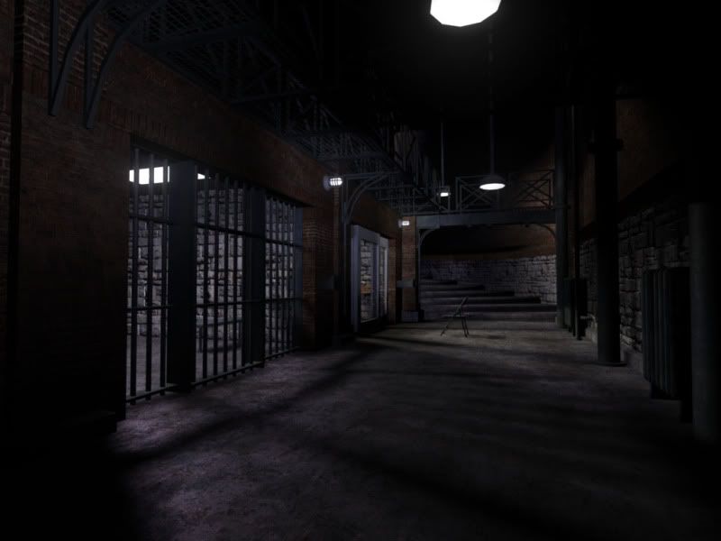
Hannibal Lecter Cell
Greetings PC, this is a scene I have been working on in my free time to start rebuiding my portfolio. I have been getting some crits from a few friends and colleagues, and decided to finally put it on here for more Crits / Feedback. As of right now, the textures for the door, chair, bed, toilet and other things inside the cell are still wip. I have always been a huge fan of the Lecter character, and want to make this as good as possible. Please tell me what you think! Thank you.
Replies
I'm not an expert but here's my crits:
Some of the scales of the assets are off especially the heater and the stairs.
You can also add contrast in lighting like putting orange lights or other warm colors. (ignore this if you are modeling from reference)
The materials of the metal can be improve by adding spec maps and also put some wear and tear properties like subtle rust.
You can also add additional edges for the picture planes so that you can fold the borders.
I am once a victim of uber-photosourcing and believe me you need to add/edit some interesting stuffs in your photosource textures before using it.
I believe this is rendered inside 3ds max?
hostilis mentioned some valid issues.
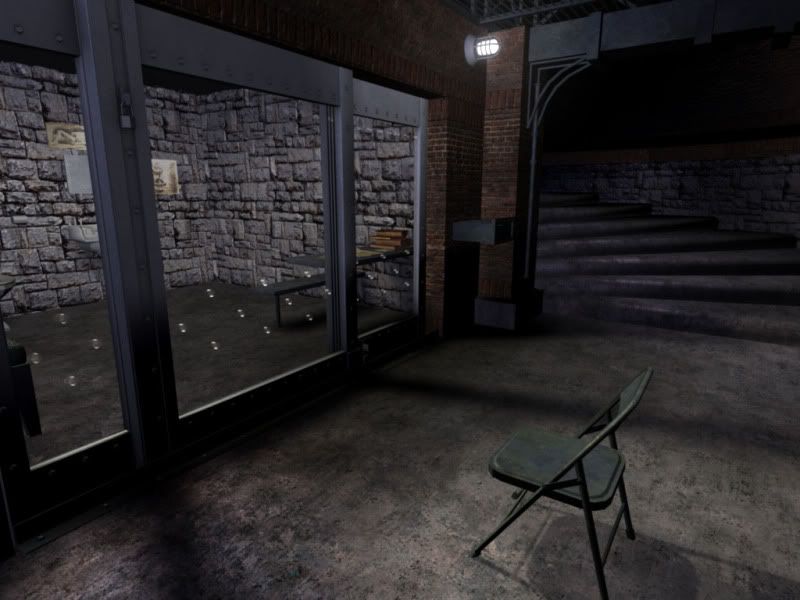
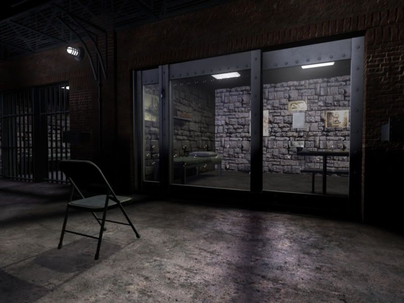
Other then that, the tiling on that stone texture in the cell interior is really visible, you should try to rework that.
Your lights are way to white and in general the lighting lacks atmosphere. Those lightbulbs should really have a cone underneath illuminating some dust thats in the room. Give them a warmer color. For the neon lights, use a more blueish color.
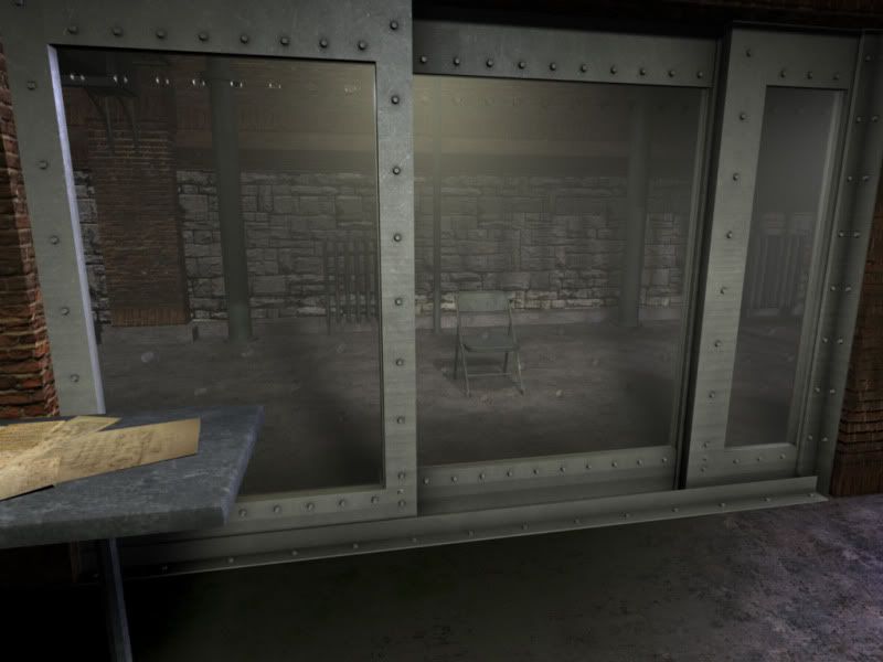
Try to make the glass reflect the environment.
Where is this rendered in?
Areas that are working for me:
The values of the lights and shadows
The floor cement texture/shader
The modeling
Areas that need work:
put a smoothing group on the cylinder that props up Lecter's table. It's visibly faceted.
Make legit unique textures for the table top instead of the tiled metal texture. This is an area where you could really make a lot of interesting things happen.
There is a texel density disparity between the bricks that are horizontally placed, and the bricks that are vertical. I feel like they should be the same size.
Alpha cards on the floor could show dirt in corners, footprints, worn areas where lecter stands a lot, etc. Consider making a 1024 alpha map with different details that you can put in areas to a) break up tiling b) enhance visual interest
INside the cell: The back wall and right wall looks blown out, but the left side wall looks very nice... strange.
Inside the cell: Where the rocky bricks meet the floor, it just looks very last-generation. Find a way to transition them in to each other whether it's metal trim around the bottom of the room or and occasional brick physically modeled out of the wall to break up that perfectly straight junction.
As others have stated there is some missing atmosphere and color. Consider some dead-space style lighting effects with fog hanging in the air around lights.
I feel like the incandescent bulbs that are sticking out from the walls with the iron rungs around them should be far more yellow and should surely have some atmospheric effects. I wouldn't rely on Maya's procedural glow alone. I would use that in conjunction with some alpha cards and hand-paint an atmopheric cloud with variation in it's thickness.
Hit it up with some updates soon brosef! You're totally on the right track and this is your best work yet!
Take what you've learned here and consider applying it in unreal.
However by all means continue on in Maya if it suits you... it just may not be the most effective tool to waste 40 hours in learning to light.
@Hostilis, yes textures are wip on some objects. As for the scale, I must respectfully disagree. I used scale reference directly from Red Dragon, and Silence of the Lambs. Thanks for looking out for that tho.
@IxenonI, rendered in maya. i currently have warm color on some of the lights, but very subtley. pumping up those values little by little will surely help out the lighting contrast.
@Pope Adam, thanks for the kind words good sir! the faceting is an easy issue to fix, and i think alpha dirt in some areas will make it look really nice. good call. some trim in the cell wouldn't technically be screen accurate, but i think its the way to go. Also, how would you suggest getting badass dead space style light-dirt for the atmosphere?
@ Erich, yes, the textures started as photosourced, obviously as I am going for realism. I did however work them over to make them my own, and tillable. As stated above, the metal is still wip. Thanks for the interest man. Its nice to get some fresh eyes on the scene.
This might be a better photo reference for your scene.
I would raise the ceiling about 2' upward. Your also missing the wall next to the sink that pops out about 2'.
The metal around the glass could be made more shiny and thinner. Right now the metal framing around the glass makes the room look smaller and out of scale. From the reference and I'm guessing here, but that bed is about... 5'8" to 6'. I would say that the reference room is 8' back and 10' wide (give or take a little). Right now to me your looks about 10' - 11' back and about 14' wide. I think if you played with the measurements you'll get that confined but yet open look to your scene. By open I mean you'll be able get those dynamic camera views / information that you want to convey about the scene as they did in the movie.
One of the best ways to get a general scale of a room is either use a "dummy" average height man or even use one mid - size object from your scene with specific measurements that are universally same no matter what shape the object is. For example, in arch viz I'll use a door with architectural standards for a doors height and width. This really helps with for scaling things in a scene when my CADs, drawings or measurements are off.
I'd say the details of the scene are there. They just need sharpening. Can't wait to see the finished product.
that image is from a hollywood reproduction walkthrough for tourists. it is not screen accurate... thats why his jumpsuit and restraint mask are on display, as well has having no ceiling. you can see in the attatched photo there is no wall protrusion, as well as the detailed cell door that is looked over in the reproduction. I also used the UDK scale guy to achieve an accurate representation of scale for the scene, it is just currently turned off and not rendered.