[Hand Painted] Ogre Character
polycounter lvl 10
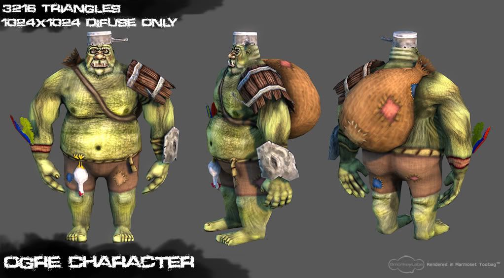
Been working on this guy for the last couple of days as a portfolio piece. About 12 hours work in total. Used Photoshop and 3D Coat for textures and Blender 2.49 (yup, the old version) for modelling.
Havn't rigged him up yet, but i promise i will post a more interesting pose soon")
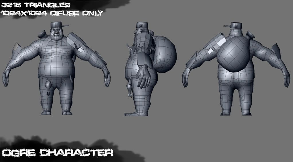
Construction shots:
Havn't rigged him up yet, but i promise i will post a more interesting pose soon
Construction shots:
Replies
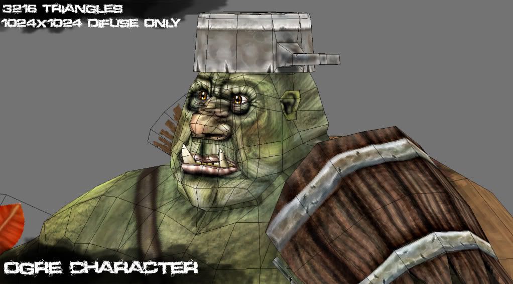
a lot of 'noise' on the character, you've got lines on the characters skin that don't make much sense, they just busy up the texture.
his body is very 'boxy' - particularly the legs. for the amount of polies you're using you could have a much smoother, more interesting silhouette.
texturing is inconsistent - look at the transition on his arm band, then look at the bottom of his shorts. one has harsh shading and the other is subtle.
i can't really tell whats going on with the piece of metal strapped to his arm. my eyes are drawn to the vaginal shaped dent(?) in the middle of it, every time i look at the piece.
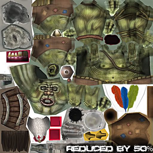
generally things look too low-rez for a 1024
i think this is a good start, but you need to put a lot more time into it before its ready to be a portfolio piece.
@Bon, haha, yes.. chicken penis is a bit suspect... i dont really want to give him thinner ankles.. as i want him to look rather flabby, i could thin them down a little, but maybe widening his heel/foot would serve the same purpse?
@Sectaurs, I think i went a bit OTT with my b/w overlays on the face instead of actually painting darker shades, resulting in the black, will probably try fix this with some colour corrections if possible. With the whole noise thing, i was aiming to get the character looking pretty busy, not your typical smooth skinned ogre
I'm not quite sure what you mean by the inconsistency, are you refering to the lack of shadowing where the shorts meet with the legs?
You've encounted some monstrous vaginas in your time if thats what you instantly thought
Cheers for the fresh eyes on this, so easy to get bogged down thinking everything looks fine once you've been staring at it for so long.
Fix it with paint.
Another thing to mention is that many of the wrinkles look unnatural, especially at the back of his neck, under his arms, at the back of his knee, across his chest and around his eyes. They do not flow with the forms properly.
The way his arms curve down in almost a circle looks bad. And why are his biceps so spiky? His hands look flat and come out of his wrists at the wrong angle (see side wireframe).
Also loose the grunge and the weird wrinkles in your diffuse.
Maybe look up some 3D from world of warcraft they make good handpainted creatures
Dont let this discourage you ! keep practicing
good luck !