[portolioliolio] Nizza_waaarg
polycounter lvl 15
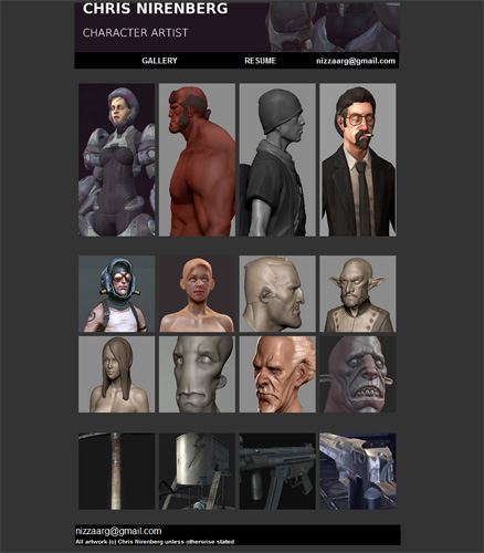
aight, dreamweaving and setting up mah domain name to work with my site was fuggin painful but finally got it all working.
Crits all round would be good. I think it's kinda cluttered and doesn't read all that well atm. Also maybe i should switch to just throwing up sculpts as the main focus, i dunno
Anyways, let me know what you think
(and if anyone has any spare jobs they need carried away, i'd be happy to take it off their hands ^^)
http://www.nizza3d.com
Replies
Also, why not include at least that base texture you've got for the skater dude in with the thumbnail? Its awesome that you have the skater in the UDK and rigged, but why put him against a checkered room? It takes away from the presentation.
For the borderlands looking character, I'm not sure what that Maya screengrab is doing, but at least get rid of the green lines in the pictures if its some kind of explanation.
To be honest I'm wondering why you'd want to group your content in the first place, right now it feels a little random. Why not drop the separation and make the thumbnails equal sized? The fact that the imagess are opening in the same tab isn't very elegant, people have to click the back button way too often to see everything. If you're going to keep the thumbnail setup then they should perhaps be opening in a new tab - or, you could scrap the thumbs and just put all your images on one scrolling page.
As for presentation, I'd try keeping a roughly consistent background colour/pattern/gradient across all images in order to tie them together some more. And while it's good to see a non-playful font in the header, the text itself isn't aligned very well. It'd be worth tweaking the layout and spacing of that (and the cv) and make it look balanced.
The only thing bugging me is the uneven spacing between the thumbnails. It shouldn't take long to fix tho - just take a screenshot of the website, bring it to photoshop and move stuff around until it feels right. It will be pretty obvious.
Great work, as always!! Loving your subtle sculpting. I'd love to see some of these pieces more finished, too.
Spacing looks even to me? Am I missing something?
Judging by the page source, it's auto spaced by the table layout with a 5 pixel width.
Lovely work man, a real pleasure to look at.
Good luck with the job hunting!
made a few changes: ditched the deagle, gave the 5s fellah a bigger button despite him being rife with anatomy probs and lame-sauce :P
Hoping to throw one or two more bigger style buttons in there too as i really need more finished stuff (cheers pior ^^).
Tried fixing up the spacing a bit too. Originally did it so it was a little easier on the eyes but i think some extra larger buttons might do it.
Kinda reluctant to throw the female char from ages ago up there due to how old she be but dunno (i could use the extra double height button).
I'mma keep tweaking (will hopefully have more finished junk to throw up soon too ^_^)
just noticed - where's yo texture flats at :E
gl ^^
There are a couple of sloppy parts though, as well as some things I think could be improved designwise.
Like DDuckworth mentioned you've got some untitled documents.
There are some spacing issues with the 5* thumbnail.
The last 3 thumbnails have broken positioning.
The spacing on text can be better, especially on the header (add a bit of space above your name dude)
JPG compression on the space chick (large image) is pretty bad.
Personally I'd make the gallery page a bit wider too, right now it feels very narrow (though it would work nicely on old PCs and the iPad. So if you carry one around it might be useful to keep it narrow so it'll work properly when you wanna show off when you happen to meet a potential employer).
The subpages and the resume feel very unfinished.