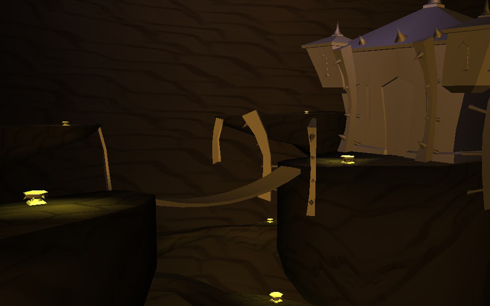
Hand-painted volcano castle
Just the block in of the scene so far. It's at 3k, not going to really worry about polys though that much. Just keep it lower and increase where I need to for lighting.
Going for a hand-painted/WoW look on this scene. Using the Cataclysm dungeon Stonecore as reference for a lot of the rocks. Textures are placeholders just something instead of flat color.
http://www.wowjuju.com/topic/1534-the-stonecore-dungeon/
Thinking of having lava at the bottom of the pit. Castle textures will be a mix of stones, metal, and a little bit of woods probably.
The bridges I'm leaning towards stone because wooden bridges near lava seems dangerous (Of course so does building a castle, but it looks cool).
Thanks for any crits.


Replies
[ame]
Going to get the textures a bit further along now.
Dan!: Extremely damaged and uber-dangerous!
Khalamea: Thanks. I was actually starting to do what you're suggesting about cutting in the rocks in the mesh on the structure that is holding the castle up. I haven't gotten around to doing that on the rest of the rock walls yet. I agree about the castle feeling tiny. I would actually say it feels 'eh' so far. I'm going to redesign that whole area. I'm just not feeling the design at all. The bridge and fire pit deals are supposed to be the scale prop. But maybe I need something else in person size.
Thanks for the great crits. It gives me a ton of stuff to keep pushing with this.
Still need to finish the textures on the bridge spikey supports, texture the fire pits deals.
I obviously removed the castle. I want to rework a new idea with that over the weekend and see if I can get something a little more interesting.
C & C always appreciated. Thanks!
For the bridge also, I'd rethink either the lighting or the colors on the chains. I didn't even notice them on the first pass, they sort of just fade into the background.
Looking good though!
I added in a new castle structure. I tried to stay consistent with repeating elements (spikes & curved french fry looking things) with the castle.
The textures are just temporary just to get an idea of the surfaces. It's still missing windows as well.
Is the scene super dark for anyone? I'm not sure average brightness on monitors. It looks fine on the 3 monitors I have access to. I'm just not sure if it's too dark for other people.
they dont look like they fit there
looks like you took a castle and transported it into this cave
that skull cave entrance looked the best to me.
but like i said, would be cool if you could get a kickass structure there instead.
yea thats all i got. . .
good work tho, i like how you made the rocks at the bottom pop out
keep it up
i hope you don't mind if i do some little paint over ( if you want to keep other than skull entrance)
The castles look like they dont fit right with the environment they're in at this stage
Thanks for the feedback everyone!
@Jessica I'm with you on that. This will probably be the last large scene I tackle for a while. Think I'll move to medium sized props instead.
@FruitBomb thanks for the feedback on them all. I totally agree with you that the castles look out of place. They don't have the vertical feeling that the cave does. Maybe I can work in some sort of structure.
@TheKenny @Gannon @cholden Agreed! The 3 I's have it. Again I'm just doing the second one so Chris won't oppress me. It sounds scary. I think that's what they do to make orange juice.
@Dan! Have I told you lately that I love you. Don't ever leave.
@xvampire I might play around with lowering the camera angle on the cave entrance or adjusting like you suggest to make that even more dominant. Thanks for the paint over! Loving the 'just attacked' vibe.
@pinkbox Again going with the second idea. Buy yeah working that skull into the structure would help a lot. I think the cave entrance makes the most sense.
Thanks again for the paint overs and the input. I think this is pretty well sorted out for me to rework and finish the scene. I'll post an update sometime during the week with this stuff starting to get worked in.
Lava Lake of the Nyiragongo Volcano in Virunga National Park in Eastern DRC. also note the large amounts of steam pillars. As i said, nitpick. otherwise i agree with the last two edits.
Here's a paint over working in most of the ideas that Dan! posted and the lava changes.
Edit: The red lighting on the walls will probably be more speckled since the lava isn't 100% red now.
Gate and cages are completely untextured. Their value will be darker once they get a texture.
Here's a version with some more textures.
Probably will change the texture on the gate to a metal instead of wood (not even sure it reads like anything from the camera distance though).
The screenshots are looking real jagged for some reason.
Thanks, and good work!
@itismario I agree it's a bit dark. I'll play around with adding something to brighten it up some. Thanks!
@linkov THANK YOU! Of course I don't mind. Please paint over anything of mine you want. Super cool of you to do a paint over. I think most of those changes (steam, lighting tweaks) should be easy. The lower base modeling might need some more changes. But I'm in no hurry to finish this up. I just want it to be good. So I'll keep on that too.
@Perfectblue It's actually easier than what you're saying. I whipped this up real fast cause it seemed easier than typing a confusing explanation.
Thanks for the C + C. Anymore would be appreciated. I'll jump on these changes over the next couple days.
wires: