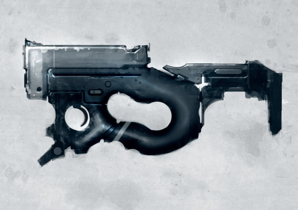
Light SMG
I necroed this thread all by my self. Most of the work in here is very old. Right now I'm recreating pretty much all of it from the ground up again.. Old model is mostly used as blockout/scale ref..
Current progress:

Found this speed paint done by Torvenius over at Conceptheart. I fell for it right away.

This is what I have so far:

C&C and ideas are very much welcome! (:
Current progress:

Found this speed paint done by Torvenius over at Conceptheart. I fell for it right away.

This is what I have so far:

C&C and ideas are very much welcome! (:
Replies
I think you've got a great start so far. Judging from the way he shades the concept, I don't think you quite have the roundness and overall shape of the rear grip loop? To me it reads as more cylindrical in cross section, though I know that's got to be tricky to square with the back edge. Really so far, so good. Something to think about would be to push a little bit of hardness differentiation between what to me looks like the softer molded/rubber of the rear grip loop and the section that makes up the trigger guard, which looks a little harder?
Paintover for the stuff I think will do well to really nail the concept, and add the necessary plausible details (some kind of sights)
cheers! looking forward to updates
So I have worked manly in the stocks shape, and I'm fairly satisfied with the results. I've touching a little bit every where so maybe it doesn't really look like I have any thing, but I have!
Right now I'm trying to figure out everything that's NOT showing on the concept. Like the top of the barrel, the shoulder support (couldn't find a better word :P) and the front/trigger guard.
For the iron sight I was thinking like a small red dot sight, very small - maybe :P And at the front a more conventional iron sight. For the shoulder support I'm looking at some of torvenius other concepts and trying to get some inspiration from them. I'm also thinking about the actual front of the barrel itself, I kinda like the flat front thing, but it needs to be something..
Again, this isn't about the hobgoblin of REAL GUNZZ but any first person weapon in a game needs to be able to "work" to a minimum degree, and things like where/how it reloads are a consideration for animations. Torvenius' speedpaint has a great silhouette but the design needs some elaboration in order to work. So here is my suggestion if it is a conventional subgun (obviously, a metal storm or lasergun or what have you and this no longer applies):
As you can see, the action is very closely based on the Uzi, but replaces the Uzi's delayed golem blowback system with one using tiny unicorns. (H&K did a lot of interesting experimental work with tiny unicorns but ultimately abandoned them--poor, imaginationless Germans that they are.)
OK jokes aside this is layout that makes sense and "works" enough to hold up to basic scrutiny. Obviously nothing inside the gun need get modeled but knowing approximate locations really helps to feasibly locate the things you DO see--like the ejection port. If you take ten minutes to figure out this kind of stuff other questions resolve themselves, like what the magazine looks like, etc. Fun as it is to just put buttons and doodads all over the place, understanding where a few control surfaces might go in a believable way makes the gun itself all that much more believable.
Anyway, I think the changes you have made already go a long way--I particularly like the part line you have introduced between the grip and the receiver; overall the grip contour looks a lot better. Hard surface stuff takes a while but man I think it's fun work, so above all I hope you're having fun putting this gun together. Keep going!
VVVV Kitteh: I thought about that too but I would say the original angle works fine since it's practically the same as a rifle grip angle, which is plenty comfortable (the reason say, the FG-42 had such a weird grip cant).
On a more practica note, changing the angle of the grip will likely change a lot of the gun's overall look and that can be more trouble than it's worth.
http://dl.dropbox.com/u/11964902/Work/mix.jpg
I like the direction you are going for, with more rounded edges.
http://www.gausswerks.com/img/tag/sltrOlsson-handhold.jpg
I think the magazine thing will work great with the design and it will be nice to say "it could work(-ish)".
I thought about the P90 when i saw it the first time to. I see it as aproximently the same size as the P90, maybe a bit smaller then on the picture below when i think about it. But i think it shouldn't be to small.
@ mystichobo - You should finish it!
Update on the way!
Todays progress.. Just a bunch of details.. I'll get to the magazine tomorrow..
I did a very fast suppresor as a test to. What do you think? Does it work?
Trigger, aim and stock left to do.
And an idea i got. Make it a separate piece so that it can be folded up.. Don't ask my why, but i thought it was a cool idea. Yes/no?
What is it that makes it a staple gun to you?
-I still don't think you've quite got the thickness/contour of the grip just yet, and you need to go ahead and finish up the lower part of the grip. Arguably that lower pokey diagonal bit out the front bottom of the grip is a handstop?
-I've included a suggestion for a charging handle in the upper portion of the receiver that is pretty blank. Another good idea is a rollmark/engraving of manufacturer etc. This will also make the design more fully realized.
-study Johny's model of dfacto's "cherub" pistol design. The relative tightness, scale of detail, frequency are all what make this seem so believable http://www.polycount.com/forum/showthread.php?t=75481
- if you go for a suppressor, I would still model the barrel first, though if it's meant to have a suppressor, give it a threaded muzzle. Will also help ground the design in believable detail. Then for the can, realize that suppressors work by simply retarding gas and letting it out slowly instead of all at once--so by nature cans have to be kinda big. Your can is about half the size it should be, needs to be longer and thicker.
-as notated, you can put some neat detail on the front part of the upper receiver to indicate maintenance access/gas system adjustment. GIS pics of guns and look at their fronts for comparison
-I'm not entirely sold on your alternative stock--it can work, but it changes the silhouette of the gun pretty considerably. I think the original stock works better with the silhouette, but it's your call.
-as noted the magazine now looks like a single stack, it needs to be about twice as thick. Look up pictures of subgun magazines for comparison--grease gun mags, sten mags, even up to mp5 mags all look pretty similar. they're wide enough for a double stack and taper to dispense a round at a time.
Anyway, keep going! Looking good so far, you just need to really dial in on realizing details and overall widths.
That's why i'm so glad for all your help!
What do you think about the trigger? I know it's different in the concept, but it didn't really feel functional.
A little iron sight in the front is in the very near future. Any thoughts on the red dot?
Haha, yeah. I've realized he's just posting random drawings :P
Yeah, that whole front part is pretty bad. It's pretty diffuse in the concept what goes there, but thicker, definitely!
I need to find a function for that crazy pointy thing in the bottom front..
also it can have the meg release above it like you get on the battery release in digital cameras. as for the ammo type. why couldn't it be some really thin bullets so you could get in like 50 a clip. looks like a spray type weapon.
That's is actually a real good idea. That form of the gun bugged me, it didn't feel right.. I'm gonna change the shape of the back to..
It was some time since i worked on this, i'll get back soon..
Thx for the crits!
Thx for the encouragement guys! I'll take a lok at this tonit! (:
Small but still deadly looking!
I'm hoping for cool updates!
Stuff i'm gonna or thinking of changing
So, the blocky thing on top of the shoulder stock thingy is the mag atm. Obviously it need allot of thinking and design, but still. What'cha think?
Paintovers and shit is encouraged!
Well done!
And it makes perfect sense in that position. Just like the FN P-90.
And if it were clear, you'd be able to cast an eyeball down and see EXACTLY how much ammo you have left! And that is a handy thing too!
Great thinking!
As Bar are saying, the same type of magazine is actually in production for the P90. So i don't really see any problems with the placement.
My "problem" is that i want to be as true as possible to the concept, i've maybe sailed away a bit form it but i'm trying to get back.
I'm thinking of some nifty litlle thing that makes the magazine pop up to a 30 degree angle from what it is now. Maybe.
I started reworking the lower part completely cause I didn't like my old sloppy geometry.. It's based from cylinders rather then free handing it all.
Not super interesting yet, but soon enough!
Just general 1/6 custom figures.
I have made some of my own custom weapons in 1/6(But only using my own model skills, lol. Not the magic you are doing).
It would be handy to have some nice custom weapons available from shapeways in 1/6.
Here are some of my own meagre works(I hope you don't mind me posting them):
I'm not really sorry, but sorry for spamming :*
I've found some more concepts that I like the style of and will steal details from them. I'm gonna go with a foldable design (something more in the line of the first image) for the top part and I think I'm gonna do some sort of electronic puls thing that shows when you open it. (Second concept..)
Baby steps..
I thought maybe it was a dedicated blog or site you had found.