The BRAWL² Tournament Challenge has been announced!
It starts May 12, and ends Oct 17. Let's see what you got!
https://polycount.com/discussion/237047/the-brawl²-tournament
It starts May 12, and ends Oct 17. Let's see what you got!
https://polycount.com/discussion/237047/the-brawl²-tournament
Broken City
Hello Gents
This is one of my first full scenes, I did it while I was still in school and I completed it in just under 5 weeks. I'm looking for some good critics so let me know what I can do better. Complements are also welcome
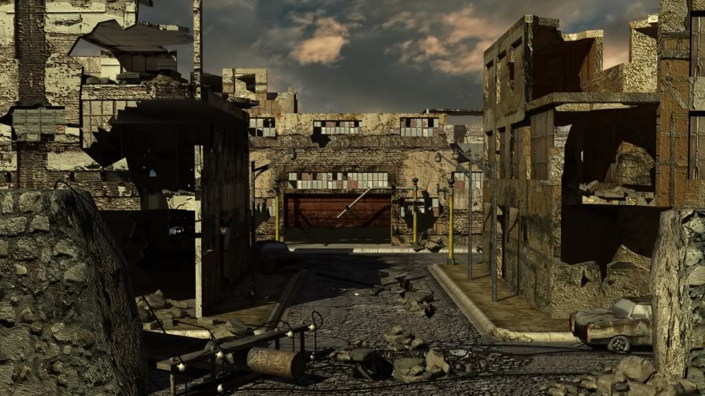
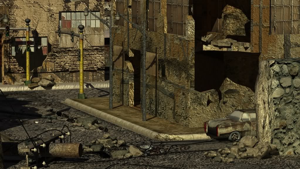
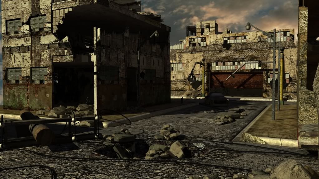
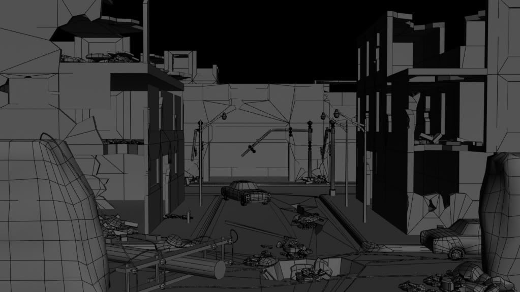
This is one of my first full scenes, I did it while I was still in school and I completed it in just under 5 weeks. I'm looking for some good critics so let me know what I can do better. Complements are also welcome


Replies
Normal mapping is a tool to had to the surface you may want to turn it down a notch.
other then that seems pretty good
Lighting: Its already been commented on, but the lighting is harsh. Things in those shadows disappear completely. One of the cars in your scene is only visible in the wireframe render.
Textures: How did you texture the scene? It would be nice to see the maps. Some of the props like the cars, and light poles should probably have more well defined texturing. Right now they look kinda under detailed. There are some things that bother me about the building textures, as well, but its hard for me to give advice without seeing the maps.
Modeling: Don't be afraid to throw some extra mesh detail into the broken parts of buildings. Shilouette really matters in those areas, and adding even 50-100 polys can be better than a faceted outline against the sky. The broken wall on the lower right behind the car is a pretty good one.
Hope that helps you zero in on some things to work on. It takes a while to really master large scale props like buildings, but once you get a workflow established its not too bad.