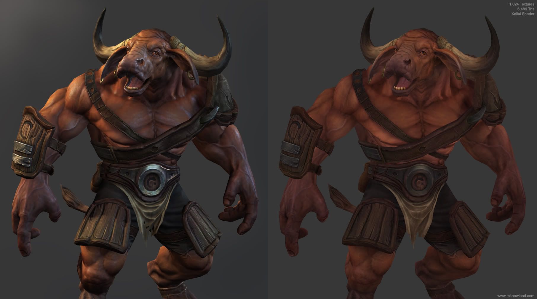
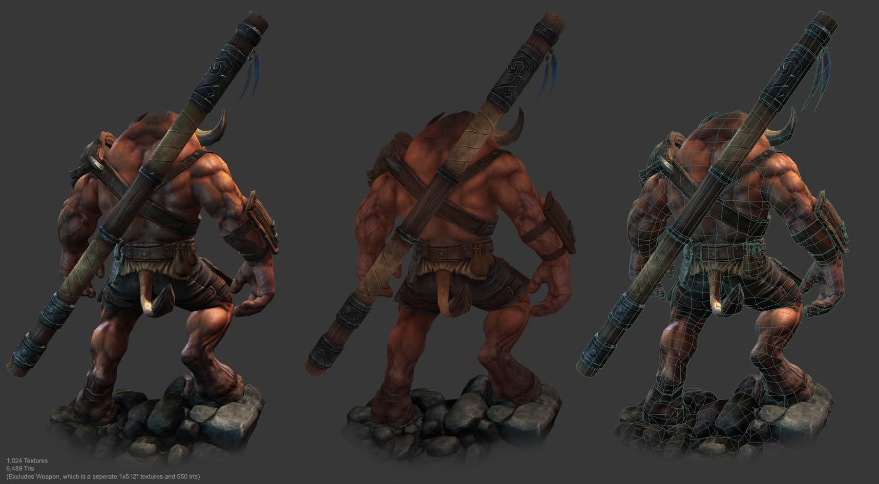
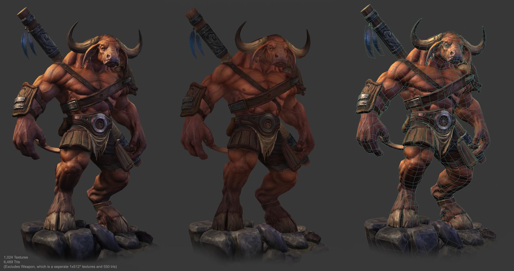
Home 3D Art Showcase & Critiques

minotaur

here's a little minotaur creature. he turned out a little bit meaner than expected, but it was good fun and practise. i didn't start with a concept, but more of a zsphere concept sculpt drawing inspiration from paul bonner's work

hope you like him

if you watch this video you can see him in the viewport in realtime

http://vimeo.com/14638665


*updated with newer images

Roar.jpg
Diffusex.jpg
Back.jpg
Front.jpg

Replies

  • bloodmoon
    Offline / Send Message
    bloodmoon polycounter lvl 8
    Love it! Really nice details and coloring. Great model.
  • Kuki
    Offline / Send Message
    Kuki polycounter lvl 8
    Your work is simply stunning man. Nothing else to say :)
  • Saman
    Offline / Send Message
    Saman polycounter lvl 14
    Wow, this turned out even better than I expected. The material work is simply amazing. I guess it's entirely painted textures? What happened to his bird companion btw?
    Edit: Are you using Xoliul's shader for the screenshots? I see no pixels at all and it looks anti-aliased, how did you manage to get that from the viewport? Also perhaps you could share your lighting settings with us?
  • Del
    Offline / Send Message
    Del polycounter lvl 9
    ~ Nice to see it finally complete. Great job, Mike.
  • rollin
    Offline / Send Message
    rollin polycounter
    beautiful!

    I'd add some more skin detail into the spec map
  • zxcman
    Offline / Send Message
    zxcman polycounter lvl 10
  • JasonLavoie
    Offline / Send Message
    JasonLavoie polycounter lvl 18
    So this is probably on the extreme side, but I would love to see a little more colour in the model, right now it seems like its just a bit too desatruated, and you lose life in the skin (if that makes sense).

    Take a look (quicky) I also agree with Rollin about pushing the spec detail a little more.

    b7qgkm3z.jpg
  • shotgun
    Offline / Send Message
    shotgun polycounter lvl 19
    The texturing is absolutely fantastic. Detailed and rendered yet doesn't overwhelm lighting.

    My only gripe - and it's very common so I wonder what others will say - is the outside-in sculpting technique, which leaves little to no room for joints rotation (wrist, knees, etc.). It feels as if the bones lack prominence and space. I see this a lot and I wonder if its just me or has it become so widespread that nobody notices this.
  • conte
    Offline / Send Message
    conte polycounter lvl 18
    outstanding!
    every aspect of this work is just perfect, love how you separate color and speculars.
    becoming your fan, Mike)
  • catstyle
    thanks everyone, I really appreciate the crits and comments

    Goraaz - yeah I bailed on the bird side kick, comicon has come around and i felt a sudden urge to finish this guy asap and think about entering that

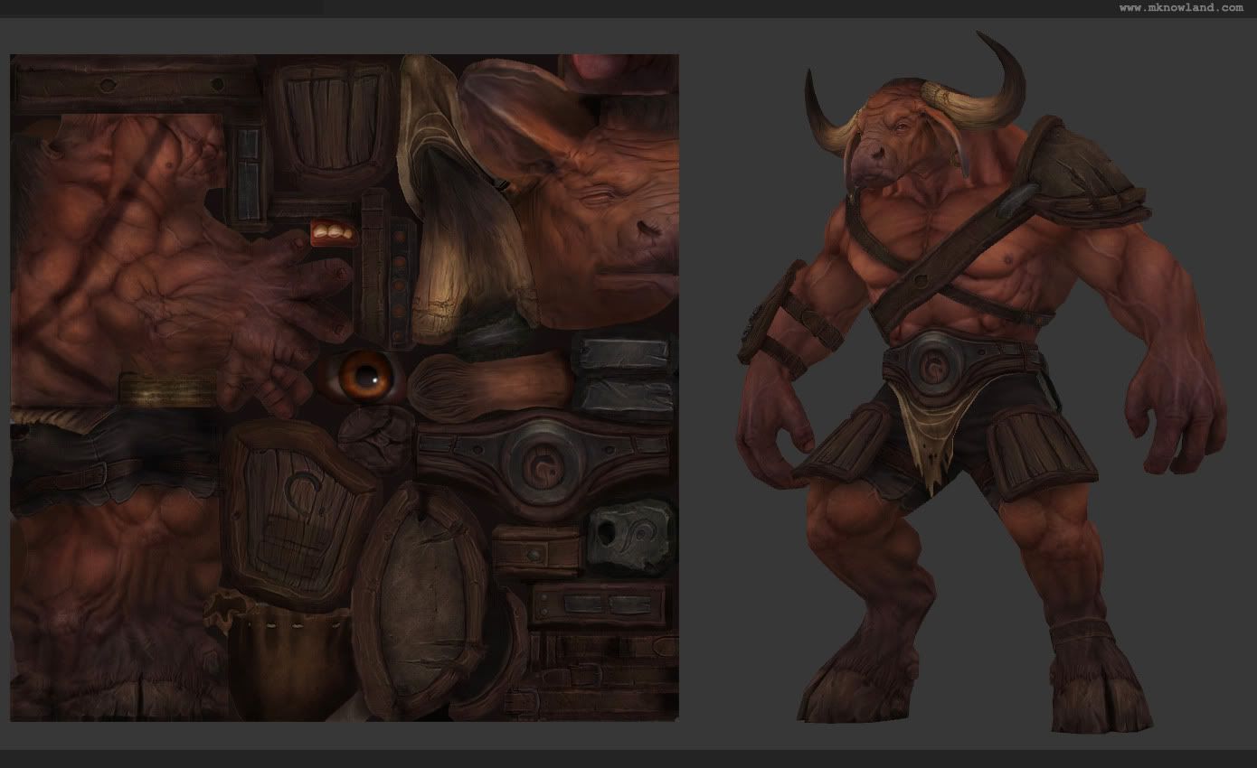
    rollin - yeah now that you mention it, he could definitely have had some more interesting spec details on the skin, but there is only so much you can squeeze onto a 1024

    jason - that looks a little too saturated for me, but i agree he is maybe a touch on the desaturated side, particularly in that light

    shotgun - can you explain the outside-in thing your talking about a bit more? im not sure what you mean by it

    i probably could have structured his anatomy in a more functional way. he did just kind of emerge out of some very loose sculpting, and i thought i'd see him through to a full version and get some texturing and technical experience out of it
  • Szark
    Offline / Send Message
    Szark polycounter lvl 12
    Really nice work! Well done!
  • dur23
    Offline / Send Message
    dur23 polycounter lvl 19
    Just rad. Love all the little details like on the hooves.
  • Silth
    Very cool stuff, when you start texturing do you work off anything or do you just start painting from scratch?
  • achillesian
    havent seen good use of normals like this in quite some time! It seems like its rare to find a diffuse and normal that compliment each other well w/o overpowering either.
  • Shogun3d
    Offline / Send Message
    Shogun3d polycounter lvl 12
    Fantastic modeling and texturing on this character. I love the presentation.
  • leslievdb
    Offline / Send Message
    leslievdb polycounter lvl 15
    amazing work on the model and textures
    love how you kept the triangle count low and it looks like it could be a highpoly model

    and same question as coolkidroc here.
    Do you just take an AObake and start painting ontop of that or is there 3d or projection painting involved?
  • bounchfx
    dude! great work! I really dig your texturing.
  • haikai
    Offline / Send Message
    haikai polycounter lvl 8
    Awesome creature model! I also like that the specifications are pretty reasonable. I think the dark areas on the armor are a little too dark, but that could just be my monitor. It would be cool if there was more body hair/fur too.

    I'm really looking forward to your Comicon entry!
  • bern3d
    yahooo thats awesome :D
  • Trappe
    Really awesome work, I think the overall texture works very well but try to push the colors more in certain places like the blue feathers and perhaps change the loincloth to a less neutral color.

    The hoofs and horns could also use a punch of brightness, all in all you just need a little more definition to separate the different parts.
  • evilblah
    Offline / Send Message
    evilblah polycounter lvl 18
    Wow, really nice piece! I really like the work around his eye. The way you built it, at least in my opinion, gives him a lot of emotion. Almost like he has been around for awhile and dealt with a lot of turmoil...

    Pretty slick!
  • 55joe
  • Josh_Singh
    Offline / Send Message
    Josh_Singh polycounter lvl 18
    I agree with JasonLavoie. The shots with just the diffuse are so beautiful. I love all those purples you got going in the shadows and darker areas. If you could punch up that purple to orange-tan transition in with all the materials turned on, it would be awesome.
    I also second some spec map love. get some wetness around the nose and mouth area.
    as for the skin here is a great map I like to use:
    http://dl.dropbox.com/u/2583729/bumps.jpg
    You can do a lot with it if you mess around with it.
  • catstyle
    ill resist the temptation to rush off and won't put this guy to bed just yet. i'll have a go at these suggestions :poly142:

    cheers for that map josh, gonna give that a go


    to answer some questions:

    it's using xoliul shader, i used grabviewport to take larger images then shrink them down. i used the half-lambert effect in the shader, to help give softer shadows and let the diffuse come through more, and a little bit of shaded hue adjustment just to bring a bit of contrast back into it

    lighting set up is 3 point, intensity and colour varies a bit between the images, but generally speaking it uses a 1.5~ value warm main light, 0.7 fill (blueish green) and a rim of 1-2 (whiteish-blue)

    for the texturing I used the AO as a base and overlayed some of the normal map detail extracted from crazybump, and from there painted in the colour tones and extra highlights/shadows. i also did a lot of experimentation with baking lighting into the diffuse the same way you would render out your ambient occlusion
  • Minos
    Offline / Send Message
    Minos polycounter lvl 16
  • Two Listen
    Offline / Send Message
    Two Listen polycount sponsor
    I love this stuff, those textures are astounding. I really need to learn to do that.
  • spacemonkey
    Offline / Send Message
    spacemonkey polycounter lvl 18
    I'm a fan, this is quite cool :) There is already some good advice in this thread so if you have the time and patience to follow it, I am sure it will pay off.
  • shotgun
    Offline / Send Message
    shotgun polycounter lvl 19
    Hmmm... It's hard to explain cat. Inside-out basically means laying out the bone structure and putting the muscles on top of it, theoretically speaking, of course. Outside-in means working from a very rough mass (which u have, apparently) and sculpting in the superficial features.

    Ultimately, the final look should reflect proper structure at the critical points (e.i. the joints). They hold together and control the connection of the masses. They must have plenty of room to twist and turn, with the muscles groups along them. Without proper installment, their function becomes nothing more than a post-effect.

    Can you imagine the guy pulling his wrist or turning his radius around? it'll break.
    It's something I see very often and it has become the norm, "disrespectful wrist" syndrome, I dunno if it's not just me seeing it.

    In any case, I agree with most of the tips given here. I'd also add that the metal belt could use more pop vs the cloth [which looks more metallic (due to the pinch, I believe) in the renders]
  • MFTituS
    Offline / Send Message
    MFTituS polycounter lvl 6
    Wow, this goes directly into my "models that kick my ass" folder.
    just one thing - his horns don't look like being grown out of his head. they look like pasted because of the upper thick edge.
  • SHEPEIRO
    Offline / Send Message
    SHEPEIRO polycounter lvl 17
    that cow has bell
  • catstyle
    i definitely feel this is working nicer, you guys were totally right about boosting the saturation. let me know if you think it needs more change

    newtest.jpg

    also i've been re-designing my website, it's more or less done now, check it out and let me know what you think of the layout and stuff

    www.mknowland.com

    i'll be remaking the minotaur video once these new changes are done, and also gonna do one for the gunslinger
  • samgriffiths
    I was thinking the skin could be a tiny bit sharper, the armour is really popping while the skin seems a tiny bit blurry compared, understandably this is texture resolution, but would be interesting to see it slightly sharper and see how it looks.


    And more saturation does work,
  • Josh_Singh
    Offline / Send Message
    Josh_Singh polycounter lvl 18
    Dig the changes
  • ivanushka
    Damn, fantastic work dude. I'm also thoroughly enjoying the saturation boost to your Minotaur.

    As for your website, I personally recommend sizing the thumbnail images so they all neatly stack with each other, height/width-wise. Right now, it just looks to chaotic to me. I'd rather see you put more effort into that "Mike!" logo than what's just scribbled there at the moment. It makes the presentation look unprofessional, and that sir you are absolutely not! Of course, if it's just a placeholder item, please excuse my groaning.
  • dur23
    Offline / Send Message
    dur23 polycounter lvl 19
    Firstly: Awesome!

    Secondly: I would suggest bringing down the specular amount on the wood bits. Right now it's far too shiny for warn down wood. The metal bits could stand to have more contrast in their specular (ie. the darkened warn bits have less spec, the smooth less damaged more spec). And also i would break up your leather spec with high contrast cracking or noise (it seems too smooth).
  • Ferg
    Offline / Send Message
    Ferg polycounter lvl 17
    ferg like, nice work catstyle
  • Barnstable
  • Thegodzero
    Offline / Send Message
    Thegodzero polycounter lvl 18
    Amazing work!!
  • JasonLavoie
    Offline / Send Message
    JasonLavoie polycounter lvl 18
    Defiantly like the direction you took buddy, it gives that character more life for sure.
Sign In or Register to comment.