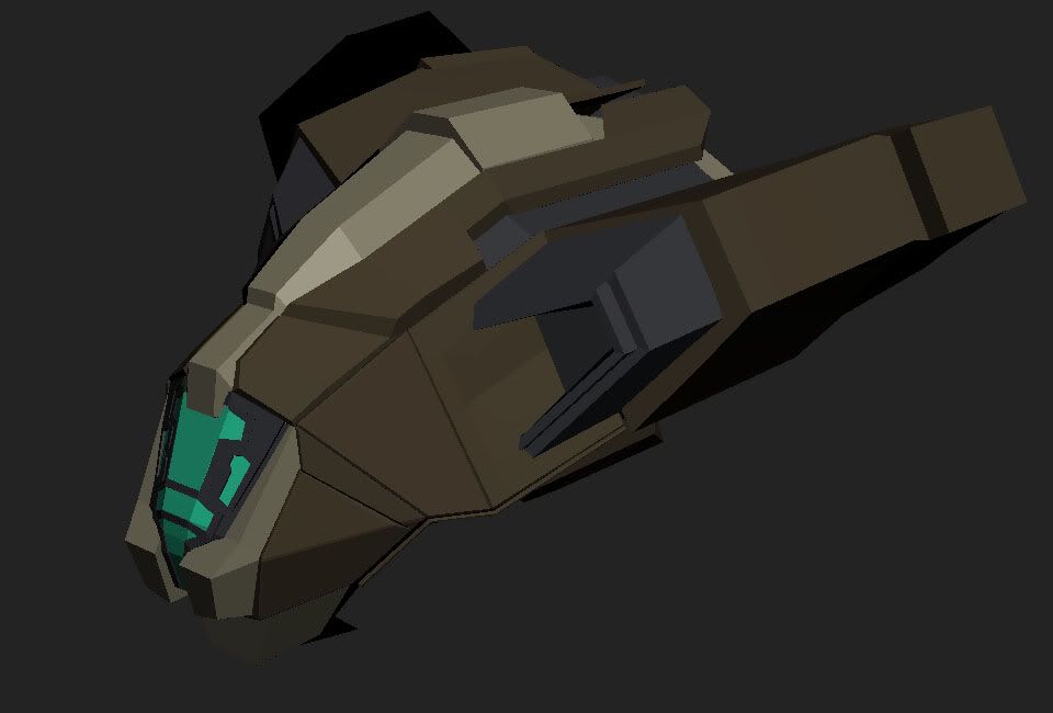
Home 3D Art Showcase & Critiques

Escape Vessell

polycounter lvl 13
Offline / Send Message
wester polycounter lvl 13
Since i've just graduated, it's time to beef up my portfolio for work. Me and my roommate is having alittle modeling thing where we're both modeling the interior and exterior of some sort of space ship. His is a drop ship, mine is an escape vessell.

It's meant to hold about 8 people and supply a journey of about 4 months. I didnt want it to be minimalistic by any means, simply because i think it'd look cooler this way :D

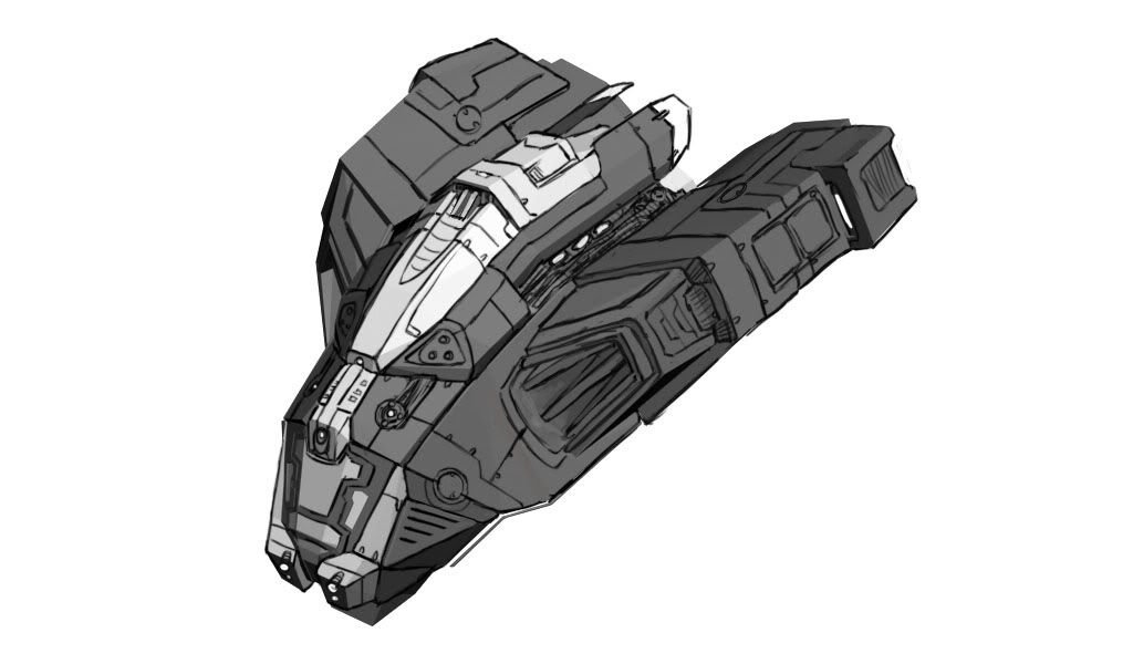
Here's the blockout, and some concepty bits ontop of it.

I'm probably going to eventually build an environment around it. But that'll happen later.

I'm going to try to build up a fairly strong portfolio by september because im pretty sure that's when my contract with SOE ends.


Ship1.jpg


shipConcept.jpg

Replies

  • El Junk
    Options
    Offline / Send Message
    Looks nice. How big is a person relative to the ship?
  • wester
    Options
    Offline / Send Message
    wester polycounter lvl 13
    They're about as tall as the front window pieces.
  • doeseph
    Options
    Offline / Send Message
    doeseph polycounter lvl 7
    Nice. You've got a solid concept and it certainly reads as an escape vessel/shuttle. And did you not want to be minimalistic, or are you saying it just ended up that way? Because personally I think it's minimalistic (comparatively) and benefits from being so.
  • wester
    Options
    Offline / Send Message
    wester polycounter lvl 13
    Some progress. Just going in and filling out the detail from the concept. Going to try to finish the top part today, and the bottom part by Friday.

    really looking forward to the interior. it'll be a lot of fun.

    EscapeVessell1.jpg

    EscapeVessell2.jpg
  • Bigjohn
    Options
    Offline / Send Message
    Bigjohn polycounter lvl 11
    Real sweet. You know, that first shot reminds me a lot of Another World. It's got that same visual style.

    Looking good man.
  • Godemper0r
    Options
    Offline / Send Message
    I feel like you've started to deviate from your concept, which I think has better details on some pieces. Just my opinion.
  • wester
    Options
    Offline / Send Message
    wester polycounter lvl 13
    Some further progress on the ship. It's taking me awhile but i should be able to pick up the speed now.

    Progress-1.jpg

    Progress2.jpg
  • Zack Fowler
    Options
    Offline / Send Message
    Zack Fowler polycounter lvl 11
    You've got a great starting design and you're making good progress. Be careful about how pillowy some of the edges are. Work more angular bevels in there (e.g. turn a 90 into a 45-45 instead of a smooth curve). Additionally, many of the details in there currently feel very flat like we are looking at a model that has very thin and very uniform height-to-normals filtered normalmap applied to it. Push your depth more. It looks a bit like you are rushing right toward small details after getting in your big shapes, without taking enough concern for your medium scale. For rendering, consider adding an AO pass as a photoshop multiply over your renders so the details are easier to read.
  • wester
    Options
    Offline / Send Message
    wester polycounter lvl 13
    It's been awhile since i've posted any of my progress. i wanted to finish the HP before i made any more posts.

    But here's the HP finished, i'm going to start up the lowpoly asap.

    Vessell1.jpg

    Vessell2.jpg

    Vessell3.jpg
  • Autocon
    Options
    Offline / Send Message
    Autocon polycounter lvl 15
    Hey Wes its looking good and I'm glad to see you making progress on this guy. Few crits though.

    First to again touch on what Zak said some of your details seem to small, mainly noticeable on the cockpit. You should over exagerate those so after you bake and it gets muddied down a bit by your engine it wont look so small and almost non existent.

    You still have some puffy looking panels, on the front and on the back under the wing. Tighten them up as now they dont look like plates that are welded next to each other to form a nice seal. They look more like marshmallows.


    As for the back door I dont understand how it would open/close at all. To be honest I cant even tell its a door. Just looks like a lot of cut in square designs to the back. Think you could push the overall design of the back more to make it more interesting and give some kind of clue that it is a door that would open and where/how it would do so.

    The back underside of the wing looks unfinished and very uneaven. Most of the plates there dont seem to line up at all.


    Also those weird little circle nobby things in the front, there are 6 of them on each side, 2 rows of 3. IDK what those are but they look odd and i personally dont like.


    Overall its looking pretty sweet. Like the legs of the ship :)
  • boyluya
    Options
    Offline / Send Message
    boyluya polycounter lvl 10
  • wester
    Options
    Offline / Send Message
    wester polycounter lvl 13
    The low poly is well on it's way. It's not fully optimized yet, it's just the first pass, I'll usually do a second pass to clean up and optimize.

    I'm also unsure on if im going to normal map the majority of the cockpit window...or model it as i have now. I'll do a test bake and see which is best.

    Enjoy


    Lowpoly.jpg
  • wester
    Options
    Offline / Send Message
    wester polycounter lvl 13
    SO i've finally finished the lowpoly. I'm going to do a second optimization pass on this guy.

    I'll make the changes to the highpoly that everyone suggested right before i bake.

    Right now i think it's at something like 6000 tris.

    EscapeVessellWire2.jpg

    EscapeVessellWire.jpg
  • wester
    Options
    Offline / Send Message
    wester polycounter lvl 13
    Update FINALLY

    It's been taking me a good while to make a good amount of progress on this bad boy. But I'm liking where it's going.

    Here's what i have so far. Just the normal bakes, no AO and no texture just yet. There is still some minor normal map issues that I'll deal with, but other than that this is pretty much the normal bake. The texturing should go a little faster since i know exactly how i want it to look.

    WIP1-2.jpg
    WIP2.jpg
  • wester
    Options
    Offline / Send Message
    wester polycounter lvl 13
    Also, this is an ugly max render. As soon as i get the AO done i'll throw it in marmoset or UDK and give a better representation.

    texture size is 4096x2048
    polycount is 7k
    fairly big...but it is a "hero" prop/vehicle.
  • Autocon
    Options
    Offline / Send Message
    Autocon polycounter lvl 15
    looking great wes.

    polycount on it isnt high at all, texture size maybe a little but hey its for a folio piece, why make it look ugly.

    overall I think the normals could be punched a little more. Maybe try overlaying your hp normal map at 50% (or 100%!, play around with it) on top of a copy of your hp normal to give it a little more punch (dont forget to fix the blue channel though). Will help out when importing to UDK as ive always seen normals get a little washed out in Unreal.

    Im sure the AO will help make things pop out a little more too.

    Cant wait to see some texture progress on this guy :)
  • Mike Yevin
    Options
    Offline / Send Message
    Mike Yevin polycounter lvl 11
    The bake came out great, nice job. I agree that some of the normal map could have been "pushed" a little more but like many others have said, the AO will help aid in that after its finished. Keep up the good work
  • EarthQuake
    Options
    Offline / Send Message
    Autocon wrote: »
    looking great wes.

    polycount on it isnt high at all, texture size maybe a little but hey its for a folio piece, why make it look ugly.

    overall I think the normals could be punched a little more. Maybe try overlaying your hp normal map at 50% (or 100%!, play around with it) on top of a copy of your hp normal to give it a little more punch (dont forget to fix the blue channel though). Will help out when importing to UDK as ive always seen normals get a little washed out in Unreal.

    Im sure the AO will help make things pop out a little more too.

    Cant wait to see some texture progress on this guy :)

    GAH! No, do not do this, it will only result in artifacts and smoothing errors.
  • c0ldhands
    Options
    Offline / Send Message
    c0ldhands polycounter lvl 15
    Bit too bulky for my taste.Like most of the polycounters said, the normals dont pop out that much, like if you see the ship from a distance I dont think the details would translate so well. But important lesson learned to keep in mind when doing your next highpoly model.
  • Michael Knubben
    Options
    Offline / Send Message
    What eq said!
    That really is a very stupid idea, it will fuck up... well, everything. Bevels won't look right, smoothing artifacts will be exaggerated. Just don't do it.
    The baked lowpoly should look nearly identical to the highpoly, polycount and texture budget allowing. If you look back to your hp, you'll see that details are very flat on there as well, which is where you should fix that.

    Also, that picture is awful for previewing. You blame it on a 'crappy max render', but you should never preview it that way anyway. Use Xoliul's or 3ps' shader, and preview it properly, the lighting in this is making it nearly impossible to see the normals. I bet if they were flipped we wouldn't even see.
  • wester
    Options
    Offline / Send Message
    wester polycounter lvl 13
    Update on the texture. I'm calling the diffuse done (aside from any crits of course), and i'm moving on to the spec to complete it.

    I'm also going to change the color of the blue lights to white, keeping the glow blue to give it a florescent look.

    TextureWIP.jpg
  • Will Faucher
    Options
    Offline / Send Message
    Will Faucher polycounter lvl 12
    Wow looks great! Only things that bug me are the windows a little. They look like they have edge wear in some corners, as if it was metal, with paint that is wearing off! I would imagine the window to be some sort of glass material. If you get a good spec map on this thing, it will be absolutely EPIC!

    Keep it up man!
  • wester
    Options
    Offline / Send Message
    wester polycounter lvl 13
    Finally finished this guy. It took me forever because I'm working off of my crappy laptop.

    Well, i've definitely learned alot with this. I'm probably going to try to start up one more sci fi vehicle to really try to ensure my workflow, then move onto to something a little more modern.

    I'll add the Portfolio sheets on here as soon as i make them. Shouldn't be too far from this post actually.

    Hope you enjoy.

    beauty1m.jpg

    beauty2.jpg

    wires1.jpg
  • Autocon
    Options
    Offline / Send Message
    Autocon polycounter lvl 15
    Looking great wes. For the most part love how it turned out.

    The only 2 things I think would be best to change would be the cockpit glass and all engine thrusters.

    The glass right now looks, well bad. Way to contrasty with the orange and yellow. Looked so much better in your shot from a few days ago because it was a darker color and the contrast wasnt so high. I would try and make it more subtle. Would also help out from a reflection map if you get it in UDK. Also there seems to be some odd smoothing/shading error on the window on the right hand side.

    As for your engine thrusters I would add some color variation in there. Get some darker blue, light purple, dark purple in there to make it look like it is an actual engine burn instead of just one solid color/solid intensity.


    Looks really nice overall though :)
  • Thegodzero
    Options
    Offline / Send Message
    Thegodzero polycounter lvl 18
    KILL that overlay!!! Do not use overlays of the diffuse/spec turned normal map on your rendered normal map! If your going to use that info use it very very very slightly! Like a 2-5% use. What you have rite now feels like stucco. With out that overlay it should look great! I might go and strengthen any areas that you want to pop more in the normal map but other than that id say it looks good.
Sign In or Register to comment.